Poll results
Save to favorites
Add this poll to your saved list for easy reference.
Which design do you trust more? What would you buy and why?
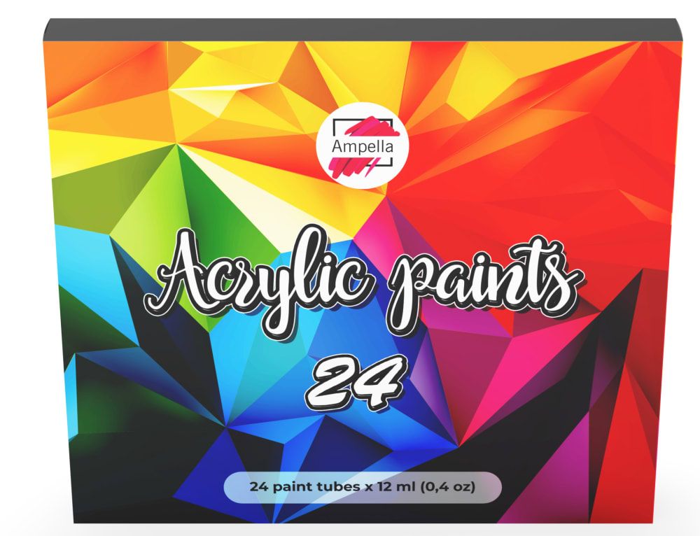
45 Responses to Option A
I LOVE the bright colors. This box is very attractive. The other box is nasty.
I like this color very much
This graphic design is more attractive and interesting to see. The design is modern
I chose A because the photo is more vibrant in color. I would buy this one because it looks like it is made of better material.
The colors on the box is a lot brighter. This leads me to believe that the paint is also brighter and higher quality.
i choose first one because its more attractive than two
It looks more modern and much more colorful. You can't really tell what the other design is supposed to be.
The choice A design looks the better from the Two. The brand deals with acrylic paint and color. Having a design with more artistic and colorful design captivates the attention of people and gives high reverence to the brand The option A design would work perfectly for the brand. I would choose it a million times over the Option B.
Vibrant and colorful! Doesn't look like a dirty, recycled frozen pizza box from the 1980s...
I chose A because the colors are brighter and more vibrant than the other choice.
I trust this option based on the cover of the box and that the cover gives you idea of what colors on in the box. I would buy this option based on the box because it catches my eye right away as the other option box is quite weird looking and displeasing to look at.
this design looks much more appealing
Far more colorful and professional looking box.
This one show the colorful colors of acrylic paints
I trust A more because the colors resemble what I expect acrylic paints to look like. B doesn't look visually appealing.
This style is a lot more attractive and looks like it's a higher quality product and company.
I'd go for Choice A over B. I like the vibrant colors of the illustration and it looks "newer" than Option B. Option B looks like it's very old, and the colors used aren't inviting at all.
They are bith veey ugly designs. They look like they are from the dollar store
A because it seems more vibrant, B looks like a textbook from an old art class.
felt more updated current and overall the packaging is vibrant which makes me think the pants will be too. the other option actually looked like a box for ice tea, very dull and muted would not pick for buying bright paints
I really, really like option A. I think the bright colors fit really well with a paint set and I think the overall design is really clean and modern. This set is more appealing than B because it looks newer. B looks somewhat outdated and brings to mind old paint, so I wouldn't necessarily want to buy it. I also like because there are so many colors shown on the packaging of A that it makes me realize how many colors are included.
I trust A MUCH more then B. Option B looks like a pizza box. Definitely would not buy option B. Option A looks like a professional box of paints. Thank you very much!
Option A clearly states that it is paint and shows the colors which gives me confidence
I chose A because option B looks like it is worn. The graphic of A is more reassuring.
I really like the different colors on option A and how bright and fun it looks in comparison to option B. As a result I think option A brings more excitement and is my preferred option.
It's much brighter and much more exciting to me. The box says, "pick me up!".
the other has a washed out look to it, not very vibrant
Option A simply shows more color options and that's what I need to see. I like knowing the possibilities.
I choose Option A, I like this one much more than Option B. I love the bright colors and how they are designed on the box. I would definitely buy this one. I would not even look at B. I don't like B at all. It reminds me of an orange ocean, not of acrylic paint.
I vote for a because it looks like a box of paints, at first glance B looks like the box for Lipton Iced Teas.
I would buy Option A because I immediately knew what this product was based on the vibrant colors of the box. I also feel the paint pigment will be very good.
The other one just looks really crappy, low quality.
I would trust choice A more than choice B because the packaging is bright and vivid and I would except my paints to be, but choice B is dull and in my mind, I would think their paints are dull too.
I trust and would buy A. It looks like a box of paints with all the swirling colors. The other choice is unattractive and looks like a pattern in the san.
Trust is something that builds with experience, so I'm not sure "trust" is a factor in a potential purchase here between two unknown products. But I am surely attracted more by the colorful design of choice A. I think anyone working with acrylic paints would want lots of rich colors to choose from. Unfortunately choice B does not express this with the muted colors. The vibrant colors show in A will attract more buyers.
Option A looks so much better! It’s brighter, and it doesn’t appear dirty/like the colors run together
For a set of 24 paints, this vividly colored image makes more sense and seems more trustworthy by showing a vibrant, vivid array of colors. The other option is dull and lacking the expected array of colors.
I like it because it has more colors in display and it's more vibrant.
For me, this colorful color represents the colors in the box. The other cover doesn't stand out.
Choice a is more clear that it’s a set of paint
A shows off the product better. It shows you the colors of the product.
The box is much more professional and fits more with the product it contains. My first impression of B was it was a pizza box. Because I had to go a double take to make sure it was the same product, I feel like the product is not well represented by the box and I probably wouldn't buy it.
Option A looks professional and better quality. Option B reminds me of a pizza box and I would not give it a second glance. While the color is bright, it is not as colorful as option A. Option A has multiple colors which better signifies the product inside the box.
The paint colors are well represented on the cover with a vivid design. It inspires creativity.
Choice A has a better presentation. It stands out and looks more attractive.
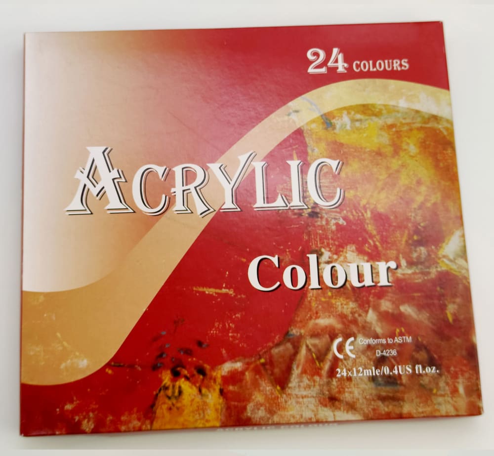
5 Responses to Option B
its very nice product to use
I trust B more. I would prefer to buy B because the box looks nicer with the color in the bottom-right.
Looks more like a product that has the colors I am looking for. The other one looks like a tea drink.
I trust this brand more because of the way that they spell "colour" which is a foreign spelling which tell me that it is a company that has been in business for many years and provides reliable products.
The design on this box looks a lot more professional, but the other version does look more visually appealing I think.
Explore who answered your poll
Analyze your results with demographic reports.
Demographics
Sorry, AI highlights are currently only available for polls created after February 28th.
We're working hard to bring AI to more polls, please check back soon.

