Poll results
Save to favorites
Add this poll to your saved list for easy reference.
which design do you like the most and why ?


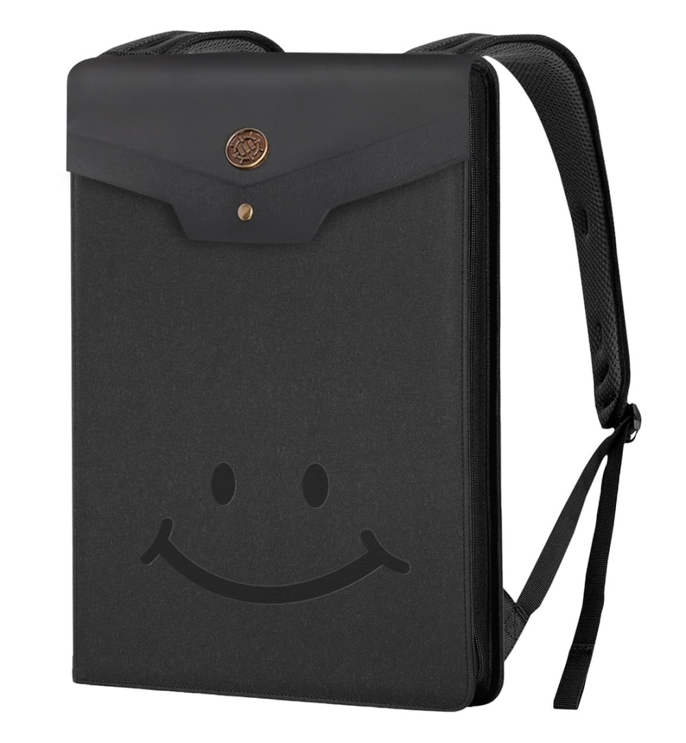
Option A won this Ranked poll with a final tally of 28 votes after 2 rounds of votes counting.
In a Ranked poll, respondents rank every option in order of preference. For example, when you test 6 options, each respondent orders their choices from first to sixth place.
PickFu requires a majority to win a Ranked poll. A majority winner differs from a plurality winner. A majority winner earns over 50% of the votes, whereas a plurality winner earns the most votes, regardless of winning percentage.
If an option does not earn a majority of votes, PickFu eliminates the option with the lowest number of votes. The votes from the eliminated option are reassigned based on each respondent’s next choice. This process continues in rounds until a majority winner emerges.
Scores reflect the percentage of total votes an option receives during the vote counting and indicate the relative preference of the respondents. If there is no majority winner, look to the scores to see how the options fared relative to one another.
| Option | Round 1 | Round 2 |
|---|---|---|
| A | 46% 23 votes | 56% 28 votes +5 |
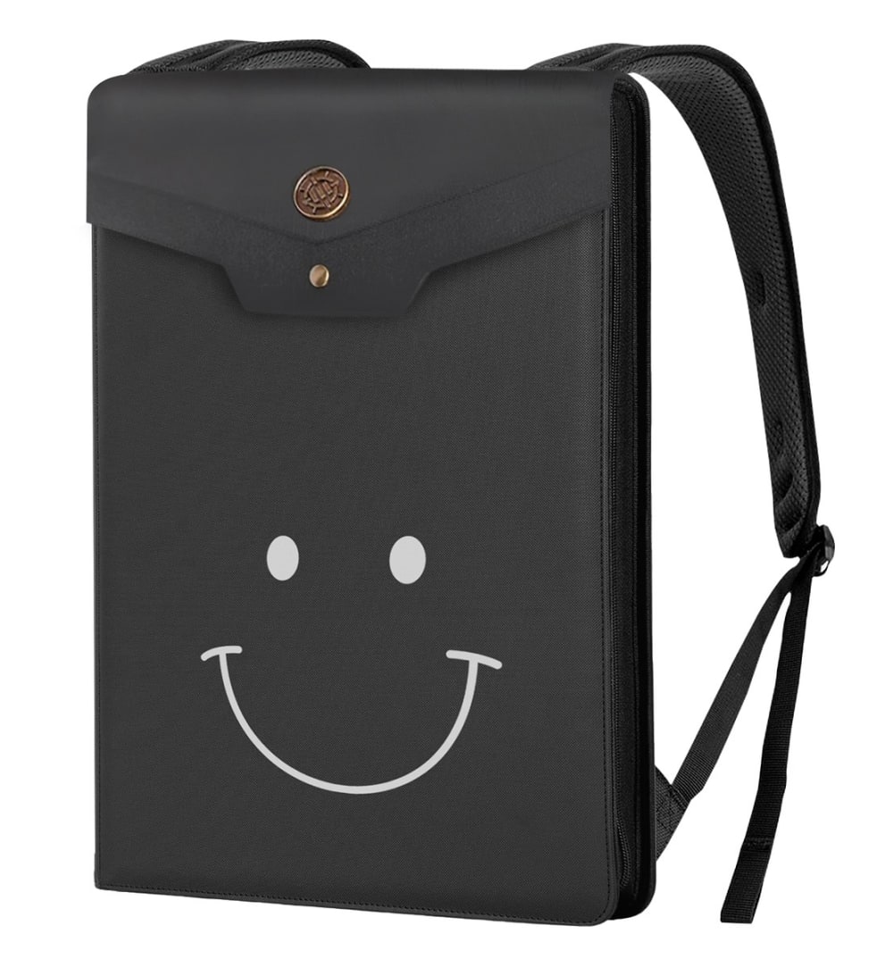
| C | 40% 20 votes | 44% 22 votes +2 |
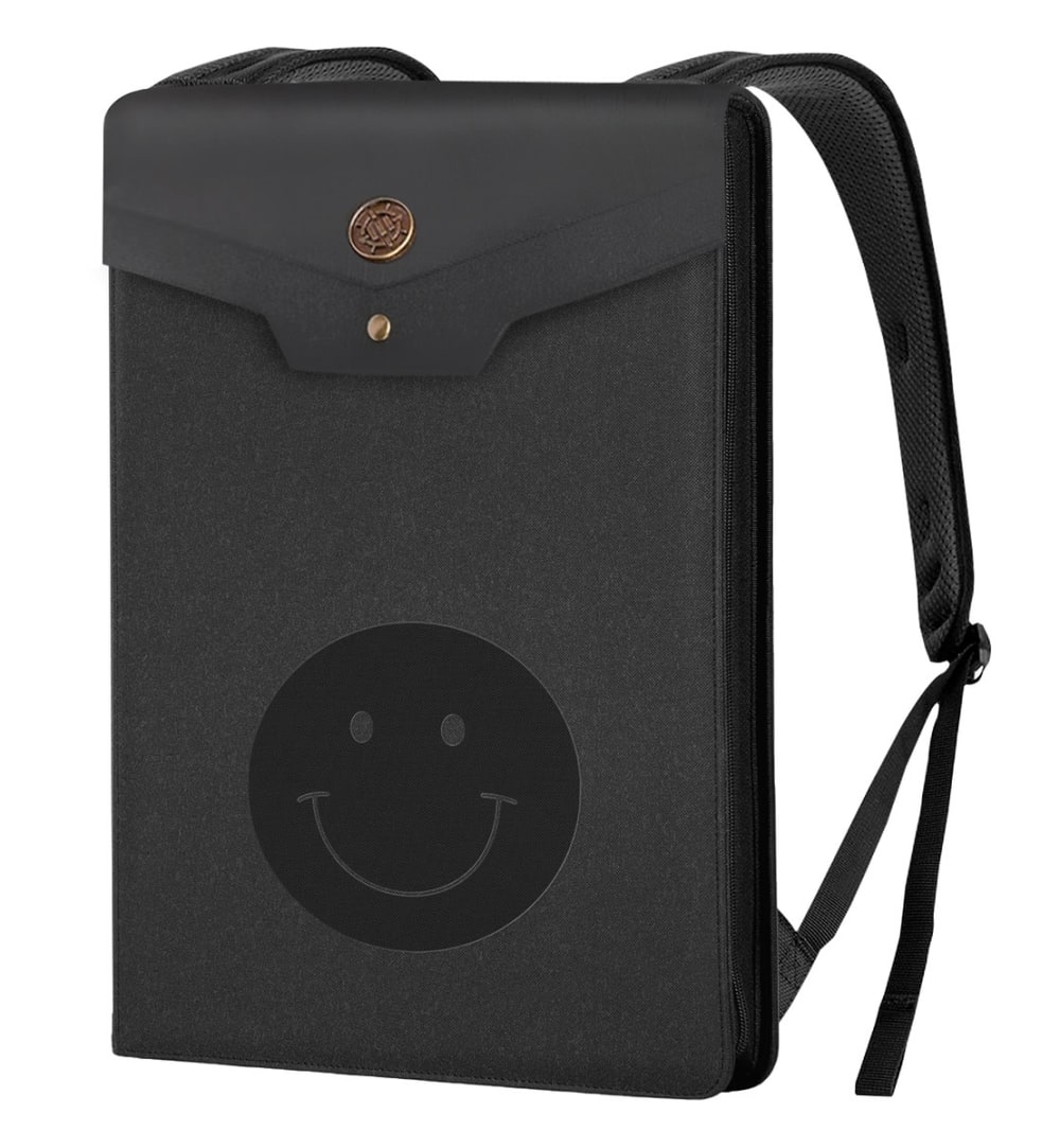
| B | 14% 7 votes | Eliminated 7 votes reassigned |
23 Responses to Option A
I like Option A because I like e simple design with the monochrome colors.
I like A, the smiley face is simple and subtle making it playful, but also reserved so it isn't consuming your full attention.
Option A has the best smile for this product style and makes me think a lot about it.
Option A is my choice because I prefer the design of the smiley face. I also think the darker black-on-black looks better than the white.
I like the blacked out graphic on options A and B more and they look good. Option C is good, but the white is a bit much.
The subtle happy face I chose is cute......The white one is terrifying.
I prefer the more subtle smile in A. It’s almost hidden and you have to look for it.
I prefer the more subtle version of the smiley face. I like how it blends in with the product making you have to look harder in order to see it.
A because you have more space too modify and make it better like putting pins and other stuff too make it unique
A has a more simple and efficient design so I prefer the look of that.
I feel a bag design should be more subtle. To me, A and B work best as the smiley face is sleek and doesn't distract you but is noticeable. To me, C is nice but a bit too stark of a contrast with the black/white. I would prefer black-on-black with the design in C.
I like Option A the most because I like the more understated smiley face that isn't as obvious. I picked Option B because I thought this was next best option for a smiley face that wasn't as obvious.
Really not a fan of any of the 3 choices, kind of scarcely looking to me, but of the choices I liked option A the best of the 3.
I prefer design to look more “hidden” and A meets that criteria. It fits the size of the bag well also.
I don't like how the one that is the white smiley face is too present. I kind of don't like that its so obvious. That's why I picked choice A. I can barely see the face.
Not a big fan of the design. I would only consider A because the design is minimal.
I don't really care for the smiley face and don't really need it to stick out so much on the bag. I would prefer the black color in either of my top 2 choices.
I prefer A, so it's not so obvious I've chosen to buy a product with a smiley face on it. C is next, just because it looks better than B, which looks like a smiley stamp.
The smiley face is juvenile and unprofessional. Th more discrete, the better.
A and C's symbol is cuter than B's. A is the 1st choice because the black symbol feels like the owner and the product must be lowkey, which is a good lifestyle.B is ok but the symbol is quite basic, nothing special.
I think the black or grey on black smiley faces look cool. It's not super obvious but i like the little detail.
I don't want a smiley face on my bag so I like A because it blends in the best. I don't like the giant circle of B.
I like that the smile on A looks like it is for the whole bag rather than being a separate feature like in B; at the same time, I prefer that it does not stand out sharply because of the monochromatic look of the darker black on a slightly lighter shade of fabric.
7 Responses to Option B
I love the black on black smiley face. I like the modern tech look of it. It doesn't draw a lot of attention, you would only see it up close.
I will choose choice B first because the design color of the product is more attractive to me and better visually pleasing as compared to choices A and C for me.
I'm a fan of the more subtle looking smiley faces. That's why I like the black one that is confined
I prefer the circular shape around the face. I like that the smiley face is blacked out. Blends in with the black colored bag.
I think B looks really fun, I want the smile to be more distinctive. I also really prefer the black on black vs. the white in C so I ranked C last.
I think the biggest question I have is what exactly is this pouch used for? I went with option B because I think the black on black classic smiley face looks tasteful, but maybe the context would make the others work better.
I prefer the Traditional smiley face , happy face . So that was my first choice . My second choice was based on the color of the smiley face and eyes , I like the black a little better .
20 Responses to Option C
I ranked my choices in order of which I liked the most liking the white smiley the most because it shows the most on the bag then the large smiley because it shows the most between the last two choices.
Although I like the full face more, it's kind of obscured with it being black on a black bag. With that, choice C is best.
I like option C because I can actually see the smiley face design
I put the image designs in C, A, and B order. I really like C. C is my favorite. I love the colors. So I would definitely buy C. I really like the design. It's my favorite out of the three.
The white smiley face in my top choice is fun and inviting, which is appealing for sure!
The happy face in C stands out and is fun to look at
C and A are okay but C really shows up the best.
I like the white smile on this product. I would probably try somethin more interesting, but the white on black looks good.
C. Image font color stands out on background. A. More simplified, takes up less space. B. Doesn't stand out on background.
I think C looks the best with the white face. The blacks in A and B kind of blend in together to the bag itself.
I like how the smiley face stands out on this one.
The smiley face on the bag in Option C makes the bag look more lively and fun
I like C because the white smile stands out and is easy to see so it looks better.
The contrasted lighter color of C stands out more against the dark background
B looks to close to the Walmart one I feel like that would be creepy. C looked the cutest and I don't see much things like this around my town.
I like option C because I like the happy face more and I like that it's in white color.
C First because the smiley face is the most easy to see and is the most detailed which makes it the most appealing A second because I like the simple design B last because the design is a bit hard to see which makes it the least appealing
Option C is the easiest to see. It really pops more. The other options the design really blends in and doesn't stand out.
I like the first one I picked because the design is more popping out
The white contrasts well with the black. On the others it doesn't look as well because you can't see it.
Explore who answered your poll
Analyze your results with demographic reports.

