Poll results
Save to favorites
Add this poll to your saved list for easy reference.
which design do you like the most and why?
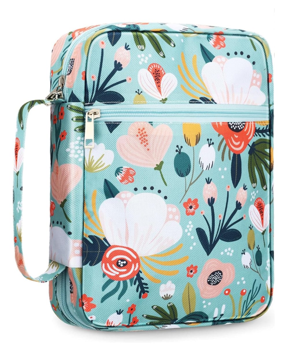
Option A won this Ranked poll with a final tally of 27 votes after 1 round of vote counting.
In a Ranked poll, respondents rank every option in order of preference. For example, when you test 6 options, each respondent orders their choices from first to sixth place.
PickFu requires a majority to win a Ranked poll. A majority winner differs from a plurality winner. A majority winner earns over 50% of the votes, whereas a plurality winner earns the most votes, regardless of winning percentage.
If an option does not earn a majority of votes, PickFu eliminates the option with the lowest number of votes. The votes from the eliminated option are reassigned based on each respondent’s next choice. This process continues in rounds until a majority winner emerges.
Scores reflect the percentage of total votes an option receives during the vote counting and indicate the relative preference of the respondents. If there is no majority winner, look to the scores to see how the options fared relative to one another.
| Option | Round 1 |
|---|---|
| A | 54% 27 votes |
| B | 32% 16 votes |
| C | 14% 7 votes |
27 Responses to Option A
I like option A the best because I like how there are no words on the backpack. I love the blue color with the flowers as well!
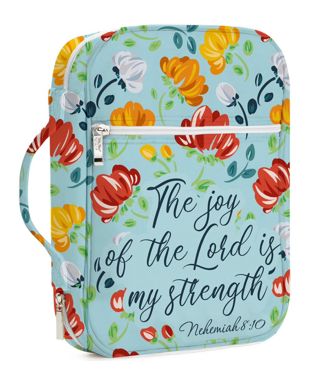
A is my top pick because it doesn't scream "Bible thumper." B is my second choice - although it's obviously a Christian Bible carrier, it quotes it directly. C is my least favorite because it just sounds preachy and the design/colors are horrendously fugly.
Bag A is better because it has a nice color design and flower pattern with beautiful colors and that makes it to appeal to me most.
A - i love the bold colors. B - less bold, C - not bold. a bit washed out.
I like the overall design of the flowers, and the blue background of option A the best. I like the blue background of option B. I don't really like much of anything about option C
I like A because I like the modern design of the flowers. I also like how it doesn't have anything written on it. I think it's more subtle.
I prefer option A. I like the colors and floral pattern.
All three options are beautiful. All three are light and may require a lot of maintenance. Even though Options B and C come with writing they are are similar.Here the ranking is based on the default alphabetical order.
I like my top choice because I feel it is the most aesthetically pleasing. I like that there is no writing on it either I feel as if that is not necessary.
I like this one it is bright and bold and stands out better
I like the lack of text on A best
I am going with the design of the book case of choice A as I wouldn't think it's for the Bible and can put any book in this case.
I like the color and pattern of option A the best. I like the blue on option B as well, but I'm not a fan of the yellow.
Option a is my first choice, i like the color and design, option c is a very soft color palette, option b is nice also
I like that this one is simple and doesn't have any words on it
I adore A! The colors and the design is really good. I like print that doesn't have words on them. However, I really like C as well.
I like A best because I like the flower colors.
I like that this one has no writing on it, so you could hold other books in it if you wanted too.
I like the look of the flowers more and that there is no text.
I like the pattern and color of Option A the best. The darker background color makes the floral image pop and is quite attractive.
I chose option "A" as it allows for a person to choose which Bible verse they want on the front of their Bible case.
I don't believe in god so much, which is why I chose A without any saying about god.
I chose option A 1st because I liked the floral pattern and it didn't have a quote on it. I chose option C 2nd because I liked the light floral design and the simplicity of the quote on it. I chose option B 3rd because I felt that the color was darker and there was too much print on it.
I like A the best because it doesn't have any sayings on the front. C would be my top preference because of the muted colors but I prefer to have no words/sayings on things I buy
I put the product designs in A, C, and B order. I really like A. A is my favorite. I love the colors and design.
the teal is pretty and I prefer no text on the cover
I think Option A has a very pleasant color combination with the pink flowers and I like that it doesn’t have words on it.
16 Responses to Option B
B first because I like the floral design on the blue background. I also like the verse shown.C second because I like the floral drawings, but I would prefer a darker background. I also like the phrase shown.A third because I like the floral design on the blue background, but there is no verse or phrase.
I liked that B featured more joyful and bright colors.
I love B the most! I love the blue, the beautiful design and the quote about the Lord. I would buy this one for myself or for others.
This one has brighter colors. It is very beautiful.
I like Option B as my first choice. It's colorful and has good graphics with a attractive floral pattern that's eye catching. Option A is also quite nice. It's a little bolder in pattern and has a striking look. Option C is softer looking and has a more muted, pastel color palette. It is very pleasant and fresh looking as well.
B and A are colorful and cheerful. B's messaging is heart warming and inspiring. C's creme color is bland.
I prefer option B because of the colors and design pattern and text.
I like that it containsa bible verse and beautiful flowers. Option C is also pretty. I don't like that A has nothing to do with the bible assuming this is a bible case.
I like the design best. I think it will stay clean longer than Option C, and I like the verse.
I like the pattern of B . It's the first one that grabbed my attention more than the others do
It is decorative and it can hold a book that isn't necessarily religious or spiritual. It shares a value.
Option B floral design attracts me most and also its quotation is very nice.
I think this is more uplifting in the colors and the words
Option B is my first choice because I like the design of the product and also the color is very beautiful. Moreover, I like the written text on the product and it looks unique.
I choose option B because I think this design is the most beautiful
Option B product design is not only very colorful but I loved the quote written on it and it looks more attractive than the other two options.
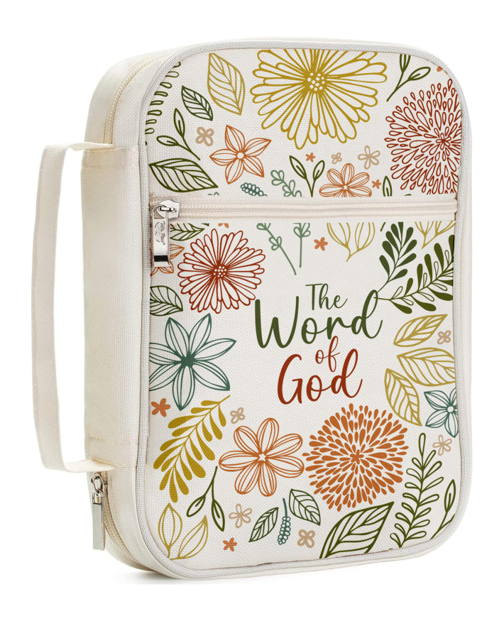
7 Responses to Option C
I like the cases with the inspirational words on the front the best, with a preference for the lighter background color and floral design in Option C.
C first because the image is the most detailed and appealingA second because I like the simple designB last because the design is too vague which makes it the least appealing
I like the subtle more elegant colors. It feels more feminine.
I chose Option C as my top choice because I like the floral design as well as the wording. I chose Option A as my second choice because I do like the design a little bit better than that of Option B. I like the simplicity of the design of this case. I chose Option B as my last choice because I'm not a huge fan of the flower colors.
Product C is the most attractive cover for its natural colors and neat font. Product B is attractive in appearance bringing bright natural colors with words of encouragement to compliment. The least attractive cover in my opinion is product A for its simplicity and dull color choice.
I like C the best because it says what is supposed to be in it, "The Word of God" so it is clearly a Bible protector. I like floral design better than the other two, seems classier. I liked the design of A slightly over C but not sure...they are pretty similar and now I think I like B better....can't decide. I think it is a tie although I think there should be a different quote from the Bible on B.
Prefer the subdued look of option c
Explore who answered your poll
Analyze your results with demographic reports.

