Poll results
Save to favorites
Add this poll to your saved list for easy reference.
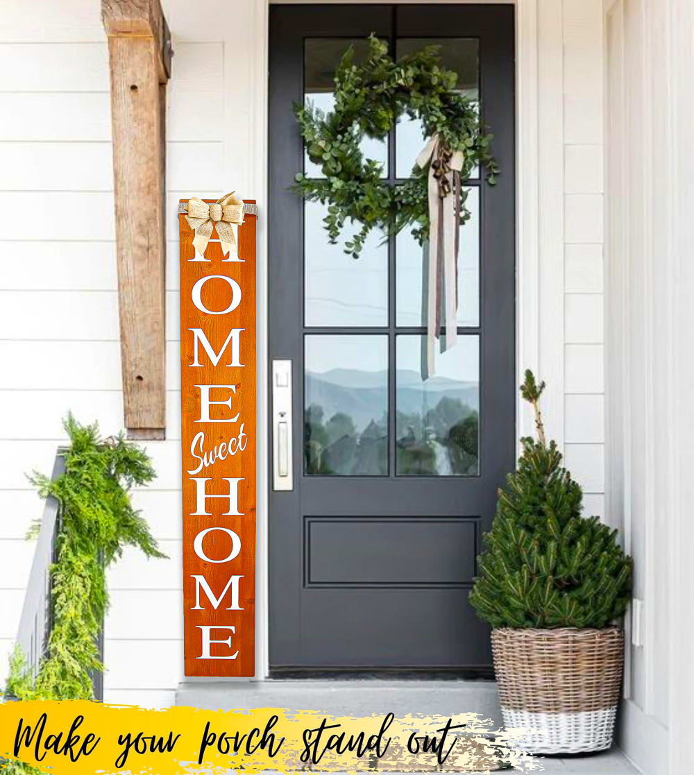
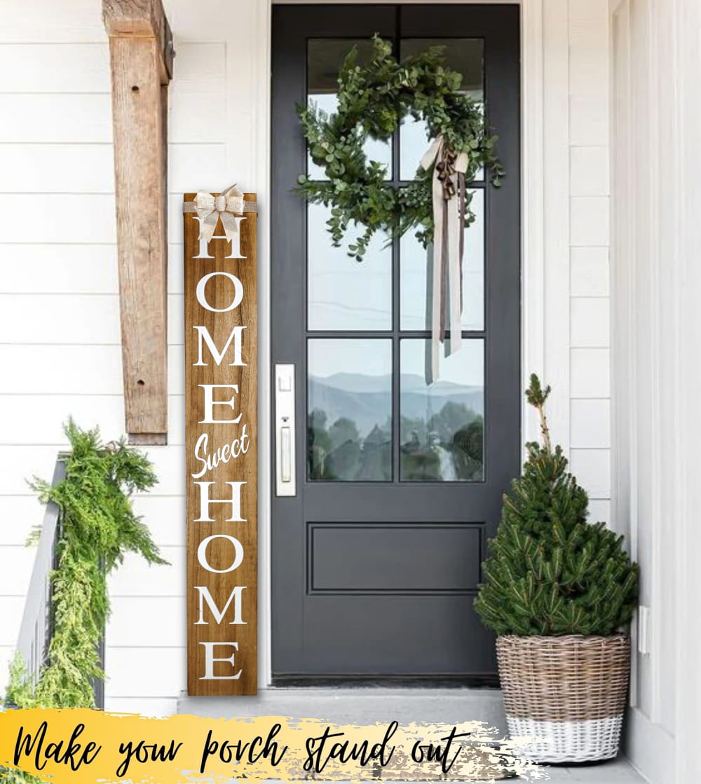
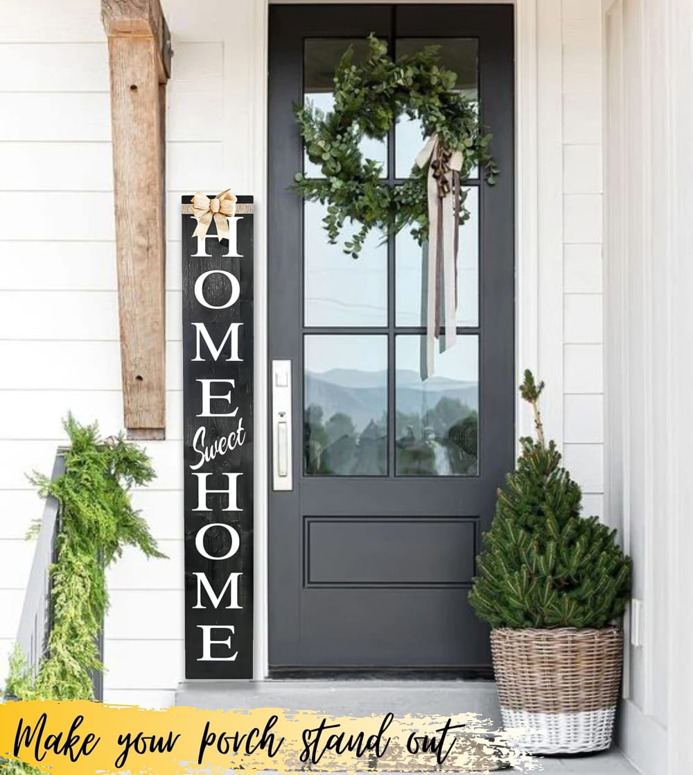
Which color would you choose to decorate your porch?
Option C won this Ranked poll with a final tally of 26 votes after 2 rounds of votes counting.
In a Ranked poll, respondents rank every option in order of preference. For example, when you test 6 options, each respondent orders their choices from first to sixth place.
PickFu requires a majority to win a Ranked poll. A majority winner differs from a plurality winner. A majority winner earns over 50% of the votes, whereas a plurality winner earns the most votes, regardless of winning percentage.
If an option does not earn a majority of votes, PickFu eliminates the option with the lowest number of votes. The votes from the eliminated option are reassigned based on each respondent’s next choice. This process continues in rounds until a majority winner emerges.
Scores reflect the percentage of total votes an option receives during the vote counting and indicate the relative preference of the respondents. If there is no majority winner, look to the scores to see how the options fared relative to one another.
| Option | Round 1 | Round 2 |
|---|---|---|
| C | 44% 22 votes | 52% 26 votes +4 |
| B | 42% 21 votes | 48% 24 votes +3 |
| A | 14% 7 votes | Eliminated 7 votes reassigned |
7 Responses to Option A
The bright color in A is attractive. Black looks cool and sleek in C.
I like option A's orange gradient the most. Option B's wood brown also gives off a "home-y" feel. I wouldn't choose option C's black.
All the colors are nice, but with the colors of the house and door A pops the most. C looks great too but B blends in just a little too much.
I prefer the orange-like color of this wood because it stands out while still blending in with the other decor. The black is a bit too stark and the wooden finish is too much like camouflage in this space.
I would choose the orange "Home Sweet Home" wooden decoration, shown in image A, for my front porch because the house looks pretty plain, with white siding and the charcoal grey door, so the orange really adds some flair, excitement, and pop to the porch. The natural, polished wood decoration shown in option B is my second favorite because it also stands out from the rest of the house and looks elegant, but it's not as jazzy as the orange. Decoration C is my least favorite because the black blends in too much with the house and doesn't look exciting or fun at all.
I like the orange to give it a pop of color. After that, I like black, but I don't like brown with the grey door.
I would choose A first because the 'home' sign is very vivid and vibrant and is easily seen which is the effect I want to portray and B would be next. Although the color is a bit muted it still portray calm and serenity and C is last because it is too dull and not inviting.
21 Responses to Option B
I prefer brown since it looks the most homey and matches my house.
I would choose option "B". The color scheme looks amazing in this product.
I like that natural wooden look of B the most. The words are easy to read without the sign looking out of place. C is also alright, but the deep black stands out a bit too much from the rest. A is last because the color is too vibrant compared to other things that would be on a porch and make it seem a bit uneven.
The odd coloring in Option A stands out way too much and doesn't fit against the home. I prefer the brown and black coloring.
I like the simple brown colored sign that is shown in option B the best because it gives me a rural type feeling.
I like the brown in the Home Sweet Home the best. It's unobtrusive but a nice brown and it's visible enough. The black is dark but nice too. The orange/red in A is trickier. It depends on what the color really looks like under real conditions and also it depends on the color of the front door whether or not it will match. B or C are both fine.
I think the more natural wood tone works the best. It brings the outside feel to the porch. I think the black and white is very stark. I feel that the orange is seasonal, best for fall.
B matches the color of my house the best
I like the natural brown of B and C is a decent black color. I would pick B over them all.
I chose B because it looked durable and I liked the sort of weathered and worn color scheme it would match. Next, I chose C second because I felt A was too bright and gaudy.
Option B would go best with my porch's color scheme while Option A beats out Option C because Option A looks more warm and inviting due to the color of the plank.
I don't really like the orange. I really like the brown and think it would go along with a lot of other decor. After that, I also like the navy blue.
My favorite is the light brown color, personally. The only one I wouldn't get is the orange colored one, as I don't think it would fit in aesthetically.
I prefer the more natural looking wood for my home. I do not like the stain used in option a. It does not look natural.
Neon orange is so tacky to me and doesn't fit the color scheme of the porch. B felt very woodsy and rustic and C felt too dark and depressing.
option B: for year long, if I dont feel like changing out my welcome sign with themes for seasons, this would be my go to. option A: for the fall season. inviting and would get me ready for the falloption C: I dont like the black welcome sign, reminds me of halloween.
If this was my porch, I would like B first because it is monochromatic with the rest of the accessories - beam & rattan pot. Didn't like A, the orange one. Was okay with the black one (C).
B is my favorite because it looks like real wood and a two tone wood that looks luxurious and rich
I like the neutral colors first. My house is red so I think the orange clashes.
The color that I would choose to decorate my porch first is option B because the brown color is close to nature and very calmingSecond is option C because the black background really show up the wordingThird is option A because it is like the bright sunshine and inviting but I think overtime the color will fade from the sun
Wood tone is super warm and inviting. Black is clean and simple and very elegant. The red is too bold and looks out of place.
22 Responses to Option C
The black would match more decor, as it bothers me when wood tones don't match. The orange is very unnatural and although it would stand out, there are very few instances where it would be a good decorative choice- maybe only in fall or autumn when displayed with pumpkins. I think bright red would be a better option, but without this, I think black would match the most.
i like the color choice in option C, it is a neutral color that does not look so noticeable but you can easily read the writing on it.
The darker option matches the front door so in my opinion that is the decor that works the best. I like how matching everything looks and the way that everything goes together and looks complete
C is easiest to read and matches the door. B is hardest to read.
I prefer Option C because it is the least noticeable and I do not want to draw attention to where I live, it is asking for trouble.
I selected C because I felt the black sign went best with the door. I selected A last because I am not a fan of orange. That left B in the middle. I was very luke warm towards that color.
I would choose the black or the brown because they are classy looking. The orange color is not classy looking.
I like C because I think the black stands out with the white font. I like B too but I don't really care for A because I don't like the orange.
Option C all the way. I really like the monochrome look. Less is more.
I prefer the black and white, they are very neutral colors and match with everything. the wood colored option of choice b is a close second for similar reasons.
I think that choice C is the best color.
I went with option C because I thought the colors went together better than the other options. Also, I wouldn't want to want to use any bright color for the porch.
I think C better makes the wording pop and is more attention grabbing. Moreover, I think the color makes the overall product appear more modern.
I selected the colors that I would choose to decorate my porch based on my personal preference.
The black first and then the red as they look the most modern and up to date
C stands out, looks really modern, and classy, so that's why I chose it first. I then chose B over A, because I don't really like orange that much.
The dark shade is luxurious and elegant.
C and B are traditional, timeless, and classic.
C seems the classiest based on the color and the other two seem to clash with the door color
I'm a fan of colors that don't stand out, so I like the black look and the gray look as well.
Black goes with my home and would go with any decor you had on your porch and easy season.
The black sign matches the door best
Explore who answered your poll
Analyze your results with demographic reports.
Demographics
Sorry, AI highlights are currently only available for polls created after February 28th.
We're working hard to bring AI to more polls, please check back soon.

