Poll results
Save to favorites
Add this poll to your saved list for easy reference.
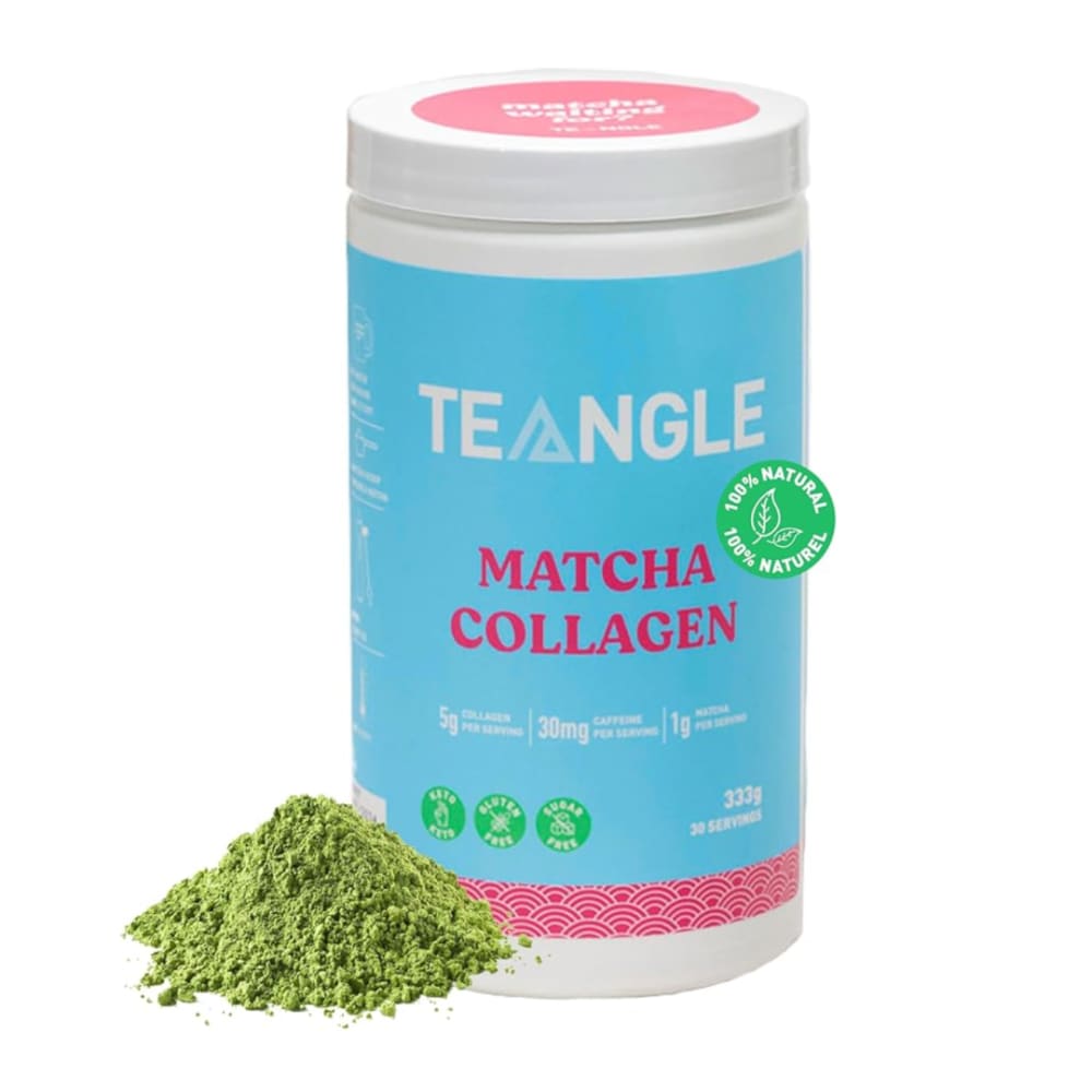
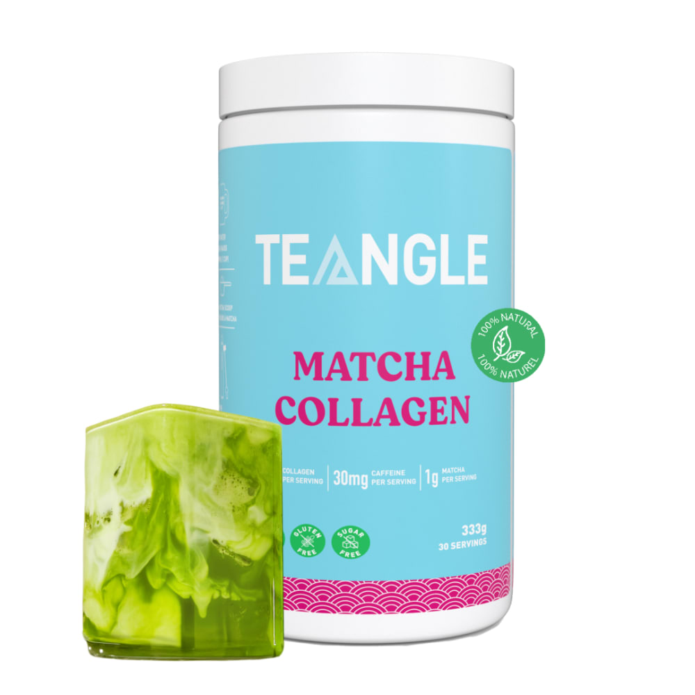
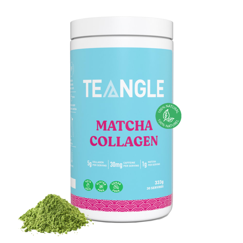
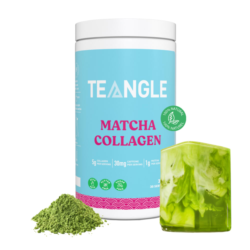
When shopping on Amazon, which one of these images would you be more likely to click on, and why?


Option A won this Ranked poll with a final tally of 53 votes after 1 round of vote counting.
In a Ranked poll, respondents rank every option in order of preference. For example, when you test 6 options, each respondent orders their choices from first to sixth place.
PickFu requires a majority to win a Ranked poll. A majority winner differs from a plurality winner. A majority winner earns over 50% of the votes, whereas a plurality winner earns the most votes, regardless of winning percentage.
If an option does not earn a majority of votes, PickFu eliminates the option with the lowest number of votes. The votes from the eliminated option are reassigned based on each respondent’s next choice. This process continues in rounds until a majority winner emerges.
Scores reflect the percentage of total votes an option receives during the vote counting and indicate the relative preference of the respondents. If there is no majority winner, look to the scores to see how the options fared relative to one another.
| Option | Round 1 |
|---|---|
| A | 53% 53 votes |
| C | 21% 21 votes |
| D | 18% 18 votes |
| B | 8% 8 votes |
Age range
Gender identity
Hobbies and interests
Homeownership
Online shopping marketplaces
Options
Pet owner
Preferred nutritional supplement benefits
53 Responses to Option A
A and C are good, honestly the cup or whatever it is on the other 2, it is hard to make out what that is it looks like a candle.
I like seeing the product next to the container.
I like choice A and C because both pictures show the matcha jar in the best light and is only focused on the product itself.
I prefer seeing the drink but I chose A because it shows the cap which has pink color and brings more color and interest to the image.
I like the angle of the bottle and that I can see the top of the lid in Option A. The cube of collagen looks like jello and isn't a pleasant look to me. I'd prefer to see the finely ground powder or flakes, since that is what the product actually looks like.
A was my first choice because I like the look best. C was second because I like it next best. D was third because I don't like the look of the square thing. B was fourth because I don't like the look of the square thing.
I like the simple image and the perspective with the pink top would get my attention. I think the glass looks like a candle.
I like to see the top of the bottle and an image of the powder.
I like the color variation and that you can see the top. I also like the graphics and the words to support them.. I am not sure what the green block in the other options is suppose to be.
You get the best idea of what the texture of the product looks like.
I really like this labeling and the color top used.
I like A best because the pink on the lid is eye-catching and I like just the powder graphic in front.
I don't like the weird swirly glass /square/whatever it is. I don't know what it is and it distracts me from the product
I feel simple is better, as long as it demonstrates what the product is. For that reason, I'd be more inclined to click on A first because it's more visible from an aerial view, and C would be my next choice because it's still simple and an attractive image of the product. B would be my third choice because the large clump of matcha is distracting from the product, and also makes it harder to view the product. Option D is kind of pointless to show the matcha in two different forms.
A is so cute with the color palette and it has the pink circle at the top. C and D are similar, but I would prefer to not have the green shard or crystal in front since it is distracting.
The pink top is interesting. Seeing the powder is more informative than seeing the drink.
I like the angle of A better. I like the image of the powder, but don’t like the cube in B and D. It would be better with maybe a glass of the matcha being stirred in.
I just picked them at random as I have no interest in matcha anything. I liked the color on A and C just caught my eye and D had the matcha next to the container while B was last
What drew me to the one that I put first was the pink top. The very front of each looks very similar. I do like being able to see what the matcha looks like but it was not a main factor in my placement.
I like the the way the matcha powder is illustrated. This way I know I can mix it with a liquid. I also like the cold and label of the container.
My choice for option A is clear it's visually appealing and a clear indication of the product being in powder form
When shopping for Amazon, I would rank Teangle collagen in order of A, C, D, B because of the main ingredients being displayed in that order.
I picked the first one based on the pink lid standing out more, then picked each consecutive container based on what stood out to me more.
A has more color so its more appealing to the eye. The square graphic in D and B look like it don't belong. It look blurry. I went with C because of this.
I chose A first because I like the pink on the lid and thee canister. I chose D 2nd because it showed the matcha in 2 forms. I chose B 3rd because the matcha is in a big block and looked better than just the powdered version. I chose C last because it only showed he powdered matcha
I chose option a first as I like the match displayed in powder form I did not like b or d as the matcha looks like a solid block
Matcha is supposed to be in powder form so I chose all the images that had matcha powder clearly shown. I also ranked all my choices by the packaging I thought was best. Since matcha is supposed to be in powder form, I chose the image that showed matcha leaves last
I feel Option A is at a good angle and I like the inclusion of being able to see the matcha tea. I feel the packaging looks higher quality in this picture compared to the others. Option C was the second best in my opinion. It looks fine but the quality doesn't look as good as Option A from the photo. I was a bit confused as to what the marbled square in Options D and B was. So I would be less likely to click on them given I would be more confused by them and might think it comes in some other form or is some other type of product and wasn't what I was looking for. So out of all of them, Option A would be the one I'd most likely click on.
The reason I would click on this one is only because how fine the powder is much easier to blend in drinks
It was just instinct, but now that I go back and look at I’d, I’m sure the fact that #1 has a pink cap and the others don’t.
I love this product but preferred the packaging in choice a. It is more visually appealing
I liked seeing the pink lid. I also pick one without the closeup of the leaves.
This option is the one that caught my attention because the packaging is very attractive and eye-catching, the powder presentation of the product is my favorite and because it is natural it makes it a healthier product.
I like A because it has a good size pile next to the bottle to see. I don't like the ones with the cube, it confuses me when I see it.
This is the order that they caught my eye. The 1st one because of the extra pink. The last, because of the fact it just looks plain
I chose A because it appears to be easiest to prepare, D because it appears next simple to prepare, C because it is third easiest, and B because it is most complex.
I prefer options A and C most, as it shows the bottle and the powder that is inside the bottle. It's easy to understand what this product is. I prefer option A with the view of the lid more than option C, it gives the design of the bottle a more holistic and complete view of the bottle design. Option D is my third choice because it also shows the powder inside the bottle but I don't like the inclusion of what I assume is a glass of the matcha drink. It doesn't look like a glass, so it's a little unclear as to what that is. Option B is confusing because it only includes the glass and not the powder in the image.
The first one just really stands out to me with the darker color it makes the words and logo pop out more
The preview of the top of product A is an added advantage.
The first one the color stands out to me more.And I also like that.It just shows powder the last one.It shows powder and the college in that seems kind of confusing.
all there is to see are photos showing shredded leaves vs. full leave, so not knowing how this product would actually be use (is it to be brewed as a tea?), I assume that's the case and chose the packages showing "tea" leaves
the one i chose first is because i can see more of it. the others all look the same.
First showed both what looks like powder and earth friendly safe both for the planet and us
My first choice shows the product in a little more detail. The following choices get less and less informative and the packaging gets worse.
I like the visual of A the most. maybe it's the pink on the top of it. Not sure what the green block stuff is on B and D.
I ranked them by how appealing they look. The powder in my first choice looks the most substancial and it goes down from there.
i picked the first because it shows me exactly what the product inside looks like and i like the pink on the lid.
The one I pick first appears to be clear and concise . Meaning that there is no messiness to the label and the product description is clear
the pretty pink at the top but they alllook alike to me
I don't actually like the look of this product in the glass but do like the powder so A and then C are better than D or B for me.
A picture shows the top label as well as the powder.
I feel like all of them is really the same but I said she like the person I said because I like the pink color and I chose the other ones last because I just don't like it.
I picked A as my most favorite because it looks very simple. The packaging is easy to understand.
8 Responses to Option B
It looks more natural and like it comes from an edible variety of plant.
I don't like the way the loose tea looks. It looks like grass clippings.
B showed leaves so that means it has to be organic which is i ranked it 1st and the rest show powder they might made with chemicals
I chose b because I liked the way it looked in the block form. Then I chose option d because it looks nice with the block and powder. Then I chose a because of how the bottle looks the pink color. Then out of process of elimination I chose c.
I like the way the glass looks in B and D. It looks like a tasty product.
I don't like the ground up mess by the can, it look disgusting, not appealing to take.
I chose B because I like that it shows what the powder looks like mixed into a drink.
I liked this one because it shows the collagen better than the others, and the next shows the powered used in this product
21 Responses to Option C
I'm unsure if the green box comes with the product. If it doesn't, it seems wrong to have it in the image. C is easier to read since it's head on. B looks bare without also the powder on the side.
I like the straight on view just with some macha; I believe D and B are supposed to be glasses of the powder in a drink, but it just looks like a block of green to me.
I prefer them at the front angle so A is automatically last.I like it better without the cube of whatever that is so I chose C first as it's just the powder. That's put D above B because B does not contain anything but the cube.
I think the powders make it look better. Its hard to see what the image is for D and B upon first glance
The green cubes shown in D and B are unappetizing. I've never seen matcha portrayed like that.
I like to see the powder, but the angle on option A is awkward and puts me off. I don't care to see the glass, it looks like a cube.
It's the least cluttered and doesn't show a pink circle on the lid.
I like the simplicity and clean lines of C. The cube shape in D and B throws me off and that's why those two are last.
I like C and A equally. I like the way the color draws my attention when the lid is shown, but straight ahead looks better and higher quality.
It shows the actual powder. Looks appealing compared to the other ones
I like the first one because it appears well made. It looks like it will be effective for my health.
I like the pictures that show the matcha powder. I don’t understand what the other image is, it reminds me of a soap bar. The first one is the best because it’s a nice clear picture.
They all look the same the matcha tea with Colleen in a power I also like the tea in the ice and glass it look refreshing
I do not like either of the ones with what looks like frozen blocks of tea. C looks brighter.
C is my first choice as it is clear and shows the ingredients.
Option C was the best because the container was at an angle that made the information easy to read and it also only had the powder in front so it was clearer what the product was for. The options with the squares in front were confusing. I'm assuming they're cups with drinks in them, but it's hard to tell and is distracting, making you not focus on the image.
The powered look stands out more for me. That's the only reason. I also like that it's 100 percent natural
I like seeing the texture of the actual product.
I put them in that specific order because they are ranked based on how useful they are to me in my daily life. The ones with matcha collagen seems to help me a lot more than the other ones.
i ranked the items above as is because they look the best and seem that they would provide the most benefits to me. I prefer the powder to the ice cube image.
C and A give a little better idea of what the product is, moreso than B and D.
18 Responses to Option D
This product looks more authentic and it looks like it has high quality.
I picked option D because it shows the product outside the jar by itself, and mixed into a drink to consume.
D shows me the most about what I can do with this product
I chose this option because the packaging looks exciting and modern
The straight view with the main ingredient is more informative to me
I would more likely click on photo D first then I would choose B,A,C because i like the cover and the ingredients in them.
#1 better packaging more eye catching very clear on ingredients 2 packaging eye catching shows ingredients and what it's for 3 eye catching and shows all natural definitely a plus #4 same packaging bright colors eye catching
It looks like D has more to it because there are more items pictured on it. Then the next has the large item, 3rd has a bigger pile of green powder and the last looks very meager.
The photo with powder and greens was most thorough. The others were less important so simply chose them randomly without a reason.
I has more in the picture and looks interesting this is why I chose this one for the first choice. The second i chose since it was similar the first one. The 3rd and 4th I chose because they had the least and I didn't see a difference between either of them.
I picked D because the images drew my attention to the product. I feel that when yo have a well designed product that tells you the benefits of the product that is the one I am going to buy
Container was clear to see and read and it showed what the contents on the inside looked like.
The way the photo is presented with the powdered matcha loose & the possible matcha tea bag looking picture makes me curious to find out more about it. I also prefer the straight on picture as opposed to the one that is slightly angled.
The bottle that shows both the powder and what appears to be a jello block is interesting. I would check out the sourcing labels and see if this was also vegan, sustainably sourced, and if my doctor would recommend using it.
Package shows what the powder form is as well as the hardened form.
I would prefer if it were dissolvable tablets. I chose d it looks easier to mix with a liquid.
I chose D first because the graphics with the packaging is very eye catching, and inviting.
the way its look. the art, designs and font are great. the product is great for health.
Explore who answered your poll
Analyze your results with demographic reports.

