Poll results
Save to favorites
Add this poll to your saved list for easy reference.
On what image will you clique on?

Age range
Amazon Prime member
Education level
Gender identity
Nutritional supplement use
Options
Personal income range
Racial or ethnic identity
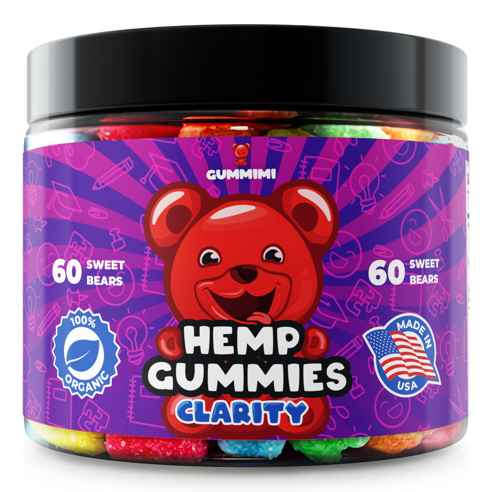
39 Responses to Option A
option A is more attractive
The purple label looks much better than the blue label
Purple seems more gender inclusive.
based on the packaging color tat stands out the most
You know, they're both good. It's hard to choose, but I think the red looks great on the purple background. It looks good on the blue but the purple has the pink highlights so it really pops.
Colors "pop" more. The graphic also more easily drew my attention.
best attractive image choose this option
I like choice A only because purple is a better color over blue in my opinion.
I like the label more for this image and find it to be more aesthetically pleasing.
i just generally think this color garners a bit more attention, although the bear is a bit odd and overly happy.
I prefer Option A because purple is my favorite color so that is what I would gravitate towards.
I love the background in purple, it caught my eye right away. It stands out and I would pick this item up off a shelf for sure.
Love the coloring of A.
A has a kind of a psychedelic look to it which I feel kind of fits the product
i prefer purple to blue
The purple and blue on Choice A caught my attention first. The bear also looks bigger on this option and makes me focus more on the product.
Creepy bear, but I like the purple better.
The darker color background makes it easier to read the lettering on the other symbols. That's the entire reason I chose A over B.
I think the deep purple is nicer to look at than the bright blue, especially when mixed with the red gummy bear.
The artwork stands out more than the other one
I like the darker color background and the almost tie die pattern looks cooler and makes more sense for the product than the other version.
I prefer purple over blue
I think B might stand out more, but I chose A because I like the purple better against the red. The blue seems a bit too bright in contrast.
Definitely A because purple is my favorite color. I also like the amount closer to the top because you can see it better and the text in white looks better and darker on the purple.
A gives off more of that high feel with it's packaging.
I think the purple is just way more fun
I would click on option A because it has the best color design.
The purple provides a more pleasant contrast with the red. Also, the purple striped background is simply more eye-catching.
I like the purple color better than the blue color on this label, it looks a lot more playful than the other one
This looks more fun and in line with the product.
i would try both, just because of what they are and how cute they look. both packaging is so nice so it was kind of hard to decide, but still really cute
I prefer the purple color.
I like A best. It looks the most dynamic. The intense purple just looks really good against the bright red of the bear. I would be more likely to pick this up on a shelf in the store.
The underlying graphics stand out more. Emphasizes "clarity". The bright colors of the other bottle suggest being stoned.
The numbers were easier to spot (higher up) on the bottle, which is more important to me than the certifications. The white also popped more on the darker / deeper background.
I like the purple color better than the blue.
I chose option A because I prefer the purple label, and I think it's less common than a blue label
I would click on option A because the label looks more appealing. I really like the purple, I think it's the right shade. It makes this really fun and I am intrigued.
I like the color of the packaging better.
61 Responses to Option B
I like this design and color of this image the most. It is bright and stands out more.
The blue color was crystal clear and better embodied the concept of clarity to me.
B is more pleasing to the eye, A is a bit too much, too "psychedelic"
I think the blue in Option B is more mainstream, so I like it more.
The red bear stands out a lot better on the blue background.
I would click on option B because I think the blue background batches more with the red gummy bear. Option A is alright but isn't as attractive to me.
The blue color stands out to me more. I would want to learn more about B.
The bright light blue color is kind of cool looking, stands out more than purple. Purple is pretty common, I Like uncommon.
I really like the blue background of option B. I feel like the red bear stands out a lot more and the whole thing has a much more professional appearance while still remaining fun. In option A, the red bear just doesn’t contrast against the background enough.
The bear image pops up much better!
The blue background makes the bear stand out more and makes the label more vibrant
I would click on B because I think the color scheme is better. I like the blue background a lot more than the purple. I also think it just looks more appealing.
My eyes were immediately attracted by the blue packaging in B.
The background images on the container are more apparent in this option. That makes me want to click to see what benefits the gummies have and how it repairs to the images.
I prefer the color blue to purple.
The color distribution works. It clashes on the other one.
I chose B as the coloring is easier to see the writing on the jar, also the rear is more clear.
I chose 'B' because the label is less crowded than in 'A'. I also liked the blue background against the red bear.
I like the color blue better than I like the color purple, so I would click on B. Plus, I think the color of the bottle of B is more gender neutral, so it would get more clicks.
This image looks a bit less stoner-like. Which I think would give you a larger audience.
I like the blue one-- the color is more calming and makes me feel like I'm getting a product that will be healthy. The purple one is almost TOO bright and I feel like it contains caffeine or something because it's just really bright. It reminds me of the packaging for energy drinks with a bunch of things in them that speed you up.
I like the contrast between the lighter background and darker bear.
Option A seems visually loud and confusing which is, for me, the opposite of clarity. Option B is broad and open and calming and more likely to lead to clarity. I'm also confused why "60 sweet bears" appears twice on the packaging.
The color combination of B stands out to me more. It's brighter.
The blue stands out more as the background of the product label.
They're both solid, but the purple and red clash a bit. While the cool blue and red work well together.
Color contrast is much better. The other one is way too bright
I like the blue. It is more appealing.
The blue and red of B is prettier than the purple and red of A.
I liked the blue label best since it seems like a clear blue sky and the product boasts clarity
Option B because the lighter background made it more appealing
the item looks more bold and attractive
I choose B the blue really stands out inthis image plus blues my forite color so this is why I choose B over A
The contrast of the blue and red makes this product stand out more than the alternative.
The layout of the label is much easier to process. A is attractive but the way the label is presented is not common and my eyes wandered around a bit.
The colors on this one complement each other better on the other one at almost clashes and it's a little hard to look at the bear.
I would click on Option B. The image is brighter (better lighting) and catches my attention better.
I feel like the background color allowed me to read about the product easier.
I like the baby blue coloring best. It's bright and just pops. It immediately captured and held my attention. I also really like that the amount of gummies in the package is listed near the bottom. It's more common and where I'd expect to find such info.
I prefer the blue color over the purple but they are both attractive options.
My eyes were more drawn to this color patter first. I don't know if it is because purple seems to be used in a lot of packages but that blue color really looks good. I also like the placement of the amount better in option B as well.
I think B represents clarity better…the swirly background of A kinda makes me think lsd trip or getting high which is not clarity at all ;)
Option B's light blue label is more inviting and contrasts better with the red gummy bear character.
I would click on the image in Option B because the blue background makes the bear stand out, and also makes the wording on the label much more readable. The red bear blends in too much with the purple background in Option A. I can see the image in Option B much better, and it is much more appealing.
the lighter blue color catches my eye a lot more, especially with the contrast of the red
I like that the colors are more sensible and muted than option A. It seems more like a serious product. Choice A makes me think of a gag gift
The red bear contrasts well with the light blue background. The purple and red don't really look good together.
B's color contrast is more eye catching so would choose it first.
The blue is much more calming, they are both wild and fun but I like that.
The background helps the bear be more visible and clearly seen
I like the color blue over purple. I think this color "pops" more and gets my attention better than option A. I like like the icons of the 100% organic and American flag is above the 60 sweet bears. The background color works better because you can see the icons in white better than the purple one. I would want to click on the blue over purple option.
I will clique on the Option B because it's very colorful, appealing and attractive.
I think that design is cleaner.
Because they tie die with hemp and marijuana is played out.
The color of the label stands out more than choice A.
I think it's important to have contrast in the image to make the picture really stand out and 'pop,' so I'd go with Option B here since I think the light blue background looks better under the read bear in the center than the dark purple does (Option A).
I prefer the light blue background better than the purple. It looks less psychedelic.
Like the color scheme of B better than A. It is more eye catching
I like Option B. I think the red bear stands out a lot better against the light blue background. I also like the circular pattern in the background, rather than the stripes in Option A, it highlights the bear very well. The label is very attractive and the product looks interesting. Love that it is made in the USA and that it is organic.
My perception was that choice B had a friendly but more serious use of hemp in these gummies for providing clarity than the swirling pattern on choice A which seemed to be less serious, resulting in me questioning the value of the product.
the blue is a brighter color and pulls my eyes to it more
Explore who answered your poll
Analyze your results with demographic reports.
Demographics
Sorry, AI highlights are currently only available for polls created after February 28th.
We're working hard to bring AI to more polls, please check back soon.

