Poll results
Save to favorites
Add this poll to your saved list for easy reference.
Just based on the COLOR COMBINATION, which self watering pot would you be more likely to buy, and why?

Option D won this Ranked poll with a final tally of 54 votes after 5 rounds of votes counting.
In a Ranked poll, respondents rank every option in order of preference. For example, when you test 6 options, each respondent orders their choices from first to sixth place.
PickFu requires a majority to win a Ranked poll. A majority winner differs from a plurality winner. A majority winner earns over 50% of the votes, whereas a plurality winner earns the most votes, regardless of winning percentage.
If an option does not earn a majority of votes, PickFu eliminates the option with the lowest number of votes. The votes from the eliminated option are reassigned based on each respondent’s next choice. This process continues in rounds until a majority winner emerges.
Scores reflect the percentage of total votes an option receives during the vote counting and indicate the relative preference of the respondents. If there is no majority winner, look to the scores to see how the options fared relative to one another.
| Option | Round 1 | Round 2 | Round 3 | Round 4 | Round 5 |
|---|---|---|---|---|---|
| D | 24% 24 votes | 25% 25 votes +1 | 26% 26 votes +1 | 33% 33 votes +7 | 54% 54 votes +21 |
| F | 32% 32 votes | 32% 32 votes | 32% 32 votes | 36% 36 votes +4 | 46% 46 votes +10 |
| A | 25% 25 votes | 26% 26 votes +1 | 27% 27 votes +1 | 31% 31 votes +4 | Eliminated 31 votes reassigned |
| C | 7% 7 votes | 9% 9 votes +2 | 15% 15 votes +6 | Eliminated 15 votes reassigned | |
| E | 7% 7 votes | 8% 8 votes +1 | Eliminated 8 votes reassigned | ||
| B | 5% 5 votes | Eliminated 5 votes reassigned |
25 Responses to Option A
I like Option C as my first choice. The cup with the olive green bottom is very different and unique looking. Options D & F both look very nice as well. Option D looks very modern with the white and grey and Option F with the dark blue has a pleasing simplicity along with a rich and strong color. The remaining options are perfectly fine but not as striking and look pleasant but unremarkable.
I choose A because its color scheme is neutral, versatile and looks visually appealing to me, compared to other options
I love green and off white. So, A is great.
I would choose A first....I like the color scheme.
I like the green bottom in choice A. I think that looks nice
If it wasn't for A or F, I would have picked B/C/E because those are more natural colors. However, I love the look of A, it's simple but I love that pop of green.
Think the subdued colors look better and go better
The color combination in A seems more green and natural.
The green on the bottom makes me think of a plants, so Option A wins.
I really like the color green so I picked option A. Normally I like solid colors but for some reason choice F just didnt look right with the solid blue, but the rest were nice choices.
I prefer the green in A, followed by the blue in D as they look the most colorful and lively. I do not like any of the other choices. B is OK because it looks a bit more colorful. The blue in F is a bit dated looking and doesn't mix well with the base color. The 2 base colors in E and C resemble vomit.
I like the more natural and neutral colors. I don't want the color to detract from the plants.
I like Option A for the sleek colors and how it relates to the concept of plants well.
F is just really ugly. A keeps the basic cream and green colors that are often on pot planters, a nice set of colors without pulling focus from the plant itself.
My first choice was made because the color would go with the green plants that I would plant in it.
I'm not overly impressed with any of these, but like the green base of Option A. The ideal color for me would be something close to terra cotta, for the entire pot.
i really like the green color of the pot in option a. considering whether this pot were to be outside or inside, i may get a darker color pot like option f.
Green is my favorite color so I liked A, but I also liked the ones whose base was more of a cream color rather than a stark white like D which will get dirty so fast.
Green reminds me of plants the most and seems the closest to how the plant would look in nature
I chose A because I like this color combination best. It looks good to me.
I'm drawn to the green first of all. The others are really nice neutral colors for gardening. The last choice is because I would be wondering about all of the dye used to color that pretty blue pot while all of the others are neutrals with tinted watering bases.
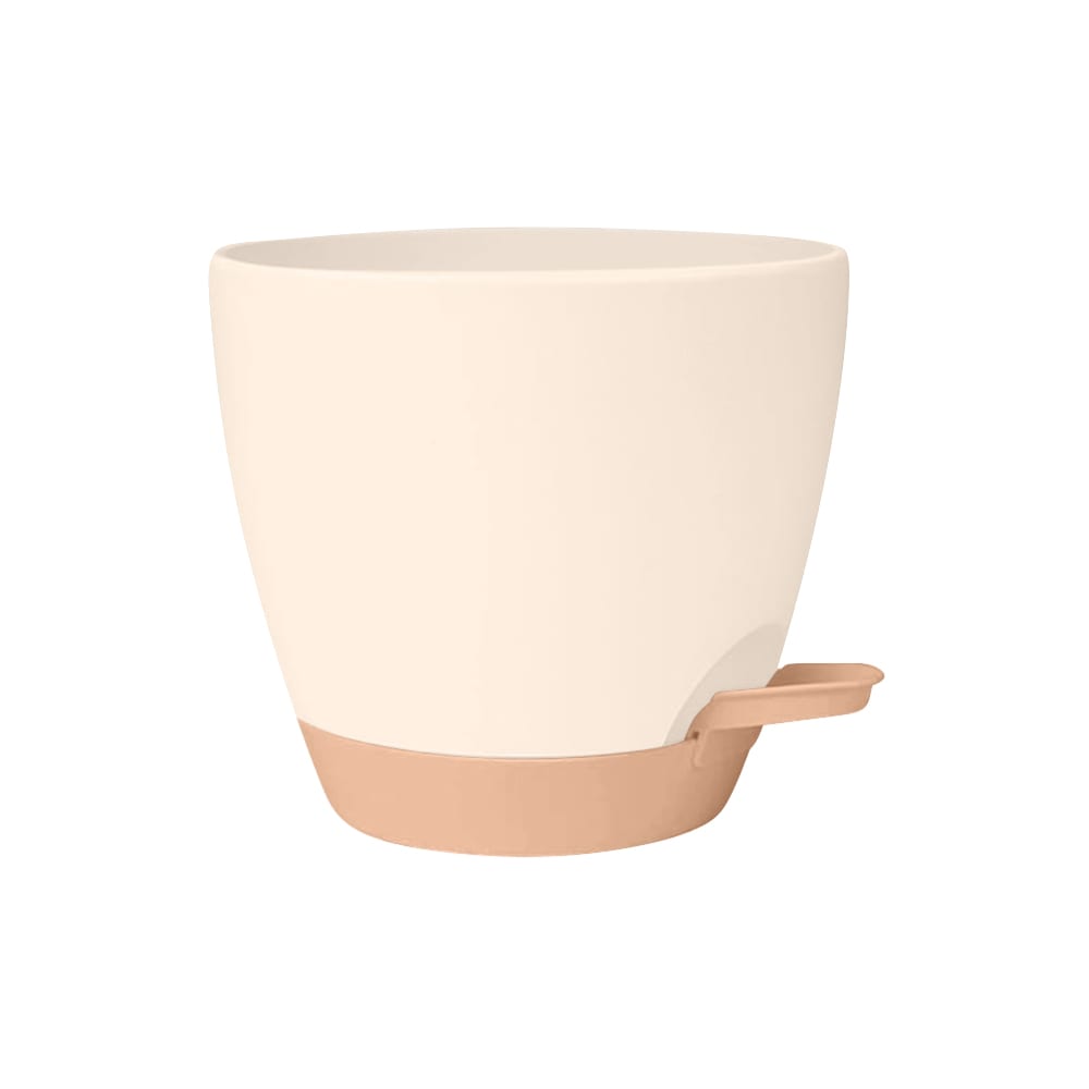
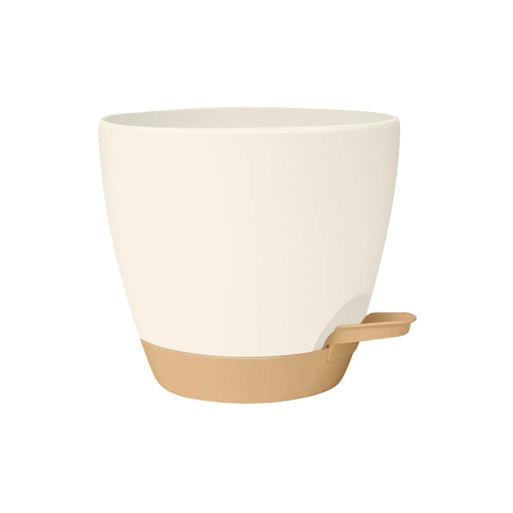
Option a with its green bottom looked like a good self watering pot. The green bottom has lots of good plant growing associations like a green thumb. Option F was the most unusual and colorful of them and after option a was my pick. Option D look like it might go well in office, decor, or places like that where you might bring a plant in and a self watering pot. Options, E, C, and B Had such slight variations between them that they all fit into the same category for me. They all look to have a common terra-cotta colored bottom though the hues did seem very just a bit. Being that most common variation of a terra-cotta bottom, these all seemed common. Like anyone you would get off any shelf from anywhere with no value added to them.
The white pot with gray bottom best matches my home.
I chose Option A because I liked the off-white/green color combination.
A was my first choice because it has a nice natural look that would go well with the plants. E was second because I like it next best. D was a close third because I had a hard time choosing between it and E. C was fourth because I also like the look. B was fifth becauses it looks okay. F was sixth because I don't care for it.
5 Responses to Option B
When comparing how appealing the color combination of the self watering pot is I would be more likely to select option B' which stands out among the other options.
The blue one might go best with other people's Decor but I think for me personally the whites and brown definitely go better although I'm not a big fan of white in general because it stains discolors and Fades over time. However I do like the white on brown ones in this I almost wish it were browned a little bit of white though I think it's more elegant. The green one as much as I love green just looks a little bit ugly for this the plant should make it look good with white
I like the more natural garden colors best, like brown or green. The gray is my least favorite, it seems drab.
I ranked them by what color combos i found to be the most appealing
I like the lighter colored and more vibrant pots
7 Responses to Option C
i would buy the pot in option C based on the color combination because it looks pleasant and subtle
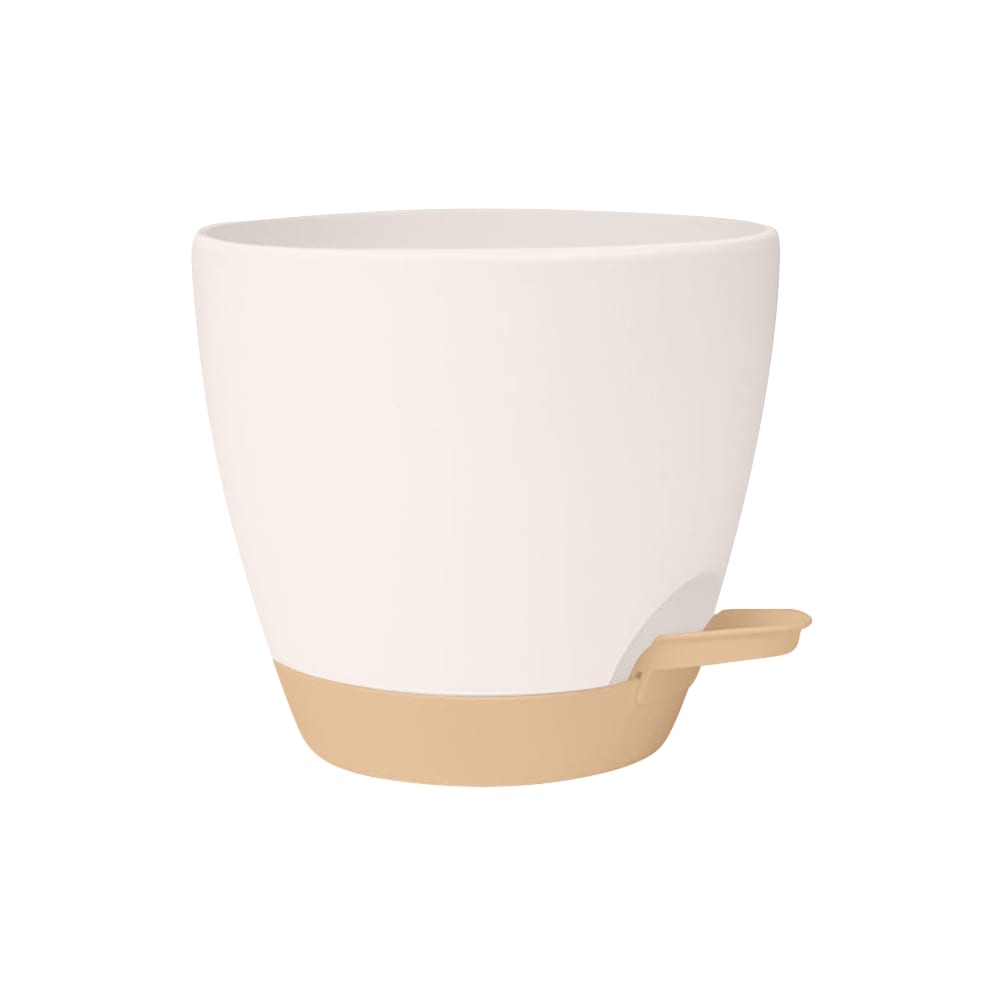
C has a more appealing contrast that makes the pot stand out. The brown and light beige combination gives the pot a more natural and earthy appearance that makes it very aesthetic.
I highly ranked the muted earth tones. When there is a plant inside, I feel like it would most highlight the plant life. The dark blue option is my least favorite because it would stick out the most and probably wouldn't compliment anyone's home decor.
I like the neutrals of Options C, E and B. I prefer C because the top part seems the whitest. I don't like the strong blue of Option F at all. I need this product to fade into the background (so the plant can shine), not stand out.
The brown color at the bottom is appealing to me along with the white aesthetic that is used here, it is appealing to me the design here.
I'd be most likely to buy C because I like that combination the most.
I like the lighter, more neutral color
24 Responses to Option D
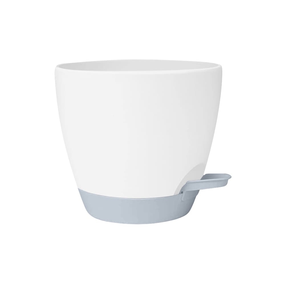
Based on color, I prefer Option D because of the subtleness of the color. The very light blue with the darker blue base is what really pops off the page for me. I am very intrigued by this option, and I would be very willing to have it in my house. It definitely matches the aesthetic that we are going for and it would go with everything in most rooms in my house.
Option D has a clear color such that one is able to see the level of water at a glance. Also the color is fade resistant
I prefer the white pot and like the grey bottom as well, but I think I'm most drawn to the color of the main part of the pot.
I preferred the pots with bases of a subtle color, and I really liked the light blue base.
I like the white and ivory combinations best, in option d, e b and c, option a is okay, not loving the green and option f would not go in my home
I will buy choice D first because the two colors are dull and combine better as compared to the other options s which are two bright colors making it less attractive to me
I chose option D as the top option over the others because I find the light blue/grey color to go well with the white.
I really like the white with gray base
I like the white and gray, I think it would fir in anywhere. C is also a neutral color. A has some green, which matches the plant, so that is nice too, although not as neutral. B and D look like the pot is pink and I prefer the white. F with the dark blue is too colorful.
White and gray/blue fits more in most settings.
I like white and gray together. I don't like the green.
I chose option D. I was drawn to the cream colored cup with the gray bottom.
I like the look of the white pot with the blue base.
The white and gray coloring is very minimal and clean it will match any other decor
I prefer option D. I like the soft colors. I think it would look great with a plant it.
i chose option d because i prefer the gray base on the mug
I like the gray - that's popular now and would match a lot.
Option D's coloring is the easiest to match decor with and use in a professional setting like my office.
I like the whit and gray best, as it is the most color neutral and would blend in with most peoples' homes.
I prefer a neutral color scheme that does not draw much attention to itself , so I would go with D or C here. There others are a bit too colorful, especially the very garish F.
My understanding of color theory is white stays cooler and reflects the light. So maybe my choices would help the plant get more sunlight and not cook in it's own planting pot.
I'm a fan of the white/blue and white/green combo the best.
I really like these. My first choice is simply because it would go well in my house with my other decor but I would consider most of these.
I love blue and beige so that's my first choice. That said, any of the beige top color bottom choices are great to look at.
7 Responses to Option E
The options featuring lighter, more subtle colors look more elegant to me.
I like the color combination of my top three. I find them visually appealing and fit my style and need.
I liked this color combination the best and I thought it would blend in best with most decor
I like the white and light brown color combination. The mostly white color is plain and minimal. Would fit into any setting. And the bottom is a nice Earth tone color.
I like the look and color of the cup in option E the most, so that is the one I would choose.
Either E or A are my first choices, because they go with the earthy tones I have in my living room already.
I like the neutral tan and beige colors best because they will go with any decor.
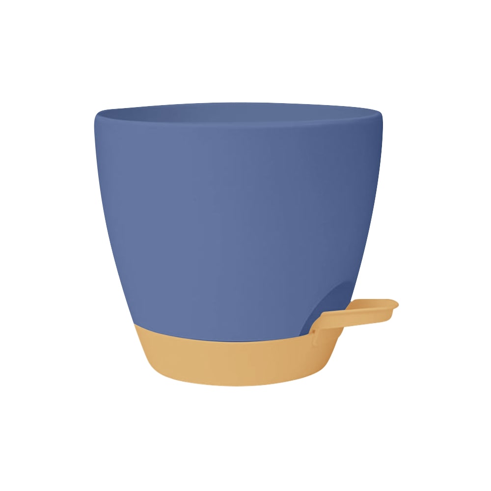
32 Responses to Option F
I prefer blues and grays over the earth tones
I prefer the blue pot because it would hide dirt better than the beige and white option
I like F first bbecause I think the blue and brown color combo is kindo of catchy
I really like this unique blue-purple color of this
I chose option F because of the bright coloring and how lively it appears. I like the bright, bold eye catching colors. This pot would look perfect in my garden and it would stand out among the other pots that I have. This pot makes a statement with it's wonderful shade of color
I like the blue choice. Pretty and would be a nice contrast to greenery.
Prefer blues in general and also like the darker color for a pot.
The blue is a unique standout
I picked F because A darker pot reduces the chances of algea.
I like the darker color of F. I don't like the pinkish hue of C, E, and to more of an extent B. I think A and D are the better lighter colored options.
Most of the pots I buy are terracotta colored, not because I really like the color, but because I know they will match everything I have at home. If its not terracotta colored, I want something bright and bold that can be a focal point.
My favorite colored options are featured in F and D. I like that shade of blue a lot
I like the bolder color that this one comes in and how it stands out more to me
F is the easy choice for me because of the blue.
I think this blue color is unique and would add pop of color to my plants.
I prefer the darker pot since it will add a pop of color to my room, also I like the contrast of the base making it easier to see where to add water when needed.
the whiter ones feel so plain and bland while F has some fun color and personality
I prefer the darker mugs. I think they have a better look and seem nicer to me.
I prefer neutral colors but something about D looks very off. I like the style of F and those colors work really well together
This color combination has the best contrast of any of the designs presented here, I really like the way they look together
Love the blue, but also depends on what room it would go in.
I selected option F because it is beautiful. The color combinations are unique and make the pot stand out nicely. Option F would fit into any style of home decor. Option F would also make a wonderful gift.
i like brighter and bolder collections for my plant pots.. i would only choose the blue one, none of the white ones
I would prefer more dark color options like F.
i prefer the different colors of the pot and holder
A's green is ugly. F is bold and bright. D's blue is cheerful. C, E and B are traditional and plain.
The ones with white pots and light colored dishes are boring. I like the blue pot.
F the color is eye catching and easy to remember what plants you have in it you can put it anywhere in the house and you are not going to forget it
I really like the blue color in option F, it would add a nice pop of color to a room. The other options are all so beige and boring.
I chose option F because I love the color combination of the self watering pot. That would be the one I would buy.
F is the boldest of the bunch. Great color comboD is my favorite for subdued colors. I like the White and blue/grey comboA is also a nice contrast in colorsC,B,&E are all about the same. Nothing unique that stands out
darker colors don't show dirt as well and so would appear cleaner than those that are white and show all dirt, dust, etc
Explore who answered your poll
Analyze your results with demographic reports.

