Poll results
Save to favorites
Add this poll to your saved list for easy reference.
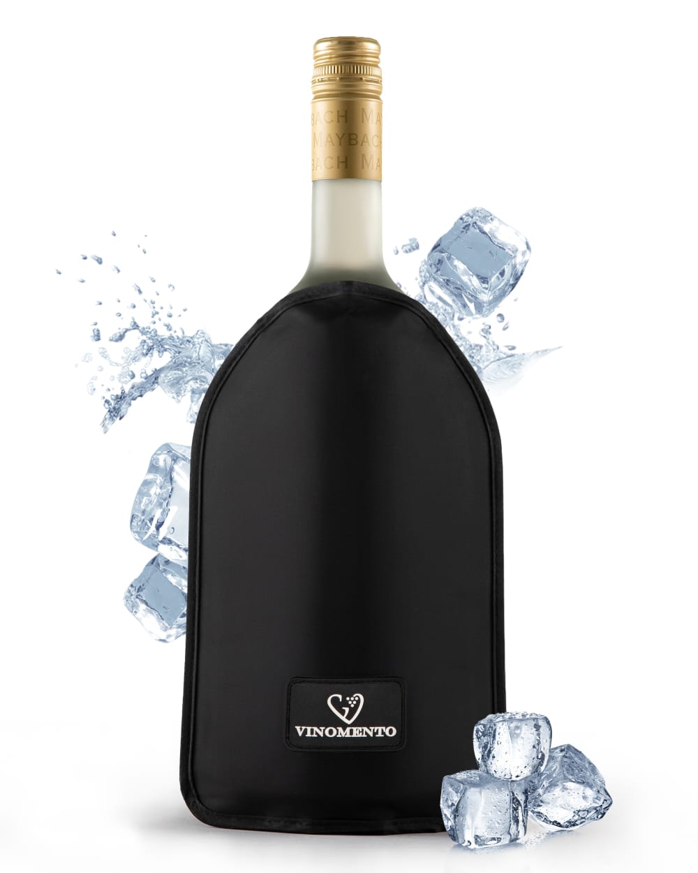
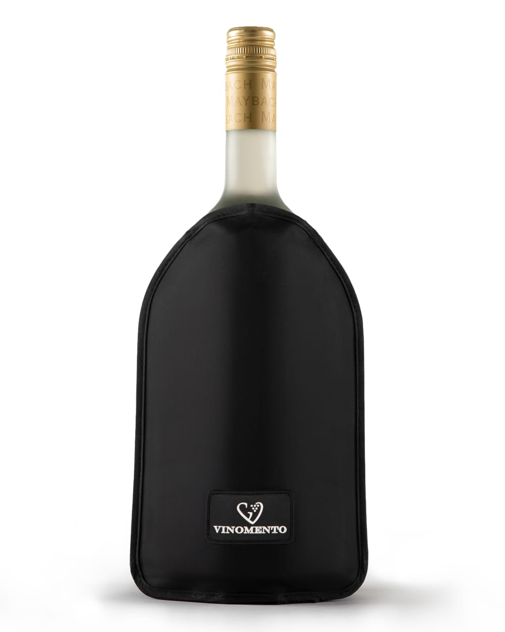
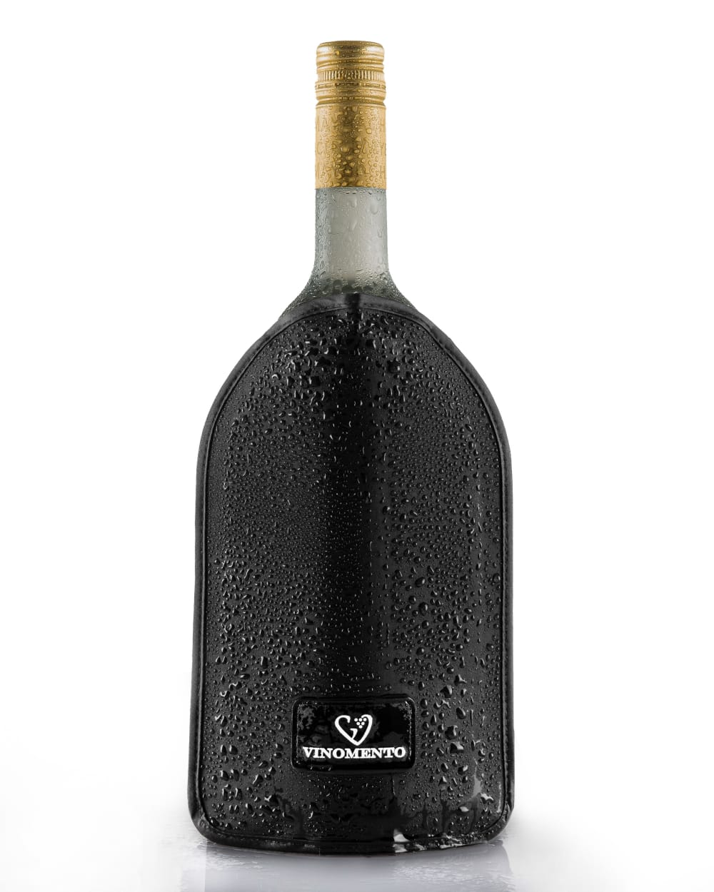
→ Imagine searching for XYZ on Amazon. On which picture would you click?
Option A won this Ranked poll with a final tally of 54 votes after 2 rounds of votes counting.
In a Ranked poll, respondents rank every option in order of preference. For example, when you test 6 options, each respondent orders their choices from first to sixth place.
PickFu requires a majority to win a Ranked poll. A majority winner differs from a plurality winner. A majority winner earns over 50% of the votes, whereas a plurality winner earns the most votes, regardless of winning percentage.
If an option does not earn a majority of votes, PickFu eliminates the option with the lowest number of votes. The votes from the eliminated option are reassigned based on each respondent’s next choice. This process continues in rounds until a majority winner emerges.
Scores reflect the percentage of total votes an option receives during the vote counting and indicate the relative preference of the respondents. If there is no majority winner, look to the scores to see how the options fared relative to one another.
| Option | Round 1 | Round 2 |
|---|---|---|
| A | 48% 48 votes | 54% 54 votes +6 |
| B | 41% 41 votes | 46% 46 votes +5 |
| C | 11% 11 votes | Eliminated 11 votes reassigned |
48 Responses to Option A
The ice cubes and water splash around the bottle better emphasize its purpose
A has a nice, classy look to it.
The ice cubes adds a nice flare
My first choices show more of what the item is and what it does better than my third choice.
I like the little accents since they help the image stand out more
I liked choice A since the image looks welcoming and cold with the ice cubes around the product. Choice C looks more distracting with the water on the bottle.
I like option A the best because the ice in the picture stands out the most to me.
Is more lively and vibrant and draws my attention to it more
i like the bottle with the ice alongside, i think it looks the most refreshing
I like the ice in the photo makes me want it more.
Option A and C are the most unique looking and have more flavor to the pictures. Option B is more bland in comparison.
I think C just looks weirdly gross and moldy or something. There's just something off-putting about it. I think A is better at communicating it's good to serve cold. Plus it looks more dynamic and exciting. B is okay but pretty plain jane and not as intriguing and attention-getting as A.
The ice in the picture gives it a very nice touch.
because of the ice
I love the extras and I'll take the ice cubes followed by C with the droplets of condensation it looks more realistic.
Option A is definitely the one that I would click on because the ice cubes and splashing water make it more engaging.
The one with Ice is just more visually interesting. The one with condensation doesn't really read as condensation.
The ice cubes in Option A catch my attention the most. I like Option C over Option B because of the condensation.
I really wouldn't like seeing condensation on the outside - it's a very unpleasant thing to deal with
A is the better image because it shows the product clearly, but also gives some extra context about the qualities.
Option A is the most attractive, you can tell this item is a beverage served cold but the added ice is not too distracting. Option C was also more interesting than just a plain image, like option B, but the condensation was distracting.
I would click on Option A because it effective illustrates with the ice cube graphical aides that this product helps keep wine/alcohol chilled.
I liked a best. Gave the perception that it would keep the bottle cold. C looked messy and b gave no real info.
I picked in order of the images that look the most appealing and interesting to me.
i don't care for the picture of the condensation on the bottle because it makes it seem like it would be messy and slippery. It isn't an imagery that evokes warm thoughts and positive associations from me. I do like the picture with the ice and water though because that I can associate with an ice bucket or something like that, so I can envision the feeling of the wine being chilly without associating the mess. Option B is just boring and doesn't do anything for me.
Option C just looks like the product is damp, making me hesitant to buy it. Option A gets across that the product keeps what is inside chilled and that it's water proof thanks to the ice and water graphics, while still making the product look really good.
I like the images with water and condensation on the bottle. The ice looks the best but C looks better than B and makes the drink seem more refreshing.
The product design is fairly boring so I picked A as I like the elements behind the product. It adds some pizzazz to the proceedings.
The ice cubes make the product look aesthetically pleasing
A - I like the splash of water and the ice. It adds something to the picture. C - I like the water drops. I adds the feeling of chilling. B - plain picture.
I like choice A the best cause it looks real and it shows it as cold without making it look fake like choice C.
The water splashes and ice cubes make this drink look 10 times more appealing and refreshing to consume
I like the movement in option a, the ice and water splashes. Option c is great with the condensation. Option b is simply a bottle nothing different or unique to make it stand out.
I would choose A first because the ice cubes in the picture would help me visualize how it would taste as I drink it. My next choice would be C because the condensation on the bottle would help me visualize how it would look after I took it out of the refrigerator and pour myself a glass. My last choice would be B since it isn't as compelling as the other two.
The first one with the water is nice it adds a nice look to it. It also makes it stand out more. Thr condensation on 2 looks nice and has a similar effect.
seeing it with ice and dripping makes me thirsty and want to try it more
A because it shows the ice cubs around the bottle and I think that draws you attention more. The water droplets on C could be confusing for customers and the plain B does not show that it needs to be chilled.
I prefer Option A since the inclusion of ice serves as a serving suggestion and would be helpful in telling me how to use it. Option C is also good since it informs me that the bottle has to be chilled. Option B is fine, but it's not as good as A or C.
I like the way this one looks and how it peaks my interest in it stands out nicely
A clearly shows the item is served over ice
I prefer option A because this image is more eye-catching, complete due to ice cubes and water splash surrounding bottle, this gives relatable and inspiring images.
I like the ice one since it's the most interesting.
I would likely click the product with the ice cubes in the photo because it looks most refreshing. The droplets on the bottle in C look nice too.
I would click on option A because the ice cubes and splash of water makes the image more appealing. There is a sense of cold and ready with this image.
To start, I think the ice makes the product a little more clear of what it is. I don't like the bottom choice because the water drops make it hard to see the product.
I like cool drinks so the drinks that suggest being cold seem better.
A looks more attractive and exciting. B is ok, but C looks strange like there's a problem with the holder.
If the liquid is supposed to be cold, then I like the ice cubes more than the condensation on the bottle.
41 Responses to Option B
I prefer choice A because it is more a more simple and straight to the point than the other options.
Option C looks like it has dirt on it, not ice crystals, and Option A is just sort of tacky, so I'll stick with the more uniform Option B.
I ranked the images of the bottle on Amazon that I liked the most. I liked just seeing the bottle with no effects in option B the most. I then liked the image of option C followed by option A.
I like that it’s just a simple picture of the bottle. It doesn’t have any extra things added which I prefer.
I like option B because the picture is clean and less distracting without the ice or the water dripping.
I like Option B because I can see the actual bottle and know what I'm getting.
I liked A first because it is simple and the bottle alone is enough. I chose A next as it is alright I don’t really think the ice cubes ad anything to the picture. I chose C last as I really dislike the way the bottle looks wer.
i like the simple picture. the other are too distracting with all that extra stuff around
Option B is staged really nicely and is plain / simple. Option A is my next choice because the splash and ice are a nice touch.
I like the cleanest image shown on the bottle.
I feel choice B has a sense of quality and sophistication that the otehr two doesn't have.
B has the most crisp and well formatted look that I find the most distinguishable.
I find B the most appealing because it is a plain, unadulterated photo of the product. C is still good - right now I prefer the plainness of B, but if I was feeling thirsty I might prefer the water beading up on C, since that implies it's cool and refreshing. I don't like the ice cubes in A at all, they just seem photoshopped in in a bad attempt to make the product eye-catching. It makes me think the brand doesn't have faith in their product's ability to stand on its own, which in turn makes me think it's low-quality. I'd have no such concerns with B or C.
The pure image is best here. This seems to work better visually and consumers will like the clean look. I'd use option B first as the best presentation without distractions.
The special effects in my 2nd and 3rd choices are weird and do not make me feel good about the product. Just show me the item.
The ice cubes look a little odd, so I wouldn't choose that one.
I like the cleanest picture because it is easy to evaluate without extra detail. The ice with it looks more appealing than the sweat on the bottle.
It gives the best view of the product without it being altered.
B is simply the product on its own which looks the best because the packaging is already nice on its own.
I didn't even know what it was at first, but I like the plain image, not the wet one or the one with photoshopped ice.
I picked the image shown in choice B as my first choice, as I like the image of the product without the extra graphics shown on the product(the condensation and the ice). I believe it is just the best overall image of the product for that reason.
I like B because it is the most straight forward. I don't think the ice is necessary in A.
I like the plain and straightforward look of B over the weird details on A and C.
I like B because it's a nice clear image of the product. I think the other two are okay but C looks odd wet and the water in A is distracting.
I prefer Option B as my first choice. It's strong on its own and looks sleek, modern and appealing. Option C with the icy bottle is also quite nice and attractive. The last option is perfectly fine but somewhat overdone and the ice cubes look out of place.
I find the ice cubes confusing. The condensation on the bottle also makes it look like it was chilled but then sat out for awhile. My preference is for the non-wet matte looking bottle.
I chose A because nothing else in the photo is distracting.
I liked my first choice because it looked more modern and premium looking. The second choice looked cool with the water coming off of it.
I think just the product image is sufficient.
The cleaner picture the better. Deffinetly no water droplets
I chose option B because I like that it is just the plain bottle. I don't like the ice or the condensation that is showing on the other two options.
I feel like option B is the most straight forward, easiest to understand, and looks the most premium. I do not like the other additives in the other images which make the product look cheap
I like B the most. i think that where the bottle is lit up at looks better
I like how this is displayed
I like the plane look of the product without the use of water or mist on it, don't think that was needed.
The bottle plain is good enough. The ice is okay, but the condensation looks weird.
Unnecessary embellishment makes it hard to see the product without adding any information or context, so it's just unnecessary embellishment :)
I think the ice cubes (in A) and the condensation (in C) are pretty distracting from the product itself.
The bottle looks better in B. The added material is detracting from the beautiful bottle.
The wet bottle and the bottle with ice on it looks weird to me. I would click on the most regular one because that is what I would be receiving
I don't like the condensation, it makes it look too slippery.
11 Responses to Option C
The sweating bottle is intriguing. Is it super cold? Is it such a great product it's trying to get out? Either way I'm interested. I also like A which is showing ice and movement while A just sits there, passively.
I think that choice B is just very bland. I would go with A or C.
I feel like the ice was too much so I went with the condensation picture. I think that it looks really nice.
The sparkles on the product make it look more elegant and sofisticated
I like these options in this order because the first option helps me know that it helps chill bottles with the condensation on the bag. I also like the second one even though it doesn't show that. The third one looks too photoshopped for my liking.
I love the effects of bottle looking like it just came out of the ice chest of ice . The photo is great. A is good because I like seeing ice cubes around it. B is just okay since it shows the bottle in normal situation.
I'd click on this image. I find it more pleasant and enticing
I like choice c the best because it looks expensive and unique. The sweat dripping off the bottle makes me want to just drink it right this second
I like Option C the best. The bottle with the moisture looks really cool.
I like both C and A the most. Depending on my mood, they might switch places for the 1st spot. Right now, I'm feeling C with the condensation.
Option C is the best because the bottle looks well designed and simple
Explore who answered your poll
Analyze your results with demographic reports.
Demographics
Sorry, AI highlights are currently only available for polls created after February 28th.
We're working hard to bring AI to more polls, please check back soon.

