Poll results
Save to favorites
Add this poll to your saved list for easy reference.
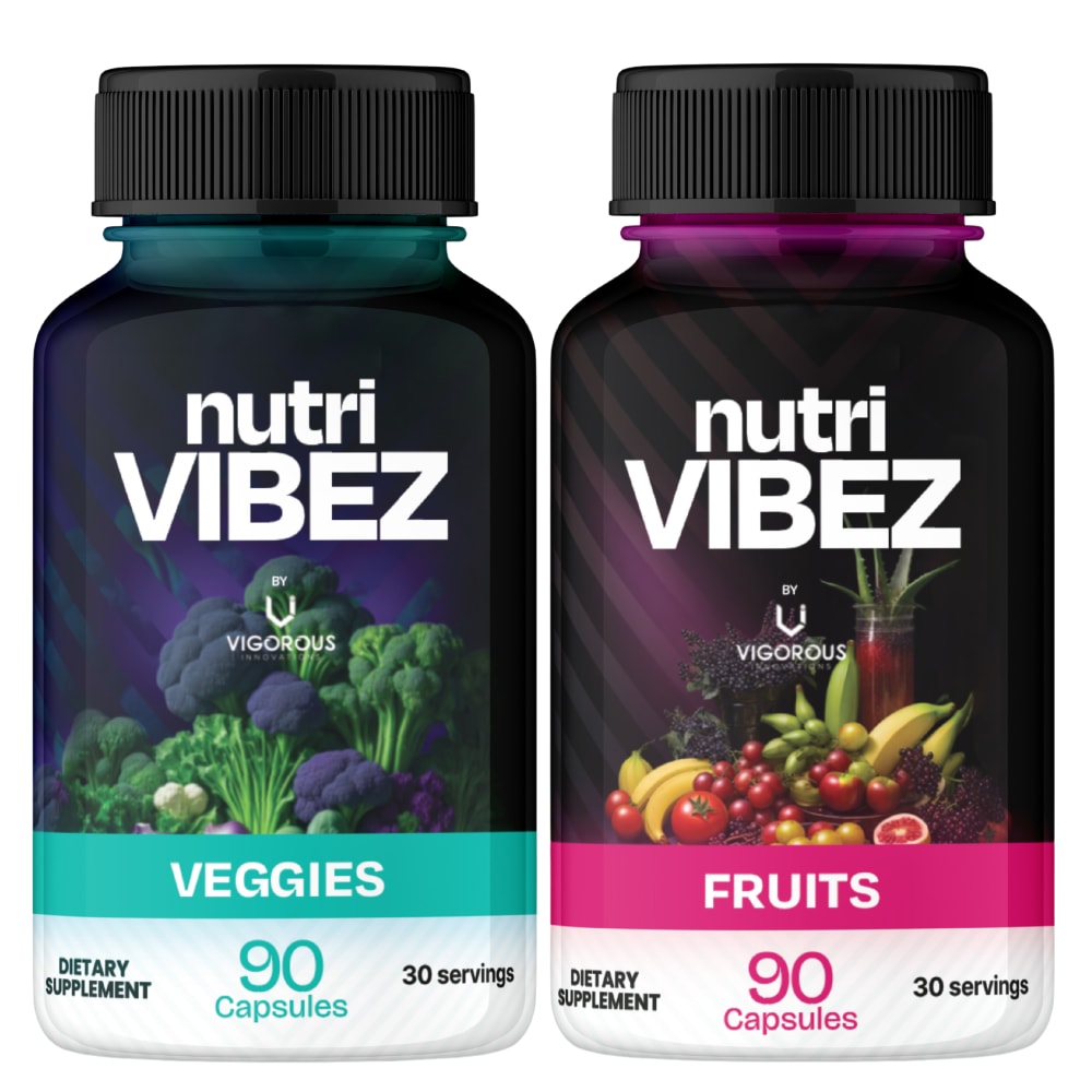
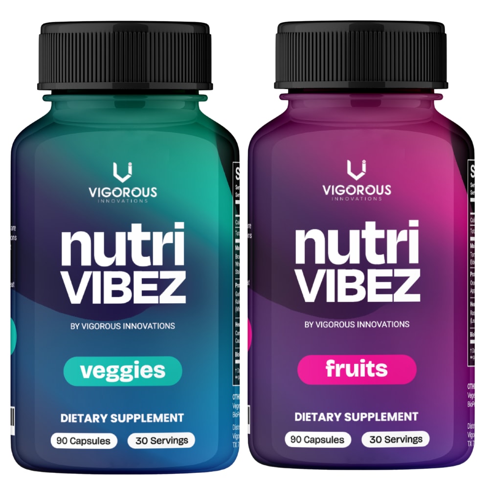
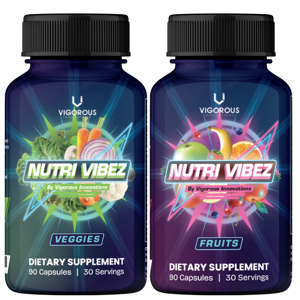
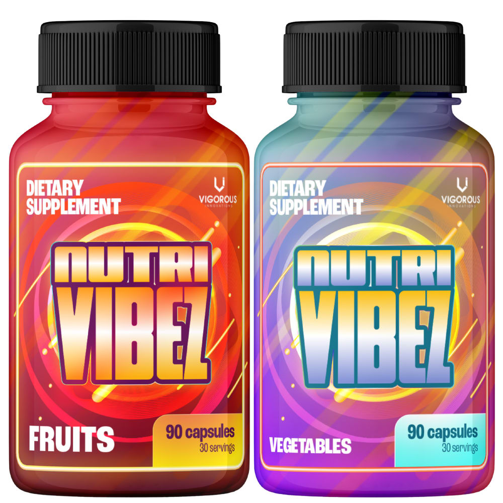
If you were shopping on Amazon, which product would you rather buy? We are seeking the more modern person who is looking for super clean/ super real ingredients and the retro look is a nod to “when times where better" and there wasn’t junk in our products


Option A won this Ranked poll with a final tally of 27 votes after 3 rounds of votes counting.
In a Ranked poll, respondents rank every option in order of preference. For example, when you test 6 options, each respondent orders their choices from first to sixth place.
PickFu requires a majority to win a Ranked poll. A majority winner differs from a plurality winner. A majority winner earns over 50% of the votes, whereas a plurality winner earns the most votes, regardless of winning percentage.
If an option does not earn a majority of votes, PickFu eliminates the option with the lowest number of votes. The votes from the eliminated option are reassigned based on each respondent’s next choice. This process continues in rounds until a majority winner emerges.
Scores reflect the percentage of total votes an option receives during the vote counting and indicate the relative preference of the respondents. If there is no majority winner, look to the scores to see how the options fared relative to one another.
| Option | Round 1 | Round 2 | Round 3 |
|---|---|---|---|
| A | 48% 24 votes | 48% 24 votes | 54% 27 votes +3 |
| B | 34% 17 votes | 36% 18 votes +1 | 46% 23 votes +5 |
| D | 16% 8 votes | 16% 8 votes | Eliminated 8 votes reassigned |
| C | 2% 1 votes | Eliminated 1 vote reassigned |
24 Responses to Option A
takes itself seriously and implies it's naturally derived
Option A is the best option because it has the best combination of image and text on the bottle. The other options do not look as good.
The names in A and B are bold and visually appealing, the color differentiation shown to highlight the product's features in A is much catchy so I would click on A first. D looks more like a cartoon image so ranked it last.
None of these really scream retro to me. C and D, while colorful and have fun patterns, look more like lights and carpets you'd see at old school skating rinks or bowling alleys, which definitely did not have clean food. A is okay but a bit boring. I like the images of the fruits and veg. B is incredibly boring and looks too clinical like medicine.
This one has natural elements on the bottle. They seem more approachable for the modern person.
I actually like all of these number four I think it's kind of cool but I think it looks like a lot of things already on the market versus number one which I really like because it's a little bit different I like it because it says all natural to me fairly obviously two and three are nice too they have that retro look
Most packaging look great, but I think they are somewhat far from resembling retro look, they are mostly very modern. Options A and B are best choices, they are clean and simple and not overloaded with colors.
I like the colors and the pictures of the ingredients in choice A
I like options A and C best because they actually show the fruits and vegetables on the bottles, making it very clear.
The images of the ingredients match the description of reminiscing about a time when things were better. B is plain. C and D look like they're trying to be extreme.
I like the labels with the pictures of the fruits and veggies if the contents is also supposed to be fruits and veggies
I really like the shape of A. It's a bit unique.
A.. As soon as I saw this one I wanted to click it immediately I think it's very visually appealing and it's absolutely gorgeous the way the colors are used And all the claims they are very easy to read easy to see stand out nicely so I would say I would definitely purchase the product
Option A' is my preference because the packaging design has a very pleasing appearance giving the impression of how quality the product is.
Option A with the images of Vegetables and Fruits displayed on the label is better designed as it is more assuring and is the most impressive of the three options.
Though all the above options comes with same brand ,quality and quantity but i am choosing the above options depending upon the design , graphics and color combination of the container .1)My first choice is option A for its beautiful design , fonts , color combination and image that is used on the container .2)My second choice is option C for its design , fonts and color combination .3)My third and fourth choices are option B and option D respectively for their respective design ,fonts and color combination of the container .
I lean towards option A because to me it looks and feels the most natural and authentic. Option C and B feel very capable as well. Option D feels the least desirable to me.
A looks perfect, the color scheme is well crafted and aligns with the different contents and flavors. The arrangement of the products names at the near top makes them even more visible and legible. The images of fruits and vegetables makes the products easy to identify.
The simplicity of design A is appreciated, its look is also appealing. It would be my first choice.
A looks the most attractive and appealing with the realistic design. B also looks very clean and makes me feel trustful. C is too catchy and D is also too vivid.
I think A looks the most natural and is eye-catching. I think it fits he theme better.
My favorite is A which has the prominent picture of the fruits and veggies on the bottle. They are simple looking like they just came from a farmer's market. It looks more unspoiled. My second favorite is B which is a neutral look. It is not as natural looking as A, but it doesn't look as artificial as the bottom two. I gave C third place because it does have fruits and veggies on the package as well. However, the graphics surrounding them make them look radioactive.
I like "A"...the contrast of the dark background with the bright colored veggies or fruits is visually very appealing.
My first two choices are very easy to read. I see all the information I'm seeking easily (fruits vs. veggies; number of capsules; brand name). The retro vibe is interesting, and I get your intent, but it's really obnoxious to look at. I wouldn't reach for this to use it. Also, I'm not sure the groovy 70s were actually a time when things were cleaner or more pure.
17 Responses to Option B
I want something that has the gravitas to say to me that it is an official supplement, so I would go with B or A. C and D are just too colorful and overdesigned, and honestly the 80's and 90's these remind me of where not that great when it came to products being any purer or better for you (we just didn't know any better back then).
I'm not a big fan of D and C because they are too vibrant and chaotic. B looks clean and mininmalistic and natural . A is ok but look a bit too dark.
The logos that don't pop as much give the impression of simplicity and no hidden ingredients that would be harmful.
Option B looks the most fitting when looking for a sleak and clean option. It has minimal photos/designs which are related to more artifical oferings.
B's simple logo fits for me the most, without distractions so I can focus on what the labels tell me in words. The colors are attractive and simple, and make me feel like it's not trying to distract me. A's photos also make me think they're clean and natural. C and D scream artificial to me, and make me think they're for kids.
I ranked B first because I think it has the cleanest and most professional label design. I ranked D and C last because I think their label designs are too distracting and flashy.
The darker colors and more simple designs make the product look healthier.
Option B is the most compelling and convincing choice. It exudes trustworthiness and appeals to sense with its strong attributes.
I feel the designs of options D and C are too vibrant and aggressive looking hence not preferred. Out of options B and A, I chose option B as its label design is plain, simple and natural looking.
I would click on and buy B first because I love the modern design and not overly flashy covering. It looks very polished.
B and A looks good. D and C are both fine but a look a little more on the cheesy side in my opinion.
Based on images I would pick option B as the best choice for me. I liked these bright colors of the packaging. Great design.
I like Options B & A best. They are more modern than the other 60's type bottles. I would trust the look of these over those.
Option B has a great look to it and would be the option I would pick.
b and a look the best for this product, it wouldnt feel out of place next to more modern containers on the shelf, it would just have more of a pop. c and d look a bit too retro and run the risk of people overlooking it as an older out of date product.
B and A have much more professional packaging. Designs in D and C look gimmicky.
I like the design of B the most because it's very no frills and looks professional.
1 Responses to Option C
Option C is about the only legitimate looking design. The other labels make the product look like a scam.
8 Responses to Option D
Option D because the bottle was eye catching and worth checking the product out
I would rather buy option D, it is not attractive and also not giving trust(It gives very dull feel) and bright look compared to others.
I picked d by following the instructions as to go back to a time when things were better I definitely thought D had a classic look to it. Next was C it also had a somewhat classic look to it.. D&A I did not find to have a retro look at
If you're going for a retro look, I'd definitely recommend the colorful/large font bottles. Those give much more of a retro vibe. The others look pretty modern.
The package design for D is better it brings the old school vibe combined with a little bit of modern design vibe giving the package an aesthetic appeal.
D and C gives the modern design look with very nice color mixture and unique writing styles for the product labels.
I like D the most and think it looks the most professional. I also think the general design is just really really pretty and looks good. I think B and C are fine but don’t like A at all.
Options D & C are what I most prefer, because I think that these offer the best representations of retro aesthestic design covers
Explore who answered your poll
Analyze your results with demographic reports.

