Poll results
Save to favorites
Add this poll to your saved list for easy reference.
If you were shopping on Amazon, which PREGNANCY JOURNAL would you rather buy?


Option C won this Ranked poll with a final tally of 28 votes after 2 rounds of votes counting.
In a Ranked poll, respondents rank every option in order of preference. For example, when you test 6 options, each respondent orders their choices from first to sixth place.
PickFu requires a majority to win a Ranked poll. A majority winner differs from a plurality winner. A majority winner earns over 50% of the votes, whereas a plurality winner earns the most votes, regardless of winning percentage.
If an option does not earn a majority of votes, PickFu eliminates the option with the lowest number of votes. The votes from the eliminated option are reassigned based on each respondent’s next choice. This process continues in rounds until a majority winner emerges.
Scores reflect the percentage of total votes an option receives during the vote counting and indicate the relative preference of the respondents. If there is no majority winner, look to the scores to see how the options fared relative to one another.
| Option | Round 1 | Round 2 |
|---|---|---|
| C | 44% 22 votes | 56% 28 votes +6 |
| B | 36% 18 votes | 44% 22 votes +4 |
| A | 20% 10 votes | Eliminated 10 votes reassigned |
10 Responses to Option A
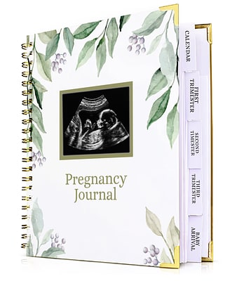
I like the simple, informal and gender neutral look of this journal cover.
I like the way the leaves are laid out in A and the large tabs on the side
I like the cover on this one and large writing tabs on the end of the pages makes it stand out more I would buy this
I would buy A. I prefer the muted tones and easy to read lettering of A. C is next. B is last.
I like the fonts and colors of the cover in Option A more than other options. It looks nice.
I really loved option C but feel like I would select option A because the colors are more gender neutral. The touch of leaves aren't suffocating the cover of the journal but still add a delicate, elegant style to it - for any gender. I would select option C though, if I knew for sure that it was going to be a girl. The gorgeous flowers blend in so nicely, and yet are bold enough to call your attention but subtle enough to not draw away from the sonogram.
I prefer the more neutral colors in the design.
Option A is my first choice because I like the representation of the product.
I prefer A the most Compared to the other two. The color and design of a is more of my style
This most gender neutral friendly baby book for keeping updates with the pregnancy and the little details the colors were well balanced in the first option and the others look very feminine
18 Responses to Option B
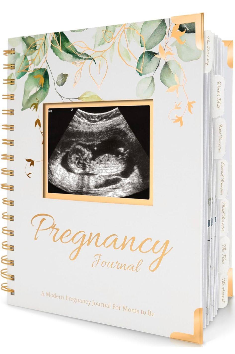
I chose option B because I prefer the gold accents.
B is the nicest, I love how subtle and pretty the leaves are. A is okay, a little more decorative, which I don’t love. C is too much, I don’t like the purple flowers, they’re too much.
B looks the most modern and appealing to me. I like the colors and I like the bigger font - it looks more natural/normal.
I'd buy "B", like the large gold color font.
I like Option B as my first choice. It's soft and gentle looking with delicate graphics that are sweet looking. Option actually has a bit a color with the purple flowers and they are eye catching and charming. Option A is the busiest but it's still quite attractive and seems stylish.
I would choose B first because I like this picture best.
I based my choices on the fact that I like it most simple.
i would buy option b because i like the gold flowers that compliment the text and corners
I like the corners and color of the corners on the first one that I chose. I also really like the way the tabs don’t stick out of the book as much as it appears the other two do.
I like the look of the first journal the best. It has more detail and looks inviting
Love the gold foil around the sonogram picture in option B with the matching gold accents throughout the cover and corners. I like the delicate touches without being overly feminine.
I love the idea of putting in the sonogram . Adds a unique touch
the number one has a more clearly design, number 2 is not clerly and untreatable
I like the font better on the first one. I also like the floral pattern better on that one.
I would choose A because of the quality and more seems to be more outgoing
Neutral colors. Pretty. Unisex . Plain and small
The first choice is very neutral and really does not speak to either gender.
B is the prettiest and more Decorative. Looks larger than the other's
22 Responses to Option C
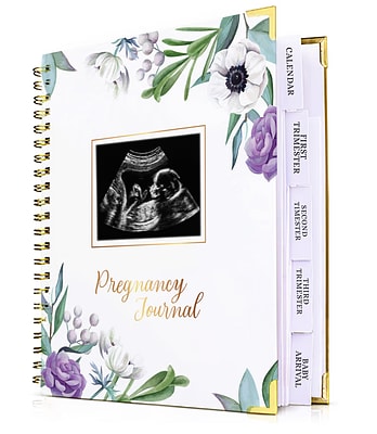
I like the brighter purple flowers around the edges.
I prefer option C. I like the colors purple and green together. The flowers are very beautiful.
I really like the colors on the cover of this option.
C is the color combination that appeals to me the most
I would buy option C most probably because I like the design and touch of purple makes it look more aesthetic.
I think the extra flowers make this more attractive
I chose C first because the purple flowers are very eye catching and inviting.
I love the gold and rose gold details. I prefer C because of the pop of purple color. I think it adds elegance. This is definitely something I would purchase for my next pregnancy.
I really like the colors on C - the purples make this journal one that I would want to buy.
C I like the purple flowers on the book, it makes it stand out. B because of the pretty white/yellow flowers (it doesn't stand out , but could be for either sex). A is last because it like it, but it needs more to it.
I like the light colored with the purple flowers, it looks really nice.
I like the colors on this option.
I chose option C as my first preference because I like the design or the print on the front page along with the photo of the sonography.
I like the baby book design of choice C I would look at this book cover first
Option C has the prettiest floral pattern and colors, especially against the white background color, which provides a striking contrast. Additionally, I really like the gold corner protectors and font style used for the title on this cover.
I like the script and the flower image the best of all three
I liked the design and binding best. I feel they look better.
I like this on mostly because of the tabs on the side of the book.
Just love the white back ground with gold writing and purple flowers and the index where you can put everthing in it
The first two options a that i ranked i chose because i like the colors. the option that i chose for the first choice, i selected because i like the purple flowers. I really like the way that they look on the cover of the book.
I think they all look similar but i prefer the one with the purple flower.
I like C the best with the purple flowers on the top and the bottom, the other two are too plain
Explore who answered your poll
Analyze your results with demographic reports.

