Poll results
Save to favorites
Add this poll to your saved list for easy reference.
If you were shopping on Amazon for Decorative Books, which product would you be more likely to buy, and why?
Option A won this Ranked poll with a final tally of 32 votes after 3 rounds of votes counting.
In a Ranked poll, respondents rank every option in order of preference. For example, when you test 6 options, each respondent orders their choices from first to sixth place.
PickFu requires a majority to win a Ranked poll. A majority winner differs from a plurality winner. A majority winner earns over 50% of the votes, whereas a plurality winner earns the most votes, regardless of winning percentage.
If an option does not earn a majority of votes, PickFu eliminates the option with the lowest number of votes. The votes from the eliminated option are reassigned based on each respondent’s next choice. This process continues in rounds until a majority winner emerges.
Scores reflect the percentage of total votes an option receives during the vote counting and indicate the relative preference of the respondents. If there is no majority winner, look to the scores to see how the options fared relative to one another.
| Option | Round 1 | Round 2 | Round 3 |
|---|---|---|---|
| A | 42% 21 votes | 50% 25 votes +4 | 64% 32 votes +7 |
| D | 22% 11 votes | 30% 15 votes +4 | 36% 18 votes +3 |
| C | 18% 9 votes | 20% 10 votes +1 | Eliminated 10 votes reassigned |
| B | 18% 9 votes | Eliminated 9 votes reassigned |
Age range
Gender identity
Options
Preferred decor style
Type of residence
U.S. geographic region
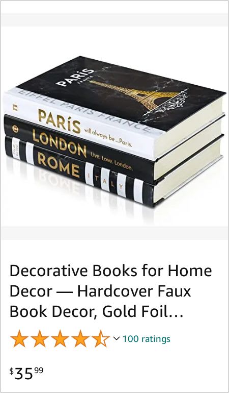
21 Responses to Option A
A and C look more entertaining to me and my guests vs B and D
I dont really like it with them stacked vertically. It feels a bit unnatural and harder to read. B though with the slanted one breaks it up a bit. A i feel fits the best and is the easiest to read. C is ok but not as appealing but better than stacked straight up.
The black and white Paris scheme is a lot better than the others
Choice A - Places I'd love to travel. Choice C - More places to visit, but the book covers aren't as elegant as Choice A. Choice B - looks like I would like fine furnishings and elegant traipsing in my home. Choice D - Let the journey begin--Happiness, please! For a faux book cover, this is extremely not the point.
I chose A as my first choice because I like the colors and the theme
I like A the best because I like the black an white and I like that the books are about cities.
The names of cities on the books is appealing. The gold foil is attractive.
These are easy to read.
These make a nice display - I like to pick up books sitting like that - maybe on a coffee table.
I personally like the black and white scheme most. A appeals to me and shows off a few popular city landmarks. C comes in next. Again, really like the black and white aesthetic. B and D are lower for me. Not bad, but lower. B offers one more book so that is why it rose above D for me. I just don't gravitate towards the softer colors.
I really like option A. It's very simple and elegant. I wouldn't want anything too fancy. I think it's also a good value. After that, I ranked based on how much I liked each one.
I think the black and white are more decorative and add interest to a book shelf because most books are not black and white.
I am sensitive to price so I liked that A and D were cheaper than C and B. I liked A more than B though even if it's a couple dollars more because D looks boring.
I prefer the bold neutral color contrast and like the themes of cities and artwork.
I choose A as #1 because it was the cleanest picture. I choose D as #2 because it was the most decorative. I choose C as #3 because I like the color and I didn't really care for B.
These books look fancy and most eye catching compared to the others. If these were on a shelf I would be drawn to them.
I like that the books for this option match, like they are part of a series. I also like the black and gold colors.
A is my favorite because of the distinct black and white colors that will stand out on a bookshelf. It also has a gold font that catches my eye immediately. I also appreciate that it seems to be on themes of traveling and certain countries, like Rome. C is my next favorite due to the similarity to A, but it has more faded looking images. B is nice simply due to the neutral colors. D is my least favorite as it is too blank looking in the cover and seems to be more countryside themed.
Option A have the colors that I like. The black and white would have a good contrast to the books.
Books in A have some very nice color design and imagery on the cover that relates perfectly to the theme of he books"Decorative Books".
If I were shopping for decorative books on Amazon, my 1st choice would be Option A because these are the most visually appealing with the stark black, white and gold foil contrast, and they feature cities I would be interested in visiting. My 2nd choice is Option C because I find the uniform color scheme to blend together well while featuring gorgeous photos of architecture. My 3rd choice is Option D because although I enjoy the travel theme, I think all three of the faux books being white is a bit boring. My final choice is Option B because I don't like that all the fonts featured on these books are different and the palette features four different colors for each book. I personally would prefer more uniformity.
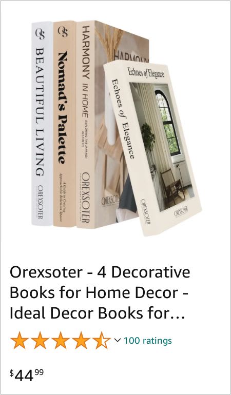
9 Responses to Option B
The colors of the books in B are more cozy looking
B was my first choice because I like the look of it best. A was second because the black and white with gold lettering also looked good. D was third because it looks okay. C was fourth because it has a dull look.
The lighter beige color on B’s set of books looked more homey to me.
Ranked in order of how much I like the color schemes and think the design fits in with my home decor
The design and covers of books in Option B look nicer than other options. Price is also reasonable.
My first choices were natural/neutral looking books because they'd match with most home decor. The black and white books would really only match modern homes so I chose them last.
I love the ones that have a light touch of color to it. That is very pleasing to me and I love B in particular because the books have a range of shading and colors that is appealing to me. From there, I like A over C as the words and the artwork are colorful and stand out
I loved the decorative books of option B the most as there are 4 books and the book design is very attractively colorful, rest of the options are ranked serially from the most likely to the least likely to buy.
Getting 4 books for such a price is a deal considering the comparison of other books is a set of one
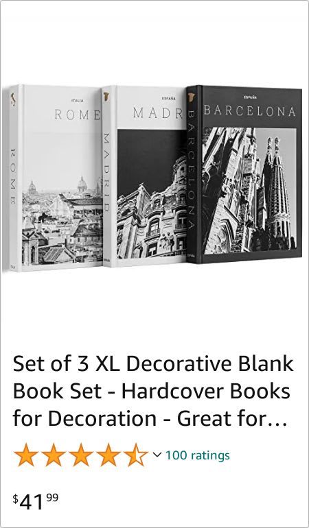
9 Responses to Option C
I liked the designs for option C the most. It has a nice premium look to it. Option A, I liked how the spines of the books looked more than option D. Option D, I liked the cover slightly more than option B.
The black and white photos on C are gorgeous. Much better looking than the others.
I like Options C & A with the European cities showcased in the books. It's photography looks interesting and it's exactly the type of book that people pick up and browse through with interest The remaining options are perfectly fine but not as eye catching and the subject matter doesn't seem as interesting.
I picked C because they look like classy art books. I also like that they are all the same size and seem to fit the same theme.
I prefer option C. I like that this looks like a group of books about architecture and that seems really interesting. It would be a great additiont to deco.
I like the designs on the cover of choice C the most. I think they would look nice on a coffee table.
I like the travel books the best; they are more exciting than home interiors.
The black and white will match with any decor I have and the large architecture is impressive.
I like choice C the best, it looks the most decorative, I can picture it being set up anywhere
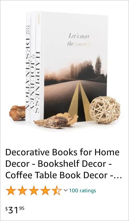
11 Responses to Option D
I picked my top choice because I like the color scheme spice and I feel like it would fit in with my overall decor.
There's nothing that sets any of these apart so I'd choose the lest expensive. They all seem equal in quality based on the reviews and look about the same.
I prefer D because it’s the cheapest compared to A, C or B.
If I am shopping on amazon for decorative books, I would like to buy option D because it is attractive among all, also in reasonable price. Additionally. it has a good review and rating.
I prefer D because it is very neutral but attractive and warm.
I love how the open road beckons in option d and how it’s not specific to certain cities
I really felt they were all overpriced, so I put them in order from lowest to most expensive. I felt they all looked professional enough and pretty.
D is my first choice because they are the cheapest...but I would not want blank books.
I wouldn't buy decorative books since real ones from a thrift store are a lot cheaper. That said, the most impressive image is D in terms of presentation.
I love the more vintage and neutral color look. My first option is really nice and has a gorgeous and peaceful looking picture on the cover.
I have ranked these options according to how appealing they seem to me.
Explore who answered your poll
Analyze your results with demographic reports.

