Poll results
Save to favorites
Add this poll to your saved list for easy reference.
If you were shopping on Amazon for Bible tabs, which color do you find the most beautiful and aesthetically pleasing?
Option C won this Ranked poll with a final tally of 25 votes after 1 round of vote counting.
In a Ranked poll, respondents rank every option in order of preference. For example, when you test 6 options, each respondent orders their choices from first to sixth place.
PickFu requires a majority to win a Ranked poll. A majority winner differs from a plurality winner. A majority winner earns over 50% of the votes, whereas a plurality winner earns the most votes, regardless of winning percentage.
If an option does not earn a majority of votes, PickFu eliminates the option with the lowest number of votes. The votes from the eliminated option are reassigned based on each respondent’s next choice. This process continues in rounds until a majority winner emerges.
Scores reflect the percentage of total votes an option receives during the vote counting and indicate the relative preference of the respondents. If there is no majority winner, look to the scores to see how the options fared relative to one another.
| Option | Round 1 |
|---|---|
| C | 83.33% 25 votes |
| A | 13.33% 4 votes |
| B | 3.33% 1 votes |
Age range
Education level
Gender identity
Household income range
Options
Racial or ethnic identity
Religious affiliation
4 Responses to Option A
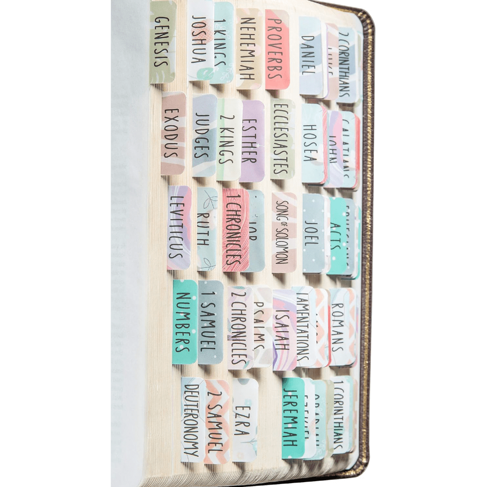
I like the variation in color in A and B. Looking at C, I see mostly blue and pink.
I like A because the colors are brighter (although the photograph isn't the best one). Option B is too busy and difficult to read.
I prefer the colors and design in option A because it doesn't feel too childish like in option C.
I like a best. I think the colors with the black font makes them easier to read. C is ok, but the font color kind of makes it hard to see. B the design is just too busy. It's really hard to see the books names.
1 Responses to Option B
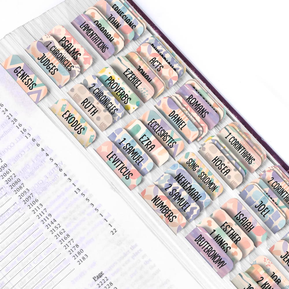
It is a tough choice between Options B and C. I do think that the congregants would ask to share mine if the tabs I use are from Option B. They are bold and three can read them comfortably. Option C works. Option A is not for me. It is artsy, but does not appeal to me.
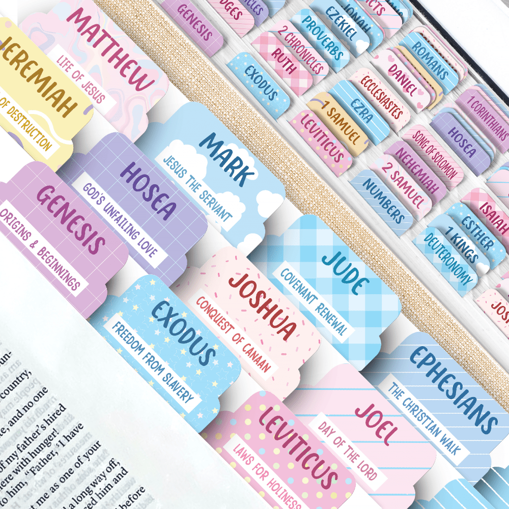
25 Responses to Option C
I find the text on these tabs more bold and easier to read.
I picked option C because the tabs are shown closer up and are more easily readable, and I like the pastel colors of them.
I prefer option C. I like the pastel colors on these tabs. They make it very cheerful.
Option C is the most appealing with the different colors and patterns on the tags. This image also shows the tags closer up so you can really see them.
I like C the best because I like how some of the tabs are plain and some are patterned. It looks less busy.
I like the colors and designs and option C and option b. I think they are very fun colorful and festive looking they make it otherwise dull product light up better seem more fun and have a pretty color with nice fun summer vibes.
I like option C best because it is the easiest to look at and most visually appealing image of the three. The picture shown for option B is difficult to see and know what the product is.
I love the colors and the overall look of C, the colors and the designs are really well done and pop. I like the colors with A, they remind me of C but I like he added detail with the prints on C.
I like the pastel colors of each tab .
I chose C first because I love the colors very much so pretty. I like the cute designs. I chose B second because I really like the purple colors and all the colors. Very fun and pretty design. So cute. I chose A third because it's very pretty colors so nice.
I chose option C because I love the larger tab size and the subtitles / summaries printed below the Book name. It gives me a quick reminder of what the Book is about. I also really liked the pastel colors and print designs. I'm very interested in purchasing these!
C, A first because the color designs are the most colorful and detailed which makes it the most appealingB last because the color design is a bit too much and overwhelming to see which makes it the least appealing
The name in B and A seems bit dull but the font in C is more bold, so I'll buy C.
I like the larger tabs with more detail. They are easier to read.
C is my choice. The colors are bright but I am also able to easily read the script.
The names are barely visible in B so I'll not buy it. A uses just black and simple font but C is colorful and bigger so I'll buy C and ranked A second.
The bible tab colors are so soft and pleasing. I find these colors to be relaxing yet the colors are strong enough to be noticed. The bible tabs look large and prominent and the designs are interesting. The option C bible tabs are the ones that I would choose, the color palette is just right for me
C is my favorite choice because it has bigger tabs with a nicer print. A is my second choice because it has the second-biggest size tabs with a clearer and easier to read design than B does. B is my third choice because it has the hardest to read tabs among all the choices.
It looks more hopeful with the rainbow colors which seem encouraging as well.
I like option C the best because, while the other 2 did have a pretty background, it make each tab harder to read. When you are looking for the book you want, you want for it to be easy to read.
I find Option C the most pleasing because I like the bright colors that all look very different. I would find this very happy and bubbly and a lot easier to find the sections that I am looking for.
This shows up better and I can read the names much better.
I just love this Bible Tab set. This Bible tab set has a colorful background with creative art and patterns. It looks bright, stylish, and joyful. These tabs also look inspiring and visually attractive. Compared to this bible Tab set, the other tab set looks less creative and less attractive. I found this Bible Tab set most appealing and aesthetically pleasing.
i really like option C. I find the colors and designs on the tabs very pleasing to look at and I think they are feminine.
I had trouble between C and A. They are both nice and easy to read the printing. C edged out a little. B has a background that makes it hard to read what is printed over the colors.
Explore who answered your poll
Analyze your results with demographic reports.

