Poll results
Save to favorites
Add this poll to your saved list for easy reference.
If you were shopping on Amazon for Bible tabs, which color do you find the most beautiful and aesthetically pleasing?

Option C won this Ranked poll with a final tally of 17 votes after 1 round of vote counting.
In a Ranked poll, respondents rank every option in order of preference. For example, when you test 6 options, each respondent orders their choices from first to sixth place.
PickFu requires a majority to win a Ranked poll. A majority winner differs from a plurality winner. A majority winner earns over 50% of the votes, whereas a plurality winner earns the most votes, regardless of winning percentage.
If an option does not earn a majority of votes, PickFu eliminates the option with the lowest number of votes. The votes from the eliminated option are reassigned based on each respondent’s next choice. This process continues in rounds until a majority winner emerges.
Scores reflect the percentage of total votes an option receives during the vote counting and indicate the relative preference of the respondents. If there is no majority winner, look to the scores to see how the options fared relative to one another.
| Option | Round 1 |
|---|---|
| C | 56.67% 17 votes |
| A | 23.33% 7 votes |
| B | 20% 6 votes |
Age range
Education level
Gender identity
Household income range
Options
Racial or ethnic identity
Religious affiliation
7 Responses to Option A
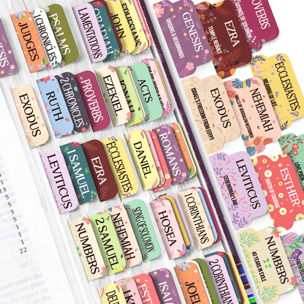
A is my first choice because it has interesting design prints, like florals directly on its tabs with the most brighter shade colors. B is my second choice because it has the second-highest amount of brighter shade color tabs with interesting design prints. C is my third choice because it has the plainest design tab prints among all the choices, which makes it the least attractive to me.
I like A the most because it also looks like it has a page that is colored/designed that also separates it. It's not just tabs for a pages already in the bible. I think this is a cool, fun idea to break things up a bit more. I also think the design is beautiful on this one so it is definitely my favorite.
I like the larger tabs and the cleaner fonts in this option. I also prefer the use of font colors in option A.
The patterns and colors in A look the nicest.
I like the options of colors and designs and option A and C the best. I find them very pleasing to look at abundant and coloring and more joyful and happy feeling when I look at them.
I chose A because I like the look of the designs and the tabs are easy to read.
I love all of these and like the fancier ones the best so prefer A, then B with C being last.
6 Responses to Option B
I prefer the name in black font which is more bold so I prefer B first. As the names in C is more bold in color than in A , I ranked C second and A last.
The colors in B stand out more. It's easier to distinguish one tab from another and find what you're looking for.
B The colors are alright. I like would like to see some darker colors. C I don't like the yellow tones. The colors are ok. A I only like a few of the colors. Darker colors and less design. Reach more audience for your product with less floral design and less pastel colors.
B, C first because the colors are the more colorful and the designs are the most detailed and minimalistic which makes it the most appealingA last because the design is a bit too much and overwhelming to see which makes it the least appealing
B first because it’s the most colorful and has the most options to choose from. A next because it seems to have a lot of options and it’s bright and bold. C last because the colors look like they are fading and not as visually appealing as The others.
I like option B the best because I like the color. I don’t care for pastel Colors, so I chose that one last.
17 Responses to Option C
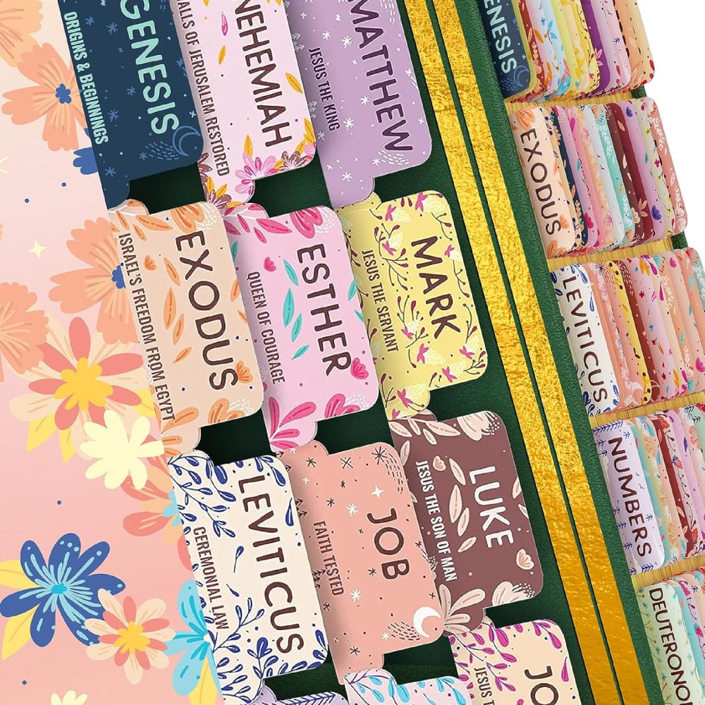
For me, the option C is the most beautiful and aesthetic. The option A is beautiful too. And the option B doesn't really please me.
Option C is not that saturated with the an appealing floral design that is well balanced and thus not overwhelming the text .The arrangement is clean and clear making it easy to access and read the book name
I prefer option C. I like the springy and light-hearted colors. They are cheerful and uplifting.
I would like the print to be large enough for the little kids and the old people (that officially includes me these days) to be able to read. Different colors are nice, pastels are better because the letters need to be most prominent.
C is colorful and I like the flower pattern in it so I'll buy C. The names are in bigger font in A so ranked it second.
I like that there are a lot of warm colors, and I also like the font.
These colors are not very bright or dark which I like a lot.
Definitely Option C because they're so much more prettier! Thank you!
These pastels are more elegant and feminine.
I like this option. I like seeing what the book is about, and it is in lettering that is big enough to see it well. I like the font that this is written in also. I think that this is easy to read and would make finding the books of the Bible much easier.
for me the brighter the better, it is more visually appealing
I like this Bible tab's image. This Bible tab set has different background colors. There are also different plant and flower art on the tab's background. This tab set has a pleasant and garden-like vibe. Just looking at these tab designs makes my mind at peace. I found this tab set's designs most beautiful and aesthetically pleasing.
I like the font and the style of the artwork in option c
c looks great a bit decorative as well as still easy to read and see. I also like the colors and the fresh springy look.
Easier to read the tabs in C. Not as flowery and the colors are nice.
I like the pastels because that is just my preference. I also like the option B. I think that the pattern on A makes the tabs to busy and hard to read.
I think that the tabs in Option C are the prettiest due to the font style used for the words and the solid, pastel color shades.
Explore who answered your poll
Analyze your results with demographic reports.

