Poll results
Save to favorites
Add this poll to your saved list for easy reference.
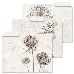
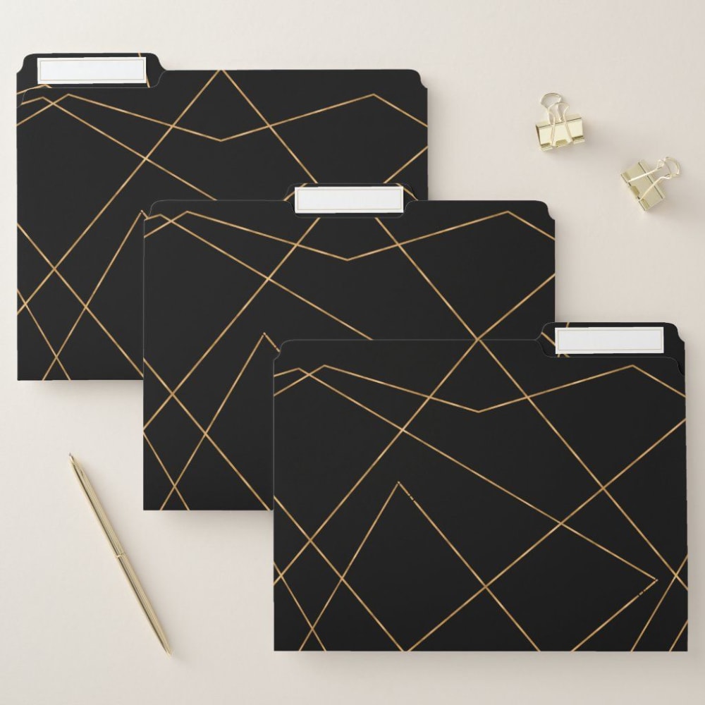
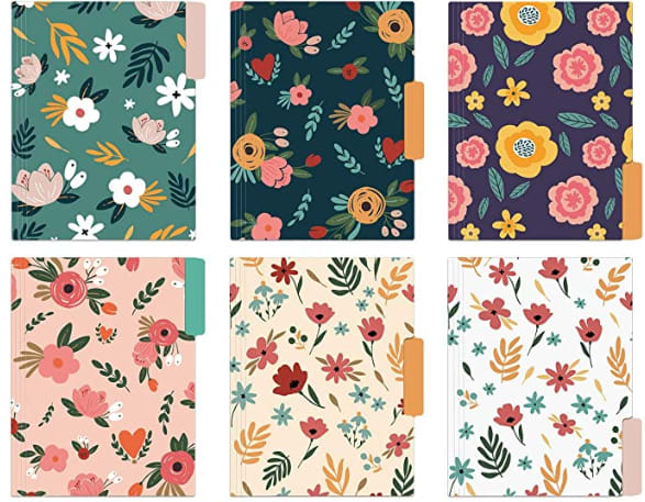
If you were shopping for decorative folders on Amazon, which design would you prefer and why?
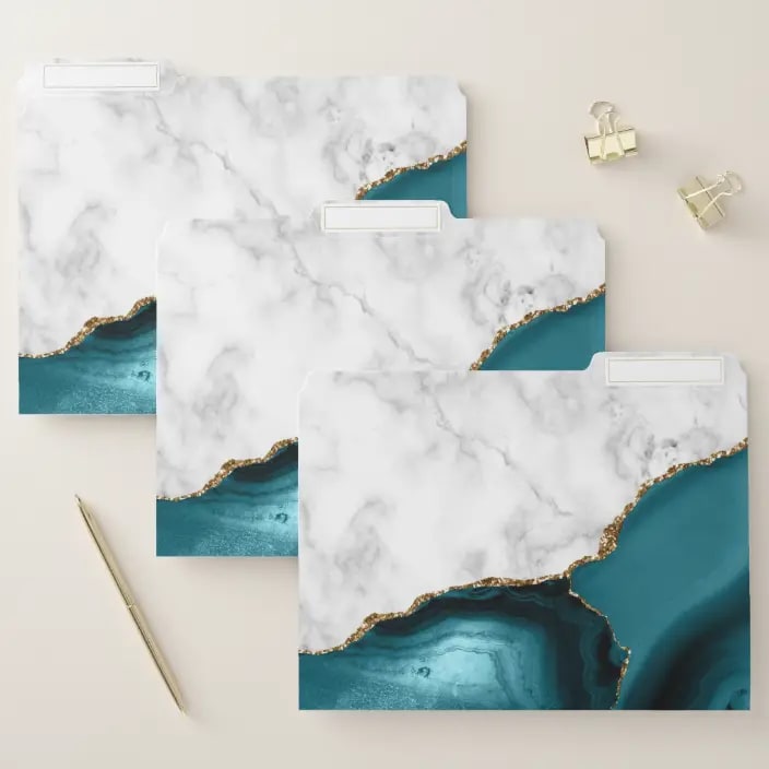
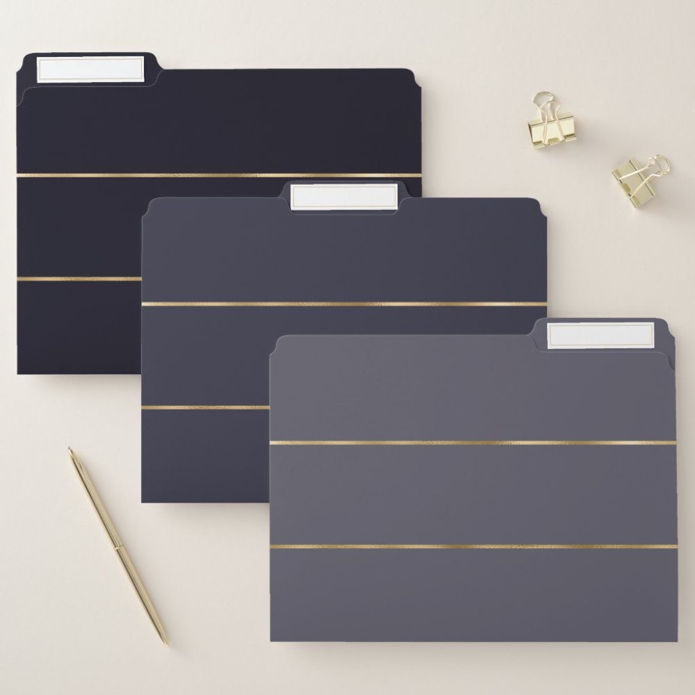
Option E won this Ranked poll with a final tally of 26 votes after 4 rounds of votes counting.
In a Ranked poll, respondents rank every option in order of preference. For example, when you test 6 options, each respondent orders their choices from first to sixth place.
PickFu requires a majority to win a Ranked poll. A majority winner differs from a plurality winner. A majority winner earns over 50% of the votes, whereas a plurality winner earns the most votes, regardless of winning percentage.
If an option does not earn a majority of votes, PickFu eliminates the option with the lowest number of votes. The votes from the eliminated option are reassigned based on each respondent’s next choice. This process continues in rounds until a majority winner emerges.
Scores reflect the percentage of total votes an option receives during the vote counting and indicate the relative preference of the respondents. If there is no majority winner, look to the scores to see how the options fared relative to one another.
| Option | Round 1 | Round 2 | Round 3 | Round 4 |
|---|---|---|---|---|
| E | 32% 16 votes | 34% 17 votes +1 | 40% 20 votes +3 | 52% 26 votes +6 |
| A | 20% 10 votes | 22% 11 votes +1 | 30% 15 votes +4 | 48% 24 votes +9 |
| D | 26% 13 votes | 30% 15 votes +2 | 30% 15 votes | Eliminated 15 votes reassigned |
| C | 14% 7 votes | 14% 7 votes | Eliminated 7 votes reassigned | |
| B | 8% 4 votes | Eliminated 4 votes reassigned |
Age range
Amazon Prime member
College enrollment
Education level
Educator, coach or teacher
Gender identity
Options
Personal income range
Racial or ethnic identity
10 Responses to Option A
I really like A and think its really pretty. I also like the geometric design on C.
Option A is my first choice because the colors and design are comforting and inspiring. Option C is visually appealing with the different angles the gold lines make. Option E is okay, but the lines are not as appealing as Option C, these are boring. Option B is okay, I just don't really like the blandness of the design. Option D is vintage, but not cool vintage. It looks old and dingy.
I chose A first as I absolutely LOVE the ocean or gem type of look in general. Option B was next because I love the white background and prefer it usually. The flower are old school and look real I really like that about these. Option C was a cool black color with the squiggly line, I would use these in a more formal office setting or a males paperwork most likely. Option E is uniform and nice. Love the clean gold lines. D would be my last choice as they seem a bit too colorful for my taste, too many colors used, flowers look fake, etc. I also don't like so many different colored folders in general as I prefer things to match and not look so gaudy.
Some of these designs are real works of art and would be very interesting to have them as folders, especially having A would be a real conversation starter I imagine
Option A reminds me of the ocean and it just seems nice and a good design. Option C is simple but with an interesting design. Option B is ok, the image of the flower is nice. Option E and Option D i am just not a fan of. E is just boring and D feels too cluttered but also boring.
The first 3 are decorative enough and fit in any design, office, living room etc. The last look forced as in "look at me I am decorative".
I like option A' best because the design's color fits so well together and makes it more appealing.
The color scheme that A has really wins me over. The blue works really nicely with the white with the gold tints. D came fairly close as I like all the colorful floral designs but it didn't pop out to me as much as A did. B had an alright design but seemed a little too safe for my liking. C and E had pretty boring designs overall. So ultimately I went with A as my choice.
A is my preference and I would buy it because I love the unique and elegant style, which I find very contemporary. The colors are fabulous and very eye-catching. These would be easy to find and use. They would be my "signature" files!
A is really cool and very unique! I think these would be ones I would never file away in a cabinet. I love the look of B as it is also very unique and has a special quality to it as well. These are meant to be seen and make a very bold statement. D is kind of "cutesy" and spring-like, and may be good for a design firm or shop, but not really office-like. The black and darker looks of C and E are very professional looking, especially with the gold accents on both. These would be very good for any professional office setting, giving a special and different look, but maintaining a professional standard, while not being a plain, boring manila folder. These kind of scream "professional" to me.
4 Responses to Option B
Choice B is the most preferred as I like the light color with the artsy flower. It wasn't too busy to look at and the design could help with organization. E's design was basic and I like that when organizing my folders. When the design is too busy, I find it aggravating to keep in order. D is next because the colors of the folders could help me know what is in each. These are nice to look at. C is next because they are dark in color and the the criss-cross design is too much. A is last because I can't tell exactly what the design is in the picture. Either way these folders are something I would want to use. They have too much going on. B is the best and one I would purchase!
I selected option C last because I felt the design of the folders was too distracting, chaotic, and not at all aesthetically pleasing. An office should give off a vibe of organization and calm, and I just felt that the folders in option C as well as option A lack a sense of peacefulness and and management. Option E, while a bold mix of color, was much more aesthetically pleasing to the eye, yet the darker color feels less creative and somewhat more of a harder choice as opposed to the choices of B & D. Though quite feminine, option D offers a lovely array of floral prints which feels calming while still preserving a sense of organization. I really liked how options D & B feature several different examples which can promote visual organization while still making filing fun and creative. My favorite choice is option B because the designs are subtle and incredibly calming. In fact, just today I was thinking about updating my file cabinet and almost purchased plain manila folders from the big box store. It would make me so happy to order folders like those in option B as they would make a quiet and peaceful impact to my office as well as offering me the opportunity to showcase my own personal style. Sometimes it's the little things that make all the difference. I would definitely select options B & D rather than options E, A, and C because there are a few different choices which help with organization (and every person can use help with that) and because they offer prints that allow consumers to express themselves in subtle ways.
B and D have a variety of folders where each is distinct from the rest. This is far more fun and interesting vs having all the folders with the same pattern. B is especially elegant and beautiful.
My first choice would be option B. I like this one best because it is neutral colored and has attractive pictures. I like the look of dried flowers in pictures like this. There are three different picture designs which I like that as well.My second choice would be option A. I like the contrast between the light marble color and the pretty blue/teal color. I also like the streak of shiny gold. It looks a bit sophisticated and like a precious rock has been broke open.My third choice is option E. This option is simple but nice looking. The black and gray folders are nice and simple, and the gold lines add a bit of sleekness to the design.My fourth choice is option C. This design is good because the black contrasts nicely with the gold lines, however, it is a bit too busy of a design in my opinion.My last choice would be option D. I typically like flower designs but unfortunately, I don't really like these flower designs and wouldn't want them on my folders. Looks like old 60's flower designs and is a bit too much for me.
7 Responses to Option C
Options C and E are the best as while they are simpler than the other designs, they are very refined and elegant as well
i REALLY like these black folders with the lines, coming in a close second is swirly pattern, looks almost like gemstones to a point
Personally as a guy, I really like the minimalist designs of C and E the most. I know a few female colleagues that would really like D because of the different color and design options. B is also nice, but a bit more boring compared to D. I don't think the marble texture looks very good on A.
I like basic which is why I liked C. B and D just don't fit me. As for designs, I like A since it is neutral and unique.
C and E are my first choice. They are not Manila colored but have a sleek professional look. I would buy D for my home office as they are colorful and kind of cute. I would not buy A or B. I didn’t like the motifs. B especially looks like weeds.
C is most appealing with the black background and gold marble effect. A is a little abstract, like the marble 'sand' and ocean washing on it. The black with 3 gold lines is neat, clean and appealing. Simple, elegant and sleek. D would be fine if someone is into floral print. No my taste.
I like C the most. I think that the design on this one is so elegant. I also like the fact that these are all the same, giving it a more uniform look
13 Responses to Option D
My favorite is option D I love the floral print it's very colorful and nice to look at. I also feel it will be easier to organize notes because they are different colors
I like option D with several different patterns so easy to differentiate. It's my first choice. B is also good in that they're different but not as many options as D. E looks professional and even but they're all the same, so not one I'd chose. The waves of A might be nice if I didn't need to tell the difference in them and I don't like C at all, too busy.
I really love the different floralPatterns. I love the various color choices.
The colors and different flowers of D are so pretty. I love them; they are well drawn! I like gardening so of course B is interesting in that aspect. A is pretty and looks like marble but is too abstract so distracting. E is quite plain and C is chaotic with the lines going every which way.
C looked visually distracting and cluttered and both E and C felt too dark and heavy. I loved the subtle femininity of the florals in D and thought A's colors were more bright and refreshing than B's.
Option D is the best because of the variety of colors and designs on the folders.
For me, E is last because the design seems a bit too typical to me and it just doesn't pop out for me as much. From there, I put C towards the end because the black doesn't feel too special or unique to me either. I Love D though because the flowers and the color are amazing. I love how it pops out for me. From there, I love the floral design of B as it feels calming to me and also elegant
Option D is bright and cheery and they make you feel good to use them.
Option D is my favorite because not only is the design rich and beautiful but each one is different which will help when using them for different subjects
When looking at the folders the first thing I would have to decide was where they are going to be placed and what are they going to be used for. If they are going in a file cabinet than I actually like E and C the best but I imagined since I'm a teacher they would be out and viewed at daily. I think D is by far the best design because they are subtle in color but also professional.
I like the floral designs the best. They are eye catching and make this product stand out. I want to be able to spot the folders from across the room.
I liked D and C the best because they look very girly and pretty. I think it's fun to look at pink stuff and flowers.
I like D because I like the floral design.It makes a file look petty even in a cabinet or sitting neatly on your desk
16 Responses to Option E
I love the simplicity of the black folders to go along with the gold lines. It just seems classy and very elegant. Something that would make the files that go in it seems of great importance.
I prefer option E because it’s decorative but still simple. I don’t use many folders anymore so I would want a design that isn’t too trendy but definitely not retro looking like option D.
E is beautiful and very professional looking so I love how organized they look together. B is whimsical but still standard and professional colors. C is geometric and interesting but it's also darkly colored and it makes it look more together and strict. Option D has nice flowers and patterns, but is too busy for me. Option A I don't care for at all. I don't like the colors or the design.
I want my file folders to be professional, and not draw attention away from the content of a meeting if I brought them with. I would want them to be sleek and not too busy to increase stress, which is why I choose E. C is probably my 2nd for the same reason. A is better than B and D, but only because it doesn't have a floral print. A is too busy, which could increase stress. B and D are floral, and not very masculine.
E and C are the classiest folders. They look good and are elegantD would be my next choice. The folders look bright and cheerful
Choice E and the simple black color with light tone and design makes it the most appealing choice for folders.
i like the decorative folders in option E the most because they have a somewhat plain design with subtle gilding of gold
B and D seem too femine E and C look more professtional they are basic with no imagry which looks most professional so it is what I would use
Option E can appeal to anyone and not a specific demographic. Option C does this as well just not as appealing. The other choices are geared towards specific demographics and won't appeal to as many consumers.
Options E and C are my favorites because they are more professional looking and have a classy looking design.
The first choice is more sophisticated and clean. The second choice was along the same line. I then chose the least busy design that was still appealing. The last two I did not like. The green color reminded me of an old lady’s home and the flower patterns just turned me off
I generally prefer more neutral color toned and themed products. I do not care for fancy patterns or embellishments.
I LOVE options E, C, and A. E is the best because it's very clean. C is second because I do like gold and black in general. A is beautiful because its like a glamorous take on nature.
Option E would be my first choice . Given the office setting I prefer solid colors verses bright and dramatic. Option C is relatively close to that theme. Option B is doable with the minimal approach in color. Option A and D would be the farthest from my mind. They are very bright and dramatic. These two choices will best be served in a school setting, art class ect..
I like the simple abstract folders such as C and E. I like the color scheme of A but its too much white for me. I be least likely to choose B and D because I'm not a fan of flowers.
I like the designs on all of them. But I would probably only use E and C. They are very subtle. I like that for a folder
Explore who answered your poll
Analyze your results with demographic reports.
Demographics
Sorry, AI highlights are currently only available for polls created after February 28th.
We're working hard to bring AI to more polls, please check back soon.

