Poll results
Save to favorites
Add this poll to your saved list for easy reference.
If you were in the process of buying a high-protein, plant-based meal replacement powder, which design would you prefer and why?


Option A won this Ranked poll with a final tally of 29 votes after 1 round of vote counting.
In a Ranked poll, respondents rank every option in order of preference. For example, when you test 6 options, each respondent orders their choices from first to sixth place.
PickFu requires a majority to win a Ranked poll. A majority winner differs from a plurality winner. A majority winner earns over 50% of the votes, whereas a plurality winner earns the most votes, regardless of winning percentage.
If an option does not earn a majority of votes, PickFu eliminates the option with the lowest number of votes. The votes from the eliminated option are reassigned based on each respondent’s next choice. This process continues in rounds until a majority winner emerges.
Scores reflect the percentage of total votes an option receives during the vote counting and indicate the relative preference of the respondents. If there is no majority winner, look to the scores to see how the options fared relative to one another.
| Option | Round 1 |
|---|---|
| A | 58% 29 votes |
| B | 20% 10 votes |
| C | 16% 8 votes |
| D | 6% 3 votes |
Age range
Amazon Prime member
Gender identity
Nutritional supplement use
Options
Recently purchased categories
29 Responses to Option A
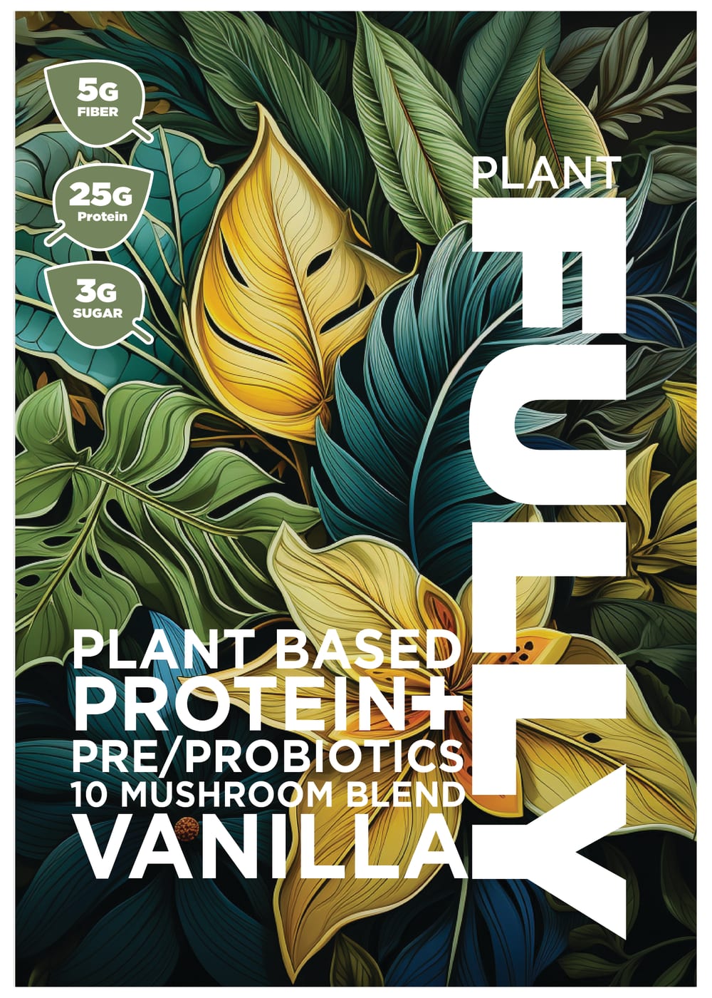
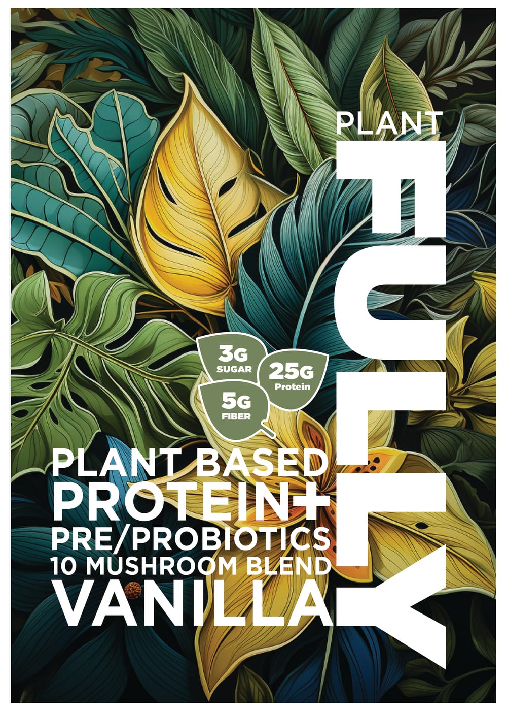
I like that option A features the fiber, protein, and sugar content of this product. I also like the placement in the upper left of the packaging, it fills that space in nicely. It feels too crowded in option B.
I prefer the package designs that show the protein, sugar, and fiber. However, these nutritional facts get lost amongst the foliage background in all but option A. I would even suggest putting the facts in little white circles in the top left corner.
The layout of the information of this product I can read nicely in choice A that I would look into this product based on this layout
I like the extra information that A and B provide, but they are all very nice.
I think option A is the most attractive because the details are easy to spot and easy to understand. Option B is a close second though.
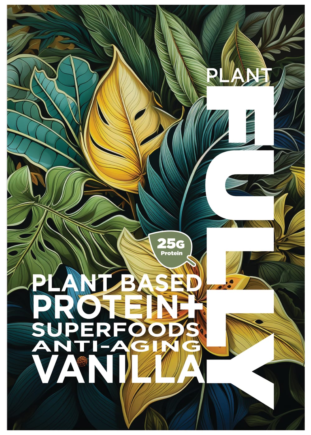
A is my top choice because I like prebiotic and probiotic foods/drinks and the design seems the most balanced. B is my second pick because it includes all of the bubble details. D is my third pick because it's missing some of the nutritional label details, but it's still a pre/probiotics formula. C is my least favorite because "superfoods" and "anti-aging" are very generic terms nowadays.
I like the little leaves with the nutrient amount to be well away from the rest of the text so they don't interfere with the design.
A I liked the details on top left side more then the others.D, C, B all look similar enough but I thought A detail wise was a bit better.
A I feel has the best design to it that is informative and is able to flow well.
I prefer option A. I like the way the beautiful artwork is framed. I like the info and where it is.
The health benefits were called out more clearly in A.
I prefer this version because of the placement of the icons. Does a great job showing the amount of fiber, protein and sugar in the powder.
I like Option A. I feel the design makes great use of the space. It gives me room to read all of the information.
I like that it includes the amount of sugar. This could help people who are watching their sugar intake.
The little leafs of info are nice to have. Option A stands out a bit more than B, which blends too much with the background. More info is better as well, and I don't care for the "superfoods" buzzword in option C.
I like how all of the nutrients and their amounts are shown on this design the best. I like that they are at the top. I also like that they are in a column and very organized used and go from one to another
I like that A mentions pre and probiotics and puts these in a good spot that looks organized within the design.
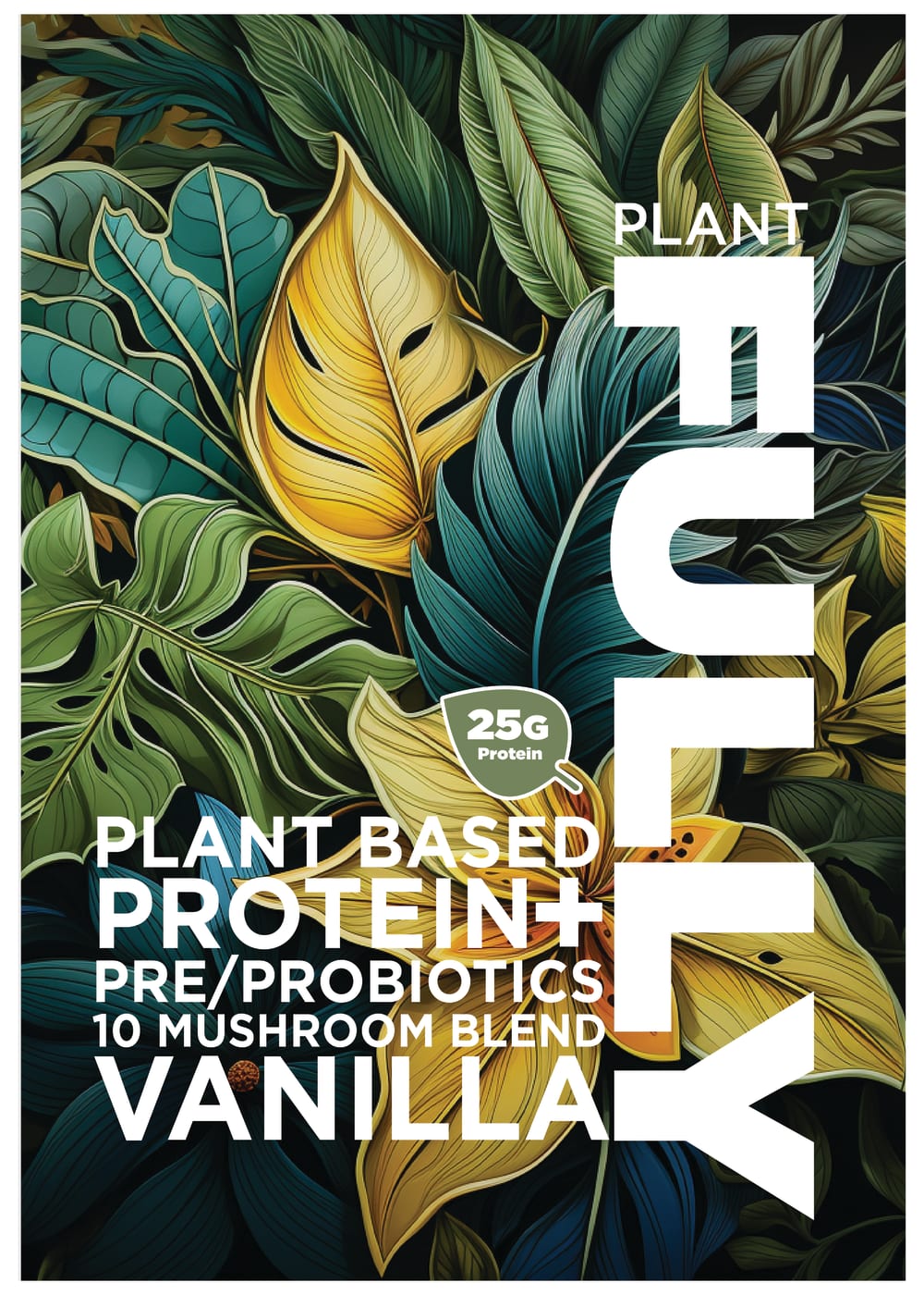
Option A and B, I liked that it contained more information than option D. Option A, I liked the placement of the protein amount in the corner. It made it easier to read. Option D, I liked that it mention its 10 mushroom blend unlike option C.
I chose option A. I think the three bullet points are helpful and they look the best on the top left. If you look at option B, they look awkward the way they are clustered, I think them being lined up looks much better.
I like that A clearly indicates the amount of fiber and sugar
I like Option A as my first choice. The layout looks sharper, more detailed and clearer than the other options. Option D is also quite nice with a pleasing simplicity and a little plainer look. Option C & D are equally nicely done and in fact all the options are lovely and look wonderful.
I like the offset infographics. It's not as busy as the three together with the other text
The packaging design for the product in A has a very aesthetic design, the product information and features are well arranged on the cover with some nice typography and vibrant colors. It also has a nice flower imagery that makes it even more attractive.
Information at the top in Option A is better. Bubbles are easy to see and understand.
The nutritional details are more organized on Option A and beyond that the differences in the details don't really grab me. Anti-aging is more informative than "mushroom blend" however.
They list the nutrition facts on the side of the advertisement
It helps seeing the fiber and sugar content and I prefer to see it off by itself in the upper left corner cause it looks cleaner.
I prefer option A because this design shows information in a more balanced and better way.
Better to have the amounts listed on the front easy to find.
10 Responses to Option B
B and A contain more information in the label just in differend locations. D and C have less info at a glance
I didn't even notice when the icons were in the corner, but I did like that three were shown so that I have more info about the product.
I like the amount of information and the placement of it on this one a little bit better than the other ones.
Option B lists down the sugar, fiber and protein level in a manner that makes them clear to me. This makes it more authentic.
I think showing the additional nutritional metrics on the front of the package is necessary
I like Option B the most since it shows the fiber, protein, and sugar amounts in a cluster that looks like a bunch of leaves. It's the most aesthetically pleasing presentation.
Options B and A have nice designs telling you how much fiber, sugar and protein is in the product.
B is the best as the amounts of protein, fiber etc are shown at the center of the package. C is the worst as the word 'superfoods' is vague and not specific enough.
I like choice B because it has all the nutritional elements grouped closely together to the name of the products.
I like B, the design of it really ties into the branding of the product. I love how all the nutritional information is grouped together as a bunch of leaves. It ties in so well to the brand itself and just makes it feel very organic.
8 Responses to Option C
Anti Aging has me sold. The strong antioxidants found in plant protein is amazing and can fight cancer cells and also prevent complications like inflammation and other problems with heart, liver, kidney and major organ problems. This also promotes a healthy lifestyle that will help the user remain active and keep a positive outlook on life.
I prefer C because it highlights anti aging which is something I am interested in. I do not like that it does not list its a mushroom blend, I would like to know that
I would prefer the design of choice C because it just gives me the basic information that I need to know at first glance at the product. After that I can look on the back of the box or whatever it is to get more information. the Anti-aging printed on the image catches my eye and makes me focus on that image the most.
For a high-protein herbal meal replacement powder, I prefer the "Option C" model, because when I look at all the other products, it has the only "Anti-aging" option, despite the fact that these 4 products have more or less the same characteristics. It's the highly sought-after "Anti-aging" option that drew me to choose it as my favorite.
the design of option C is very interesting, it is more consistent with the product in question, the 25g protein content being placed alone in the design is less distracting than others whom placed the up to three nutrient formular
C and D look the best to me to me because of the graphics on it
C is my first choice because it does not emphasize the mushrooms (not a mushroom fan). B's my next choice because I like how the "leaves"/bubbles containing information cluster to mimic the background pattern. I don't like how A's informational bubbles are organized; it's too formal for the organic feel of the design, but at least there are more informational bubbles that D.
i prefer c because it emphasizes anti-aging.
3 Responses to Option D
I like the look and design of the packaging in option D the most, so that is the blend I would choose.
The font on "D" is the best of the four. It is arranged very nice.
Option D provides useful information and looks better. I don’t like looking at the lead clump on Option B. I think the information on Option C if less useful than the information on Option D that tell us about the prebiotics, probiotics, and mushrooms. I don’t think anti-aging is very meaningful if it doesn’t tell us how it’s anti-aging.
Explore who answered your poll
Analyze your results with demographic reports.

