Poll results
Save to favorites
Add this poll to your saved list for easy reference.
If shopping, which photo would make you more likely to purchase?
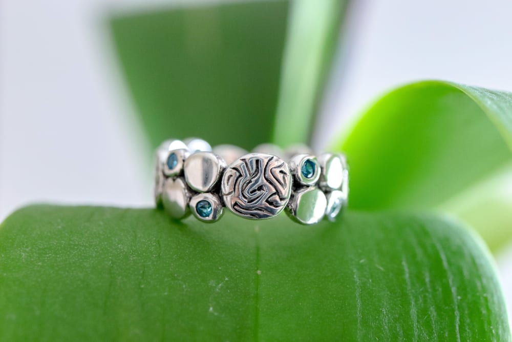
26 Responses to Option A
I like seeing the center part of the ring. It is awesome
A is the better option because you can see it clearer.
A is more clear and easy to see than B.
I liked seeing more of the stones as I felt as thought I was getting more for my money.
Like the background makes it more appealing to see the jewelry
YOu can see the ring in this one better than the other one and the green back ground helps it to stand out.
This is beautiful and in focus. I will buy first.
A displays the ring most beautifully. I don't like option B because it's not realistic. I'm buying a ring to wear it and to accessorize, not to have it sitting around near nothing.
they look like different designs, and i think a is a little better
I find the design on A much more appealing than the way it's presented in B.
I think that the natural, green background gives more contrast to the colors on the ring, which makes it look more expensive and high-end. I think the photograph is very professional and allows me to really see the detail on the ring better than option B.
I feel like I can see so much more detail without having to focus that much in the option I chose. The other option is just odd and unsatisfying to look at.
Better angle,looks a little more high quality
Although I'm not too excited about the background of Option A (is it a plant?), I do like the contrast it provides. This is a beautiful ring and the details get lost in Option B. You need a contrasting color background to be able to fixate on all of the intricate details of the ring. Therefore, the ring DOES need to be presented on a colored background--I'm not not sure if the leaf (don't know what the ring is sitting on exactly) is the exact thing it needs. You're on the right track though :-)
The background really brings out the colors and hues of the ring, making it look extraordinary.
i like a because it shows you all the details
I would actually consider either photo, they both look good to me. But since I have to choose, I went with A because it is more interesting to look at.
The background in option A sets off the ring very well and offers a good contrast
I think sitting on the green leaf the ring really stands out and pops. It attracts my eyes seeing the bright color in the leaf. I think the focus and details is shown better in the choice image a too. Compared to the choice image a.
The green background enhances the image.
this is a nice straight shot of the ring, and putting it against the green makes it easier to see
I perfer the more full frontal view
The green makes the ring stand out.
I chose A, because the contrasting colors from the leaf make the details in the ring easier to focus on, and I prefer that angle.
Option A seems like a more realistic photo and I feel like I can see the product better with the angle. The background isn't too busy to distract from the product
I like viewing the brain/fingerprint-like pattern as the centerpiece of the ring. I also think having it on a leaf gives it a pop more of color that makes me want to look at the ring more. B is kind of boring, and I would scroll past it, whereas A caught my attention and I wanted to figure out what the pattern in the middle was supposed to be.
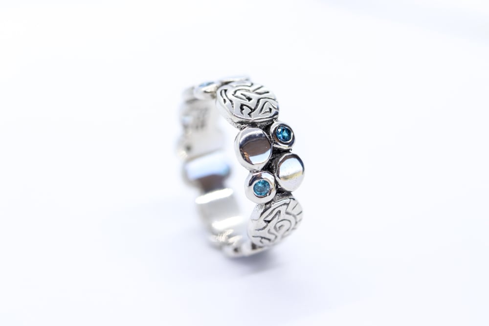
24 Responses to Option B
I find the leaf distracting. I had to stop for a moment and figure out what the product was resting on and once I realized it was a leaf, I wondered what the connection was. I much preferred B as it allowed me to focus solely on the ring.
Would like to pick option B is the best photo which is more likely to click on the product, great design with amazing style
I like the ring turned to see the stones, but I also like it positioned on the leaf. Use a combination of the two designs for the perfect image, rotate the ring so the stones are the focus point, but have the ring placed on the leaf to add the color and natural look.
I like the simplicity of the photo to better show the diamonds and the ring features
The colored background in choice A is a little distracting and takes away from the actual product itself.
PREFER B, I THINK THE RING STANDS OUT MORE WITH JUST WHITE BACKGROUND
Option B is appealingly clean. However, other views of the ring should also be provided
The ring is easier to see with the white background. The white background makes the ring look classy, while the green natural background of A seems out of place.
I like the more simple background.
I chose B because the overall design and colors are clearer with the clean background. Option A takes away from the colors and design, making it too distracting.
B SEEMS TO STAND OUT MORE CLEARLY
I likeOption B better for two reasons. The first is that I think the stones stand out better against a white backdrop than a green one, and the second reason is that the vertical rather than vertical placement of the ring in B makes the picture look a little more interesting given that rings are more commonly displayed in photographs at an angle more like A's. (That said, I do also like the plant element in A. That's a more creative shot, but I think that B is more elegant, and that suits the ring a little bit better.)
I think the details are much more easy to see and comprehend. The nature is a bit distracting so just a white background with the product will be more appealing in my eyes.
B because of the plain background. I am not distracted by the plant like in the other image.
I think in this plain picture, you can see more of the detail of the ring (?) rather than seeing the plant in the background.
I don't like the distracting green thing in the background of the other image
You can see the product better in B without the distracting background
You can see the details of the ring better in B.
I love how simple the ring looks in this picture. You get a clear understanding of what the ring looks like. I don't like the one that is sitting on the green leaf because it is kinda of distracting.
I prefer the plain background, as it allows me to focus on the product instead of the background details. I find that the ring stands out and I can get a feel for the product alone rather than being distracted.
I like B the most because I only want to look at the jewelry and not be focusing on the background. I want to concentrate on the piece instead on the background since I will be wearing it.
Unique and nice looking product
I love the simple focus on the ring in this image. The other images makes the ring look like a bug on a leaf.
A just looks weird sitting on a leaf. There is no correlation and it doesn't help bring out the colors. B is simple and just right.
Explore who answered your poll
Analyze your results with demographic reports.
Demographics
Sorry, AI highlights are currently only available for polls created after February 28th.
We're working hard to bring AI to more polls, please check back soon.

