Poll results
Save to favorites
Add this poll to your saved list for easy reference.
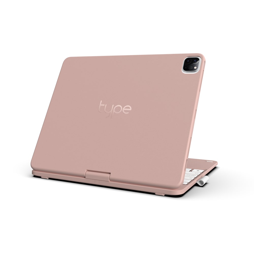
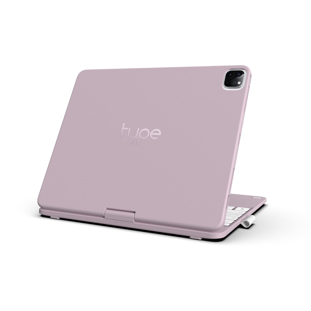
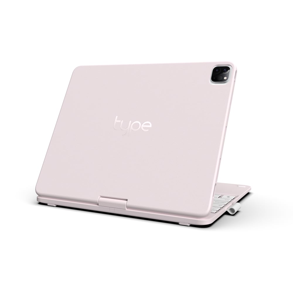
Based on the product color, which keyboard case would you most likely buy for a new 2021 Apple iPad Pro 12.9-inch (the biggest iPad)?
Option A won this Ranked poll with a final tally of 28 votes after 2 rounds of votes counting.
In a Ranked poll, respondents rank every option in order of preference. For example, when you test 6 options, each respondent orders their choices from first to sixth place.
PickFu requires a majority to win a Ranked poll. A majority winner differs from a plurality winner. A majority winner earns over 50% of the votes, whereas a plurality winner earns the most votes, regardless of winning percentage.
If an option does not earn a majority of votes, PickFu eliminates the option with the lowest number of votes. The votes from the eliminated option are reassigned based on each respondent’s next choice. This process continues in rounds until a majority winner emerges.
Scores reflect the percentage of total votes an option receives during the vote counting and indicate the relative preference of the respondents. If there is no majority winner, look to the scores to see how the options fared relative to one another.
| Option | Round 1 | Round 2 |
|---|---|---|
| A | 42% 21 votes | 56% 28 votes +7 |
| B | 34% 17 votes | 44% 22 votes +5 |
| C | 24% 12 votes | Eliminated 12 votes reassigned |
Age range
Amazon Prime member
Education level
Gender identity
Options
Personal income range
Racial or ethnic identity
Tablet device
21 Responses to Option A
I picked Choice A because I think the color is a nice neutral color. If I buy the case I would buy one for myself and my husband so I think Choice A is a gender-neutral color for both him and I. Choice B and C has a lighter color but I think the purple and pink are not eye-catching as Choice A. I also think Choice A would not get as dirty as Choice B and C.
I liked that A was the most feminine with its rosy pink color; C also felt feminine with its light pink; B felt a bit dull and depressing to me.
A is my 1st choice because the color is cute, girly and not easy to be dirtyC is my 2nd choice because it's bright and nice, looks clean but easy to be dirtyB is my 3rd choice because the color is light purple or a little turn to purple
I love the pink. The lavender was nice. White is too common.
C is too white. I like the peachy color of A the best.
i like the warm tone of this color and i think it looks kind of neutral
A! Rose Gold is my favorite color! I love the light pink as well and actually I love all of them!
The warmth of color option A, neutrality of C; didn't like shade of B
I like A because it's peach/pink tone is very neutral and stands out with being too much. I like C next because it looks very bright and neutral and has a better color than B. I like B the least because the color is to purple looking for my taste.
option A: I am obsessed with this old rose color. it is unique and really hard to obtain and or buy in time before it sales out. For the popularity of this color I would go with this option. option B and C: these colors are usually always available, there are not as unique and or sought after.
Option A is the most visually appealing and grabs your attention more right off the bat. It seems like it is the most unique and would be something that most people don't have. It also has a more universal look to it that would appeal to both genders and they would find it more fun and exciting. I also think it would match better with other items and would be easier to blend in. Option A would appeal to more people and would make them more likely to check deeper into what it has to offer.
I like option A the most because of the tone, its a war tone that is different to many of the products available in the market. I like it because its original and also has a serious tone to it. B is my second favorite choice because the logo of the brand shines and stands out. C is no t bad but the logo tends to get lost and I think the logo is great.
I selected the colors that I liked best for the keyboard case, based on my personal preference.
I like the color in Option A because it is a very appealing Rose Gold color. This color is neutral, but still has a bit of color to make it pretty and appealing to the eye. I do not like Options B or C nearly as well as Option A. Options B and C are a lavendar color that are usually appealing to only a small proportion of people. Option C just looks faded out.
Option A has the warmer tone I'm most attracted to give the options presented. Option B is a close second if Option A wasn't available for some reason.
I really like rose gold, which is what drew me to A. I like the darker lilac on B too, so that was my second choice. C was okay, but not as pretty as A or B.
OPTION A IS ACTUALLY MY FAVE BECAUSE OF THE COLOR. I ENJOY LIGHT PASTEL PINKS. I ALSO CHOSE OPTION C LAST BECAUSE I FEEL THAT COLOR WOULD GET GRIMEY QUICKER.
The pink one looks most lovely, mellow and feminine. White looks classic while purple is not a color that crosses my mind for a keyboard case.
I loved A’s color with B being a close second. I personally strongly dislike the color pink.
I prefer choice A because it is a more neutral shade of pink.
Darker color seems more appealing and seems least pink or white.
17 Responses to Option B
The purple and blush pink are so pretty. C is too light pink, where is almost just looks like a dirty white
I like the rich look of B. Looks very classy and pretty.
I like the option B because of the pink and how bright it is.
Not really crazy about any of these colors as I prefer any blue color but I would choose option B.
I like choice B because I feel that the color is dark enough to be feminine but strong enough stand out.
Option B is more my color vs the others. I like the mauve color alot
I really like the color it's just the right amount of pink without being too girly, A is not bold enough and C is too light.
I like b the best because I like the lavender color. C is my least favorite because it’s so light that I think it would get dirty quickly.
The first shade is perfect. The second one is a bit too pink but I'm not a fan of the last one.
B) This is very close to my favorite color A) I like this color but not as much as the first C) This color is too late. I don't like it
I like purple, so I like Option B. I think Option C is too light, I feel like light colors get dirty or scuffed and look dirty more easily.
I chose my answers in the order that I liked them. Option B is my favorite because I like the color the best.
My favorite color is pink so I would go with the one the is the brightest pink. I am not a fan of the palest pink.
I liked the color for option B the most. Option A, looks nice but typical with the rose gold color. Option C, looked a bit plain.
B is the closest to purple which is my favorite color. A reminds me of hospital vomit basins.
They're all nice! I wouldn't mind any of them. So I just chose quickly but it really wouldn't matter to me.
I like B the most because it is the closest color to my favorite color, blue. I like C next because I dislike the color of A most. I wish there were more options to choose from like darker color options.
12 Responses to Option C
The shade of color in option C is so pretty and feminine. I would love to have that color on a computer. I would not even consider any other colors if I saw the color in option C. I would purchase it right away. It is a color that I would not ever get tired of looking at
I would buy option C because I like the light baby pink the most. I think it’s girly and cute and not too flashy.
I like the lighter color one best. B would be next. I like that color. I don't like the color of A.
Pink is my favorite color so I would go with Option C. The next closest color to pink would be Option B.
I like C the most because it reminds me of a cream or off white color that would stand out but still look elegant and refined.
I think the lighter product is the cutest. After that, I like the the pinkish more than the lilac color.
Option C was the least bad for me. None of the above wasn't an option.
I like that C is light and discrete. A and B are both too bold, bright and feminine for the masses.
I like option C, it's a really pretty light pink, perfect for spring. I do like the mauve in option B, The color in option A is a little too peachy for me.
C is pleasant and not too bold so it would be my first choice. B reminds me of a rose gold color, which I love, so that was my second choice. A was too pink and I thought I may get tired of it.
They all appear pinkish in color so frankly if that is the case I wouldn't buy any of them. But if that isn't the case then C with it's more white color would be my choice and A with it's pink color won't make it.
I just prefer the white one/lightest color. The others are too bright.
Explore who answered your poll
Analyze your results with demographic reports.
Demographics
Sorry, AI highlights are currently only available for polls created after February 28th.
We're working hard to bring AI to more polls, please check back soon.

