Poll results
Save to favorites
Add this poll to your saved list for easy reference.
Based on the packaging design, which product would you rather buy?
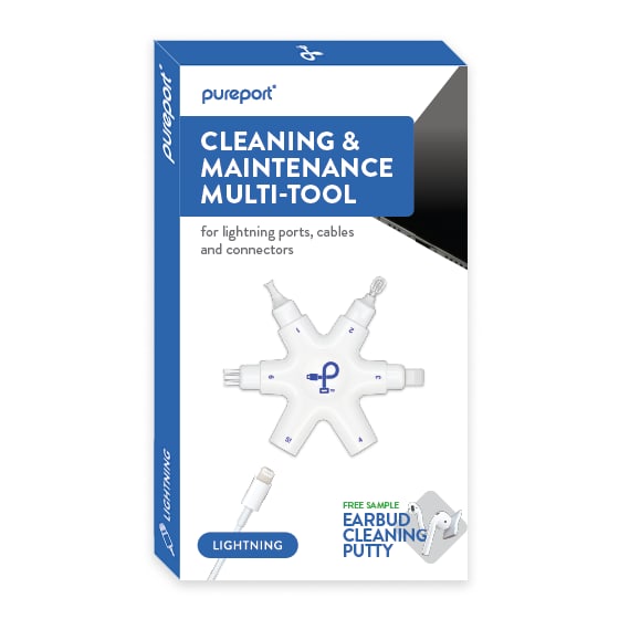
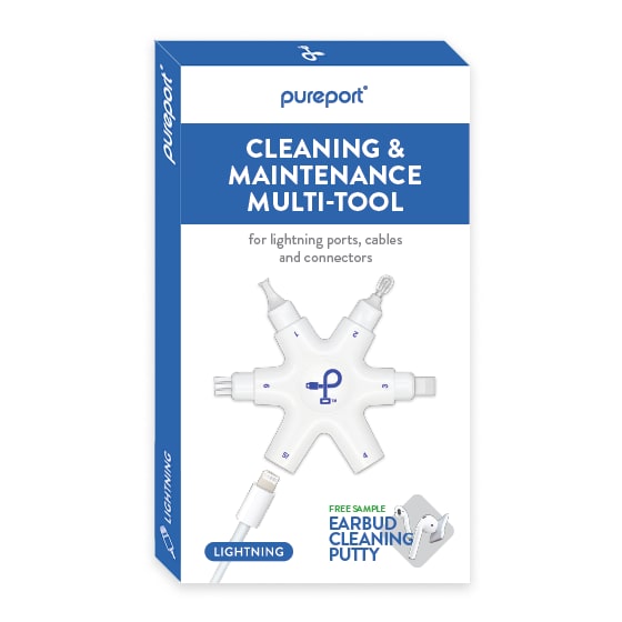

Option B won this Ranked poll with a final tally of 53 votes after 1 round of vote counting.
In a Ranked poll, respondents rank every option in order of preference. For example, when you test 6 options, each respondent orders their choices from first to sixth place.
PickFu requires a majority to win a Ranked poll. A majority winner differs from a plurality winner. A majority winner earns over 50% of the votes, whereas a plurality winner earns the most votes, regardless of winning percentage.
If an option does not earn a majority of votes, PickFu eliminates the option with the lowest number of votes. The votes from the eliminated option are reassigned based on each respondent’s next choice. This process continues in rounds until a majority winner emerges.
Scores reflect the percentage of total votes an option receives during the vote counting and indicate the relative preference of the respondents. If there is no majority winner, look to the scores to see how the options fared relative to one another.
| Option | Round 1 |
|---|---|
| B | 53% 53 votes |
| C | 25% 25 votes |
| A | 22% 22 votes |
Age range
Education level
Gender identity
Mobile device
Options
Personal income range
Racial or ethnic identity
Relationship status
22 Responses to Option A
I like A best. I love that the image shows a phone in the corner. It helps me realize more clearly what this product is for. I also love that the box is mainly blue.
I like the packaging on the first and like the wording lightning on the front
I think package A has the best visual - it shows the phone and I like the blue banner across the top. B also shows the phone which is why it came in 2nd place. Finally C which does not have the phone came in last place
It’s nicer to see with a couple of devices It can clean. I also like the lightning caption where the charging cable is.
I like the textual hierarchy as well as the graphics and color palette the most in Option A. I catches my attention and holds it the best, which ensures I pay enough attention to consider purchase.
This package is the easiest to read
i chose the ones id pick up on a shelf
I prefer the blue box around the wording 'cleaning and maintenance tool". I also prefer the cell phone image over the one that does not have it.
The packaging design for option A is much more dynamic and visually interesting, and provides valuable information at the same time. Option C achieves this to a lesser extent. Option B is the most generic and least visually compelling, in my opinion.
Rankings based on aesthetic of design. #2 has a bit of extra text. #3 doesn't have the phone in the background which would make me wonder a bit what the product is for
I like how there is a small amount of the black contrast in the right corner - it is just enough. Second, I like the all white one.
All look great. A has a brighter title with the blue background.
Option A has a very direct look with the patch of black behind the main text item. Option B without the black patch is acceptable.Option C - the black patch is too prominent and detracts from the name of the produce and main text.
The designs with different colors make it pop
This one is more visually interesting than the others.
I like option A the best because the image of the phone on the box and the background text is easier to read.
I'd rather buy A because it is most detailed and the design stands out the most. I like C next because I like that it has more on the design on the package than B. I like B the least because it is too plain.
I ranked the design of the packaging for the multi-tool that I liked the most. I found the design of option A to look the most appealing followed by the design of option C and then finally option B.
Seems to most clearly represent all that is included and uses.
I think the white lettering looks nice against the blue box background
Based on the packaging design, I would be most likely to click on and ultimately purchase option A because I think that it has the most eye-catching and visually appealing design out of the three options.
they honestly look so similar that I don't have a strong preference but A seems a little more easy to handle. The shape is more pleasing.
53 Responses to Option B
The plain blue color and the font choice here makes this stand out as it is the most simple and easy to read while still being unique.
The packaging design on option B looks more pressentable.
Option B is the packaging design that I find to be most appealing. The packaging is straight to the point and the packaging has the cleanest look to it. I prefer the package that is shown in option B because there are no unneccesary items on the package and there is a clean look to it
The box without the black (phone?) would be most enticing for me.
Choice B is the most simple of designs and doesn't have any unnecessary marks. Choice C has the black box, which really serves no purpose but it's not intrusive too much. Choice A is the most odd. The black box serves literally zero purpose and is just kind of there.
I don't find it helpful to include just a small corner of the phone like in A and C. Either no phone at all, or make it clearer that it's a phone.
The order in which I ranked these was based off one simple factor. The simplistic design of the picture on the box. B had no distracting black part of the image. C does have the black triangle but it is still decently clean looking because there is not blue box around the text. A just has too much going on in the picture. I would have to continue to look at the image to make sure I wasn't missing anything. Again B is simple, clean, and clear. You know exactly what you are looking at right away. The other two draw my attention away from the main product.
Option B is overall the cleanest looking product out of all of them, which would get me to purchase that one over the others. The phone in options C and A is very intrusive and unappealing.
I like something that's simple and easy to look at. I like Option B the most because the packaging is simple and everything is centered. I don't like the black triangles in the other Options and I think that it's really unnecessary. As a result, I like Option B a lot more than the other Options.
choice B is less distracting without the black in the corner like the others, choice C and A are basically a toss up.
The differences are subtle, so there isn't an obvious answer. I picked B, because the black object (I guess a laptop?) was distracting and didn't add anything.
I like option B the most because it doesn’t have the black part in the corner. It looks more clean and professional.
I chose based on which package highlighted the main text the best
The top pick is the most clearly readable label without the more off balance appearance of the black upper right hand corner of the package showing a device or smart phone.
I don't like the Black graphic that the other two show on the box. I just like the simple blue and white color designs.
The clean design of A is the simplest and gets the idea of the product across the best. The phone on Option C is at least recognizable, whereas the cropping on A is confusing.
I liked the blue background on the product label and thought that it looked the cleanest and most coherent to have the label span the entire width of the packaging.
My choice was based on how clear the packaging was since the product is for cleaning. I feel there shouldn't be too much graphic for a product like this.
I find B easier to focus on and process than the other 2 choices with the black triangle.
All three of these options are very close in quality but I selected Option 'B' over the other two options since the lack of a triangle-shaped cutout allows the information to be be displayed cleanly and in a center-aligned manner.
I like that the packaging of B is only two colors. It is simplistic, but yet visually appealing. My second choice would be be A, even though I do not find the addition of black to the packaging to be appealing. My last choice is C because I think the packaging is the most boring of the choices.
I like the bold blue background and the centered lettering of B. A is good too but don't like it isn't centered. C seems incomplete.
The blue box or the black triangle look good. They do not look good together though.
The black triangle looks weird and horrible. Option b has no triangle, a the triangle is partially hidden and c looks like the printer broke.
I selected option B because the box was less cluttered and easiest to tell what the product was. I do not understand why the black triangle is on option A and C.
I prefer the more simple packaging color scheme with only blue and white.
Option B looks the cleanest, option C is not that good, while option A is okay.
I would prefer option B because it is a clean and simple design that is still eye-catching.
I like this image the most. The design is best.
I think option B is the best because the design is simple and easy to understand. C and A are kind of similar and are also good options
I like the brand name in the top middle over the other options. I prefer there not to be a blue border at the very top
I don't see the point of having the black on the corner of the box. B looks nice and professional.
the cellphone in the corner doesn't looks right even after clicking the image B looks a lot cleaner!
I ranked these in order of how attractive and professional I thought the packaging was. I think that B is the best because it is the best designed and places the product best. I think C is good too but not as good as B. I didn’t like A at all though.
I like the package design of option B as it does not have the black part in the background.
B looks the least cluttered. I like the arrow on C better than the colored box and arrow on A.
Choice B is my top pick for several reasons. I like how all of the text in Choice B is centered with the front of the box and the image on it. It looks so much nicer being centered like that as opposed to being off to the left like Choices A and C. I also like how it looks a lot better without that pointless black shape that Choices A and C have. Choice A is second for me because I like how it has the word lightning over the cable in the bottom left as that looks nice to me and it is also something Choice B does. Choice C is last because it is missing that and I do not like how it does not have the main wording in a blue box like Choices B and A.
I like the writing to be in the blue box at the top. It brings more color and I really like blue. I would choose B over A as my first choice because I think it looks better without the black. The more blue the better
The black triangle thing in B and C is kind of obtrusive. A is the most minimalistic and visually appealing.
I think the packaging with the focus on the item makes the most sense. I also think the white lettering on the blue background stands out the most and is the easiest to read.
Option B is the best the packaging for the multitool looks simple and easy to understand how the product works.
I like the packaging design of option B the best. I like how the brand name and name of the product is centered on the top in a blue background which looks visually appealing.
I like the presence of blue and white -- it fills out the design and feels cohesive.
Seems to have better value and appeal for me as it stands out and makes me want to look more at it
I like the clean look of B the best, it is not cluttered and makes me interested in the product. I then think A is the next best in terms of being uncluttered, I like that it does not have the top banner like C.
I prefer choice B because I think the brand name in blue lettering, centered on white background stands out more. I notice the brand name most in that one.
I THINK OPTION A IS EASIER TO READ THAN THE OTHER OPTIONS SO THIS WOULD BE MY FIRST CHOICE
Choice B looks professional and clean without the black triangle on the side of the banner. Has easy to read product information. Choice A has the word LIGHTNING in an easy to see spot next to the earbud cleaning putty. Choice C might not be picked up because people generally look for something that says Lightning very clearly and noticeable on the box at first glance.
I do not have a strong opinion one way or another as these all look OK. I think B looked slightly more professional so I chose it.
I like the brand being centered. It makes the layout flow better.
I like this one because I'm not really a fan of the device on the label.,
the odd black segment in the top takes away from the label and is confusing and distracting
The black triangle is distracting for me. I like my packaging plain and straight forward if possible.
25 Responses to Option C
C makes it clear what the tool is used on without obscuring the device like in A.
I can inspect the product closer up. I can see what I am planning to buy.
I chose Option C because it through the visual presentation , I could tell I was buying something for a phone. Option A covered the phone so it just seemed off
I like how Option C clearly shows both the phone and the actual product itself, while Option A is ranked because it slightly obscures the phone.
it shows how you will use the product
I prefer items that show it with and/or next to a product to get the idea of the size, so Option C was an easy choice for me personally. Thank you.
I would prefer option C personally just going off of the style of the box. The white background is more appealing to me.
I don't really need the black triangle in the corner, but I also don't need why you have to basically have three mentions of lightning on the box. it already says it once, and you have a picture of a lightning cable. no need for b and a to have it written again.
I like that in C, the laptop/phone is shown in corner, equating the tool with your products, A also includes that. The blue at banner top on C is slightly stronger but both options are good. B is also fine, though I would like the equipment included more, like in C.
Option C - because it shows part of the phone. I don't like option A because "cleaning and maintenance multi-toll" is hiding part of the phone and Option B does not show a phone at all
I like the product being in the picture with thing it’s helping so C is my favorite. Having the phone in there gives you the best look because it actually shows you what it’s about rather than just telling you. I think A shows a tiny bit of it it doesn’t give you full look of the phone and B doesn’t show it at all.
C is the cleanest design, the blue banner is not necesarry.
I like the design. It’s a good font and design the colors are good the arrangement is good
option c looks more modern and cleaner, the blue letters on the white background stand out better than the white letters on the blue background.
I think that option C does a better job of showing the purpose of the tool with having the electronic in the photo as well.
I like the packaging of option C the best because it's very simple and looks proportional. I do like option B as well, I think when they put the company name in the middle, it made it look better than option A. Option A is just meh.
I like the visual with the phone as it helped you see the functionality of the product. C also does not have the blue banner that hides too much of the product as A does. B is OK but leave the functionality up to the user.
I chose Option C as my first choice because I like the images used. I like the border. I chose B as my second choice because I like the header at the top and the contrasting text. I like the blue elongated oval at the bottom highlighting the word LIGHTNING. I chose A as my final choice because I like the border, the text, the blue elongated oval showing the word LIGHTNING. I like the device shown in the upper right hand corner.
It's nice seeing the phone for reference, but I don't like where the phone is hidden.
I prefer C because it looks like it has the brightest packaging and it also shows all the attachments and how they fit to your phone or device and how many are included. It shows the most upfront to the consumer.
i like that you can see the device but its also more in the background and doesnt take up everything in the top section
I chose C asthe lettering seems bigger and stands out more. It is cleaner and stands out better. b seems cluttered.
It helps to have an illustration of the connector ports in a cell phone and Option C does that best.
I prefer option C because this packaging looks the most well put together and everything on it is arranged in most professional and effective way.
I like C the best because it clearly shows the use.
Explore who answered your poll
Analyze your results with demographic reports.
Demographics
Sorry, AI highlights are currently only available for polls created after February 28th.
We're working hard to bring AI to more polls, please check back soon.

