Poll results
Save to favorites
Add this poll to your saved list for easy reference.
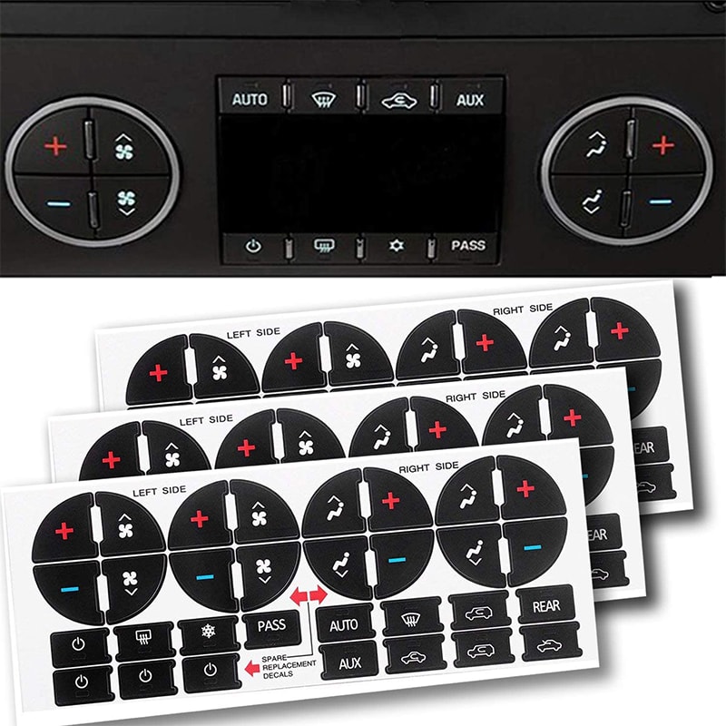
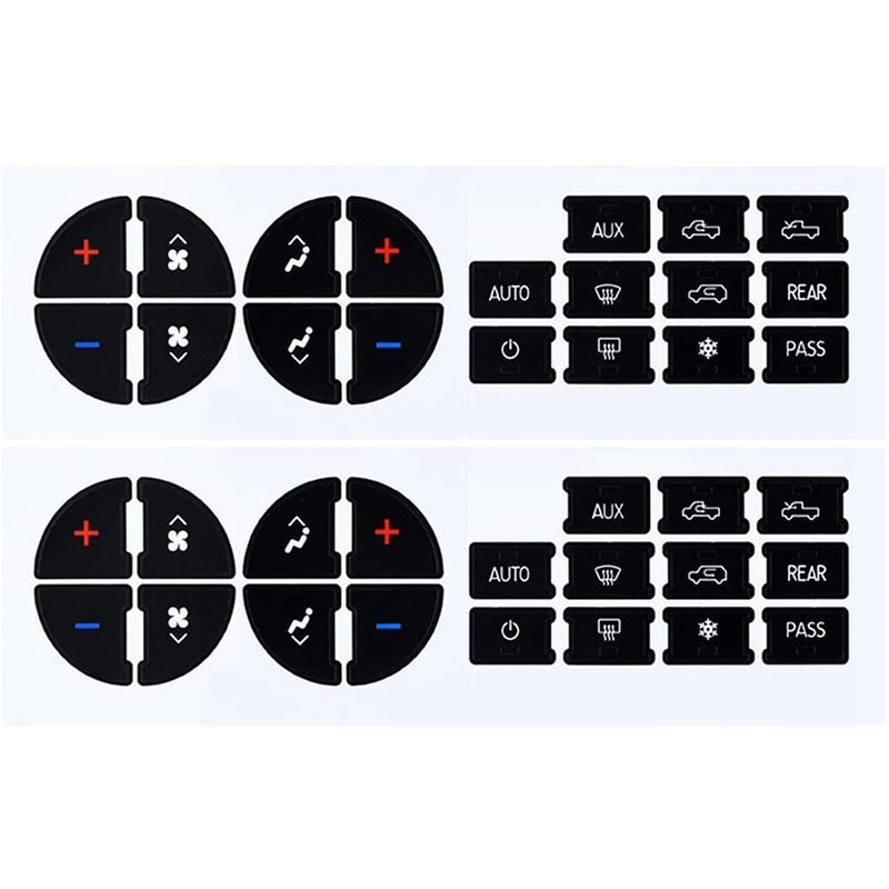
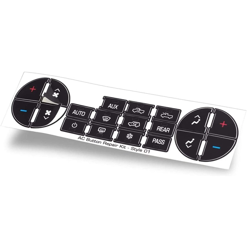
Based on the image, which product would you rather buy?


Option A won this Ranked poll with a final tally of 45 votes after 1 round of vote counting.
In a Ranked poll, respondents rank every option in order of preference. For example, when you test 6 options, each respondent orders their choices from first to sixth place.
PickFu requires a majority to win a Ranked poll. A majority winner differs from a plurality winner. A majority winner earns over 50% of the votes, whereas a plurality winner earns the most votes, regardless of winning percentage.
If an option does not earn a majority of votes, PickFu eliminates the option with the lowest number of votes. The votes from the eliminated option are reassigned based on each respondent’s next choice. This process continues in rounds until a majority winner emerges.
Scores reflect the percentage of total votes an option receives during the vote counting and indicate the relative preference of the respondents. If there is no majority winner, look to the scores to see how the options fared relative to one another.
| Option | Round 1 |
|---|---|
| A | 90% 45 votes |
| C | 6% 3 votes |
| B | 4% 2 votes |
Age range
Education level
Gender identity
Household income range
Options
Personal income range
Primary mode of transportation
Racial or ethnic identity
45 Responses to Option A
I like to see the item actually in use on a product, and with multiples available.
Option A allows me to see what the product will look like once installed.
It looks like there are a lot more items included in these and they give a better value.
I like option A because it shows how the decals would look when finished. Option B was also good as I could see the different types clearly.
A I feel is the best because it shows off the product the most and it also shows the quantity it comes in.
option A looks more eye catching in my opinion
A is the only one that shows the product in a black background which i like
Option A is the best. It gives the best view of what the product does.
Showing a sample of the overlay for these AC stickers like in A is best
I like that option A shows the decals and how they're applied. It draws my eyes to look at the picture.
I like Option A because I like seeing what it's used for. I wasn't sure what I was looking at at first, but seeing the end result helped a lot.
Seems most appealing offering the best description of the product which will help me make my devious
Option A makes it seem like it offers a more comprehensive array of features and stickers as compared to Options C and B.
I would rather get option A because this image shows a lot of different items of all thing.
By showing me more of how it is used, I understand and therefore wish to purchase this option at a higher degree
i would rather buy the product in option A based on the image because it looks more professional and trustworthy
This is the best one to me as it has everything that you are going to be getting.
This image gives me a clear and wide view of the entire product up close in a very detailed manner relative to the others.
I think A is the best image because it is most informative. Unless I was specifically looking for this, I wouldn't know what it exactly is. I'm still not 100% sure. So if I saw this as a related search or suggested item, I would skip over it without image A.
Based only on the image I can't honestly tell what this product is for.
I prefer the option A product image because it comes with three whole button repair sticker kits. I chose option B second because it comes with two button repair kits. I chose option C last because it only shows one button repair kit.
A has a black design that I prefer over the others. I prefer C over B because of the layout
out of all of the option A has more detail so I choose that for my selection.
I feel that A is the most helpful in providing the all-encompassing context of the product.
I like having an image of how they actually look in use
The 1st one seems to include a lot more stuff with it but I really like the layout of the 2nd 1 I think it shows the most perit's the most. The 3rd 1 doesn't really compare to the other 2 because it's kind of hard to know exactly what it is it looks like an airplane hand controller
Option A makes it the easiest to identify what the product is used for.
I like option A the best with the front of the console shown.
A has a better eye catching feature to it.
option B: has the most realistic visual of how the product will look once I get it. I like that I can see all of the different details, really allowing me to truly appreciate the product. option B: I like the zoomed in, I am able to really look all of the details, thought it makes me feel its missing details compared to potion Aoption C: looks lazy, weird angle, I cannot really see all details as the the skewed view is not the most optimal.
This option has the most detail. I like seeing the straight on picture at the top which shows the most and it helps to have the extra pieces at the bottom. I like B better than C because the angle of the picture looks a lot better
I feel like Option A is the most diverse and offers a range of colors and layers which makes the image more multi dimensional. Image C is also very interesting because it is slanted and features a shadow, which makes the overall space a lot more interesting.
I have a better understanding of what the product is in A and why I would want to use it.
I would rather buy option A because it looks more appealing. Also, I like that it has a picture of what it could look like when you add the stickers to the object. It's a great visual.
I like being able to see the product in use, then with it on the angle is looks more professional than just flat.
i like option a the best you can see the entire product.
Choice A looks the nicest and easiest to understand what the product is. Choice C is kind of plain, but at least I can tell what it is. Choice B looks too busy and confusing.
I like option A the best because it shows the image shows the decals on the actual product.
A- this one shows the product close up and with the greatest detail, B- this one shows a good view of the product, C- this one doesn't show the product well and is at a strange angle
I like this one the best because you can clearly see how the product will look when you receive it and what you are supposed to use it for.
I found these product images to be the most attractive
I look the preview with it all set up and everything back to working.
The image with a single product and a massive background has entirely too much blank space. It looks unbalanced. Go for either of the two others.
I like this image that shows how the product will be used so I can verify that it's going to look the way I want it to. I have a hard time visualizing things like this, so this helps.
A is more detailed of what your buying
2 Responses to Option B
I think both of them are nice.
B seems like it provides the most detail without any slanted angle. A is better than C because it shows how the stickers compare to the panel itself.
3 Responses to Option C
They are easy to see when you're driving the less you look away the better and is better when the controller off everything are easy to see
I believe that C looks the cleanest while A looks the busiest. I prefer C because it is a clear cut and uncomplicated version of A. I would love to upgrade soon.
The more simple it was the more appealing it was to me and the more spread out it was the more cluttered it felt.
Explore who answered your poll
Analyze your results with demographic reports.
Demographics
Sorry, AI highlights are currently only available for polls created after February 28th.
We're working hard to bring AI to more polls, please check back soon.

