Poll results
Save to favorites
Add this poll to your saved list for easy reference.
Based on the image, which product would you buy?


Age range
Amazon Prime member
Education level
Gender identity
Options
Personal income range
Racial or ethnic identity
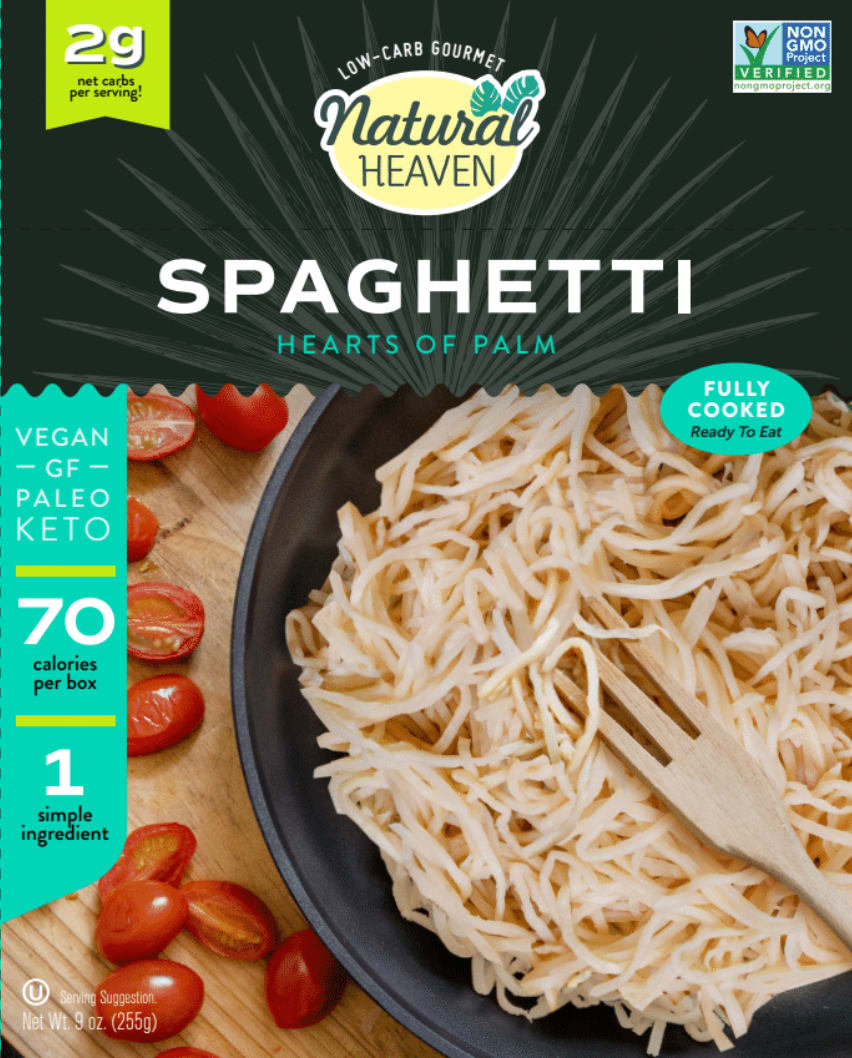
32 Responses to Option A
Part A is more inviting and truly catches my eye
I chose A because it looks more realistic and it has a more natural background to the picture so I can see it on my kitchen table easy
I really like the colors of B but I think the product looks super fake and overly processed from the picture. I get a very healthy vibe from A and that what I'm eating is fresh and not super manufactured
I would buy this because it's showing the actual product off better and not hiding it.
I like the design and color of A
The photo is more vibrant, appetizing, and overall much better.
I choose this one because it appears to be the most appetizing product.
Everything about the package design is more appealing - the picture of the food, the colors used, the general design...it looks more professional and high quality.
I like option A. I think the close up of the pasta with the mini tomatos and the packaging are very nice.
I love option A, which is more likable than the other one. And it explains about the calories. So usually I am eating by knowing about the calories that have.
I find the graphic design to be much more appealing
Option A looks more sleek to me. The food on the packaging looks more tasty as well
They look so much more gourmet and fancy. B looks like a kid food.
Shows the ingredients better, and final dish is close and looks good.
choice a looks very modern, chic, and sophisticated. b is cute and fun, but i think choice a fits the look better.
This color and design makes it seem really professional and high quality.
I chose A because I think the packaging more. I think the words about calories and being vegan are more clearly illustrated on choice A. The green panel on the left stands out more. I also prefer that the cherry tomatoes are on the table instead of mixed in with the pasta. I think this highlights the pasta more, it doesn't cover up the spaghetti image as it does in choice B.
I chose option A because the photo looks more realistic and the pasta looks yummy. The background looks like a table instead of a cartoon.
Option A shows the product to be much more appetizing than in option B. I also like that there were a few natural ingredients on the side you could pair with the main product, but it wasn't completely covered in a sauce that wasn't coming in the package.
Choice looks much more appetizing to me. I love the big picture of the food and how it emphasizes the food.
I like the pasta taking up more of the space. B is too constrained and segmented to me.
this looks like it would be more yummy
The packaging presented in Option A is much more appealing to me as a potential customer in comparison to the other present option. The other option does not have nearly the number of vibrant colors and doesn't seem to show the product as well as the selected option.
The food in the picture looks more appealing.
i liked the label
It is of my opinion that the choice I made looks more appetizing. I just think the image looks more professional.
Option A looks like a healthier choice in terms of the image on the front of the package being an actual photograph of the dish itself, as opposed to just an illustration of the food in question. Though both seem like healthy options in general, Option B simply looks too childlike and artificial for my tastes.
I like how we can see the calorie count front and center. It makes me feel like there's nothing to hide.
The image helps
The image of the food make me feel as though it will be more filling.
I would buy the product in A because it is more visually appealing. The pictured food product is more appetizing and looks healthier and less generic than in option B. Also, the color scheme on the book is slightly more natural looking, making it more appealing to those the product would likely be aimed towards.
I like the information on option A better. It tells me that it is hearts of palm. I can also see the product in a clearer way so I know exactly what I will be getting. Although option B also shows the product, it is covered up with a lot of tomato sauce and it gives me the impression that the sauce is included but I do not see that option on the box. If just the noodles are included then that should be all that is shown
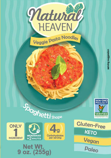
18 Responses to Option B
the colors of the packaging are attractive and the meal itself looks appetizing
I like B because I think the product being more centered on the package is more attractive. I like that it shows it with sauce too.
Pasta noodles made from veggies seem more appealing than heart of palm noodles.i would like to try both before definitively judging them, but I think the veggie noodles are preferable just based on look and initial impression alone.
I would be interested in trying both of these products. To me, the packaging of B is more appealing in that it looks like a dish I would normally make myself. The noodles in A look a bit strange and plain, which is fine but to me does not look as appetizing. Having said that, I like how A tells you what the ingredient is, hearts of palm in this case, whereas B says it is made of 1 veggie ingredient but does not specify which veggie that is. It would be helpful if it mentioned the vegetable on the front.
I like the look of spaghetti with the sauce , it looks weird with no sauce
I like seeing the product with tomato sauce on top. It makes it look tastier. The colors and overall look also make it look nice in my opinion.
I liked A more mainly to the fact that with Pasta Sauce on top it look more appetizing.
I prefer choice B because it makes it clear what the noodles are made of.
I like how the image shows a more-complete dish to eat. Also, it looks more like pasta than the other image.
I don't actually like either of them but I was confused about exactly how A was made.
it says that it microwaves in 2 minutes and is veggie based, it has a more appetizing image so overall I like this image best (B)
I think that the text is easier to see and read. It makes it faster to see what the product is and the nutritional benefits. The image is also tastier looking
The photo of the pasta in option B looks more appetizing with the marinara sauce and basil leaves on top. I prefer that it simply states veggie pasta noodles instead of hearts of palm. Although Im sure hearts of palm taste great, the name and photo do not look very appetizing in option A.
Option B - looks unique, excellent style, special information on top, easy to grab one when looking
The picture looks better and you can see the whole dish
The image of pasta looks a lot better on B, the design is much more unique and easier to read
Choice B looks more tasty and inviting with the plate of pasta and sauce.
Aa has too much going on
Explore who answered your poll
Analyze your results with demographic reports.
Demographics
Sorry, AI highlights are currently only available for polls created after February 28th.
We're working hard to bring AI to more polls, please check back soon.

