Poll results
Save to favorites
Add this poll to your saved list for easy reference.
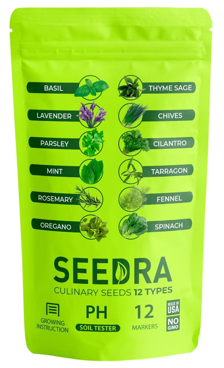
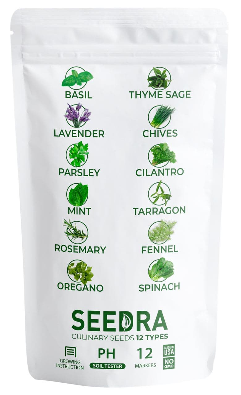
Based on the image, which product which you rather buy?

Option B won this Ranked poll with a final tally of 26 votes after 2 rounds of votes counting.
In a Ranked poll, respondents rank every option in order of preference. For example, when you test 6 options, each respondent orders their choices from first to sixth place.
PickFu requires a majority to win a Ranked poll. A majority winner differs from a plurality winner. A majority winner earns over 50% of the votes, whereas a plurality winner earns the most votes, regardless of winning percentage.
If an option does not earn a majority of votes, PickFu eliminates the option with the lowest number of votes. The votes from the eliminated option are reassigned based on each respondent’s next choice. This process continues in rounds until a majority winner emerges.
Scores reflect the percentage of total votes an option receives during the vote counting and indicate the relative preference of the respondents. If there is no majority winner, look to the scores to see how the options fared relative to one another.
| Option | Round 1 | Round 2 |
|---|---|---|
| B | 44% 22 votes | 52% 26 votes +4 |
| C | 30% 15 votes | 48% 24 votes +9 |
| A | 26% 13 votes | Eliminated 13 votes reassigned |
13 Responses to Option A
the bright green has nice shelf appeal
I think the green really stands out in a great way. B is ok but it is way better than C. C reminds me of medicine which i dont want in my food.
I chose these options in this order According to which ones I found had the most appealing a packaging looked the most high-quality and made me want to learn more about the product I chose these options in this order According to which ones featured a picture of the ingredients along with a name as it gives you a better understanding of what all is in it and it makes it easier to read
I actually like all three very much, I guess this is in order of most favorite to slight least favorite. I really like the images of the herbs next to the words but I really like the format of A.
I prefer this one because I can actually see the different types of herbs that there are, I also really liked the lime green bag it makes the product pop out from all of the either ones.
I would rather buy A. I really like the packaging and it catches my eye the most.
the packaging in A and C speak more to me with a preference to A because of the green package. B is okay but a little busy.
I liked choice A the best since the product has a green background which looks more organic and fresh. I also liked how each item name has a small image of the product which looks more appealing and easier to read than choice C which is too spaced out.
Option A was the most eye catching because of the bright packaging. I think the design of option A most clearly explained what the package contained as well. I like seeing "culinary seeds" large and centered. I felt that the organization of the pictures and seed names was better done on option C compared to B because it felt more concise and organized.
Option A is th emost noticeable and attention grabbing packaging
A had the best color and looked the most interesting to me. I fid not like the other ones as much. Green was really fun.
I find A more appealing because it is mature and attractive, it has a very nice content of image design with good display, while B is cool and attractive and i like the display content with good design, also C looks nice and I belief it has a good idea of image design but the color is not really attractive to me.
The images/icons/logos on A and C are indicative and informative. The bright green of A is eye catching.
22 Responses to Option B
The sort of brown box that is used here is best though, I like the follow up with the all white packaging used here.
The brown bag makes me think it is a more natural product. I really dislike the highlighter yellow bag
I like B because being marked culinary herbs let’s me know it’s for cooking and a safe edible product. I like A for the bright packaging.
I like the look of it and the color scheme. It doesn't blind me with color and isn't too bland, either. I like the pictures on it and that it's made in the US.
I would rather buy option B because it has clear labeling that it's made in the USA.
I would rather buy B based on the images because it is the most attractive and the easiest to read.
I really like option B because you can see the herbs, but also because of the herb list which is very easy to read and understand.
I don't like the color on Option A! I'm putting Option B in first place because it's so readable and yet the packaging is still attractive.
Ranked this because that is how the spices and herbs I already usually buy come packaged.
B is my first choice. The packaging has attractive contrast and I like the botanical illustrations, and like that the seeds are heirloom. C is my second choice. The green botanical illustrations contrast somewhat attractively with the white packaging. A is my last choice. The green botanical illustrations and text really looks weird and unattractive with the bright chartreuse package.
Option B really drives home the idea that this is a bag of seeds, and that it's natural. The brown paper bag type design makes you think of typical recycled goods and of earthy tones and ideas. Option C and A do a good job helping you identify the herbs better, but look too modern and sterile in comparison, making me think of a lab and unnaturalness.
The packaging on option B seems more welcoming and friendly. Easy to read and it stands out with right choice of colors.
I'm a little mixed here, from a design perspective, I like B. It's a good looking package. From the informative standpoint, C is pretty strong. My thing is, C almost looks like an institutional product. So I think putting less emphasis on label/package design kinda holds C back a bit.
i think options b and a look the most authentic and organic
I am more familiar with this type of bag used. I find it more trustworthy. Plus I like the information on the label and design of the label better than the other ones.
I like the quasi paper packaging on B. C looks to be a close second with classy packaging. A has a weirdly bright color that is off putting.
I like B because the label gets my attention first and I like that it says made in the USA. A an C are okay, but B gets my attention first.
I voted based on how appealing the packaging of the product was and if I would want to buy it or not.
I chose panel B. I like all of these choices however. But I like the tan bag, the list of ingredients or nutrients and the artwork of the plants.
I love this one because it is the clearest and easy to read. I can clearly tell of the herbs included in the package. I also like that it is made on recycled paper or what looks to be recycled paper. I love that it is made in the United States and Non-Gmo.
I like the brown bag packaging, it looks more natural. I also like the images of the herbs on the package, more realistic
I like option B because it looks the most natural and healthy. I put option A in last place because the bright green is just harsh and unattractive to look at.
15 Responses to Option C
I liked C the best because it looks the healthiest to me.
C gives the best look at what is in the package and A is second and closely behind. Having the images of the herbs is best to me.
B looks quite low-end so B 3. I prefer C to A so C 1 and A 2
I really think they all are good. I like how they list each one and have them easy to read. I would buy these. I love to cook and would like to have all of these to grow.
Option C is much easier to comprehend and read than the other two. I really like incorporating the image and the text describing which herb is in the bag. I think that the name of the product should be a little larger, it seems to kind of get lost on the packaging.
I like C the best because it is very easy to read the contrast is very good. I like how the list is on C and A compared to B they are much easier to read with the two collums. A is harder to read with the lime green and the black. B seems way to cluttered and harder to read.
I'd rather buy C because it includes markers that B doesn't have, the images of the plants is more attractive with the white background than the green background in A.
B looks to old-timey and plain. C and A look modern and sleek.
C - looked more professional, and thus felt that the seeds would do better at growing.B - mainly because I did not like A whatsoever.A - was ugly, would not get my attention at the store.
I like seeing the simple white design with the little illustrations.
I like being able to see each herb with its picture but I like the white bag more than the green, it is easier to make out what is pictured
I like the clean white package. I also like the images of the herbs that appear on both C and A.
I chose Option C first because with the white background it is easier to read and I like the individual pictures of what will grow from the seeds. Option A, the bright green is too bright for me. Option B is just a little bit dull looking, it looks kind of cheap to me.
I like C the best because it has the most information by giving an image for each herb. B is almost as good because it has the most attractive packaging and Made in USA is featured prominently. Oops, "lavender" was misspelled. A is good and eye-catching, except on-screen the bright chartreuse green is a little hard to read.
colors, fonts, and how the design of the package is laid out and presented is in the order in which I made my choices but C is by far the best for it's smarter and more clean look
Explore who answered your poll
Analyze your results with demographic reports.
Demographics
Sorry, AI highlights are currently only available for polls created after February 28th.
We're working hard to bring AI to more polls, please check back soon.

