Poll results
Save to favorites
Add this poll to your saved list for easy reference.
Based on the front of the box design, which product would you rather buy?
Option D won this Ranked poll with a final tally of 60 votes after 3 rounds of votes counting.
In a Ranked poll, respondents rank every option in order of preference. For example, when you test 6 options, each respondent orders their choices from first to sixth place.
PickFu requires a majority to win a Ranked poll. A majority winner differs from a plurality winner. A majority winner earns over 50% of the votes, whereas a plurality winner earns the most votes, regardless of winning percentage.
If an option does not earn a majority of votes, PickFu eliminates the option with the lowest number of votes. The votes from the eliminated option are reassigned based on each respondent’s next choice. This process continues in rounds until a majority winner emerges.
Scores reflect the percentage of total votes an option receives during the vote counting and indicate the relative preference of the respondents. If there is no majority winner, look to the scores to see how the options fared relative to one another.
| Option | Round 1 | Round 2 | Round 3 |
|---|---|---|---|
| D | 32% 32 votes | 37% 37 votes +5 | 60% 60 votes +23 |
| C | 31% 31 votes | 33% 33 votes +2 | 40% 40 votes +7 |
| A | 24% 24 votes | 30% 30 votes +6 | Eliminated 30 votes reassigned |
| B | 13% 13 votes | Eliminated 13 votes reassigned |
Age range
Education level
Gender identity
Mobile device
Options
Personal income range
Racial or ethnic identity
Relationship status
24 Responses to Option A
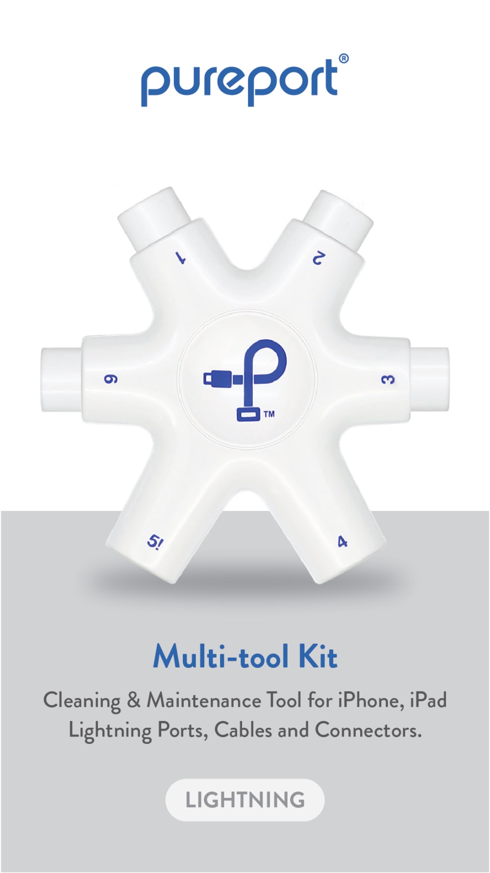
Having a hub is one thing, having a lightning connector cleaning device is an entirely other, and new, level. Options A nd D each mention the cleaning functionality, and of these two option A gives a description which is the most accurate and intriguing.
I like A and D the best because the added text gives the most additional information about the product. All design elements are good but those are the easiest to read.
I have a good idea of what the tool does in 1 and it looks clean.
I like the layout, the product and the information but then at the bottom is lightning in a gray bubble but it looks pleasing
I pick option A because it is all white design and it fits with "pure" .
I like option A since it combines multiple colors to add interest and contrast. It stands out easily among these four.
Choices A and D are my top two picks because I liked how they both mentioned that they are design for iPhone and iPad lightning ports, cables and connectors. They were both more specific in the language that they used compared to the other two choices. Choice A was first for me because I liked how it said it was a multi-tool kit and then below that says what it is used for. With Choice D I felt that it gave a bit too much of a word jumble with how it was done. Choice C was third for me over Choice B because it still mentioned that it is a cleaning tool for iPhone and iPad. Choice B does not say anything as to that level of specificity.
I think options A and D are simple and well designed. The ads look professional and are easy to understand.
Having some background color behind the letting makes it easier to read. I like the idea of the product sitting on table top.
i would buy option a because it tells you exactly what the product does and is designed for
I like the phrase "Multi-tool cleaning kit" on the front.
Option A is the most visually appealing and grabs your attention more right off the bat. It has the best look and feel to it that makes you form a higher first impression that the product is high tech and would function well. It also gives you a better overall vision of what the product looks like and what it has to offer. It allows the viewer to imagine owning and using it and what benefits it would offer to the user. The wording stands out more as well and you get a better idea of what it is and what it has to offer. Option A would appeal to more people and would make them more likely to check deeper into what it has to offer.
I like the one with text on a grey background. It makes it stand out more.
I chose A as my first choice because I like the design, the way the colors are shown/placed, the text, and where the name is placed. I chose C as my second choice because I like the colors used and how they are the same just opposite. I like the text and how the name stands out. I chose D as my third choice because I like the block of blue with the text and the text beneath the blue box. I chose B as my final choice because I like the product showcased by itself and the way that the name and what it is arranged.
I want to see the words on the box that are big and easy to see that describe what the product does. Cleaning of lighting cables.
My choices were made based on the written descriptions. Choices one and two were more defined, more detailed and more informative to me
I like the look of the ad in "A". It tells me what it's used for and I just like the layout of the page. "D" also gives me a description but I don't like the layout as well as "A". The same reasoning behind "C". While "C" gives me a description, the page layout is less attractive to me than "A" or "D". The description doesn't really stand out much and it's rather hard to read on the lighter background. Almost like they're trying to hide what the description is, which is exactly what "B" did and therefore gets the last spot. There is no description on "B" that tells me what items I can use it on.
A is cleaner design and lists usages more clearly
I prefer Option A because it seems to have the most clear information about the product , presented in a nice clean looking format, Option C is my second choice because it is quite simple and to the point. Option D is my 3rd choice because the function is highlighted. Option B is my last choice because there is not enough information to explain what the function is.
I like the gray background
Options A and C work best, both in terms of naming the product and providing a description. I though Option A's second font worked better, so that's in first place.
All of the designs are visually appealing and look solid, Options A and D are a little bit more clear in terms of their descriptions as compared to Options C and B.
Option A is the easiest to understand what it is. Option D also points out it is a multi tool kit and describes it wellOption C is hard to tell what it is.Option B i have no idea what it is for.
prefer the design
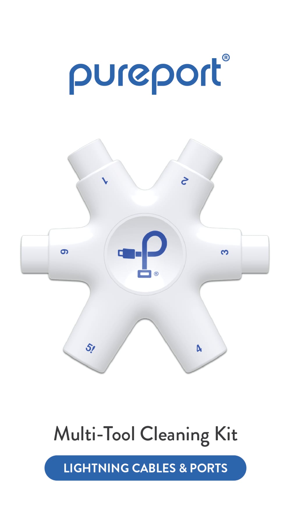
13 Responses to Option B
Options B and D are the easiest to read so I prefer those as the two stand out options; they communicate information and never look visually confusing. Options A and C are a bit too complicated and seem to put design over legibility.
I like the simplicity of option B, the design is nice but not too much. I don't like the blue of option C, it is too contrasting.
top choice has a clear simple image
I prefer option B because it’s the most simple. It’s straightforward and easy to process which I like.
B offers a clean and simple presentation that is easy to read and focuses on the highlights. C, D and A are too busy and cluttered.
I chose B and C first because the ads seemed cleaner and easier to look at. The final 2, A and D just felt cluttered to me with all the information on the photo.
i like option b the best, it is clean, clear, explains the product very easily
B is the most minimalistic and “pure” feeling. Impossible to get distracted.
B is basic but up front with what I'm looking at, it would be what I would look for in a search.
Option B offers the simplest form and easiest to understand
I really like the simplicity of option B, it seems very clear on what the part is (Multi-Tool Cleaning Kit) and seems obvious on how it could work. I also like the clean white background better which is why I had B/D as my 1/2. I think C and A get too cluttered in how much they have and I don't like the background, I also think their descriptions have too many words and make it confusing on what they do.
I liked B and D since these were the most subtle options -- they had more white and thus seemed more modern. A felt too dull and gray and thus seemed a bit depressing.
option B has the best design out of them all.
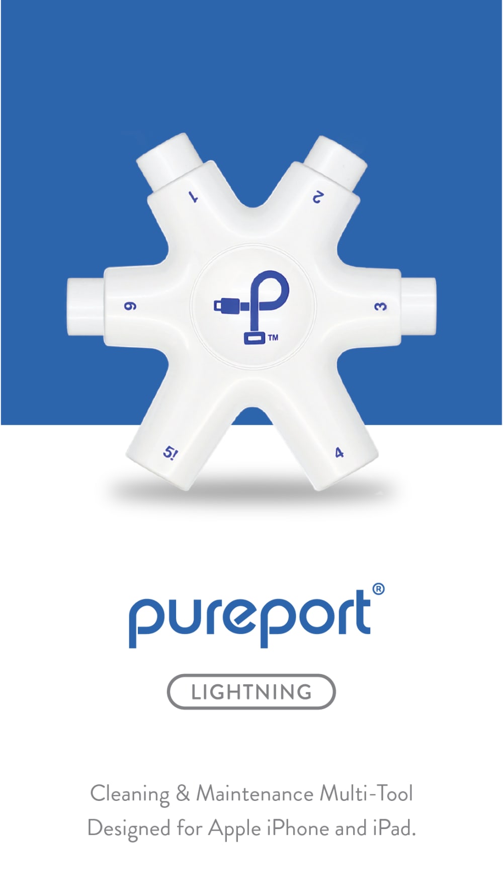
31 Responses to Option C
I like the design of option C the best. I like how the top half is blue while the bottom half is white. I also like how the brand name is below the product.
I would be most likely to click on and ultimately purchase option C because I think that it has the most eye-catching and visually appealing box design out of the four options. I also think that option C has a visually appealing box design, but it is not quite as eye-catching as option C.
I liked the messaging with the most blue the most (C), and the one with the second most blue the second best (D). I chose A last because I liked the gray second best and chose B last because it had the least color.
I like the addition of color. The large blue background stands out the most.
I think the one I selected first does the best of outlining that it is for apple lightening products
I much prefer option C. This option is much more appealing and balanced design wise. This is the most enticing image to me personally and the only one that i feel looks professional aside from C.
C is my favorite design because I like how much blue there is in the picture. It is my favorite color and it really makes it stick out a lot. I would choose A next because I like the gray in the background. It is a nice color that matches the blue and white really well
I like C the best because the blue background makes everything stand out more. B is nice and simple and clean. D is kind of too standard. A I don't like the gray background especially with gray text over it.
I value simplicity highly so B would have been my first choice if it had more information. I think it is good for the user to know what they are going to get out of their product so my choices go in order of the ones that give the information you need with the more simple designs
C is best because I like the blue background. it makes it pop. then I did it in order of how well it caught my eye
C is really the main and only good option here, the blue background makes the great product pop, highlighting the blue color printed on the product, failing that, D at least affords some blue background to print, to make it pop, B includes a small bit of blue to add interest while A omits it all, leaving things looking washed out.
I like the blue back ground. It makes the white tool pop.
I ranked the Pureport charging device advertisements that I liked the most. I found the advertisement in option C to be the most appealing followed by the advertisement for the device of option B followed by option A and then finally option D.
option b gives no information you don't know what all it does so i wouldn't purchase that one. i like c,a, and d. however c is the best and gives the most information. information is key when purchasing a product.
Options C and D are a good balance of explanation of the product without being confusing.
The product can be seen better against the colored background.
I like the color blocking, option c is my first choice, lines up nicely with color of product, option a is next the gray provides good balance, option b is next, clean and simple with option d last
option C: is the most assertive, bold, and eye catching from all the options giving. I was automatically drawn to it, and was the only option that really made me want to stop and read the information. option A: not as bold but having the grey be a dominant color in the ad, does attract my attention, though the color grey makes me think dull and boring. option D: makes me think its a health care flyer giving me information about vaccines not of a product that I can use. option B; the least exciting option, lacks greatly compares to others.
this is the best mix of informative text plus vivid colors. the blue is vivid but a grey would dull it out and make it not as lively.
I like option C the best because you can really see the product with the matching blue background. Then I like option A and D. Option B doesn't really give enough information.
I would buy my top option because it defines the intended use of the product and the layout looks best with the blue background. What I’m not fond of is the shadow underneath the product.
Option C is the best because the caption and advertisement for the multi-tool connector is easy to comprehend and share with others.
I chose C first because I think the blue color makes the tool stand out, this one also has text saying what it can be used for (intended audience). Next D has the most information on how and what it can be used with. A also has some good information about how to use. B is too simple and I didn't understand what it was for.
I think C has the most appealing design, it looks professional and reliable.
I like the darker background against the lighter colored product as well as the description of what the product does.
I like the options with substantial blue in the logo - I always associate blue with clean. The gray feels a little less clean to me. Crisp white and blue feel techy and also clean. Also the blue background on option C makes the white tool pop.
The blue background on C helps the product stand out.
I like the color combination of C as well as the wording on the box.
The ones with the fine print description at the bottom are the best because they tell the story of what the product does. The one with blue pops the most followed by the gray one.
The darker background colors make the tool pop out more. That said I really don't understand what this tool does even with the explanation.
I like how C has two colors, makes the picture stand out more, and the colors are good and go well with the product.
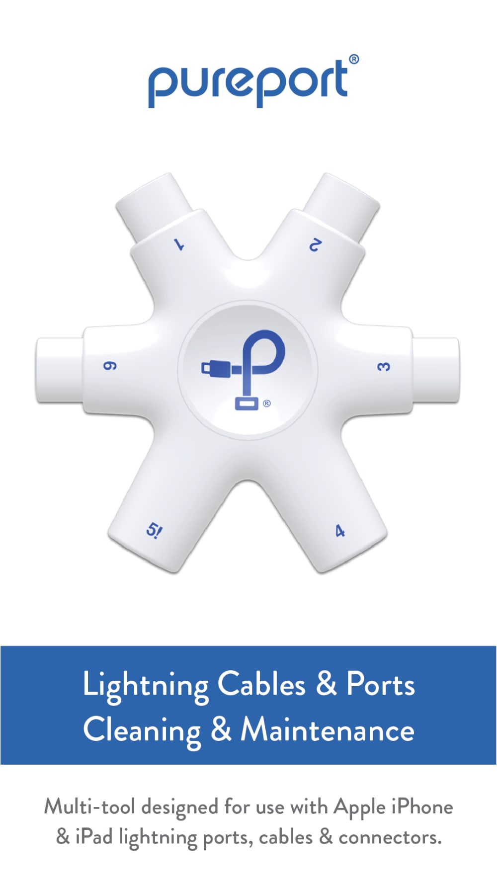
32 Responses to Option D
I ranked these based on the amount of information available. #2 had an edge over #2 because of the background color which made the text more legible
I really like option D the best, I think it's so simple and easy on the eyes. It's doesn't have unnecessary boxes. I think it's also very organized. It's presented really well. I also like how it gives a little info as well.
I like the blue bar of D and the blue background of C
The font and design on D looks the best to me.
I like the extra information.
D and B look like the actual product. A looks like the product but the grey doesn't do anything good for the picture and C looks like it's not the actual product.
the blue belt is the nicest overall look with the information underneath
This looks like I could get a better grip on it. There’s also more information in available below the lightning cable part.
This describes the product and is visually appealing as well.
D-showed and thoroughly explained the purpose of the productA-C showed and offered description of the use, but not as well as DB-Does not describe the uses for the product, I wouldnt know what it was for
I liked the cleaner and more minimalistic designs and I also liked the contrast of navy blue and white. I felt D best captured these preferences.
D and A are the most descriptive. D is easier to read.
I like option D the best because it describes the product the best in the image.
I like the ones that are easier to read - better background color. Also a bit more information is also helpful.
I didn't know what this product was, so I found that D explained it's function better than the other options.
D is easiest to read in terms of product description. B is clean and has best images of the product. A is okay with full product description, but grey background is harder to read. C is worst with the light grey text on white background which is hardest to rea.d
B doesn't have hardly any color to it. D grab my attneiton the most because of the colors.
I like the options with a blue background as I think it reqlly helps the product to stand out a lot more than the other options.
Any of the options that describe what this tool will do. I had to look it up to really know what it was for. I think if you included the little extras that come with it it would help make people understand since I never knew there was something like this out there.
The higher quality the picture of the item and the more text was the most preferable combination.
I like this option most because of the description of the tool and the contrast between the text and background.
I like the clean look with the colors and the more information that is provided.
I chose D first because it had a short explanation of the product and what it could be used for. This image also stood out the most to me among the four. Option A was second because it also explained what the product was used for but I did not like the design on this one.
i think it should be shown that it works with multiple ports other than just lightning
D and B are the cleanest looking designs with a good layout.
Options D & C are the most visual appealing to me. Options D, C, and A provide more detailed information about the actual product. Option B would be my last choice because it does not provide any detailed information about the product. I like the colors and layout of the design on Options D & C best.
I prefer the one-toned versions without the extra colors. But I also like to see more text in the image to inform the viewer.
I like the first 3 more than B, because you're always concerned that the product is not for Apple products.
I think D and B are the best because I like that the description is in a box that stands out. I think A and C blend in too much and it’s not as clean to read. I think D is the best because it gives the best description of what this is.
Options D and C give the most detail as to the functionality of the product - as my family uses a variety of smartphones, and thus a variety of charging cables, I want to know which cables will work with this product. Options A and B give much less information regarding which cables and devices can be used with the product.
I prefer option D because I like how font is high-lighted in a blue box with more writing underneath.
I chose option D because it was more appealing.
Explore who answered your poll
Analyze your results with demographic reports.
Demographics
Sorry, AI highlights are currently only available for polls created after February 28th.
We're working hard to bring AI to more polls, please check back soon.

