Poll results
Save to favorites
Add this poll to your saved list for easy reference.
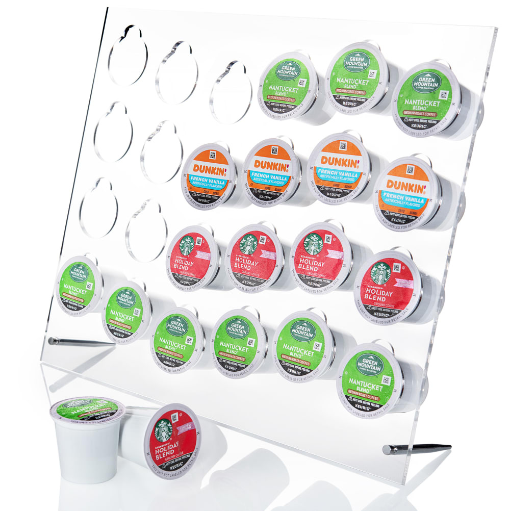
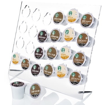
Based on the 2 keurig pod holder images below, which colors do you like better, which lay out of the the color do you rather like, from top to bottom or from right to left?
30 Responses to Option A
I like A better because the layout is more colorful and like that the similar colors are in a horizontal line.
This color is more aesthetically pleasing, eye catching and stimulating.
I like the top to bottom and brighter colors
I like A because I like the colors better and I like the colors from left to right too. It looks more attractive to me.
I think A with that the color pods makes it stick out to me. I think the same color pods in B doesn’t make it stand out as much and won’t catch my eye as easy as A with color.
I think the variety of the cup colors is better in Option A overall and I think the top to bottom looks more natural.
the starbucks colors but these layout
I much prefer A for color but like the lay out top to bottom. I think the top to bottom looks more organized and higher end. I don'e like when items look disorganized in images . I also think the color in A has much more energy and grabs your attention.
I like the left to right color arrangement better, more visually appealing to me
I like the brighter looking K-Cup pods there. Looks better and more fun. I'd go with that for the display and I like the top down approach of the layout just fine.
After carefully studying and comparing both images of Keurig Pod Holder images displayed above I selected Option A over Option B as my first preference and the one that I would more likely click on to purchase for my own use. I felt that this image had more eye catching appeal to me based on the variety of bright coloring and the closeness of the image. I have no preference as to the layout of coloring.
its closer and you can see the items better the other is blurry
I prefer the layout in Option A because I prefer the layout being left to right and I prefer the colors shown in this image too because it makes the image look less dull.
Colorful pods will make a positive attention to the consumer . The bright colors will help to increase the sale by attracting the consumers mind . It will sold out quickly . I like to buy the option A .
I like to have a lot of variety and contrast in colors, and prefer the left-to-right orientation, so Option A is the clear winner here as far as I'm concerned.
Like seeing the colors better. The ones are brigther in A
Even without the close up view , the bright colors make this look more attractive than the other.
The cups are more colorful which is more attractive
both layouts are the same except the type of kcups in the holder. that said, I feel choice A is better presented, the colors stand out better.
I like this option which is brighter and more eyecatching.
The bright colors look way better. I like the layout with the empty ones on the top left.
Option A is more colorful, showing how easy it often is to find just the right K-cup without looking to hard. This option also has multiple brands, which make it seem more useful. The other option just has one brand, with dull, bland colors. I would not believe that the layout from left to right would matter much. I would assume that most people would stack from the bottom, so that it would not get top-heavy.
I think A is the better overall presentation for a Keurig pod holder. I find the brighter colors are more eye-catching at a glance. Also the color assortment going up and down creates a sense of balance.
Based on the 2 keurig pod holder images below, which colors do you like better,- I prefer the pod holder with the bright green and red cups, I noticed the other image has a lot of brown kcups which is boring.which lay out of the the color do you rather like, from top to bottom or from right to left?- I also like the visual display of image A more here, it appears to be a more appropriate angle and better for viewing. I'd prefer to see the entire rack full of cups and no empty spaces.
I think the brighter colors are more appealing. In general I think it should go from top to bottom.
I prefer the colors of option A, as well as the layout of right to left. Option A is eye-catching and grabs my attention immediately.
The brighter colors are prettier to look at- I like the left to right orientation the most. It looks very put together.
i like this option the most because it has a lot of bright and unique colors giving me a feeling of happiness and a feeling of inspiration.
The typical reading direction is from left to right. Thus, I like the lay out in A since the same pods are positioned in the same row. Pods in A come with attractive colors such as red, green, and blue.
I like the colors as well as the order in option A the best.
20 Responses to Option B
I think the dark looks better for coffee
I prefer option B because the starbucks are all higher quality and the dark colors look like they are official starbucks.
I prefer the top to bottom layout because it seems more intuitive for me especially if I am trying to find the right one in the morning when I haven't had my coffee yet.
I like the starbucks brand so I went with B. I tend to buy a lot of Starbucks K-Cups.
I like the vertical assortment of colors and I like the brown shades and coffee colored items best because I feel it’s most fitting.
I like them placed top to bottom
I like Option B because it looks more better with the color
I picked B because it's all Starbucks, which I prefer over the Dunkin nonsense in A.
I like the brown color pallet going downward because it is what I am use to with some of the vertical feeding dispensers.
B's view is not so up close like it is for A.
I chose B for both color and layout. The colors make me think of coffee more and I prefer the color scheme going up and down.
I prefer right to left, it has a slightly more pleasant look to me. I also like these colors a little more they're easier to look at
I chose option B because the vertical color layout is more aesthetically pleasing.
I like B - the colors are more bold and easy to see - it really pops out more
I like the color of coffee, so Option B seems both more inviting and more realistic to me, as does the top to bottom arrangement.
The earthy tones make a more relaxing and satisfying image.
The vertical layout is more eye catching and the brown colors remind more of coffee
I like the dark brown and light brown colors the very best. "A" has too many colors. "B" is my pick.
I like the top to bottom layout with the same coloring.
While I wish B wasn't ALL Starbucks (they nailed that brand icon), it definitely looks more visually appealing.
Explore who answered your poll
Analyze your results with demographic reports.
Demographics
Sorry, AI highlights are currently only available for polls created after February 28th.
We're working hard to bring AI to more polls, please check back soon.

