Poll results
Save to favorites
Add this poll to your saved list for easy reference.
You are shopping online for a double-sided dishwasher magnet. Which one would you buy and why? Note that all 3 magnets are the same size physically.
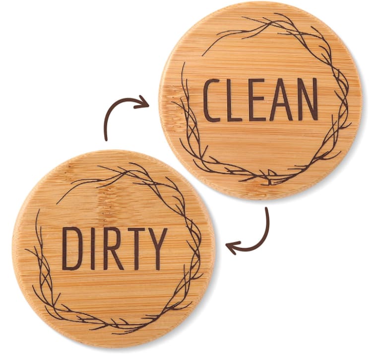
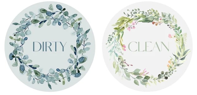
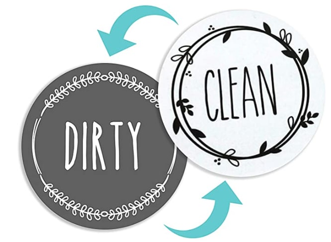
Option C won this Ranked poll with a final tally of 28 votes after 1 round of vote counting.
In a Ranked poll, respondents rank every option in order of preference. For example, when you test 6 options, each respondent orders their choices from first to sixth place.
PickFu requires a majority to win a Ranked poll. A majority winner differs from a plurality winner. A majority winner earns over 50% of the votes, whereas a plurality winner earns the most votes, regardless of winning percentage.
If an option does not earn a majority of votes, PickFu eliminates the option with the lowest number of votes. The votes from the eliminated option are reassigned based on each respondent’s next choice. This process continues in rounds until a majority winner emerges.
Scores reflect the percentage of total votes an option receives during the vote counting and indicate the relative preference of the respondents. If there is no majority winner, look to the scores to see how the options fared relative to one another.
| Option | Round 1 |
|---|---|
| C | 56% 28 votes |
| A | 28% 14 votes |
| B | 16% 8 votes |
14 Responses to Option A
I like the wood/classic look on A the best. Though C lacks that, the text is clear and crisp. B has blurry text which blends with the background.
i like the natural look and feel of the wood
I love the rustic feel of this magnet and think it would be a cool addition for my appliances. The floral design is a close second because it reminds me of the decor from my childhood home. The last choose is there because it just seems too "timely" and like a lot of other products I see around; I don't expect the design to age as well and feel it will be stuck in 2019 forever.
I would buy A because it's rustic.
I'm male so will pass on Option B's flowers. I like the old cork look of Option A the best.
even though its not as obvious by color, i love the wood design. you may want to consider filling in the background a bit more to make the sides more obviously different. i like the design of the first one, and the coloring of the second one. the third on is hard to read because of the text and font style.
I loved the wood looking ones so much!! Next, the floral design is also very lovely. The third pair are cute but not nearly as attractive as the wood and floral designs.
I love A and B. I only like A more because I really like the wood texture. I like that C is dark and light. I also love the fonts of both A & C. It is clear if they are clean or dirty. I do not like choice B. I dont like that they look too much alike and the font is very small. Too confusing with a quick glance.
I liked the color of S the best and the design. I thought B was average and C was not that interesting. I was a fan of A for sure because of the old world look.
I like the first one because of its simplicity and I feel it would blend in well with alot of kitchen decors. I like the second one because it is feminine. I do not prefer the third one as I feel it would clash with alot of kitchen decors.
A is my first choice. The wood design is very attractive, unique, and different. B is my second choice. The floral design is attractive but not as unique as A. C is my last choice, the black and white design is kind of plain looking.
I like option A the best because the wood design looks the most modern and would be the best fit for my home design.
The fake wood finish looks the best on the magnets in my personal opinion
I chose Option A first as I like the wood grain as it stands out nicely and would be a nice touch in my kitchen. Option C looks decent but it has more boring neutral colors and Option B just looks unappealing and generic.
8 Responses to Option B
B looks super classy and I like that.I don't like the wooden feel of A
I like having a more visually striking difference between the two designs and this matches my decor better.
It's a tough choice between the floral ones and the wooded ones for me, but right now maybe just because it's a sunny day I love the floral, perhaps later on I would prefer the wood, it's a toss up
B looks the cutest with the design and I like how the display on both sides. C is easy to tell the difference between clean and dirty. A is just plain and boring to me. I don't like the wooden look it gives off.
I like the floral design on these. They are really pretty and delicate.
I find B appealing because it is mature and attractive, it has a very nice content of design with good display, while C is cool and attractive and i like the display content with good design and nice content of product, also A looks nice and I belief it has a good idea of product design but the color is not really attractive to me.
I would buy option "B". The design on it looks colorful and unique. The pattern on the design looks appealing. I would definitely go with option "B" for a double-sided dishwasher magnet.
I like the plants or flowers on the B option. I chose C second because the text is big and easy to see, plus the stylization is sort of nice, in that it looks a little handwritten. A is nice, mostly because of the wood background, but I don't like the writing as much as it seems more machine-like.
28 Responses to Option C
These magnets are the most interesting looking and have the best design
I like seeing the dark for dirty and white for clean. It looks better to me. I don't care for the faded ones or the brown ones.
Because at a glance it makes it easier to see whether they are dirty or clean based on their coloring.
I really like the wood design but i'm afraid it won't look great on a dishwasher. definitely enjoy option C the best, while option B looks like a tacky old person's home decoration.
C/A are my top two choices. the color scheme goes well with my decor.
These tow would stick out more. Plus I like the simple color and design of these.
I like Option C the most as it is colorful and has clear, easy-to-read font. Option B is pretty, but difficult to read, whereas Option A is less pretty, but easier to read.
I like the look of this one because it looks very pleasing to me alot
C is the easiest to read from a distance, then A. B has small text and low contrast.
I think they're all pretty neat but I found Option C to have the most appealing color scheme and overall design.
I like the obvious black and white distinction.
I think that option C is the best because you could easily tell from further away if the dishes are dirty or clean that are in the dishwasher. I think that option B is second best because you could still tell from further away if the dishes are dirty or clean, but it wouldn't be as easy to tell. Option A looks too simple and you wouldn't be able to tell if the dishes were dirty or clean until you got much closer. I also think that option A looks more like coasters.
I ranked them by what I feel is the easiest to read. The color change is very significant with C and it is easy to tell what is what. That is why is C is my top choice. B does an okay job, but the changes of it is small. B is my last choice because the only change is the text.
I like option C because it looks the most simple yet still very stylish and elegant. Option A looks pretty vintage and not a bad choice. Option B looks too distracting.
I like Option C because I like the Rae Dunn Style of words and the colors are great. Option A is also good but I feel like the font is a little too basic. I don't really like Option B's design which is why I ranked it last. As a result, I more likely to buy Option C a lot more than the other Options.
It takes a more modern approach to the way it looks and I like that more than the other two
C seems the most clear and easiest to see. I don't like the design on B and it's harder to easily read. A's sides look too similar to be able to easily see which is dirty or clean with a quick glance.
I picked C because of the two tone coloring. I think it's great that clean is white and dirty is black, it makes it easy to glance and see rather than read the word itself. The two color contrast is very nice too. The wooden ones are not bad either but the B choice is too fuzzy to look at, you can barely read the words and they look too similar.
I chose, in order, the ones that match the decor of my kitchen.
i like the black and white magnets the most, i feel they will fit most decor
The reason I'd choose C is because it catches my eye. The dark background for "dirty" and white background for "clean" makes sense, and I can see whether the dishwasher is clean or dirty from across the room/house. I dislike A. The border around the word looks like straggly hairs to me. Ew!
I like the design of option C the best; plain and simple enough to get the job done.
Option C has a more hip and modern approach. The text is easy to read and I like the design. Option A is my next choice because it is simplistic and natural with the wood background. Option B is my least favorite of the three because it looks a bit more generic and both sides look similar to one another.
C looks the best and is the most neutral in color
I really like the visual distinction of black and white, so Option C. Also, Option B is my next choice, again, because the colors change. Option A is my least favorite because there is no visual distinction between the two.
it was ranked according to the best desings
The colors are important as it can be confusing otherwise. It looks clean to me though.
I chose C as my first choice because it is easily readable against my black dishwasher. Option A is okay, but I'm not a fan of the wood look. Option B is difficult to read to me and seems like it's more focused on the pattern than the words.
Explore who answered your poll
Analyze your results with demographic reports.
Demographics
Sorry, AI highlights are currently only available for polls created after February 28th.
We're working hard to bring AI to more polls, please check back soon.

