Poll results
Save to favorites
Add this poll to your saved list for easy reference.
Which product would you rather buy?
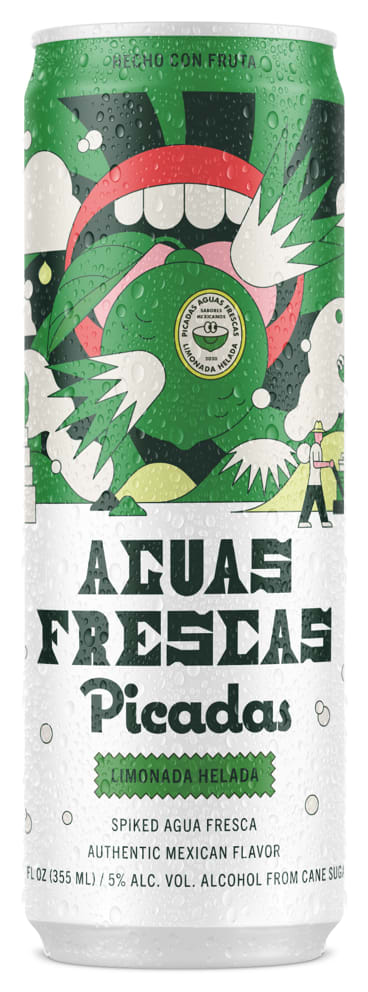
62 Responses to Option A
I would rather buy this one because the colors flow well together.
Looks much better with the white added since it makes the artwork stand out.
The white bottom creates a better contrast to read the text which I think is clearer
This label is easier to read. The other one has too much green.
I think the two-toned can is more visually striking and likely to stand out on a shelf, so that is what I would pick.
The green background in the other version makes it difficult to see in my opinion. This one better fits the product in my opinion and would be more memorable to people who see it.
I chose A because I felt that the white and green colors looked better than the all green can. I feel that I was able to see more of the design and art on the can.
I like the two tone one
I would buy Option A. The white background makes it very eye catching and easy to read.
I like a. The background makes the text stand out so much better.
I like the color block of this option. The white balances out the green and doesn’t drown out the bottle. I also like that the white helps you see the writing and the full details of the can.
They are both pretty well done. I chose A: because I prefer the white section of the green section in B. If I am in the store it makes it easy to read. Especially since most store displays are at a distance and most times have to move in the cooler to get a good look. I am not sure why there is a LIME green there in B. when the product is hard LEMONADE.
Option A has a better contrast. It's easier to read. I like the green and white combination. Well made design and good choice for the Aguas Frescas here.
I prefer option A for the product that I would rather buy because the label is much clearer whereas option B looks more like an alcoholic beverage.
I love the design of both of these cans, but I do find A to be more appealing. The white on the bottom half contrasts well with the green and the other colors. B all runs together a bit.
I thought the light theme of A felt much more fresh and visually appealing. While B seemed too strong and overpowering.
The white can looks less cluttered with green than the other one.
I like the change in color/contrast between the top and bottom of the can.
It's cooler, easier to read, more aesthetically balanced when you've got the lower silver half and not just more green.
.I prefer choice A because it is the lighter colored can and it is easier to read about the product.
A's color scheme provides a more pleasing color contrast.
The color differential with the light color mixed with the dark color (white/green) makes it appeal more to the eye. That makes me more likely to purchase.
The green and white color scheme split is unique and eye catching
I choose A because the contrast of the lettering is clearer.
A makes the words easier to read. The green background on green text of the b option makes it hard to read. But the white background really makes the words pop out and looks overall neater.
B is just too green. A looks more refreshing.
I would want to try option A it honestly looks like a refreshing drink. The sweat of the ice cold water dripping along the sides of the can, can do wonders for a parch throat. Option
Both of these are really, really good. A is the best because the colors really pop. The can is well designed
I love the white contrast against the green as it feels so fancy and a lot more eye catching for me when I walk by it
The can with white pops a lot more drawing my eye in. All green just blends away
I like the white added with the green rather than just an all-green can -- it adds some sophistication or catchiness to its overall look.
I love the contrast of the top and bottom of the can in choice A, I also think it's easier to read. I kinda wish "Limonada Helada" was in yellow for readability too. I'd love to try this stuff!
B is too green doesn't feel it's a safe drink
I like this white and green color combination on this can because it has a nice two tone and simple design
Product A is the best one because the green background marks important facts about this product that makes it remarkable like: limonada helada and of course the picture that sustains this product. I don't find the same connection with Option B.
A has more contrast which makes the can stand out more.
I like this one the most because it is easier to read the text with a white background behind it
It made it more eye-catching and easier to read.
I'd get Option A over Option B. The can's design stands out a lot more than Option B's can design. I really like the green and white color scheme of the can.
The white background gives me contrast and makes it more readable for me
A is the most attractive and Makes it easy to see the product information
I like A better because it's easier to read the wording on the can
The lightness of the can really makes it stand out to me, whereas the green and black sees everything blend together. The words don't pop, and the name wouldn't be as memorable.
I chose option A because it caught my eye more than the other option with the two different colors on the can. The contrast of the green and right made me want to read it more.
The white in option a breaks up the green color of the can. I think the green/white can looks better than the solid green can.
I like the one with the green and the silver on the same can the best.
I like the contrasting green and white because it stands out much more and the text is also much easier to read on the white background.
I like the contrast between the two main colors of the can
I think the white and green go well together and I like the overall change in color from the top to the bottom in A better.
I feel that the contrast between white and green in Option A is more visually striking and attractive.
I feel choice A looks better with the white than the green - the green makes everything look washed out
White looks more refreshing because it reminds me of an icy drink.
I like the color contrast and it’s way more in your face with the logo
I like the light color background. The contrast in colors makes the wording pop.
The white bottom of the can helps the title to really stand out. The all green can feels like too much of a single color. The two tone can is much more visually interesting.
I prefer the can design of option A. It's easier to read and more distinctive. I could spot this can from across the room.
I LIKE THE CAN WITH THE WHITE BOTTOM, I THINK THE CONTRAST HELPS THE WRITING TO STAND OUT
I like how the white balances out the top of the can which is mostly green
The other can has too much green, looks cheap and tacky
I prefer the can design of option A more than option B. I like the contrasting white color of the can.
I like the green and white contrast.
I prefer the white can, it makes it easier to see the description of the product.
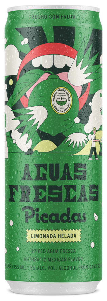
38 Responses to Option B
I like the completely green can the best, it is the most visually appealing
After carefully studying and comparing both product images displayed above, I selected Option B over Option A as my first preference and the one that I would more likely click on to purchase for my own consumption. I felt that this image had more eye catching appeal to me personally based on its coloring (especially use of yellow) as well as the darker shading of colors. However, I felt that both images were quite acceptable.
The green and black is easier to read.
Such a cool looking label design. Option B looks great. I'd certainly buy a can of option B.
Like them both. Just like the green in B slightly
I like more green on can
I do not like the design which uses two different colors as background as shown in A. The two colors are not consistent with each other. I would just prefer using a single color as background as shown in B. It is a simple design but much more attractive.
I would definitely pick out a darker colored can if I had the choice.
I like the part at the bottom more with this one I think the colors worl better.
I like the all green label as opposed to The partially green one. Aesthetically, it sticks out for me a lot more
I like this one the best because I like the all green container as I think it looks more authentic.
Would prefer Option B can. The predominantly green colored can gives the impression of a more full flavor beverage.
I think the can design in choice B is the best of the two.
I like the all green colored can shown in option B the best because it stands out a lot more to me compared to the green and white colored option shown in option A.
The reason I picked B was because of the different colors on the can which is why I picked B over A
B because I feel like the green makes it stand out more and seem like it has more flavor.
I really like the all-green design of it in Option B, as it makes it stand out more.
The solid green can of option B makes it seem like a higher quality product.
I like B better because I like the green background better than the white on A. I think it looks sleeker and more attractive.
B seems like a stronger product design by comparison in terms of the art
I like the colors in option B and think it is the most eye catching, easy to read, and looks the coolest
i like the all green look better
I chose B because I like the more green can over the white in A.
I prefer Option B as my first choice. The all green can looks more vibrant and fun. It has a sharp, cool exterior that inviting and looks like a party in a can. It's vivid and attractive with fun graphics and a cool design.
The green background on this product makes me more likely to select it for some reason
For me, the can that is green from top to bottom is visually more attractive. I also think that vibrant color will be more eye-catching than the one that is two-toned.
Green is my favorite color so if it's something subjective like this I usually go with the green. I'd prefer the all green, however the white/green isn't bad as well. Either is a fine choice and would sell
i like option B the best. I really like the all green color on the can. very attractive and eye catching
The green can works the best, gives it a bit of a punch that goes with having alcohol.
Option B is the best because the product design is simple and elegant
The white can makes it seem less substantial.
Option B is my choice because the colors of the product container are much more engaging and fun.
Something about the green can draws me in more than the white one
The all green can stands out from the pack of other similar products. THat is why this would be my pick
The green color is fresh and vibrant, so I like seeing lots of it. Very cool for sure!
I think the all green can is unique and stands out. I think you definitely notice it more on a shelf than the other one
The colors imply that this is a full flavor option. The lighter colors on the alternative are reminiscent of a diet drink
I like the all green one. I find it both visually appealing and pleasing to me.
Explore who answered your poll
Analyze your results with demographic reports.
Demographics
Sorry, AI highlights are currently only available for polls created after February 28th.
We're working hard to bring AI to more polls, please check back soon.

