Poll results
Save to favorites
Add this poll to your saved list for easy reference.
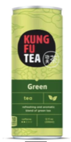
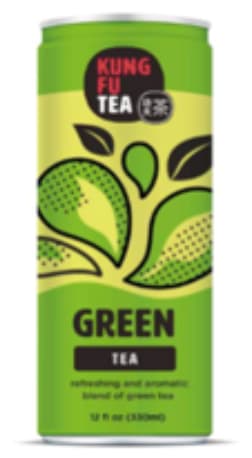
Which packaging design do you prefer for a new Green Tea drink?
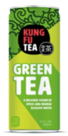
Option B won this Ranked poll with a final tally of 28 votes after 2 rounds of votes counting.
In a Ranked poll, respondents rank every option in order of preference. For example, when you test 6 options, each respondent orders their choices from first to sixth place.
PickFu requires a majority to win a Ranked poll. A majority winner differs from a plurality winner. A majority winner earns over 50% of the votes, whereas a plurality winner earns the most votes, regardless of winning percentage.
If an option does not earn a majority of votes, PickFu eliminates the option with the lowest number of votes. The votes from the eliminated option are reassigned based on each respondent’s next choice. This process continues in rounds until a majority winner emerges.
Scores reflect the percentage of total votes an option receives during the vote counting and indicate the relative preference of the respondents. If there is no majority winner, look to the scores to see how the options fared relative to one another.
| Option | Round 1 | Round 2 |
|---|---|---|
| B | 42% 21 votes | 56% 28 votes +7 |
| C | 36% 18 votes | 44% 22 votes +4 |
| A | 22% 11 votes | Eliminated 11 votes reassigned |
Age range
Education level
Gender identity
Household income range
Options
Personal income range
Racial or ethnic identity
Tea drinker
11 Responses to Option A
I chose the one that looked the nicest as far as art goes. A looks really original.
I ranked them by what I feel has the most flow to its design and draws my interest the most. A does the best job at that and I feel stands out the most. C is okay, but I do not feel does enough. B's design just does not really flow well.
Choice A for green tea looks a lot more premium than the other two options which look a bit whimsy and retro. I like the sedated design of the first choice and looks a bit more high quality compared to the rest.
A is the style I like the best because it has a professional and more serious look to it which makes me think it would be more effective.
I like the color of A a lot. I like the patterns it has.
These are all about the same. I like A because of it's simplicity. I like the colors in C but the image is a bit much.
I think Option A looks the sharpest and most professional. I like that. it seems confident and secure in the product, and trustworthy. I like Option B next because it also looks good and is fun, but without being too silly or over-the-top, which undermines my confidence in the brand. Lastly, Option C is least-preferred for me. The look is just too casual and relaxed. It makes me doubt the quality of the beverage, especially when it's a green tea drink.
I prefer the simpler graphic design on the label of option A because the others are too distracting.
I liked choice A since it looks the most natural and gives me a lot of useful and relevant information about this product. Choice C looks too distracting and takes away from the product and image.
C is a bit bland so C 3. A > B so A 1 and B 2
As green tea is originally from China, my favorite is Option A as the light green background with the clouds look most Chinese. Option B is my second choice as the top part feels Chinese. Option C is my least favorite as it looks cheap and cheerful.
21 Responses to Option B
I like the combination of the green design (clovers) and the white Green Tea logo. It looks the best to me and stands out the most.
I like choice B the most. The reason I like this design is because the font is big, it gives me warm vibes, and it looks like a reliable product. The layout of the information is great.
THe bottle with the bubble letters is fun to look at
I like the design of B and the darker coloring of B and C. I'd like to try this product based off all three images though.
I would go with option "B". The colors matches the packaging design nicely. The overall design looks unique and stylish.
I looked at the designs of the green tea drink that I liked the most. I found the design of option B to be the most appealing and looks the most bright and attractive. I then liked the design of option C and then finally option A.
B has a nice design that I think is aesthetically pleasing. A is something I would expect to see while C I thought looked totally weird.
I chose by what most catches my eye and looks least generic.
I can tell right away that it contains green tea best in this order.
my choices are made on design/layout, colors, and text/font but for me B, is by far the best
I like the graphics and the bold print that shows you what your getting.
A brand like this needs to be fun. B and C are the more fun designs, but something about C is off-putting, the splash drops are weird. A is boring, but it could get the job done.
I thought Option B was the best because it keeps the words "Green" and "Tea" together, and it doesn't make sense to me to split them apart like in the other two options since "Green Tea" is a single idea. Option B also has the largest font size for "Green" and "Tea", which is useful for helping the shopper clearly and immediately understand what the product is. I then ranked Option C over Option A because I didn't like the rectangular segments for the text in Option A. I didn't think the rectangular segments made too much sense, especially putting "Green" and "Tea" in different segments, and I also didn't think it would look good on a cylindrical can from other angles.
B is the only one i like because it is easier to read
I like the design in option B because it looks the most fresh and nutritious. Option C and A look nice too but not as enticing to me.
B and C are really cool and new aged looking.
A is last because the design just really doesn't pop for me, but I love how C B pop with their design. I love B the most because I feel like this design is more modern and I love how the words pop out at me.
Option b label is well arranged snd all the verbiage is clear and able yo read
I like the bright green coloring and white lettering in my top choice, which is bright and exciting. All three options are nice, but my top pick is the best among them. Looks like a tasty product for sure!
I like the font choice on 'green tea' on B, it pops out at me
This is a good look in option B for the Kung Fu tea. That will be great. Excellent choice here for the green tea. I like option A as well. This is a nice look in all three but option B seems the best to me.
18 Responses to Option C
I feel like choice C here is the cleanest option and uses graphics the best compared to the other two.
I really dig the way the leaves splash like water drops.
I loved the splashy boldness of C and appreciated the subtlety of A since that made the product feel more natural.
Design was really amazing in option C. I like to choose option C
A is definitely last because it's not as exciting compared to the others. I like the bold, pop art style of both B and C, but C is first because the design overall seems more balanced since the lighter section is in the middle.
Option C is really unique and modern looking compared to the other options. If I saw C at a store or in a listing, I would pick it up just to investigate it, increasing the chances of me buying.
I chose the can in panel C. I really like the design. It is artistic and very eye catching and shoppers would notice this popular drink.
the first two seem more fun in design with the kung fu tea. when it seems too legit it reminds me too much of stuff from wish and its a turn off and i won't buy it .
These package designs are the strongest in terms of layout and appearance
A is too serious, like a drug bottle. C is the cutest1
I like C and B better than A because the colors are bolder, which makes me want the product more. I prefer C over B because of the large droplets animating the actual tea, which makes me thirsty.
Option C has such a nice design and I think it really does stand out when you compare it to the other two options. Option B is nice as well has a nice design and on both of these products I love the green cans. Option A I think is nice, but I think its to wordy for a can, I dont really feel like people whom get this drink would want to take the time to read all the information that is on Option A,.
I like the colorful shapes on this option, they are very unique and eye-catching, and make it more visually appealing than the most straightforward designs.
Option C is really cool and innovative. The design definitely stands out compared to other drinks. The splash of colors caught my eye quickly.
Looks the most appealing and the ones that will be the best tasting with the most value
I like option C the best because the leaf graphics give the can some character that would be memorable to users of the brand.
C. It sticks out and is unique.
i like option C the most for having a more unique look with the added image below the label
Explore who answered your poll
Analyze your results with demographic reports.
Demographics
Sorry, AI highlights are currently only available for polls created after February 28th.
We're working hard to bring AI to more polls, please check back soon.

