Poll results
Save to favorites
Add this poll to your saved list for easy reference.
Which packaging design do you prefer for a Keurig Coffee Machine Descaling Solution?
Option F won this Ranked poll with a final tally of 30 votes after 6 rounds of votes counting.
In a Ranked poll, respondents rank every option in order of preference. For example, when you test 6 options, each respondent orders their choices from first to sixth place.
PickFu requires a majority to win a Ranked poll. A majority winner differs from a plurality winner. A majority winner earns over 50% of the votes, whereas a plurality winner earns the most votes, regardless of winning percentage.
If an option does not earn a majority of votes, PickFu eliminates the option with the lowest number of votes. The votes from the eliminated option are reassigned based on each respondent’s next choice. This process continues in rounds until a majority winner emerges.
Scores reflect the percentage of total votes an option receives during the vote counting and indicate the relative preference of the respondents. If there is no majority winner, look to the scores to see how the options fared relative to one another.
| Option | Round 1 | Round 2 | Round 3 | Round 4 | Round 5 | Round 6 |
|---|---|---|---|---|---|---|
| F | 36% 18 votes | 38% 19 votes +1 | 42% 21 votes +2 | 42% 21 votes | 48% 24 votes +3 | 60% 30 votes +6 |
| D | 12% 6 votes | 16% 8 votes +2 | 16% 8 votes | 24% 12 votes +4 | 32% 16 votes +4 | 40% 20 votes +4 |
| C | 12% 6 votes | 12% 6 votes | 14% 7 votes +1 | 18% 9 votes +2 | 20% 10 votes +1 | Eliminated 10 votes reassigned |
| B | 12% 6 votes | 14% 7 votes +1 | 14% 7 votes | 16% 8 votes +1 | Eliminated 8 votes reassigned | |
| E | 10% 5 votes | 10% 5 votes | 14% 7 votes +2 | Eliminated 7 votes reassigned | ||
| G | 10% 5 votes | 10% 5 votes | Eliminated 5 votes reassigned | |||
| A | 8% 4 votes | Eliminated 4 votes reassigned |
Age range
Amazon Prime member
Coffee drinker
Education level
Gender identity
Household income range
Options
Personal income range
Racial or ethnic identity
4 Responses to Option A
I feel like the more simplistic logos are the best at showing the product
I lean towards the darker blue labels..they look nicer as well as more professional.
I like option A because I think it does the best job of showing the product.
I just like the color scheme and general design of A best.
6 Responses to Option B
Option B is the most appealing product design. The packaging is easy to read, and understand. The color scheme blends well with the background, and presents itself in an eye catching, yet simplistic way.
I like the options with darker colors and the blue red contrast.
B has the greatest overall color and format that shows off the brand well
I like to know how much product and how many uses I can get. I like to see that information clearly visible.
I think the larger the coffee logo, the better. It is much easier to get a good perception of what the product is for when a big logo of its purpose is shown
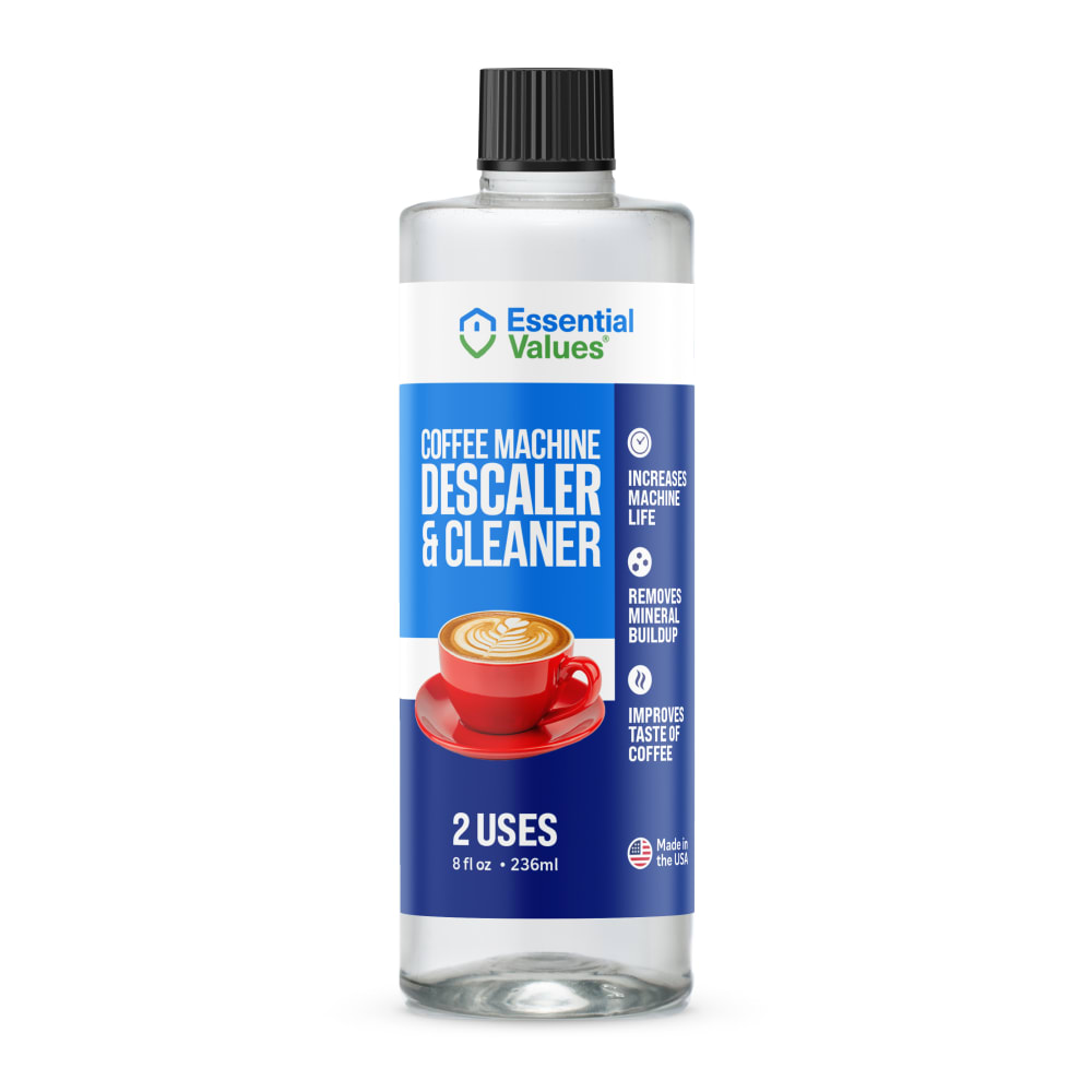
I really liked that it had a picture of the clip art coffee cup and that it was clearly written descaler on it and not really cluttered. Some of the others were to closley written and had too much all together. I really didn't like the picture of the real coffee cup because that could be mistaken nowadays and someone might add it to their drink on accident.
6 Responses to Option C
Show the coffee cup at but keep it simple let the descriptions speak for themselves also the colors are great in option C.
While most of them are attractive, C has a very attractive label, presents the information very clearly, and easily shows the product is made in the USA
There's many pluses for this product.It can be used twiceIt deep cleans your coffee makerIt extends the life of your coffee makerYour coffee will taste much better
C stands out the most to me. I like the label because it has a balanced look and uses color well to be eye catching and interesting looking.
darker colors bigger letters are better and stand out more
Option C because the label is right in the middle and provides the facts right upfront.
6 Responses to Option D
Having green in the label gives me the impression that this is an environmentally friendly product. I also like the coffee icon used on the label. Overall this is a very clean design and shows me what I need to know about the product.
I like that it has lighter colors. It’s more fresh and vibrant.
D A and C all look the most professional and well made to work right
choices d,c,b has a cleaner look to the labeling
i like 5 design wise. but the ones that i put ahead of it have green, which is nice. 5 stands out as being obviously cleaning solution and i won't accidently use it. i do like the green on the first few that i chose though. i want to make sure that both the product and the packaging are not as bad for the environment. the green packaging helps show environmentally concious which is very much the trending thing right now that i think lots of people look for.
I want to see the small green strip as that shows the product is healthy - or at least provides a feeling of such. Having the small coffee art on the label is a good added feature although in C I am not overly n love with the small red cup design
5 Responses to Option E
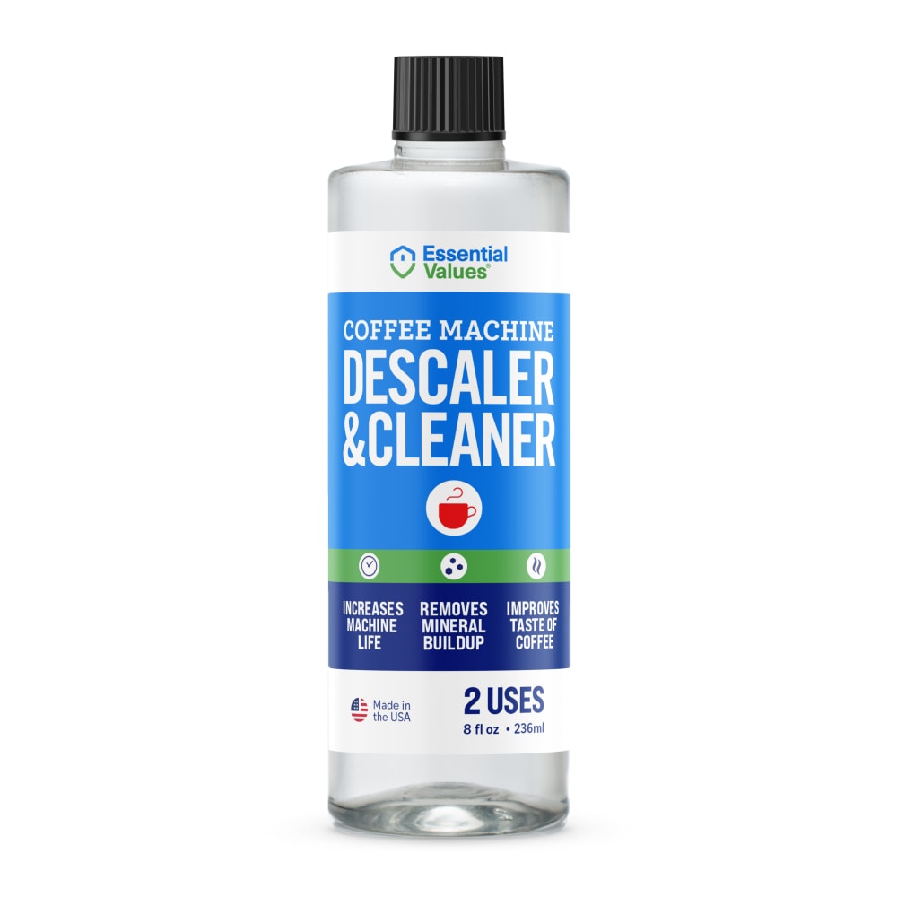
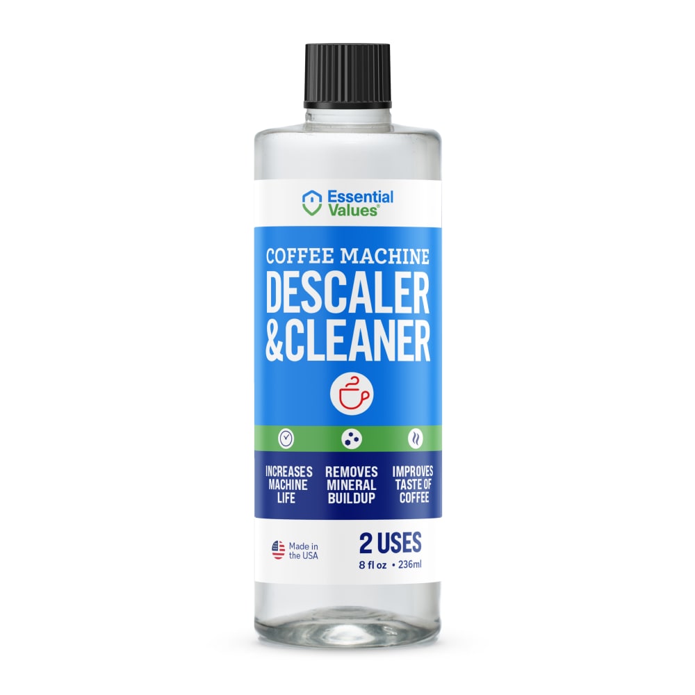
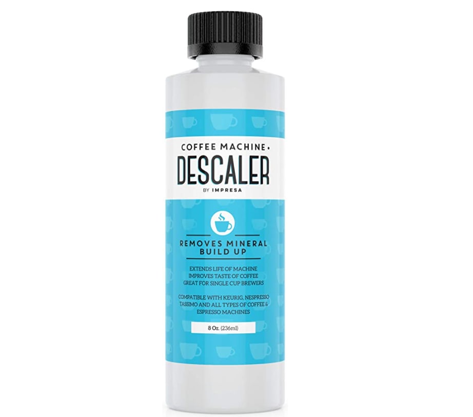
I prefer the bottle labels that use a combo of white, blue, navy blue, and green since those colors work well together and the green line helps sell the cleaner as being "clean". Most of these designs look good due to the professional-looking font and crisp, clean lines in the graphical design. The only one I'd say I don't like is Option G -- I think that the use of turquoise/aquamarine doesn't look that good compared to the colors used in the other options.
I like the larger white bold fonts. it seems more quality
All of these bottles look really good but my favorite would be E, C, F. I like the ones that say cleaner in it. The only thing that I kind of don’t like is that it’s only for two uses maybe you should consider selling a larger bottle
I ranked the designs of the bottles of the descaler and cleaner solution that I liked the most. I found the label design of option E the most appealing followed by the label design of option D then option C then option B. I then preferred the label design of option A followed by option F and then finally option G.
The products that feature cups or coffee cups are too attractive and might confuse a child if they saw this type of bottle. I would never add an icon to a cleaning product that makes the product look like it might be a beverage or beverage related, which is why I chose E. The mug icon is unnecessary. I chose G next because at least that mug blends in color-wise and doesn't stand out as much.
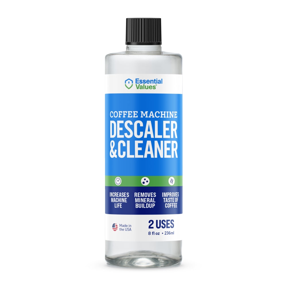
18 Responses to Option F
I choose option F because it looks very attractive than other images.
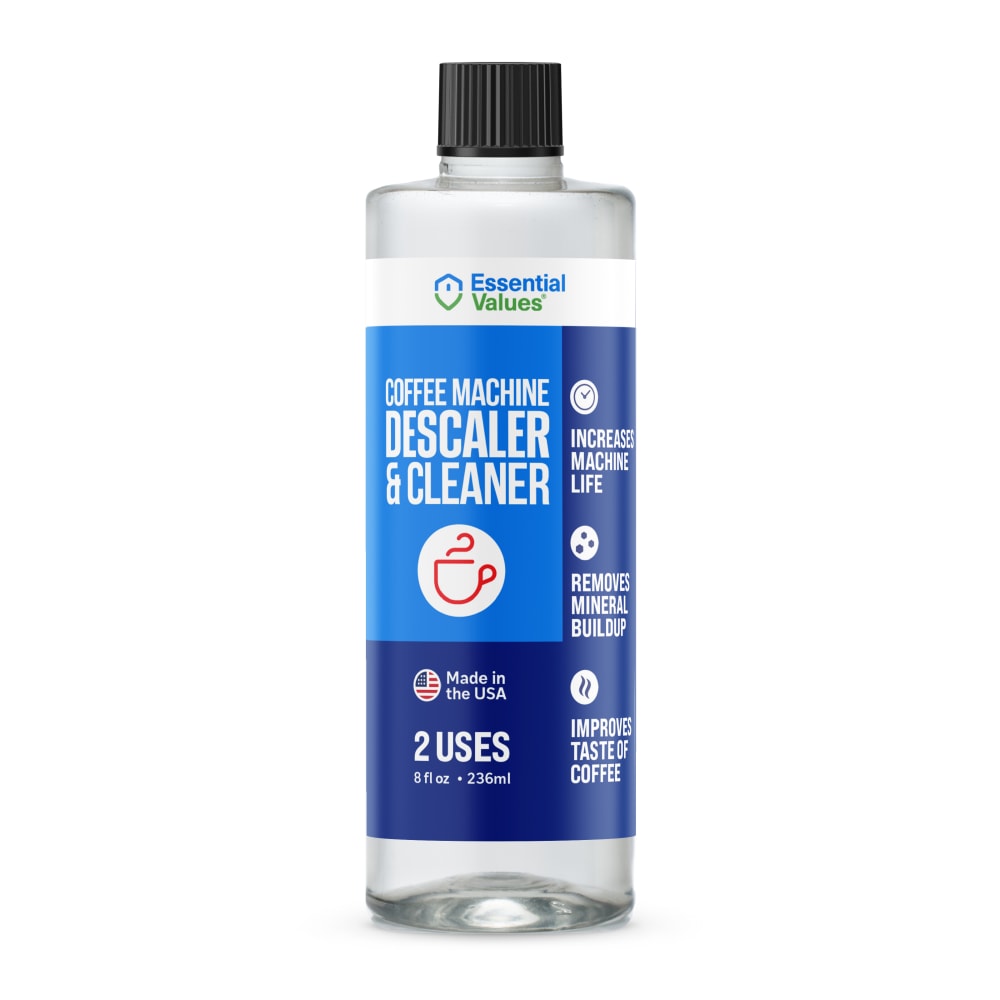
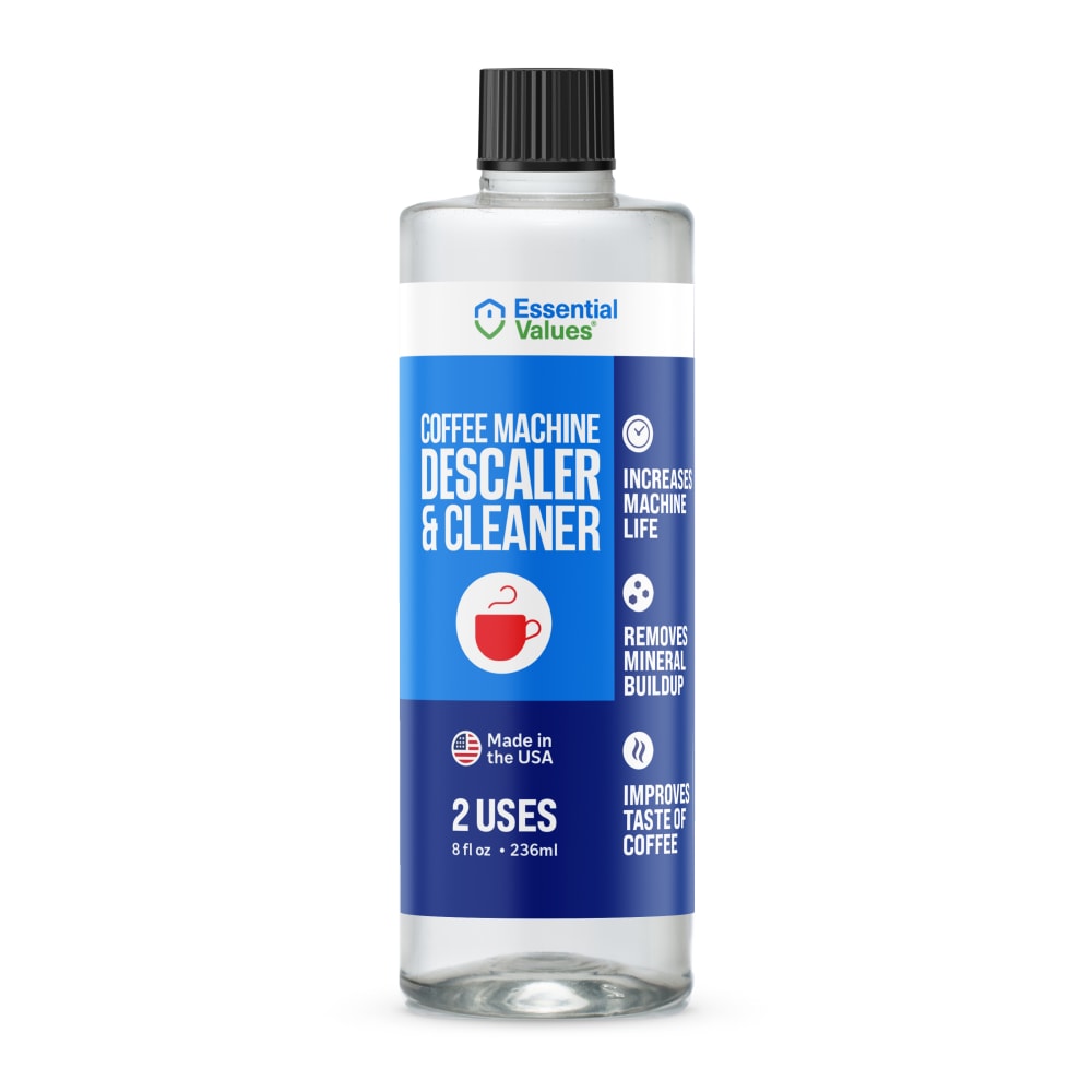
The product will be used to help keep my coffee flowing. Thus, I really want to see a cup of coffee in the descaler packaging and Option F offers the only cup that's not a drawing.
you can see the coffee cup on f very clearly , a and b have a better color then dceg , I cant see g the color to similar
I like seeing the Mug on of coffee on the package.
I prefer the option F product image because I like the mostly blue color scheme and large red coffee cup on the product label. I chose options B and A second and third because I like the blue color scheme and the red illustrations of a coffee cup but not the empty coffee cup as much. I chose options C, D and E fourth, fifth and sixth because I like the coffee cup illustrations but I do not like the green colored lines as much, and I like the filled red coffee cup illustration the most. I chose option G last because this is the only product image that does not include a made in the USA logo on the product label, and I do not like this color scheme at all.
I like option F the best because I like the image of the coffee cup on the label. I like that the color of the coffee cup is red because that makes the label stand out to me due to it being combined with the two toned blue colored backgrounds.
I like the little coffee logo. I like the idea that the bottle is clear so you could see how much liquid you have left in the bottle
The fact that it has actual picture of a cup of coffee in there is a huge plus.
Option "F": As a Keurig daily user, I was immediately attracted to the latte graphic on the front label; it drew me in and the overall packaging led to choose this design which I found more relatable to the product.
Option F has a nice picture of a coffee cup on the bottle, which gives me an idea of exactly what the descaler is for. Option B also has a nice image of a coffee mug but it's not as large or noticeable as Option F. Option D has a nice overall design with a bit of green added to the bottle. Option C also has green in the image but I don't care for the coffee cup that's on the bottle along with the green. Option E has no coffee mug image anywhere and it looks a bit plain. Option A just looks too plain altogether and Option G is about as basic and unattractive as you can get.
I think seeing the cup of coffee in Option F is a nice touch that makes it stand out and makes it unique. The fact that you can easily see the product features is also good. Option C is next because I like the red cup, and I do prefer the horizontal design/layout in terms of being able to see all of the product highlights and features. C is ranked over D because of the red cup. Option G is a bit "wordy" with the text being too small.
I like choice F is eye-catching. I choose this because it stands out well.
I'm really drawn to the label shown in image F. I like that it shows a real coffee cup. That helps me to think about this being a cleaner for my own coffee machine.
I like F the most - because it shows an actual picture of a cup of coffee. The others with coffee icons are also good. Sometimes, it's easier to recognize what something is by image vs. words on the packaging. I appreciate that all products shown here say they contain 2 uses.
I honestly like all of these label designs and could easily see myself buying any of them. E seems kind of plain, I miss there being a coffee cup. G would be a winner if the coffee cup were larger. D has a similar problem, it would rank higher with a more realistic or larger coffee cup. A is a really nice look, I just like the others better. C and B are both great labels B is over C because of size of cup. F really grabbed my attention, the picture of the real coffee cup really grabbed me.
Anyone with a coffee mug on it so people know what this product is meant for.
the way I ranked my choices is based on the picture that was most eye catching to me, F was my first because it has a picture of an actual coffee cup for those who cannot read English very well it will help them much more. E was my next choice because it seems like the more professional. then the rest of my choices were pretty similar to each other.
Striking image of the coffee cup on the bottle label.
5 Responses to Option G
G - is well designedA - color commination is wellE - it's is attractive B - well design and unique D - seems like three dimensional viewF - color commination is wellC - is attractive
Im a minimalist, i think less is more and G has a classy look. I by far like it better than all the the others. I then ranked them but general appeal of the design.
I love option G the most because I love that particular shade of blue the most and it is the most aestheticically pleasing.
I prefer the white-based design of G. It looks more akin to what I would expect this product to look like.
G has a very cool, midcentury style label design, which i like a lot. F uses an actual photo to illustrate that it's for coffee machines, which I also like. A/B/D/C are all roughly the same, and I'm not a big fan of the illustrated coffee cup in any of them. E is too plain to tell you much.
Explore who answered your poll
Analyze your results with demographic reports.
Demographics
Sorry, AI highlights are currently only available for polls created after February 28th.
We're working hard to bring AI to more polls, please check back soon.

