Poll results
Save to favorites
Add this poll to your saved list for easy reference.
Which packaging design do you prefer for a Keurig Cffee Machine Descaling Solution?
Option A won this Ranked poll with a final tally of 30 votes after 3 rounds of votes counting.
In a Ranked poll, respondents rank every option in order of preference. For example, when you test 6 options, each respondent orders their choices from first to sixth place.
PickFu requires a majority to win a Ranked poll. A majority winner differs from a plurality winner. A majority winner earns over 50% of the votes, whereas a plurality winner earns the most votes, regardless of winning percentage.
If an option does not earn a majority of votes, PickFu eliminates the option with the lowest number of votes. The votes from the eliminated option are reassigned based on each respondent’s next choice. This process continues in rounds until a majority winner emerges.
Scores reflect the percentage of total votes an option receives during the vote counting and indicate the relative preference of the respondents. If there is no majority winner, look to the scores to see how the options fared relative to one another.
| Option | Round 1 | Round 2 | Round 3 |
|---|---|---|---|
| A | 48% 24 votes | 48% 24 votes | 60% 30 votes +6 |
| C | 30% 15 votes | 32% 16 votes +1 | 40% 20 votes +4 |
| D | 14% 7 votes | 20% 10 votes +3 | Eliminated 10 votes reassigned |
| B | 8% 4 votes | Eliminated 4 votes reassigned |
Age range
Amazon Prime member
Coffee drinker
Education level
Gender identity
Household income range
Options
Personal income range
Racial or ethnic identity
24 Responses to Option A
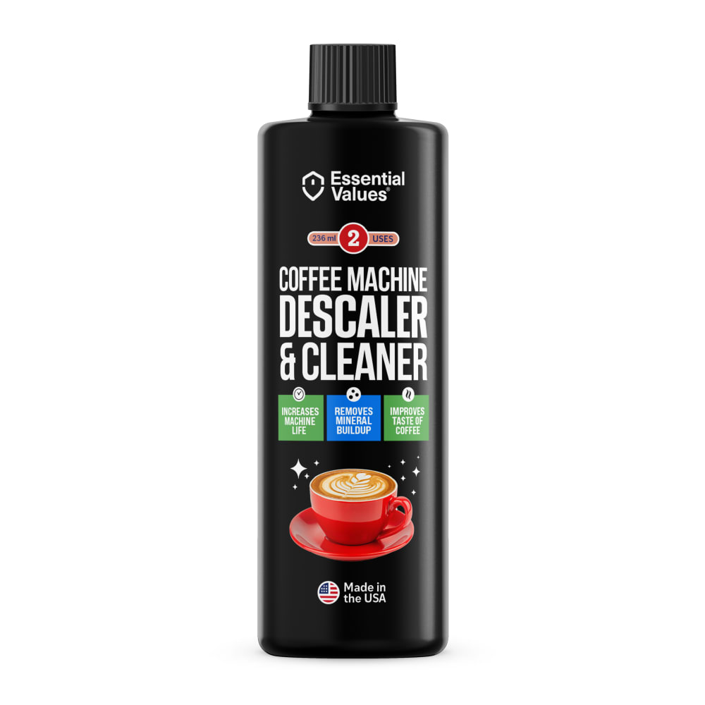
I like the black bottle because it is more eye catching and easier to read.
I most prefer option A personally. This option is most vibrant and stands out most. Just seems like the highest quality product to me personally!
I like A the best. I like that it has a coffee cup on it so I know what machine this is for at first glance, I also like the black bottle better for some reason
Package and label wise, option A is really good. It makes for a really nice looking package.
The black bottle wins top rank here..definitely the most distinct and easy to read.
I like option A the best because I like the all black colored bottle, cap, and label. The black background makes the white text and other colors used really stand out more compared to the other options.
The black is cleaner and allows you to read everything else easier.
I think the black bottle looks the best. It sticks out more than the others and makes all of the other colors stick out a lot. The green and blue stick out real well on the black. I would choose C second because I like the green line that goes across the middle. It matches well with the different shades of blue
I think you can scan the text more quickly on the bottle with the black background, which is helpful if you see it in a listing.
A and D make the most sense to me, the coffee picture really drives home the use case and I like the all black design.
The black bottle design looks cleaner and more appealing for this product.
i actually like all of these, although i like the black one the best i think having the green on my #1 adds a nice touch too as going green is something that you want to capitalize on at this time. 2 i like because the picture of the coffee cup is good and also shows the number of uses a bit more clearly, 3 and 4 are nice too though.
I prefer the black packaging because it stands out more
I prefer the all black aesthetic of A. It feels clean and efficient, which are two hallmarks of the goal of the product.
I love option A the most because of its dark packaging and it is the most aesthetically pleasing option to me.
I chose option A because because I like the color of the design and the photo depicting the cup of coffee. It allows you to know exactly what the product is supposed to be used for. Option D was good for the same reason but I liked the color of the black bottle better
I would be most likely to click on and ultimately purchase option A because I think that it has the most eye-catching and visually appealing product label design out of the four options.
I like A best because it is a black bottle with a color picture to help you notice what it is used for.
I like the big cup of coffee in Options A and D - that's why I'm buying this solution - and Option A's sparkly label is too much fun!
The black from the bottle is the most attention grabbing. It has the personality of this type of product, and would therefore draw me in first
I prefer A because the black bottle stands out much more than a boring white/blue bottle. It wouldn't really matter in the big picture but I'd still rather purchase A.
I like the look of the black bottle best. I like the coffee/cappucino cup on option A & D. I feel like A has the easiest to read label with the information showing what the product does. I don't like the way C is set up at all, it almost looks like a chemical bottle?
The black bottle is most eye catching.
I like the black bottle. I think the little cup of coffee on the label is cool also I think it makes it stand out
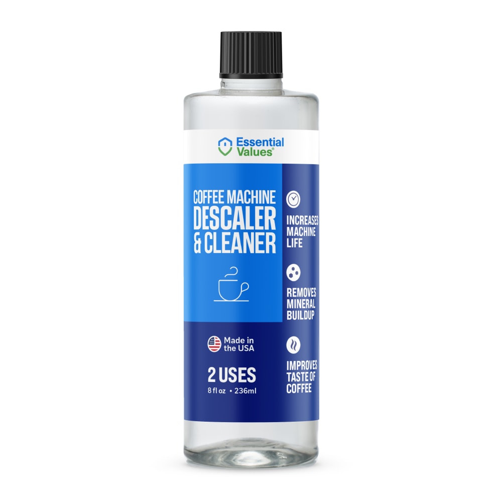
4 Responses to Option B
I prefer the clean look of blue and clear. It is easier to read and see.
I like the clear bottle best, and option D, I like the cute little coffee cup on the label so you know really easily what it is for, and I also like how it lists everything down the side of the label that the product is used for and good for. I prefer the coffee cup on the label in option B because it doesn't stand out too much like it does in option D where it is red
I like the clear bottles but I like the design of option A the best with the stars and cup.
I like the design of "B" the most because it's the simplest. I really dislike "A" because I want to see how much is in the bottle.
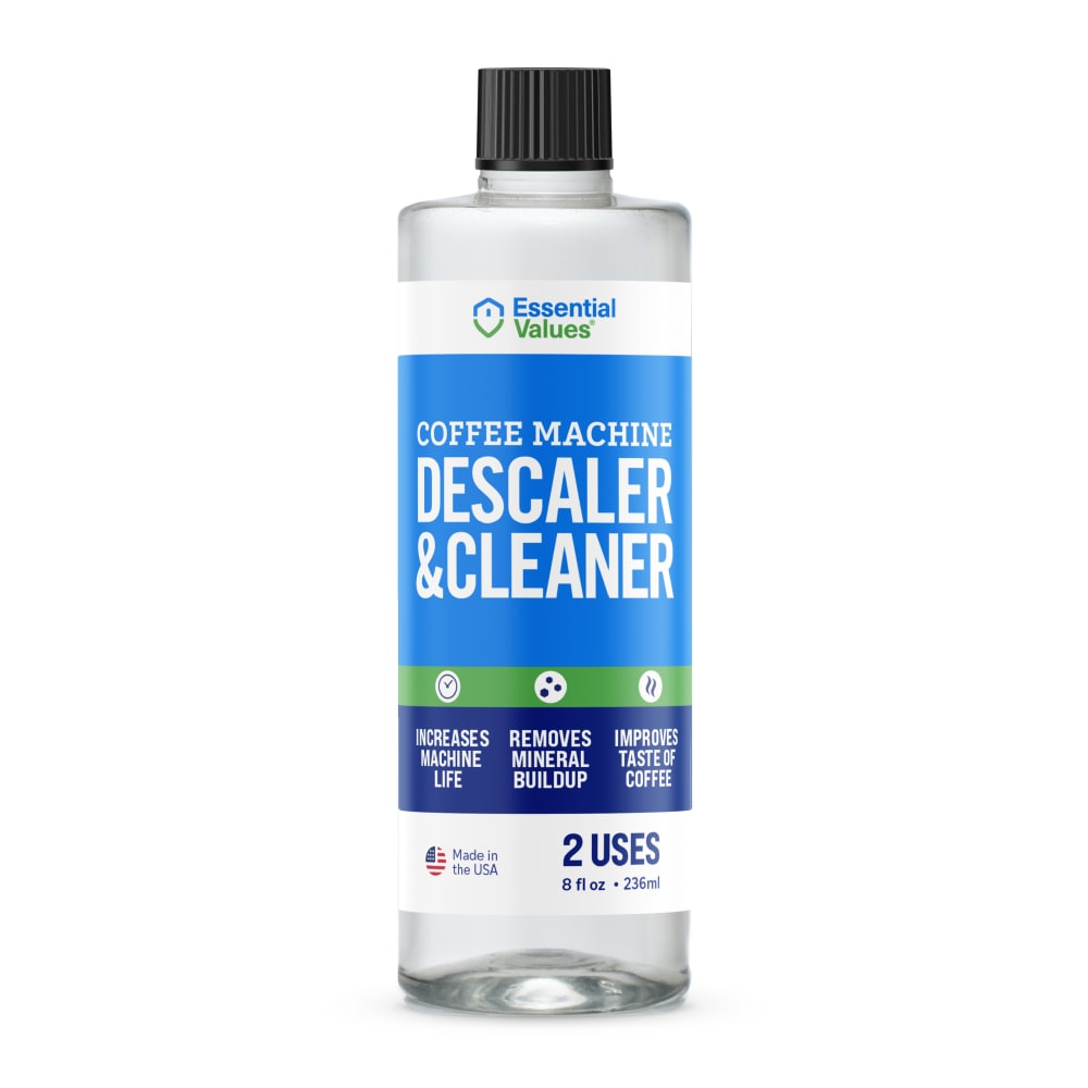
15 Responses to Option C
This has a very simple presentation with a nice bold and large font choice that looks professional and established
A cleaning and descaling solution should feature the lightest blue hues possible because that looks more cleansing and refreshing. Darker blues and black just felt a bit muddy and depressing to me which didn't fit the product.
I prefer the simple packaging and the clear bottle so i can see how much is left.
My top picks look more professional and more appealing in their design. I don't think you should have a coffee on the cover though because someone might mistake it for creamer or something.
I prefer option C because it is the cleanest and sleekest packaging which I feel like is a bonus for a cleaning product. No need for anything artistic on it.
I ranked the designs of the descaler and cleaner bottle that I liked the most. I liked the transparent design of the label of option C to be the most appealing followed by option B and then option D. I then liked the black bottle of option A the least.
The blue and green label of Option C makes the product seem gentle and safe to use.
C is the most simple, straightforward presentation. It gives me confidence that it'll be effective. A is more fancy, eye-catching. It would be worth trying out. D and B are pretty similar, the only difference being the picture of the actual coffee cup on D, which reminds me what it's for.
I like C because the label has a clean uncluttered look to it that I like. I like the two shades of blue with the green strip. I like B a lot too but I don't really care for D or A. I think the coffee cup looks odd.
C has the cleanest look to it, it is very clear and pleasant looking. The label has a lot of good information and it's more inviting and eye catching.
I like the green band, but wish the coffee graphic (B) was added to the image somehow. It does remain my top choice, but it would be a nice addition.
I really like the green strip on C and think it fits really well with the black and the clear bottle.
C is perfect in comparison to all others as far as layout. The quality dips with each subsequent choice.
The green used on the label in C helps it stand out more to me
C and B look like a cleaner bottle. D and very much A look like a bottle of something you would put in your coffee. The person shouldn't have their cleaner and creamer on the same shelf, but if they did, this could get a bit confusing.
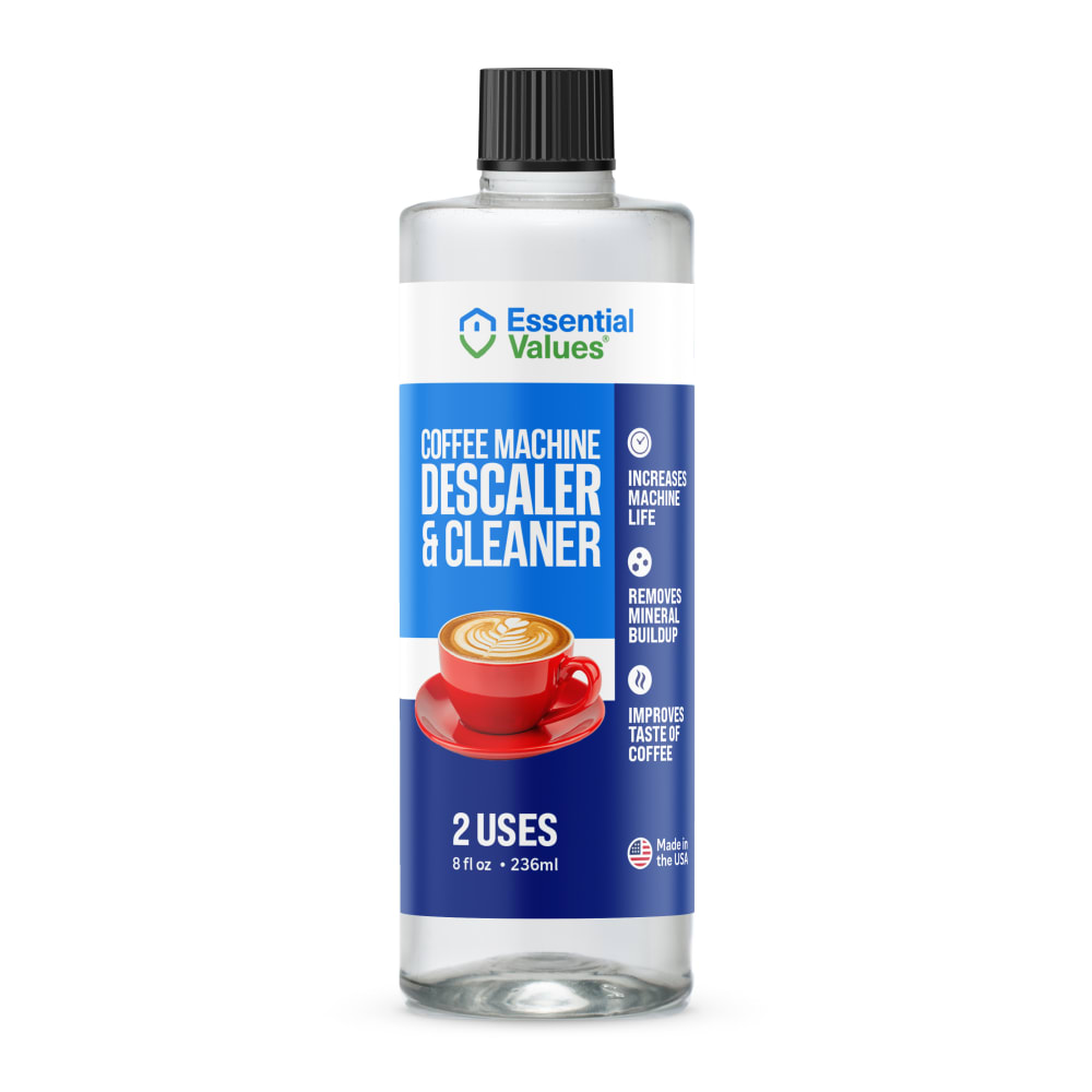
7 Responses to Option D
The ones with a coffee cup on them so people know thats what this is for some people dont know you need to descale your coffee pots.
I prefer options D and A because the picture of the coffee makes me feel that it is safer to use in my coffee machine.
D looks the best and i like the design of the label and the inclusion of the cup of coffee on there, C is good too and i think the little green ribbon banner nicely brings it together, B is ok but kind of plain looking to me, A i don't really like the look of because of the black bottle
i like this
I like the pop of color in the coffee mug against the clear bottle in D, and again in A. I slightly prefer the clear bottle because by showing a clear liquid inside it just seems like the product packaging isn't hiding anything.
I think the coffee mug on the front is jolly.
The packages shown in options D, B and A are the best ones because their purpose is really clear and the design on them is really appealing which makes the customers feel more secure about the uses of this product, then we have option C which for me at least looks like a shampoo bottle, making it not at all appealing, but if i had to choose only one i would surely choose option D.
Explore who answered your poll
Analyze your results with demographic reports.
Demographics
Sorry, AI highlights are currently only available for polls created after February 28th.
We're working hard to bring AI to more polls, please check back soon.

