Poll results
Save to favorites
Add this poll to your saved list for easy reference.
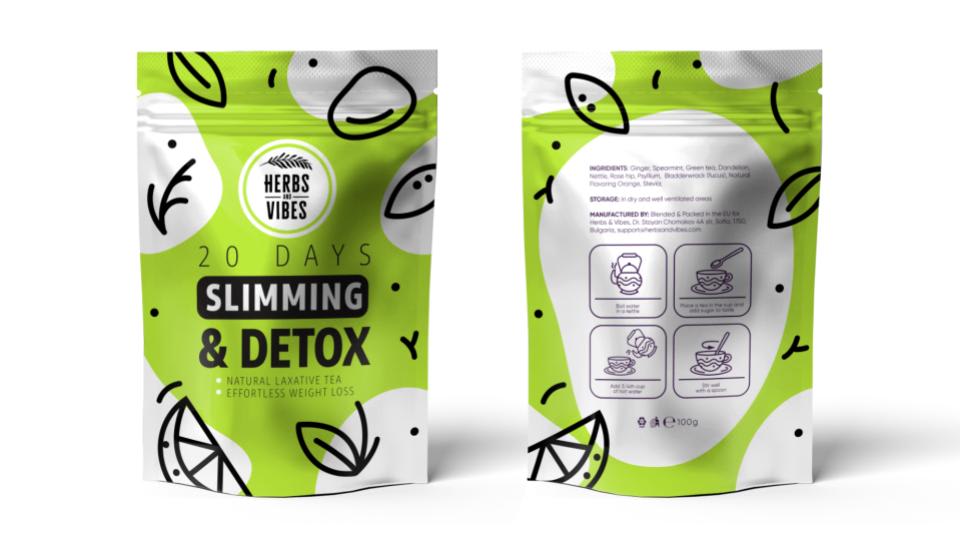
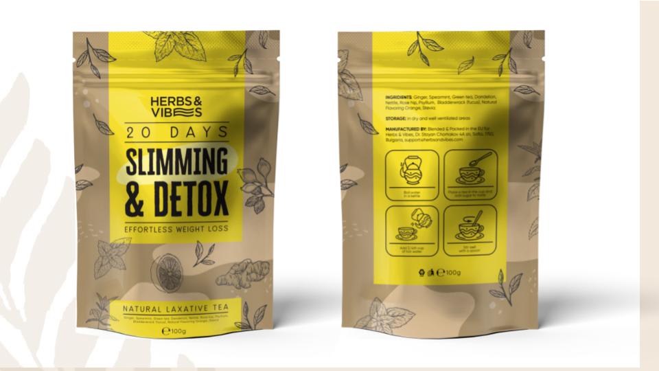
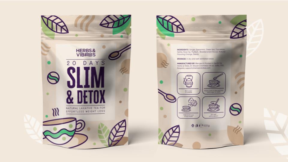
Which package design for Slim&Detox tea do you like the most for selling on Amazon
Option A won this Ranked poll with a final tally of 28 votes after 2 rounds of votes counting.
In a Ranked poll, respondents rank every option in order of preference. For example, when you test 6 options, each respondent orders their choices from first to sixth place.
PickFu requires a majority to win a Ranked poll. A majority winner differs from a plurality winner. A majority winner earns over 50% of the votes, whereas a plurality winner earns the most votes, regardless of winning percentage.
If an option does not earn a majority of votes, PickFu eliminates the option with the lowest number of votes. The votes from the eliminated option are reassigned based on each respondent’s next choice. This process continues in rounds until a majority winner emerges.
Scores reflect the percentage of total votes an option receives during the vote counting and indicate the relative preference of the respondents. If there is no majority winner, look to the scores to see how the options fared relative to one another.
| Option | Round 1 | Round 2 |
|---|---|---|
| A | 48% 24 votes | 56% 28 votes +4 |
| C | 38% 19 votes | 44% 22 votes +3 |
| B | 14% 7 votes | Eliminated 7 votes reassigned |
Age range
Amazon Prime member
Education level
Gender identity
Options
Personal income range
Racial or ethnic identity
Tea drinker
24 Responses to Option A
I think yellow is not an attractive color since it’s not slimming at all. Thus B is last. I like how A feels healthy with the green leaves. C is cute with the coffee cups
option A is ranked 1. Any customer who gives a cursory glance to Option A will associate the color green in their heads with slimming foods such as green tea and green vegetables etc and therefore green is a good association with a slimming product.Option B and C are not my personal preferences for color and I would personally not buy them with that packaging. Having said that, the only reason C is ranked above B is because the lighter background in C highlights the main product title and description well compared to B
A stood out to me most because of the bright green color, c looked fun with the design of the package b was very boring and brown i didnt like it at all even the yellow didnt help it pop.
I thought that the lime green bag of detox tea stood out most due to its vivid coloring and the whimsical designs that decorated the bag. Also, I tend to equate green with the color tea, as green tea is a personal favorite of mine. I thought that option C was the next best choice as the teacup and leaf design were very cute and helped to promote the product very well. The only reason I didn't rank it i n the number one spot was that the colors were mainly more neutral and not as eye-catching. I thought choice B was the plainest of the three designs, and it was not as nicely decorated as the other two. It just sort of looked like a brown paper bag with a yellow label, and it didn't have the same aesthetic appeal.
i like this design very much and i want to purchase this product.
I like A the best. The bright green packaging stands out against the others. I also liked the cute citrus cartoons and think the label is really easy to read, which is a plus.
The option A package design for slim & detox is better. It looks sleek and it would represent the product well. It inspires me to buy the product. It looks very original. The color combination and design is sleek. I prefer it. The green color gives me a good impression of the company being an environmentally friendly company.
The bright green packaging in Option A is bright, eye catching, and earthy.
The most necessary product for people who are in diet like me, "Slimming & Detox" tea. I pick option A, this design is eye-catching and the best among three, white and bright green is an amazing color combination and with black fonts which is great about choosing the product, the small detailed designs are great. and the second option is C, which is subtle and appealing to pick, beige and white mixed design makes in super good looking and the design patterns with green brown and black is great about the cover, and the final option is yellow and brown mixed option B, which has decent design and subtle inner black patterns and nothing great to mention about the third one. Hence my final choices are A C and B.
this packaging and color design seems really eye catching and bright and I love the large graphic style of the design
yellow and green are more energetic and look more effective
I like the green packaging as that shade of green makes me think of tea. I like the brown packaging of B as it feels natural.
I just think the yellow is so ugly!
A as the first one because the green color fits the slim theme better, C as the second one because the characters are larger and comfortable than B.
I like A and B the most because you can read the slimming and detox best. It is hidden and the colors make it harder to read in C.
I much prefer the green packaging as it’s more visually appealing and appears more trustworthy.
I like the green color on A best. B is sort of boring/unappealing.
good information on the label and nice graphic
The bright color on A especially and B are eyecatching. C is very dull and you wouldnt really notice it.
i selected the options i would be most attracted to based on packaging
I like the green one the most. It stands out the most to me and most fits with tea since it's green. Yellow is okay. The last one is good, but lacks color.
I made my choices based on what I thought looked better. I chose A for the first one because I like the colors together and the layout of the words. I then choose B because of the colors and images. Lastly, I choose B because I still liked the colors but not as much as the first two options.
I chose A first because I really like the green and white packaging. It's simple and draws your eye in. I chose B next because while I overall like the design, I don't care for the colors. I chose C last because while cute, the design is far too busy. I prefer to keep things simple and to the point.
I like the packaging that reminds me of natural things the most, because that makes me feel like the product is more safe and healthy.
7 Responses to Option B
I LIKE CHOICE B BEST. IT LOOKS MOST NATURAL AND EYE CATCHING
YELLOW COLOR IS MOST ATTRACTIVE THAN ALL OTHER SO PICK OPTION "B" THEN COMES OPTION A WITH COLOR GREEN THEN LEAST ATTRACTIVE WHITE COLOR OF OPTION "C"
I liked all the options but I chose Option B first because it looked the most natural based on the brown color and realistic leaf design. It looked overall the most professional and thus like it would work the most. Then I chose OPtion A because I liked the green color which caught my attention and the '20 days' was more clear than Option C. Finally I chose Option C which I did like but didn't think the pacakging necessarily communicated it was a detox tea.
For B I like the color scheme of this packaging and its simple and easy to read. C is nice too, simple and looks nice.
I like the packaging of the color on Choice B because the recycled cardstock brown color looks more natural, therefore, I am forced into believing that I am receiving a naturally produced product. I like Choice A next because I think the green color is vibrant and I am drawn to the color palette.
I chose B first because I feel the packaging is more serious. It isn't flashy. It seems more serious than the other 2. I just feel like C and A are done up in a way just to catch the attention of young girls and and seems kind of immature. I don't want to drink something that is made up to appeal to a younger crowd.
This packaging makes me think it is organic and natural. Its plainer, but eye catching enough that I would notice it quickly when scrolling through. The others look kind of in your face, like they need to grab your attention because the products are inferior.
19 Responses to Option C
i like the one i chose with the tea because it stands out the most
I love the purple design. It looks hip and modern. I also like the lime green because thr color is bright. I am not crazy about the yellow packaging.
My h wife I liked the color / design the most my option b I like the green and I like that the daytime with easier to read on it I'm an option c I really didn't like that color it really didn't say tea to me as much as poop.
I was really drawn to A because of the bright green color, but I think C is better for the product. The design is simple and calming.
I chose option C as first ranked because this light grey color looks different and delicate. spoon and tea cup provided is opted for slim and detox tea brand. remaining option b somewhat better than A option. finally the green color
I like the simple design with the little color and basic design
I ranked C first because the packaging is very unique. I have not seen a design like this for detox tea before. I ranked A next because the green color gives the feeling that it is natural. I like B also, just prefer the other two.
C and A are both fun looking and inviting. B is a little dull.
My choices are based on my preferred color choices. I like the minimal colors used in C. The colors are very earthy. I chose A second. It's bright green and might attract browsers. The bold lines go well with the lime grren. Personally for me, I wouldn't want others to see the bright green packaging and see that it's a laxative. I didn't like the packaging colors on B. It tries to blend the natural earth colors of C with the bright color in A. I think a different shade of yellow could be used - it clashes with the light brown color
Option c has so very beautiful inviting colors. Options a and b were nice but they just didn’t lure me in like c did.
I really like C I like how it has cute design on the package. I like the colors. Choice A I like the colors the green and black go well. The B one I really don't care for
I like the packing. The packaging for option C is beautiful
Choice C is the most appealing to me. I like the simple design of this packaging, and the colors used for this.
I like choice c because it is more colorful.
i picked the first one first because i really like the colors of the package. the leaves are very cute, and i like that they stand out nicely. i picked the second one second because i like how the wording stands out nicely, and the yellow and the black is very nice. i picked the last one last because i don't really like the green color, though the fruits are cute, the green just isn't my favorite.
They were all really good choices! I chose C because of the design and how well the font stood out on the packaging. The design for it was also really clean and not too “busy.” Option B was my second choice because I really liked the font as well. I feel like on package A, if the font was like the font in option C, it would have been my favorite but I did not like the way the “slimming” was in the black box and white font.
They are listed as how they look like they would look.
Like the way the teacup is shown on white packaging; and the brand presentation on the white and brown packaging. Overall layout and color-scheme of those two are preferred.
C: I like the nice blend of colors. The design doesn't stick out which is appealing because it allows the words to pop.B: Colors don't blend as much because of the bold yellow but I like it over option A.A: Not a fan of the green and white design.
Explore who answered your poll
Analyze your results with demographic reports.
Demographics
Sorry, AI highlights are currently only available for polls created after February 28th.
We're working hard to bring AI to more polls, please check back soon.

