Poll results
Save to favorites
Add this poll to your saved list for easy reference.
Which package design for Sleep&Relax tea do you like the most for selling on Amazon
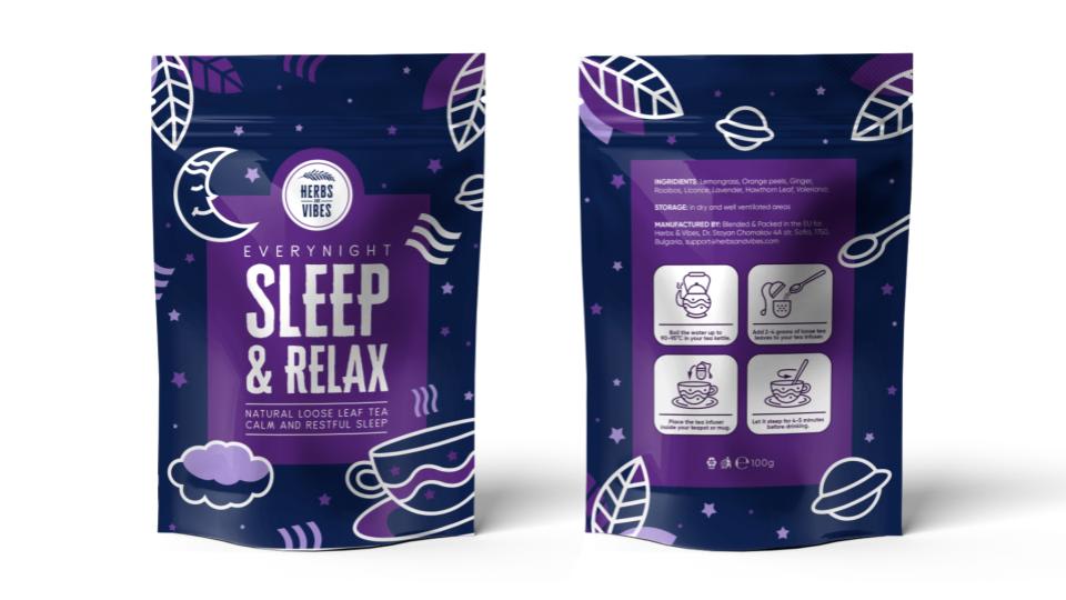
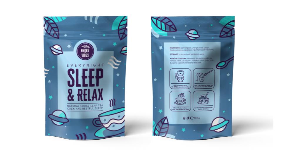
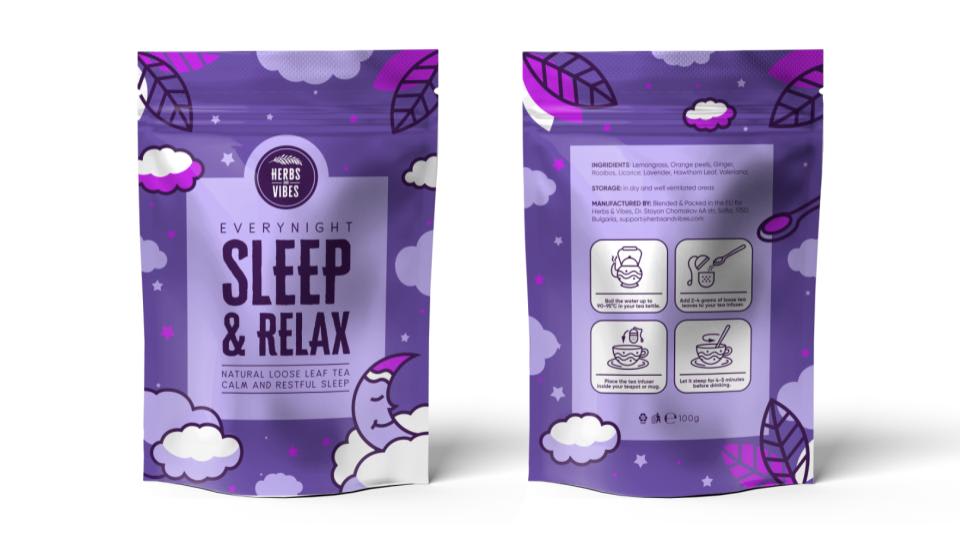
Option A won this Ranked poll with a final tally of 29 votes after 1 round of vote counting.
In a Ranked poll, respondents rank every option in order of preference. For example, when you test 6 options, each respondent orders their choices from first to sixth place.
PickFu requires a majority to win a Ranked poll. A majority winner differs from a plurality winner. A majority winner earns over 50% of the votes, whereas a plurality winner earns the most votes, regardless of winning percentage.
If an option does not earn a majority of votes, PickFu eliminates the option with the lowest number of votes. The votes from the eliminated option are reassigned based on each respondent’s next choice. This process continues in rounds until a majority winner emerges.
Scores reflect the percentage of total votes an option receives during the vote counting and indicate the relative preference of the respondents. If there is no majority winner, look to the scores to see how the options fared relative to one another.
| Option | Round 1 |
|---|---|
| A | 58% 29 votes |
| B | 22% 11 votes |
| C | 20% 10 votes |
Age range
Amazon Prime member
Education level
Gender identity
Options
Personal income range
Racial or ethnic identity
Tea drinker
29 Responses to Option A
Choice A is the most appealing and I would purchase this item before any others.
I went in order of the shades that I associated with sleep (dark to light) and the colors that I associated with calm (purple then blue)
Tea that helps me sleep and relax should come in packaging that reminds me of nighttime. I think A accomplishes this the best with the navy blue colors for the night sky and the moon. I think the lighter blue color looks less like the night sky but it's better than purple which does not look like nighttime at all
I chose the tea packaging that is most appealing to me and visually representative of relaxation.
the color and the design makes the number one the best looking one
I chose option A because the darker purple color makes you immediately think of night and is so beautiful all while being relaxing and showing the night sky,
Choice A is my favorite packaging among the other options. I think the darker packaging really sells the fact that the tea is relaxing and can help you sleep. I associate sleep, nighttime and relaxation with dark colors and a deep purple is perfect for this packaging. Option C is the next best as the purple has a very relaxing feel to it (it makes me think of relaxing lavender). The blue packaging feels like it's best for daytime as it's similar to a sky blue.
For A, I really like that the packaging is dark as it reminds me of sleeping/nighttime; the design is also very creative and makes me feel like I can trust the product. I like B because of the design, but prefer the darker color better. Finally, I chose C last because it reminds me of something a child would use.
I like the deep purple the best, also the white images stand out well and look good. The packaging is also easy to read.
I chose Option A first because the dark color of the package makes me think of night time the most and I associate the dark, night colors with sleep.
I like choice a because of the darker colors.
The deep purple is dark, which can be associated with nighttime, and it's a color that's associated with relaxing and calmness.
I like option A the most because it has a darker color scheme. It makes me think more about sleep and looks obviously like it is a night time product.
I always associate purple with relaxing and sleep because of lavender flowers. I think purple would get the message across best.
I absolutely LOVE the darker packaging, makes me think of sleep, peaceful sleep, without waking up at night. the color and the design is aesthetically pleasing. I would most likely grab the product because of the theme of the packaging. the other two options look generic not attention grabbing.
They all look very appealing and eye catching but i'd say Vote #1 takes a super slight lead over the others.
I love the night time design that is on A, and the colors work really well with the packaging. I like C as well for the colors, but the design doesn't seem quite as nice to me.
Blue seems to be the go-to for sleep aids... I like purple!
I like the purple colors more than I like the blue. The blue makes the bag look like I'm going to be on a tripping episode.
I actually like all three. But I think the dark purple one is the best, it makes me feel most sleepy and relaxed when looking at it. Then comes the lighter purple. The blue makes me think of relaxing, but not exactly sleeping.
I like the dark purple. IT reminds me more of the dark night sleep
this color grasp the consumer much better rather than other option. option A dark color make me to buy the sleep & relax product quickly.
I like the dark colors to be associated with sleep rather than the pastels. 3 being the darkest makes me think of a deeper sleep 2 is still in the purple so still associated with decent sleep and 3 pastel blue makes me think more of a spring day than a good night's sleep.
I chose my selections based on my personal preferences and what I can picture myself purchasing when viewing this specific product. I myself enjoy relaxing night time tea's and/or lavender Epsom salt type relaxing products. I chose my selections in order because the labels look more realistic to me. Thank you kindly
The choice I liked the most is choice a because the colors seemed so soothing and like night time. Purple is a night time color to me
i love the 2nd one the most because the colors make it stand out so much
I feel more favorable towards the Option A. It looks better and it attracts me to it. I love its design and appearance. The color theme is adorable. I love the design mockup.
Option A has the package design which looks bright and has the emphasizing description that is more appealing.Option C has the design which induces the sleep that looks better than option B.
I thought darker colors are nicer because it tells you it is for sleeping. I personally like purple, which is why I chose C next.
11 Responses to Option B
I love the colors of B but with the image of C, I love the sleepy moon he's so cute
B is light blue that is delicate and cute, A is more mysterious than C and cooler, so B A and C.
The blue makes me think more of sleep, so I'm drawn that way. Otherwise the light purple, like lavender.
I like the colors and design of B more than the purples. Blue makes me feel more sleepy and relaxed. I prefer the lighter shades.
I like B because the color is the most relaxing and subdued to me, followed by A. C is a little bright I think.
I like the blue design of Option B best, followed by the light purple design of Option C. I am not too keen with the black and dark purple design of Option A.
I was more drawn to option B for the color grab my attention by all 3 even though i don't feel that the packaging is really for sleep with the planets. I like option A design with the moon and seems more night time of the universe. Option C is too purple which i don't think that color is associated with sleep.
Option B I feel reminds me of sleep and relaxation more, because the colors are a little less bold than Option A or C. Blue is a nice calming, almost neutral color, so it fits the product more. Option A is also really nice, and the colors obviously match the idea of a night sky. But I feel like they're almost too bold. I think Option B would probably appeal to a wider demographic as well, since it's more "gender neutral."
I like the comfy and warm welcoming appearance. The product is approachable and subtle. I will order.
I chose option B because the blue color is calming to me. Option C is next because the light purple looks nice and relaxing. Option A is last because the dark purple looks like night but is too intense.
Light blue goes well for sleeping and nighttime, it just looks the best. i love all three of them, through.
10 Responses to Option C
It has big benefits blended with a bursting flavor
I like the purple ones the most. They are the cutest to me. I actually like all of them, but prefer the purple.
I like this design because the images on the front look relaxing and make me think of sleeping. A cup of tea makes me want to get up and get going for the day. The other two options look like baking packages.
I like the colors in the first one, relaxing but not too dark.
The purple would stand out the most in the aisle, and the darker blue is easiest to see and read the contents. The light blue would blend into the aisle and be hard to see and read, it's a very standard color. I think the bright purple reminds me of lavendar (and calming) and it fits very well.
C looks nice and has a good design with the light purple clouds and moons
Purple seem to be choice when it comes to sleep tea
I like the design most of option C. I like the color and the clouds on the bag. I chose A next because I like the color of it. Then I chose B.
c is my first choice because i like the fun look of the clouds, a is second because the moons and stars are cute, and b is last because i dont really like the astronaut theme which i could see working better on a kids themed thing
I think the gentler, more washed-out colors represent "relax" much better than the darker and more intense ones in choice A
Explore who answered your poll
Analyze your results with demographic reports.
Demographics
Sorry, AI highlights are currently only available for polls created after February 28th.
We're working hard to bring AI to more polls, please check back soon.

