Poll results
Save to favorites
Add this poll to your saved list for easy reference.
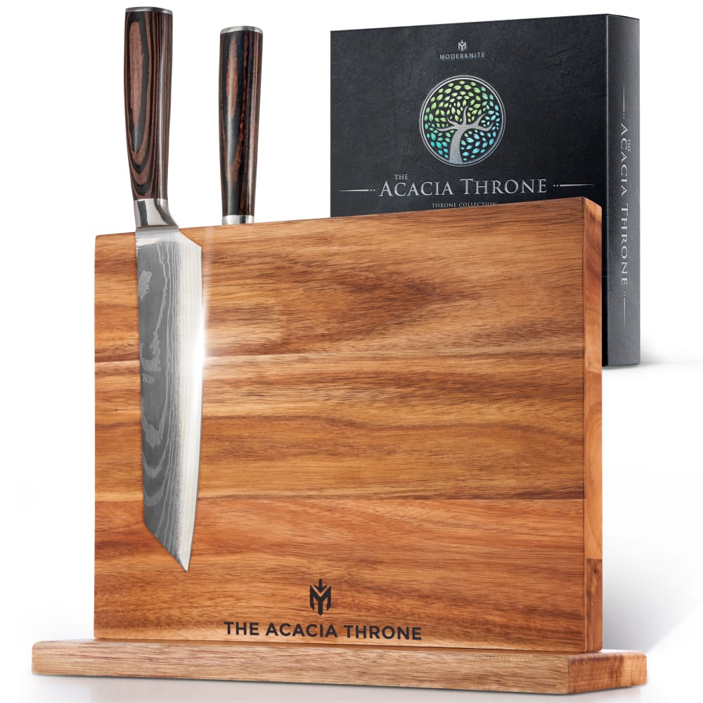
Which magnetic knife block would you rather buy and why? (Only logo is different)

21 Responses to Option A
I like this logo better. It's much easier to see and looks regal instead of just a circle of black lines.
Option A was selected for the logo is a little bit less busy making it easier to see.
There is something strong and sharp with the logo with option A. It seems more sturdy and gives off a better sense of quality.
The logo looks better to me.
I like the cleaner looking label, takes up less space on the block.
I like the smaller one and the symbol used. The symbol looks mysterious and intrigues me.
The image seems to be a bit bolder and pristine
Between these two logos I like the one and a the most however I have some concerns that the logo on the wooden block does not match the logo on the front of the box
I like the picture that has the package shown closer (and, I suppose, larger and more zoomed in)..it ads some balance to the photo so it looks better overall.
I like the symbol on that board the best.
It's less busy compared to the other logo. I like a neat and clean logo.
Everything else being equal, the logo in A is more attractive.
I don't see any difference between the two photos! I only went with Option A because it comes before B.
I like the logo on A as it feels more dynamic and seems like a better match to the magnetic feature of the product.
I know that B matches the logo on the box, and I like the logo on the box but it just looks too smushed when it is on the board. I like that I can see the detail in A.
I like the logo for option A the best. The wood grain handles of this knife looks really nice
I like the logo better, it looks nice and it's a little unique looking.
I like option a better. It looks more elegant and cool looking.
Consider how small the logo on the board actually is, I'd have to say that A looks better and would be the one I buy if that were to be a factor. B's is a lot more complex, and while that looks good when properly sized, it looks rather bad when there isn't enough size to accurately translate all the fine detail. Such as here. A looks much better in the limited space provided. In reality, this wouldn't make or break such a product for me, but I do have to admit A looks better and more professional.
Looked for a while but cannot see a difference They look very close. Both look good.
A is the better of the two for me. I would rather buy this because the logo was clearer and resonated more with me as a consumer.
29 Responses to Option B
It makes more sense to match the logos. Also the Tree logo looks a lot better
B i prefer this one as it fits the box art more and i think it looks better in my opinion as far as logo designs go
I really like the round tree logo, I think it is cute, fits the brand name and looks nice on the product.
The logo makes more sense with the brand name
I like the logo in this one better so I chose it over the other one.
I really enjoy the tree logo.
B looks more like something established and crafted, which I think is a better fit.
I like how the board has the tree symbol on the bottom of it. It matches the box and it looks prettier compared to the other logo.
I find the logo to be more upscale with B
I like the circular logo as it seems to be more symmetrical and makes me think this brand is more professional and prestigious.
I think that this option makes more sense since it has a logo that matches the box.
I like the round tree logo better than the other one. I could do with either one, but if I had to choose, it would be A.
i prefer the tree in choice b more. i feel like it sticks with the natural aspect we try to keep in our home.
I definitely like the logo on this block better. The other logo looks like the Autobots from Transformers!
Definitely prefer to see the more nature oriented logo. It's more apt for the wood block.
I would want this block because I like the way it looks and the design. This would be the one I would want in my kitchen
This logo seems more natural, like it was meant to be on a wood cutting board. The logo for option A reminds me of a tech company.
Option B as the brand logo on the block matches and is aligned with the brand logo on the box. It makes no sense to change the logo moniker on the block. This adds production costs that are passed on to the consumer. Option B keeps the logos the same and thus aligns the product with the brand.
It took me awhile to even find a difference, but of the two emblems on the block I prefer B. I like that it matches the box and it just makes more sense to me.
I like the logo on this board. It makes me think that the products are made in a way that is better for the enviroment. I feel that they would last longer.
I like B because the logo design is more elaborate and complex. It looks like an abstract tree design, and that appeals to me.
Option B as the logo on the board matched the logo on the box.. If someone were to attempt to find the until, using on only the board as a guide, and not the box, it might become confusing if they were looking at Option A and searching for it's logo when the Tree logo is found on the box, but the other one isn't..
B has the same logo as the box.
Pretty much a pointless and trivial survey here - as stated, "only logo is different." And how much could that possibly matter to a consumer? ZERO - that's how much.
I prefer Option B as my first choice. I like the round logo better. It's discrete looking and elegant with a modern twist that's pleasing and attractive. It fits nicely with the wooden board and has a expensive and classic look.
the fact that the logo matches the box logo makes the most sense to me they both represent a tree the other logo makes no sense to me.
I like the circular shape of the logo in B and like that it's a tree design. This seems more natural and earthy to me and also more visually appealing.
The tree logo from the box repeating on the block is nicer compared to the simpler company logo.
This has a more natural looking logo to me
Explore who answered your poll
Analyze your results with demographic reports.
Demographics
Sorry, AI highlights are currently only available for polls created after February 28th.
We're working hard to bring AI to more polls, please check back soon.

