Poll results
Save to favorites
Add this poll to your saved list for easy reference.
Which Japanese ramen bowl design you like to purchase?
Option C won this Ranked poll with a final tally of 55 votes after 5 rounds of votes counting.
In a Ranked poll, respondents rank every option in order of preference. For example, when you test 6 options, each respondent orders their choices from first to sixth place.
PickFu requires a majority to win a Ranked poll. A majority winner differs from a plurality winner. A majority winner earns over 50% of the votes, whereas a plurality winner earns the most votes, regardless of winning percentage.
If an option does not earn a majority of votes, PickFu eliminates the option with the lowest number of votes. The votes from the eliminated option are reassigned based on each respondent’s next choice. This process continues in rounds until a majority winner emerges.
Scores reflect the percentage of total votes an option receives during the vote counting and indicate the relative preference of the respondents. If there is no majority winner, look to the scores to see how the options fared relative to one another.
| Option | Round 1 | Round 2 | Round 3 | Round 4 | Round 5 |
|---|---|---|---|---|---|
| C | 25% 25 votes | 28% 28 votes +3 | 30% 30 votes +2 | 33% 33 votes +3 | 55% 55 votes +22 |
| B | 22% 22 votes | 23% 23 votes +1 | 32% 32 votes +9 | 35% 35 votes +3 | 45% 45 votes +10 |
| E | 19% 19 votes | 19% 19 votes | 21% 21 votes +2 | 32% 32 votes +11 | Eliminated 32 votes reassigned |
| A | 16% 16 votes | 16% 16 votes | 17% 17 votes +1 | Eliminated 17 votes reassigned | |
| D | 12% 12 votes | 14% 14 votes +2 | Eliminated 14 votes reassigned | ||
| F | 6% 6 votes | Eliminated 6 votes reassigned |
Age range
Education level
Gender identity
Options
Personal income range
Racial or ethnic identity
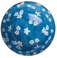
16 Responses to Option A
I like the design on option "A". The floral pattern on this bowl looks unique and appealing.
I likd choice A and simplicity of the design of the bowl. Choice A makes it easy to focus on the design compared to choice D which has a very busy look which is distracting and takes away from the design of the product.
I really like the darker blue ones a little bit more although there all nice a feel like these ones feel more luxurious especially numbers 1 and 2. The last one I feel with a bit sloppy though
I like Options A & E the best. They are still traditional but are bright and vibrant looking. The particular shade of blue is very pleasing. Options C & F have the lightly scattered pattern and it's gentle and soft looking. The remaining options are all just okay but seem ordinary.
I really like the 2 with the blue background and the white flowers. My first choice is the blue background and the non-symmetrical flower pattern. It's an attractive pattern and really drew my attention first.
I like the richer blue in A or E. I eat ramen a lot, and this would make it a much more fun experience.
The flowers with the blue background really stands out. Looks fancy it would be really nice to eat ramen out of
The intricate and well-balanced designs are more favorable over those that seem atypical and with a pattern that isn't as recognizable. Overall, I find the display to be mostly appealing to the eyes with sharp colors. I like the deep blue and slightly off-white shades of these ramen bowls.
I like choice A the best.
I prefer the bowls that have a most solid base color. I feel this would give the food a more visually appealing display and make the food pop better on presentation.
All of the options, except for D are pretty good looking. They have a nice color and design. I like the blue color on option F the most.
Honestly I like all of them. I'd like to eat ramen out of any of the bowls. They are all such pretty patterns
My favorite design is A because it is most enticing to my eye personally, and the design that is most memorable for me
I like the bowl design in option A the best. I like the smooth blue color and the delicate white flowers of this design. The design feels very pleasant to look at.
I prefer the shade of blue in A. I also like that there isn't as much floral pattern on the inside, it is more subtle.
I like the blue color and flowers in A. I think the unevenness of design in B and C add visual interest, and the design is pretty. I don't like E or D's design.
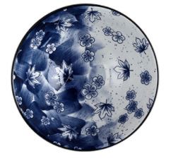
22 Responses to Option B
B AND D ARE THE MOST ARTISTIC TO ME. THEY ARE ELEGANT, CLASSY, AND WOULD MATCH MY KITCHEN
Those are the patterns I like.
B is a beautiful bowl,it has a modern look that is stunning. D is great also but with more of a traditional look.
I chose by which designs I felt looked the most unique.
Option "B": I love this color and pattern which to me is a traditional floral pattern but a unique coloration that to me looks like a lotus blossom moon when compared to the others. This is the most fetching noodle bowl.
I like the two-toned design in B. It feels like two different seasons. I think it looks pretty cool and it would be the one that I buy
Like the patterns and colors on all of them but the first three are by far my favorites with o#1 being the most unique>>#4 & 5 are busy to look at but still appealing>> #6 is not a favorite but unique
I really like the gradient from blue to white in bowl option B.
Option B is very beautiful and colorful
B has a very sincere and charismatic design I find engaging and complete.
B is very cool with the contrasting shading. D looks like a traditional Bowl. E is pretty but I wouldn’t want a set. C is too plain, F looks like my bedsheets and A is too solid blue.
The contrast between the white and the blue, and having it seemingly go from one color to another, is quite neat looking. That main feature is why I would go with this option.
I like the uniqueness of the design. The way the color goes from an almost dark blue to white really drew in my attention making me want to closely look at all of the details of the piece. I like that the design is unusual, but very tasteful.
Option B of light and darkness. It helps create day and night atmosphere of sunrise to sun set. As you start eating to finish eating.
I LOVE THE PATTERNS IN OPTION B AND C AND THE WAY THE COLORS LOOK TOGETHER. I DO NOT LIKE OPTION D AT ALL SO I WOULD NOT CHOOSE THIS OPTION
I like the darker contrasts in options B C and F in favor of options A & E. Option D is too busy.
I like the colors in B and F best
I like the dark navy color contrasting with the white.
I prefer the darker bowls to the lighter ones, but this pattern the best.
I picked B, C and E as my top choices as the leaves and dark colors make it look like they're very rich design.
The asymmetric pattern is novel and attention-getting. The look is dark and light which is contrasting.
I like the coloring of B the best but I also really like the design of C so I ranked B the best and C the second best based on these metrics.
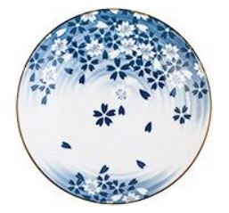
25 Responses to Option C
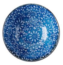
I like the ramen bowl design in Option C the best because the colors are light and the pattern is not too distracting. The patterns in the other options are too visually overpowering.
The simpler the better
They all are pretty great but I like the style of choice C the best.
I like my ramen simpler... so I'd want a simpler bowl. I don't want to go too complicated with anything.
i like the ramen bowl in option C the most, it has a mostly white and almost rustic design that is easy to the eye
Prefer the darker blues and the more simple design.
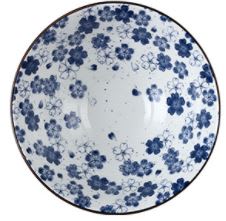
I love the subtly of the two colors and the beauty of the cherry blossoms as that is what I immediately associate with Japan/Asia.
Choice c is simple but has an eye catching design
Wow - the way the flowers are spaced out in option C is so creative and unusual and artful. A beautiful bowl!
I like Option C. I like the movement in the design. It looks bright and beautiful.
I just don't really like the design of D or the colors in B. C & F first because I love the extra white. A & E in order of how I like the flowers.
All 6 choices are attractive. (I wish I could see the images “up closer” when I click on them. I tyipicaly can do that with your polls.) C is my #1 choice b/c the image has a sense of motion to it, like leaves falling from a tree in the fall. E is #2 b/c I like the complexity of the pattern. I also like the complexity of F’s pattern. But it looks a bit like something I’d find in my grandmother’s home. It doesn’t “go” with Ramen noodles. But it seems prettier to me than #4, A.B and D are at the bottom of my ranking b/c B is too obscure. It reminds me of contemporary art that has no meaning. D is #6 b/c it just has too much. I wonder how I would rank it if the background panels were pure white to accent the 4 patterns better.
I prefer this one the design reminds me more of the japanese culture.
I greatly preferred the darker blue bowl designs over the light blue designs. I like the dark/light contrast the best. I overall really liked the design of Option B and Option A the most because of the way the dark blue and white looked together. Option D was a close third, but it seemed too busy in its overall design. The others I did not dislike but I did not care for any of them in particular.
C was what I was initially drawn to the most. Then I used that same method to go down the line and pick the rest.
It’s just a preference in design. I like the ones that have white involved
All six of the Japanese ramen bowls are beautiful. I chose C first because I like that it is not too busy. I appreciate the white space in contrast to the blue flowers. Next I chose A because I like the use of the blue as an empty space so it is not so cluttered. Next, I chose E because I like the flower design. F, B, and D seems a little too busy to me.
Gorgeous options, but C looks like my grandma's china.
C is the most beautiful because of its simple, subtle design. B is too busy and I don't want to eat out of it. F, E, A and D are all lovely.
I like C...which is a bit more subtle and neutral. Also, lighter colors
1. I chose option C first because I like the white color. As you're eating your ramen you can see the bottom of the bowl. I think lighter colored dinnerware is the best choice because it doesn't effect the way the food looks when it's being used. I also like the design with the petals floating down.2. I chose option F next because it's also a lighter color so you can see the bottom of the bowl. The design is average nothing very special about it.3. I chose option D next because I really like the design and the color is not to dark. But still not as light as I would like for my taste.4. I chose option A next because I love the shade of blue that is used. I wish it was reversed so the bowl was white and the flowers were that beautiful shade of blue.5. I chose option E next because it's too dark and I don't really care for the design. There's nothing unique about it.6. I chose option B last because the shade of blue is too dark for my preference although I do like the design. The split colors and the design of the leaves and flowers is very unique.
The flower petals in my top choice look simple and elegant, and are very appealing. Overall it's a great looking set of products for sure!
I chose C first because this bowl is simple but elegant.
I think I like the gray/white colored bowls mixed with the shades of blue the most which is why my first four choices was of such. It just looked more traditional to me.
I think Options C and F are the most trendy and I like their simplicity. I really don't like the light blue background of Options E and A.
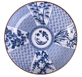
12 Responses to Option D
D looks the best to me, this has a sort of classic style to it, but it also looks interesting and sophisticated.
I like option D because it has rich color and more detailed design.
D is beautiful, traditional, and expensive looking. B is original, attention getting, and interesting. E is simple but classy. F is okay, it's pleasant. C looks half finished. A looks like something for a child.
Ranked in order of personal preference.
These are all great. I'm not as big of a fan of flowers, though, but I really like the radial design of D. The plants look exotic too.
I like the pattern on D better than any of them, although all are somewhat pleasing.
I like symmetrical patterns. These are most symmetrical, with the prettiest colors, in this order.
First, I prefer leaf to flower designs. Option D: I love the design -- it looks unique and classy. Option B: It's a beautiful dark - light contrast. Option F and E: They look like what we can find at discount stores.
Of all the patterns I liked D the best, then simply ranked them based on the pattern and who much I liked each one F being my least favorite.
D is the most appealing to me, I just love the floral design.
These are all beautiful, my fav china color, and a very hard assignment. I liked the more traditional patterns and colors best, more like the old china, but the newer choices, #5 and #6, are pretty too, just not my favorites.
They are all kind of design busy but I like D the best. E is the least appealing because it's too busy.
19 Responses to Option E
I chose by patterns I find most interesting.
I prefer the design in my first choice to the remaining ones. The intricate pattern of flowersrs is more appealing than the others. My choices of 2 - 4 wer because of the flower patterns being attractive but not as the first one. Number 5 was uniquie but not what I would choose. My last choice was because there is little appeal to the bowl and it appears from the pic to be deformed.
I picked the coolest looking design.
I like the deeper, darker hues better. They are all interesting though. D may remind me too much of Pennsylvania Dutch.
Options E and A, in that order, are my preferred choices because the colors and design would blend better with most dining decor.
These options are difficult to rank because they're all beautiful and interesting to look at. I chose E as number one because it's more of a distinct pattern and I love the colors
I liked the most structured designs best.
I really like the color scheme for option E. The flowers, the blue color, it's all very pleasant to look at. The bowl would be something that is part of my decor as well for the living space that I have and aesthetically this is the most pleasant of the bowls to look at on a day to day kind of basis and so that's what I like. I like Option E as a design I'd want to purchase because I like the art style, the color scheme, the overall design, the aesthetics, and the general presentation. I like Option A second best for similar reasons. The color scheme is excellent. The flowers are really nice. I don't like the pattern so much as option E so it's my second favorite, but otherwise it's an excellent design. It's pleasant to look at, and the bowl is really well designed overall. I like option C third best because I like the flower design. I like the art style. I don't like the background as much as E or A but otherwise the bowl is pleasant to look at. I like how calm and pleasant the overall presentation is of the bowl. I like option B fourth best because I don't like the darker shading. It's not as pleasant aesthetically. The design of the flowers is decent and the overall art style is nice, I just don't like the color scheme as much as my more favorite options. I like Option F fifth best because the design is too simple and I don't like the contrast of the color scheme as much. Aesthetically it's not as pleasant to look at as the other options. I like option D the least because the pattern of the art style is unpleasant to look at and I don't like the color scheme as much. The colors are too dark and it would not be pleasant to look at the bowl every time I eat ramen. Ultimately I like option D the least because the other options are better with respect to art style, aesthetics, color scheme, and design.
My choices were based on the flowers and the pattern of them and the color hues.
the themed color is the first choice, also brightness. less desireable as you move to grey and more complicated patterns.
I prefer options E and F and A because they are closest to a steady pattern throughout the whole blow.. Option D is far too busy and option B is ugly pattern and colors
I thought all of the bowls were beautiful and would like the option to purchase any. I ranked from the most versatile and attractive to the least
e - i really like the flowers and how it covers the entire bowl.a - i like the flowers but the deep blue backdrop is really nice too.f - this one seems light and fresh. the white backdrop is interesting.c - it seems a bit sparse but is nice overall.b - it's a bit odd being like a half/half design i think it would look better if it was more consistent with one design.d - i dont like how it looks like a compass.
They are all beautiful, my favorite pattern is option E
Options E,A,B and D are great designs and I love the shapes and looks. Options F and C are awesome looking, but not better than my top picks.
I really like the design option that are mostly blue. They are more eye catching.
i like choice e the best. it is most unique and pretty
I like the symmetry better than the nonsymmetrical pattern. I don't care for the sharp lines in option D. I prefer the blue shade to the purplish shade.
the more blue, the more i like it. my least favorite looks too much like a chocolate chip cookie.
6 Responses to Option F
F & C have a more "vintage" look so would fit in best with my home
Ipicked f because,I like the contrast of the white and blue was the design is cute.
Geez, this one was tough. It was a tough choice between options F and C. I like both designs and I like that there is more white than blue. I like Options E and B almost the same as well, but I like Option E a little bit more because the flowers resemble sunflowers to me, which is my favorite flower design.
The options with the more subtle flowers and colors were preferable to me because they were more elegant and classic looking when the flowers were super fine and detailed and the colors displayed some restraint.
Option A for the design and the white background.
For me, food is more appetizing when it's not in a dark plate or bowl. So I liked the lightness of option F--the flowers look happy and bright. Option D is also very eye-catching, although maybe the style is more Chinese? Option A is pretty although a darker color. Option E I like less because the pattern is so busy. And I don't really like C or B at all because they are not symmetrical in the design.
Explore who answered your poll
Analyze your results with demographic reports.
Demographics
Sorry, AI highlights are currently only available for polls created after February 28th.
We're working hard to bring AI to more polls, please check back soon.

