Poll results
Save to favorites
Add this poll to your saved list for easy reference.
Which Essential Oil design would you pick/buy from the following options?
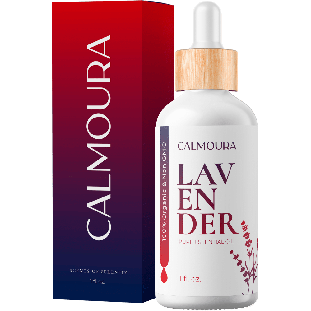
Option E won this Ranked poll with a final tally of 26 votes after 2 rounds of votes counting.
In a Ranked poll, respondents rank every option in order of preference. For example, when you test 6 options, each respondent orders their choices from first to sixth place.
PickFu requires a majority to win a Ranked poll. A majority winner differs from a plurality winner. A majority winner earns over 50% of the votes, whereas a plurality winner earns the most votes, regardless of winning percentage.
If an option does not earn a majority of votes, PickFu eliminates the option with the lowest number of votes. The votes from the eliminated option are reassigned based on each respondent’s next choice. This process continues in rounds until a majority winner emerges.
Scores reflect the percentage of total votes an option receives during the vote counting and indicate the relative preference of the respondents. If there is no majority winner, look to the scores to see how the options fared relative to one another.
| Option | Round 1 | Round 2 |
|---|---|---|
| E | 50% 25 votes | 52% 26 votes +1 |
| B | 24% 12 votes | 28% 14 votes +2 |
| D | 12% 6 votes | 12% 6 votes |
| C | 8% 4 votes | 8% 4 votes |
| A | 6% 3 votes | Eliminated 3 votes reassigned |
Age range
Amazon Prime member
Cosmetics and body care habits
Education level
Gender identity
Options
Personal income range
Racial or ethnic identity
3 Responses to Option A
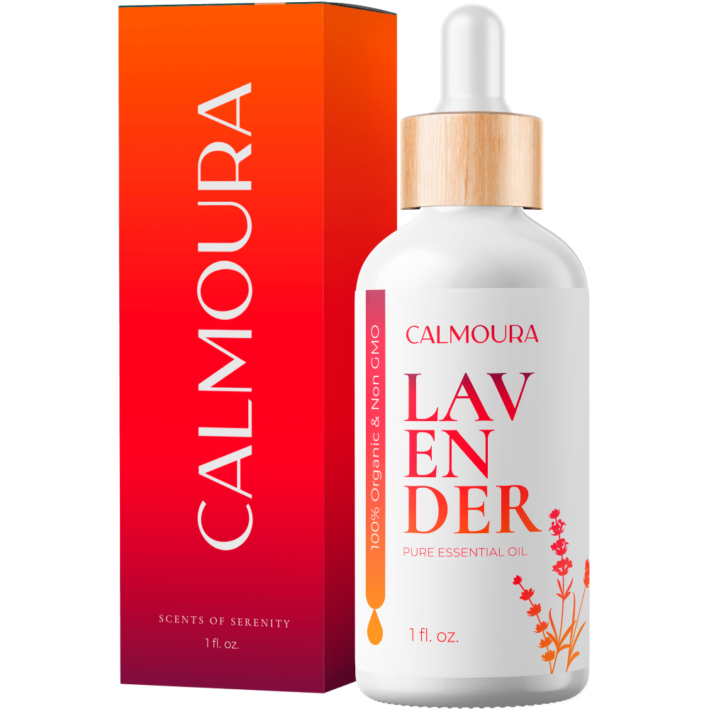
I enjoy the packaging with the bright colors, then the fancy gold image on the packaging. They both look extremely expensive and a great design.
They all look great, the one that appeals to me more is option A, the package is cuter
A: I feel, it has the best color code among the list, the dual tone color / ombre design of Gold to pink color look good B: Almost the same as A but the color code is from pink to Blue.C: The light beige color flower design coordinate/matches with the wooden look cap.E:The bottle image is blurry but the packaging is matching with the container design.D: The image of the bottle is not clear and i feel the packaging cover is not even matching.
12 Responses to Option B
Based on the colors of the packaging I like the hues better on B, C, A, D, and E in that order. I don't care for the Design on option D and E at all.
I want a brand that looks high class and not something you would purchase at a truck stop on the interstate next to the cash register.
B is the prettiest then E then A then D. C is boring
Out of all the options I really like Option B the best. It feels calming and relaxing. I like the box where the darker color blends into a lighter color yet it still feels warm and soothing. I would choose that one far above the others. It just feels more fitting to me.
I like the color blending on the boxes B and A. The simpleness of option C makes it easier to read some of information on the box and bottle. I'm not a fan of the decoration on D & E. The design is a little overwhelming and distracting.
The first two look expensive, like mid range luxury brands. B looks better on the bottle and A looks better on the box. The D choice looks okay. E, even though you expect purple for lavender, looks wrong. It's too busy with the gold and purple. I actually like the design of C other than that "Scents of serenity" design on the box. If that were gone it would be one of the better choices.
I like the colors and how they shift on B. E and A also feature appealing colors, but I like the design on E more than A. D is too dark while C is plain and dark.
I chose B first because I liked the gradient best; blue to red is soothing. Then E because the purple color goes well with what I think of lavender as a plant. Then D because the graphic of the drop of water gave an appealing busyness to the packaging. Then A because the orange gradient was pretty and more upbeat-looking than C.
Option B is my first choice of those available as I really like the bright colors that fade to dark on the box. Option C is second because I prefer green to the other options. Option E is 3rd because not only does the colors on the box fade from a lighter plum to a darker color, but the gold design is cool. Option D is 4th not because I particularly like the color, but because of the gold design on the box.Option A is last because it is simply too bright.However, I would not choose any of these options because the bottles look like they are made of cheap opaque plastic. Essential oils should always be stored in dark amber glass to protect them from degradation.
I choose B as #1 because red and black are my favorite colors. The red and black gradient looks the most prestigious or high end of all the options. I choose A as #2 for the same reason. I like the more red than black gradient only slightly less than that of B. I choose A as #3 because purple is the colour of loyalty and therefore denotes a high end product. I choose D as #4, over C as #5, because of the extra gold embellishment. All five options are aesthetically pleasing.
I chose based on which box showed the name fully together and then I chose which color looked better with the gold
Pick based on what looked closest to high quality oil
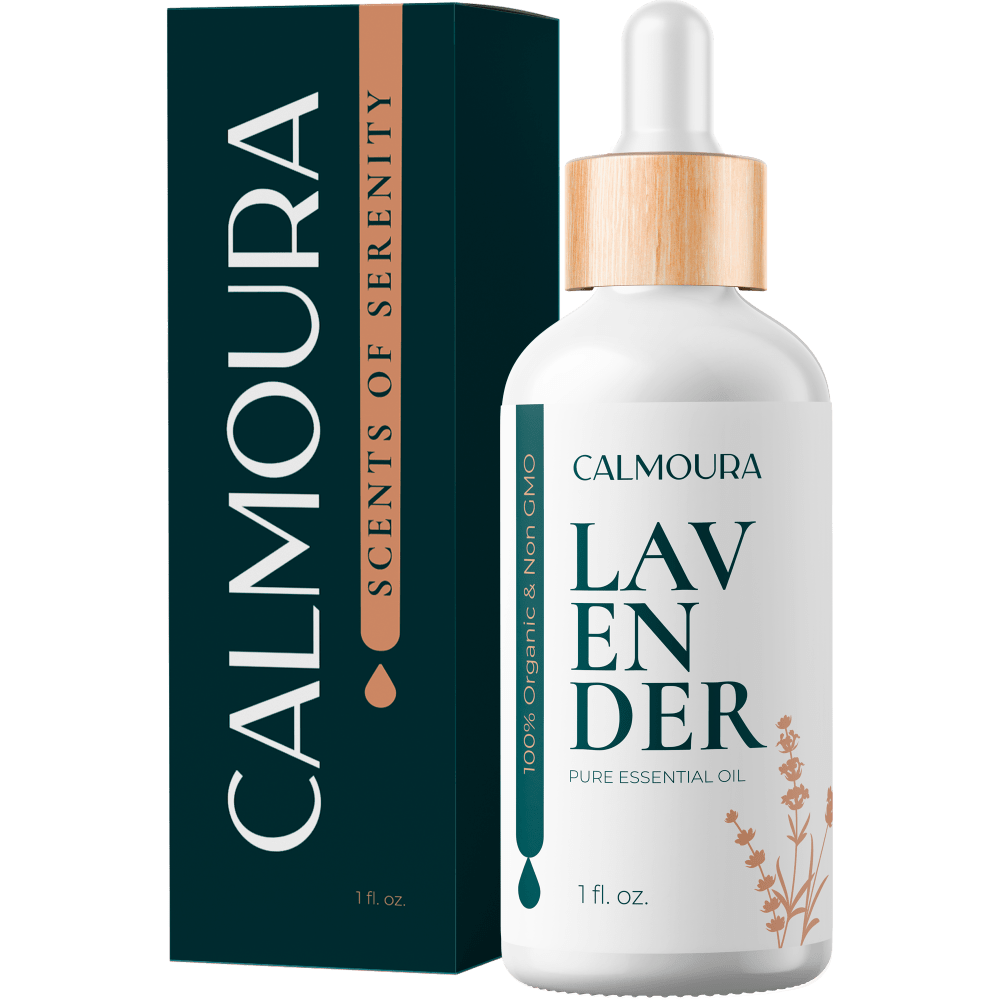
4 Responses to Option C
Because they are essential oils, I feel the box should be more simple to remind me that it is a pure oil. The boxes with the design included remind me more of perfume and make the oil seem cheaper and diluted in my eyes. I buy essential oils regularly.
C seems more trustworthy and honest.
I would buy option C and D looks very nice and eye catching then other options
I much preferred my first option. It's an attractive design with simple clean lines and clear text. The second and third place options had very attractive packaging, but I dislike the use of script. For some individuals, it's harder to read and is essentially a dying art form. If you want to appeal to all, it needs to be easily read by all. The fourth place option is bright and bold but the descriptive is just too small. The last place item is just too bright and gaudy.
6 Responses to Option D
I ranked by the following criteria. The design of on the box, font, and color pallette. D and E really captured my attention first by the design on the box it popped out more then the others. Then C with its forest green color very dark and bold. Followed by B and A with ombre look
I like the packaging with the leaves on it, and the soothing colors much better. The red is awful.
I don't like how the word lavender is broke up on all of the bottles, it would be better to find a way to make the word's letters together
the colors of the boxes are in order of calming thoughts, also elegance of the packaging makes you think of good money spent
I like the flower and the neutral color. The one with the flower and purplish box is second best. The dark red is nice, so I picked it 3rd, but the bright red is not something that would associate with lavender, so I picked that last.
Option C looks high end and regal.
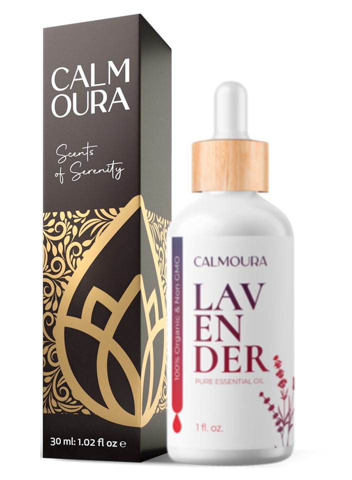
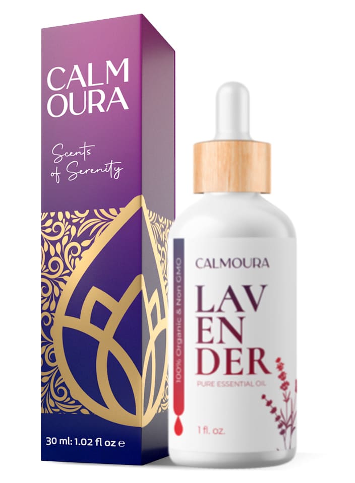
25 Responses to Option E
I have to admit this one was hard to choose from. They are all basically the same. I chose E as my first pick just because of the color of the box. I like purple.
I really liked the first choice(E). The box is my favorite color and the intricate design was eye catching, I had a little trouble reading the name of the oil but once it registered it looked quite nice. I then chose the next one(D) because it was quite similar to the first but the color wasn't as eye catching. The remaining choices are in the order that I prefer the color choices. I don't particularly like any of the designs. They look a little "unfinished" to me. The first two choices just look classier and more professional.
Option E has calming purple and a design that reminds me of a lotus flower- B also has calming colors. The green colors on C remind me of nature-which I like. The colors on option D are a bit dull and A is too bright for the product.
based on looks of how good quality the product seems to be
I love the purple color on the packaging of E, as it best conveys 'lavender'. B is next because of the color. I don't really like C and D because of the very dark packaging color, and I think the red packaging of A is garish, and completely unsuitable for something as relaxing as lavender.
The color and design of option E looks really great. I like the design of option D. The color of C and B is really pretty. A looks too bright and the colors don’t seem like a good fit for the product
The purple and gold design is professional and appealing
I chose by packaging design that feels warm and relaxing.
Option E has the more eye catching packaging
I can't get pass Lavender not being purple. I associate Lavender with purple and I like it in the purple packaging like E.
Lavender is meant to be calming so I prefer the more soothing, calming colored packaging. Additionally, I find breaking the word 'lavender' into 3 parts very visually annoying.
I like the box with purple on it the best since the matches the lavendar name. That makes the most sense and stands out to me more.
I'm a traditionalist. lavender should always be presented in a lavender container. :)
While a little predictable, I chose Option E as my first choice because the box is purple. Lavender and purple go together in my mind, far more than the red shades that are in options B and A. The purple color on the box of Option E is very attractive to me and it looks luxurious with the golden swirls and lotus design. The overall look says "high-end luxury" to me. The retention of that golden design on the box for Option D is why D was my second choice. The same idea applies - the design looks more elegant than just the plain colored box of the remaining options. I placed Option C third, because I do like the color of the lettering on the bottle. I also like the addition of the dropper on the box packaging which aligns with what I know about natural oils being dispensed by drops. All three of these options also contain the words "Scents of Serenity" which are an additional clue to the benefits of this product. The remaining options, B and A, are acceptable but just not that interesting to me. They could be any product in the health and beauty aisle, and would be less likely to catch my eye than the striking gold and purple design of Option E. This is why Option E, in my opinion, is the best of these options.
I really like E. The colors of the box and on bottle are complimentary. I really like the lotus. Very appealing and zen feeling.
I like seeing the name split like that so it reads "calm oura" that makes more sense to me and it is easier to read that it would be without the space. I like the lotus flower design, and the purples and blues of E feel very calming
C is last because it doesn't fit the product at all. It's green and I don't associate that with lavender. I chose R first before I thought it was the prettiest and reminded me the most of lavender. D, B and A I chose for the same reason, in that order of what I thought looked the prettiest and reminded me of lavender. It wasn't rocket science, just a feeling I got when I looked at each one.
I think that the purple color seems the most calming looking for me personally. I do NOT like the bright red. It is too garish looking for me.
I like the stylized leaf on the box best and the calmer purple color. I think the color of box A is very bright and doesn't match with the lavender oil product.
It makes sense for the package to be lavender or close to it.
E reminds me of Lavender oil the color and design are attractive and D reminds me of essential oil in general with the same design, but would be fitting for different types of oil as well.
Although in my 5th ranked choice the bottle matches the box the best, the box design is plain and doesn't match the mood of the name. The name contains the word calm so more natural colors go better. So the 4th and 5th choices are my least favorite. I slightly like the colors in the 4th choice on better. I like the lettering layout in the 3rd choice better than my first two choices, but the box is still plain. I like the design on motherboard box of choices 1 and 2 better but the purple draws me in more. However, I don't think the bottles match in either case.
For Lavender oil, I really like the violet colored box with the gold design on it. That design is particularly attractive, and I like it in the black version as well, so the black one is my second favorite. I would be looking for something in a shade of purple or violet when I am searching for lavender oil, just naturally, so I picked the violet as my favorite. However if you were doing a whole line of oils the black box with the gold design is great and I could see using that for all the varieties.
I like the color and design of the box and I love lavender, what else can I say. Purple and lavender go together just love it.
Lavender flowers are generally purple, so it makes sense to me that it would be in a purple box. The red and green boxes seem really wrong to me for this product.
Explore who answered your poll
Analyze your results with demographic reports.
Demographics
Sorry, AI highlights are currently only available for polls created after February 28th.
We're working hard to bring AI to more polls, please check back soon.

