Poll results
Save to favorites
Add this poll to your saved list for easy reference.
Which design do you like the most and why?
Option C won this Ranked poll with a final tally of 26 votes after 3 rounds of votes counting.
In a Ranked poll, respondents rank every option in order of preference. For example, when you test 6 options, each respondent orders their choices from first to sixth place.
PickFu requires a majority to win a Ranked poll. A majority winner differs from a plurality winner. A majority winner earns over 50% of the votes, whereas a plurality winner earns the most votes, regardless of winning percentage.
If an option does not earn a majority of votes, PickFu eliminates the option with the lowest number of votes. The votes from the eliminated option are reassigned based on each respondent’s next choice. This process continues in rounds until a majority winner emerges.
Scores reflect the percentage of total votes an option receives during the vote counting and indicate the relative preference of the respondents. If there is no majority winner, look to the scores to see how the options fared relative to one another.
| Option | Round 1 | Round 2 | Round 3 |
|---|---|---|---|
| C | 32% 16 votes | 34% 17 votes +1 | 52% 26 votes +9 |
| D | 28% 14 votes | 38% 19 votes +5 | 48% 24 votes +5 |
| B | 22% 11 votes | 28% 14 votes +3 | Eliminated 14 votes reassigned |
| A | 18% 9 votes | Eliminated 9 votes reassigned |
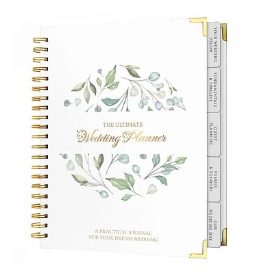
9 Responses to Option A
I like the design on this one and how it stands out better I like the simple look it has
I love the gold font that is used in the center of this planner. It adds a lot of style.
I prefer option A' because its design is the most visually appealing, featuring captivating text and a beautiful flower that easily grabs anyone's attention, making it stand out among the rest.
All of these are nice, but I like the circle theme of A and D.
I think this type of thing is very dependent upon a person I really like the first two but I like that style and theme of wedding I also like number three is a green team firstly I'm just not as big a fan of number four but it is still nice
A the look and style is bestB second best look to itD third it has but to much empty spaceC last saw to much empty space in design of it.
All these planners have beautiful covers. I want to collect them ALL. They evoke visions of a lovely spring or summer get together with near and dear. The choice of images bring to mind beautiful floral images in elegant settings.Here the ranking is based on the default alphabetical order.
Option A is elegant and modern with a balanced use of leaves and text. Option D has a clean, natural look with a beautiful wreath design. Option B 's simple leaf design is nice but lacks the balance of A and D. Option C 's floral design is a bit too busy for my taste.
A and B look calming and professional
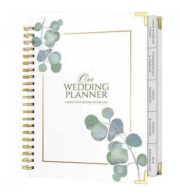
11 Responses to Option B
I like option B, I think the simplicity of the golden border and the leaves is both pretty and tasteful. I don't think a planner needs to look extravagant but should remind of the event, this looks nice.
the text used in B and C are easier for me to read so I was drawn to those options the most
This one has a nice design. It seems to take up enough room on the cover without overpowering it.
I like the placement of the flowers in this one the best. I like how they look at the top and bottom. The color is really nice. I like that they are a little more big and bold too
Option b is different then most of the other options i like how the branches come out from the side of the book without taking away from the title.
I like B an C the most they look elegant and I would want to reach for them more often. D is alright too and the image looks good enough. I don't like A very much it would be my last choice.
They are just simple leaves, but the way they come in just looks perfect.
I like the golden border and branches of leaves on this cover.
Simple illustration and gold frame make it look understated but still luxurious.
I prefer option B. This is the right combination for me. I like the greenery and I like that it says our wedding.
I like b. Elegant professional and not overdone.
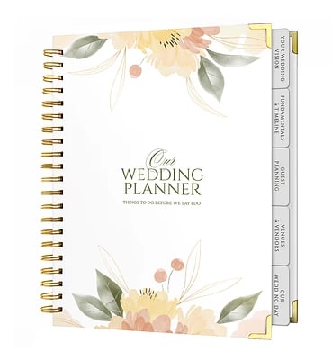
16 Responses to Option C
The design of this cover looks very classy and nice looking
C looks the most appealing because the colors are warm and pleasant.B also looks appealing because of the way the nature design is placed, it looks more pleasant and inviting.A I like how it has the circular design, however it also doesn't grab my attention as easily.D I find the design is odd and makes the product look off balance.
This design is very beautiful and very classy, it has a timelessness that you can really appreciate
The orange / yellow flowers featured in my top choice are classy and striking, which is appealing for sure!
I like the colors and design. I find it charming.
I'm not a fan of designs that create a border like the round border on D or rectangle on D. A looks like it has too much going on. I like the simple plant designs on C and B.
ALL THE DESIGN LOOK REALLY GOOD BUT THE SIMPLER THE BETTER,SOMETIMES SIMPLE IS GOOD
I like that the first option is easy to read and like the second it is minimal in design. The last two options are just a little too busy for me.
I like the floral design of this one. It looks sophisticated and mature. I would not get tired of looking at this design.
The font looked elegant and stately in C and B and I liked the floral/leaf pattern best on C since it looked more whimsical.
I think the floral design in C is the prettiest.
I like options that are most simple and easy to read.
I like the soft colors of the flowers on this option.
Option C was my favorite one because of the nice font in the middle and the surrounding colorful plants.
C does the best job of highlighting of the Wedding Book title without overshadowing it.
I like that C feels sophisticated and the image also feels more complete on the cover than the other choices.
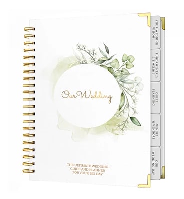
14 Responses to Option D
Simple and being about our wedding is most appealing to me.
I think the circular designs feel a little more elegant. I feel like the cropped white rectangular space in A doesn't look great.
I like the simple wording on D
i like the design in option D the most because it looks pleasant and floral
I prefer option D because this looks more dainty and classy to me.
I like D it is a plain but classy design.
D, C first because the designs are the most detailed and appealingB second because I like the simple designA last because the design is a bit overwhelming to see which makes it the least appealing
I chose D because I prefer "Our Wedding" on the cover and the clean understated design of the drawing on the cover.
Not really big on any of these. I would start with D as the cursive writing is more appropriate and elegant. But I would alter the color scheme to simply incorporate gold and cream.
You honestly cannot go wrong with any of these - they're all tastefully embellished without going too far. I just personally like D the best.
d because of the pretty circle decor on the cover it symbolizes wedding and all come to full circle.
The round wreath symbolized the unity and coming together of everything to make the day special.
Option D is a great keepsake so it seems more than just a planner. I like the title our wedding as well as the overall circle emblem. It seems like it would be great to keep things organize yet also be a better keepsake. Whereas the other planners don't illicit the same fondness with wedding planner in the title.
The circular greenery is feels like a symbol of the wedding ring to me. It is a cute correlation.
Explore who answered your poll
Analyze your results with demographic reports.

