Poll results
Save to favorites
Add this poll to your saved list for easy reference.
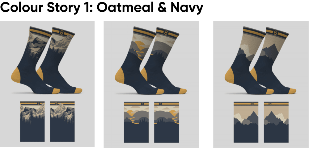
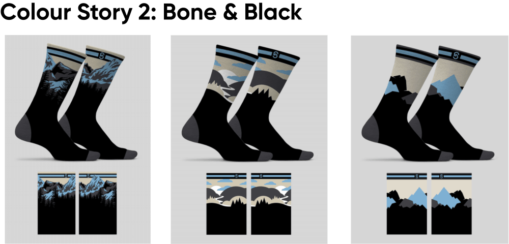
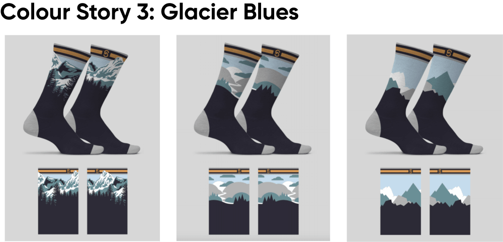
What colour collection do you like best for these High quality merino wool hiking socks?
Option B won this Ranked poll with a final tally of 28 votes after 2 rounds of votes counting.
In a Ranked poll, respondents rank every option in order of preference. For example, when you test 6 options, each respondent orders their choices from first to sixth place.
PickFu requires a majority to win a Ranked poll. A majority winner differs from a plurality winner. A majority winner earns over 50% of the votes, whereas a plurality winner earns the most votes, regardless of winning percentage.
If an option does not earn a majority of votes, PickFu eliminates the option with the lowest number of votes. The votes from the eliminated option are reassigned based on each respondent’s next choice. This process continues in rounds until a majority winner emerges.
Scores reflect the percentage of total votes an option receives during the vote counting and indicate the relative preference of the respondents. If there is no majority winner, look to the scores to see how the options fared relative to one another.
| Option | Round 1 | Round 2 |
|---|---|---|
| B | 44% 22 votes | 56% 28 votes +6 |
| C | 30% 15 votes | 44% 22 votes +7 |
| A | 26% 13 votes | Eliminated 13 votes reassigned |
Age range
Education level
Gender identity
Interest in hiking
Options
Personal income range
Racial or ethnic identity
13 Responses to Option A
I ranked the designs of the hiking socks that I liked the most. I found the oatmeal/navy color to be the most appealing followed by the bone/black socks color and then finally the glacier blues design.
I liked choice A since the yellow on the socks look appealing while grabbing my interest. Choices B and C look too generic and aren't appealing to look at since they are more plain color combinations.
the naming is a bit weird but the color combination of Oatmeal and Navy is extremely pretty and a great color combination. It gives it that sunset dusk kinda feel that makes it seem warmer!
i like the the lighter color. i think it is nic and ahppy looking
I like the orange on the toe and heel.
I really like otion A and the addition of the yellow to the socks. I think that makes them more fun and a little splashy without overdoing it. I think the colors compliment each other very nicely.
I am a fan of choice A over any of the other colors simply because i feel like they would go with the other clothes i would wear in this type of situation. The other colors go together well also, however i doubt i would want to rock with sky blue type socks in this scenario. Also, the colors in choice A are just blended well in general.
I like the bolder colors but they are all pretty great and are fairly close in preferance.
I think A really captures the sunset image well with the color combination. I think C looks like a Bob Ross painting on a sock which is very nice ans serene. B simply looks like a dark gloomy ice field
I like choice A. The use of the warm orange tones is a nice contrast to the cooler blues and greys
My top choice just fits the product type well for some reason. The color goes with most other material these types of users wear.
The oatmeal and navy really stand out and are quite fun, and the navy blues are fun also. The bone and black are just kind of plain and like most other sock brands.
Yellow is one of my favorite colors, and the 2 choice has a brighter blue than the 3
22 Responses to Option B
i like the darker heels and toes, the yellow is fair but the brighter color i really dont like
I really like all of these designs. I prefer B because I like darker socks, and the black contrast against the other colors makes it look a bit sharper. The blue ones are nice too. The navy/oatmeal ones I don't like as much because the color looks a bit washed out/dirty to me. I'm not able to see the design as well as the black ones.
The first option I chose is really the only one that I would consider buying. I think they would match well with my clothes and my shoes whereas I feel the other socks are a little too loud and a little too busy
I like the ones with the black heels because I think the black looks really sharp. The grey in the second one is pretty decent. I'm not a fan of the off yellowish ones at all and would definitely not want that pair
I dig the more solid black style myself.
I liked the color of option B the best.
I prefer the single color on the bottom of the socks. It looks less distracting and will go well with many of my clothes.
I like option B the most because I feel the bone and black looks best overall colorwise. I then like C next because I like the color combination a little better than A.
I prefer the option without the yellow first. I think that it clashes with the blues to much. In regards to the ones with yellow I feel like I prefer to go all in with it rather than just having a yellow accent at the top.
I like B as I am partial to black socks. C has attractive colors however. A is not attractive to me.
I personally prefer my socks to be plain in color and not too flashy. That's why I prefer the socks that are gray and black and blue and black, respectively. I don't really like the oatmeal coloration in Option A since it's flashy and doesn't pair well with as many things as more subtle color schemes.
I like option B the best because the blue stripe at the top of the socks matches the blue of the mountains.
I would go with option "B" based on the colors. The black matches well with the overall design of the high quality merino wool hiking socks.
Option B is the best to me, as it has the most pleasing to the eye pallet of colors. The cool blues and greys contrast nicely with the black. Option C is the second best, as the gold band brightly accents the design, giving a regal-looking banner. Option A is my lowest ranking, as the color pattern is too similar to that of sports team, not entirely original or inspiring in design.
The "Bone & Black" one is my favorite. I like the color combination most on this one, and it makes the "scenery" look a lot more prominent than the other options do.
These appear to have the best design and layout.
I prefer the grey/blue hues of B. When adding yellow to the mix (A and C), it loses a hiking vibe to me. B seems more mountainy and hiking style.
The bone black looks classy, and fits well with the rest of my wardrobe. The glacier blue also looks pretty nice. I've never really liked wearing brown so the oatmeal and navy is not ideal.
My personal experience is that the part of socks near the heel position is worn easily and got dirty very often. It is necessary to use dark colors for that part. Among all of the designs, the one in B is my top choice. The design in C is also acceptable. I do not like the design in A. It uses yellow for the part I mentioned above. It gets dirty very easily.
I like the shade of blue in option B, option c is a little muted for my tastes. The yellow I don't like at all.
Any of the options are acceptable, but I prefer the darker options. If these are for hiking, they probably have a propensity to get dirty, and the darker colors would help to hide the dirt.
B has the best color choice and looks most appealing
15 Responses to Option C
I do not like the yellow look of A. I think the solid gray and blue/black works best
I prefer option C because I like the color scheme that incorporates the grey heel and feet more than the others. I also feel like this sock would be more versatile and blend in better with more of my clothing.
I think the yellow/orange shade of color is quite catchy so B 3. I prefer C to A as the orange shades in C are catchy visually so C 1 and A 2
I thought the Glacier Blues color scheme shown in C was the most appealing because I liked how neutral and calming it seemed. I thought it would go well with a variety of different attire that I normally wear. Next, I liked the Bone and Black color scheme in B more than the Oatmeal and Navy colors in B because they seemed less gaudy. More specifically, I thought the yellow accents in the Oatmeal and Navy option stood out too much and disproportionally drew my attention, while the Bone and Black felt more smooth and balanced.
The bright blues and white in Glacier Blues give a nice high contrast for these socks. Option C looks fabulous and it is fitting for these hiking socks. Option A is nice in the sunset colors for the Oatmeal and Navy. I would go with that as well. Good choices for all the socks and all three would work. But the images of the Glacier Blues seems best, followed by the Oatmeal & Navy.
I like the mix of colors in C.I don't love the shade of blue in BI don't really like the yellow. It's more boring than the blue ones.
I like C the most because I think that the color can go with more things than A and B. I think that the mostly blue color in C really is forgiving and can go with almost anything. I think A is similar to C in this regard but not quite as good, so I ranked it second. I really don't think that B can go with much because it's black and I feel like black has only a few things that it can match with. Therefore, I ranked B last.
I like the light and grey color combo they match well. The orange is very out of place with the black
I like the black and blue color schemes.
On top of looking the best. Glacier blues even has a trendy name for the color scheme relevant to what their function is for. Option B is the 2nd most attractive to me. Option A is ugly and doesn't look like an actual sky as far as I'm aware.
I like the blue and the detail in C. It looks really cool. B has similar detail, but the yellow color turns me off. I would choose blue every time. B is alright, just not as detailed and striking as C
I think blue goes with everything. I would probably wear these with jeans while out hiking. So I went with C Glacier Blues as #1 choice. I also like the navy and oatmeal color which ranks #2 for me and looks quite outdoorsy.
I liked the grey and blue accented socks. I thought they made the design stand out more than the other choices. The yellow color was my least favorite. I wouldn't want mustard yellow socks.
I prefer option C (Glacier Blues) because of the subdued color pallet of these socks. They would match any outfit I would choose to wear. The other socks are a bit too bold for my taste.
I like how the orange band at the top contrasts the rest of the sock. Just a nice touch. For my second option (B), I always like the color blue. It doesn't stand out and goes with nearly everything (at least everything I own). The last option (A) just looks washed out and faded already. I don't like that color style.
Explore who answered your poll
Analyze your results with demographic reports.
Demographics
Sorry, AI highlights are currently only available for polls created after February 28th.
We're working hard to bring AI to more polls, please check back soon.

