Poll results
Save to favorites
Add this poll to your saved list for easy reference.
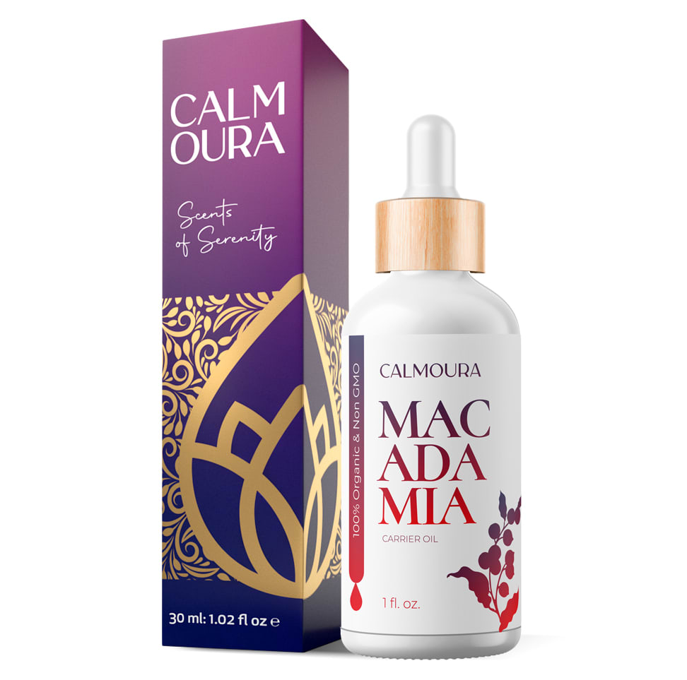
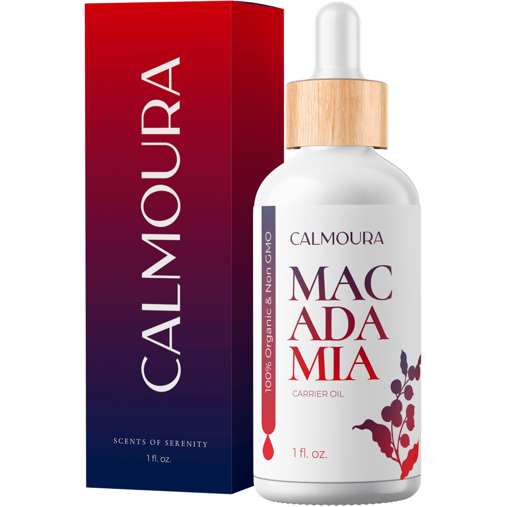
We are launching a new Essential Oil line and using to use the same box for all oils. Which design would you choose?
Age range
Amazon Prime member
Cosmetics and body care habits
Education level
Gender identity
Options
Personal income range
Racial or ethnic identity
27 Responses to Option A
It feels more interesting, and accessible. B seems more like some overpriced luxury brand that I would never even consider.
A is prettier and more feminine
Choice A has more eye catching colors with the gold aesthetic and design,this makes the product inside feel more expensive.
I like choice A the best. The packaging is very pretty and is eye catching.
i like the package better-colors and graphics
I prefer option A because the purple color and design reminds me of calm and peace with a touch of opulance.
I like the coloration of this option better but I do not like the font for the Scents of Serenity section. The coloration on the other package is just too gaudy and bright.
I would choose option design A because it looks nice and eye catching then option B
I like the artwork on it more. Breaking up the name of the brand makes it easier to read it as "calm aura".
This color and design is attractive and appealing
The design of A is more appealing visually than the ombre color of B with no design
Option A has the more attractive colors
I chose A because I prefer the use of purple on the box versus red on B. Also, I like the logo on A. It has a zen like quality that is my style. Purple to me is peaceful and soothing, which is why I am attracted to it.
I like the design on the packaging. It really caught my eye first and makes it look professional
I like the gold design in A and it sounds like more product with 1.02 fl oz vs B saying 1 fl oz.
I chose choice A because I liked the flower design on the box. I felt like box A was easier to read than box B. Box A looks more expensive than box B.
I like splitting the name on the box like this, and the lotus flower looks good, feels very zen
I feel like the color scheme and fonts on option A really showcase the idea of this as a calming product. The purple gradients with gold lotus inspired imagery is very soothing.
this box would catch my eye more the gold design would draw the eye
I picked A because it looked more elegant. Makes it look like a higher end product. Eyes were drawn to this box first.
Reading and down is a lot harder than reading across. I thought it said CLAMOURA when I saw it up and down. Also, I think the purple is prettier than the pink and the gold design makes it look special and a little exotic.
I like A. I love the color and the gold flower design. I think it really stands out more. B does go better with the bottle, but I feel like B could be any type of product, it just isn't clear to me what it is. It's just a bit bland. With A, I also like how the name is spaced out. Overall, it just looks more expensive then B.
I think that this one has a very classic look and nice pattern. The other one is too bright.
Normally I would choose B because the pattern was less loud, but I thought the "scents of serenity" detail at the top of the box was better at describing the product.
The design on the box is very nice and it catches the eye
The design in choice A has an essential oil feel to it.
I like the purple with the gold design. The design suggests that it is from eastern medicine. The purple suggests that it is for royalty.
23 Responses to Option B
I chose B because it is much easier to read the brand name when it's one continuous word instead of broken up like it is shown in Choice A. I had a hard time figuring out that the product was macadamia oil because of the way it was broken up. I would recommend making the font smaller so it could be read correctly.
I like the range of colors on B. It feels more elegant.
I like option B design because it much more cleaner than option A. Option A have too much going on with the design on the looks has be done in a foreign language. Option B is easier too read on the design.
B looks more luxurious and professional at the same time.
This one looks more premium and I like the colors better. The deep red to black ombre is lovely.
For essential oil packaging box, to me B best fits with the design of color red to blue or it somewhat represent the mood changing looks and also coordinate with the bottle's pattern color.
The box for Option B makes it look formal and eloquent which makes me think that it will work. It doesn't need to baffle me with BS.
Option B the package is clean and elegant! The colors are amazing
I prefer the simple designon choice B. I like the clean lines and readability of choice B. The colors of B are very pretty and simple. I like to keep my oils and anything organic very simple. The simple box of choice B conveys that message to me.
The red looks so stylish and sophisticated! I love it!
I like the plain look of B. The packaging is modern and sophisticated. I like the sleek look. The design on A is a bit much for me.
I found the box without the design to be more elegant looking. It even more look a bit more expensive. I find the color scheme to be much more appealling on the choice b. I think that I would pick up the choice b before I would the choice a. I think the the writing is also much more clear as well as the oz
I prefer B. A reminds me of a discount perfume from the 80's.
I chose option B because all of the colors match and I like the color transition into the red which ties into the bottle. Option A doesn't have the red color on the packaging. I also didn't selection option A because I don't like the gold design as much. Maybe it looks fine without the bottle next to it but having the bottle next to the outside packaging I think option B is best.
I'd go with the more minimalist design. The hippy looking design of the other one is a bit overdone, it almost looks generic at this point. The cursive text on it is also hard to read.
I like the box with just the name rather than with a design.
I like the color scheme for B and the image for A.
I prefer B. I think it looks warm and soothing and would be appropriate for different kind of oils. I also feel the colors fit better with the name. I instant read "calm" and that's what those colors are to me, how they make me feel.
This box is sleek and bold in design. I like box B.
I like the clean design on the packaging.
I chose the box that first gets my attention.
I love B. It is beautifully done, and easy to look at. Moreover, A is overdone and distracts. B perfectly reflects the brand and would be cohesive with any scent of oil.
I prefer a simpler, less ornate design to correlate better with the concepts and functions of soothing, calming and stress relief that I associate with essential oils.
Explore who answered your poll
Analyze your results with demographic reports.
Demographics
Sorry, AI highlights are currently only available for polls created after February 28th.
We're working hard to bring AI to more polls, please check back soon.

