Poll results
Save to favorites
Add this poll to your saved list for easy reference.
We are launching a new Detangling Conditioner to compliment our existing Aloe & Oatmeal Shampoo. Which label design compliments best and yet still looks distinct enough?
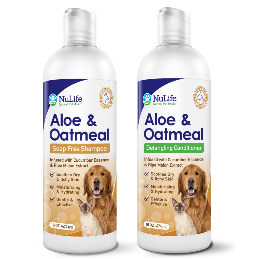
10 Responses to Option A
I like these better as they better display the product name.
I choose A as it looks most distinct and seems to help the design overall.
this bottle looks more innovative to me
I think this one looks great and attractive. It compliments the other one, but it still distinct. Thank you
I think keeping the label the same, except for the part in green where it specifies that it's conditioner looks best. That way there's no doubt that it's a set of products.
I think the whole bottle needs to have a different color because it is very similar the only thing different is your coloring on stating whether it is a shampoo or conditioner I do like the label it looks good but a new color needs to be complete the all over the bottle for the conditioner.
I can't see the difference
Definitely, definitely option A! I really like that the main label is the same so you can easily see that they are the same product variety and go together. But having the smaller conditioner/shampoo label a different color makes it really obvious which is which when grabbing in the store or at the bathtub. We usually run out of shampoo first for our dog as she doesn't use conditioner if we've recently given her a haircut so being able to just quickly glance and grab the bottle with the orange text (and orange label so we know it's the same product) would be super nice! I think B is fine but it's not as obvious that they are the same general product, just a different version, because the labels are just too different. You would really have to read and see that they are the same (so smells will match etc).
A caught my eye
A ties them together nicely. B looked like they were maybe different products, like the green one was maybe an aloe version of shampoo. A is different enough that I could tell them apart during bath time when the corgi is trying to get out of the tub, but I would still know they were a set when I was buying them.
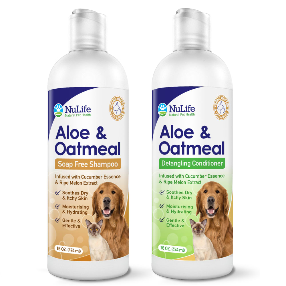
40 Responses to Option B
Looks better with the green color background on the second bottle.
The full tan and green labels on the bottles look more distinct.
i think the background color should match the top sub title
I like the green background on the one bottle better
I prefer choice B because this choice the back ground color makes it easier to distinguish from the two different products.
I like the color around the text matching the background color. I think that it looks more cohesive and flows together better than the different colored one.
I highly prefer the one with the green background as it still has the same title yet it looks incredibly distinct to the shampoo. I think I could get confused with the one offered in option A.
I really like the green background on the aloe -based conditioner. I think that the utility is more enhanced by that label.
Choice B has a different color background for each item. Brown background for the shampoo and green background for the conditioner. This will keep the customer from buying two bottles of the same thing. Choice A having a just a color banner with product description - detangling conditioner - might not be enough of a design change to keep from buying two bottles of the same thing.
The difference in label color helps me determine the difference between the two products. I would likely overlook A because they are so similar.
I have this issue with human shampoo and conditioner. I have grabbed wrong one and get mad when I get home. I like option B because they are the same.shape bottle and bottle color but the two different color labels make it easier to tell apart. I have asked my husband to pick up something from the store and he doesn't ever want to look..He would see name and be familiar with the bottle and assume he is getting the right thing. Am Going with option B to cut down on buying wrong product and when washing a wet dog, easier to grab right bottle to soap or condition her.
I like choice B the best...because the conditioner bottle is a different color...it would make it easier to tell the difference if you when you are not paying a lot of attention.
When I shop I am often in a hurry and sometimes pick the wrong item by mistake....like the shampoo and conditioner are the same color and packaging....so I buy the wrong item. So, I really like that the conditioner is a different color than the shampoo, such as in choice B.
Ingredients are printed in bold and label is easy to read and understand. I would choose this one.
I like the design of the bottle in option B. I like the tone of the overall green in the detangling conditioner as opposed to just a small portion of the label in option A.
I like the larger green label on the conditioner to quickly and easily tell the difference.
I really think the different background colors is appealing on the eyes and also attractive.
I like B because the conditioner label having a green background makes it different enough from the shampoo to easily tell which product is which. This will be extremely handy both when in the store making the purchase and also when you are giving your dog a bath. There is nothing worse than grabbing the wrong bottle and having to start over so I think B is totally the best option.
There is s lightness to this label that makes it stand out.
Choice B is distinct enough that I would notice it was a different product. The shampoo and conditioner are similar enough that I would know that they're from the same line, but different enough that I could easily pick out what I needed. I could see myself accidentally picking up the wrong product if it looked like Choice A.
I think these are similar enough in name, but different enough that you won't grab the wrong one by mistake
The label needs the green to distinguish the conditioner from the shampoo.
Option "B": The Detangling Conditioner bottle design on this pair are similar but clearly distinct enough to be easily differentiated with the added green color highlight. From an ad space or store shelf this distinction is warranted and is clearer than option "A".
I chose Option B because of the label colors. Option B detangler background color is different than the shampoo. It would visually make it easier for the consumer to differentiate between the two.
It is clearer that this one is related but it is different enough that I am unlikely to mistakenly grab the wrong one.
I chose B for the fact it is clear they are different as to help the vision impaired with seeing which to use first at a quick glance which is important when try to wash a dog that does not want to be washed.
Honestly at first it was hard difference between the two of them but once I noticed that one was all brown and the other one was all green that's when I picked be because when I'm buying a product many times I'll just go with the color that I noticed especially if I bought the product for so the detailing conditioner I like when it's a solid distinct color like the green naked giving information the colors pop out the dogs are cute the cat is cute overall great product but I prefer the distinguished
I get very upset with myself if I accidentally buy conditioner instead of shampoo and I like B much better because it would help differentiate the two better so this doesn't happen. I like how the product types are different colors on both, but the different background really helps.
because you can tell the difference with the colors.
"B" looks more complementary "A" looks too similar to the point they would be confused.
professional looking with unique information
I like that the overall label is the same and laid out in a familiar way. The green in this version is easier to see on the shelf without having to look as closely.
I like that the shampoo and contioner each have a different colored label.I like that both have oatmeal and aloe.
It is easier for me to see a difference between the two.
I choose B because I like the two different color label backgrounds. You will never get confused and use the wrong product. The labels are nice looking.
the green color throughout the label separates the shampoo and conditioner much better
I think you need to go with the label that has the most green in it. If someone is glancing at it on the shelf in a hurry they may pick up the wrong product if they are not careful if both labels are mostly tan.
I like the different colors for the shampoo and conditioner to make them distinct from one another.
Option B design compliments the product. The lebel design on option B feature the company and product name, this will allow the product to be easily identified and the product still look instinct with the label design.
I feel like differing colors to the backgrounds would be helpful in identifying and keeping the shampoo seperate from the conditioner
Explore who answered your poll
Analyze your results with demographic reports.
Demographics
Sorry, AI highlights are currently only available for polls created after February 28th.
We're working hard to bring AI to more polls, please check back soon.

