Poll results
Save to favorites
Add this poll to your saved list for easy reference.
If you were shopping on Amazon for Bible tabs, which color do you find the most beautiful and aesthetically pleasing?
Option A won this Ranked poll with a final tally of 16 votes after 2 rounds of votes counting.
In a Ranked poll, respondents rank every option in order of preference. For example, when you test 6 options, each respondent orders their choices from first to sixth place.
PickFu requires a majority to win a Ranked poll. A majority winner differs from a plurality winner. A majority winner earns over 50% of the votes, whereas a plurality winner earns the most votes, regardless of winning percentage.
If an option does not earn a majority of votes, PickFu eliminates the option with the lowest number of votes. The votes from the eliminated option are reassigned based on each respondent’s next choice. This process continues in rounds until a majority winner emerges.
Scores reflect the percentage of total votes an option receives during the vote counting and indicate the relative preference of the respondents. If there is no majority winner, look to the scores to see how the options fared relative to one another.
| Option | Round 1 | Round 2 |
|---|---|---|
| A | 40% 12 votes | 53.33% 16 votes +4 |
| C | 43.33% 13 votes | 46.67% 14 votes +1 |
| B | 16.67% 5 votes | Eliminated 5 votes reassigned |
Age range
Education level
Gender identity
Household income range
Options
Racial or ethnic identity
Religious affiliation
12 Responses to Option A
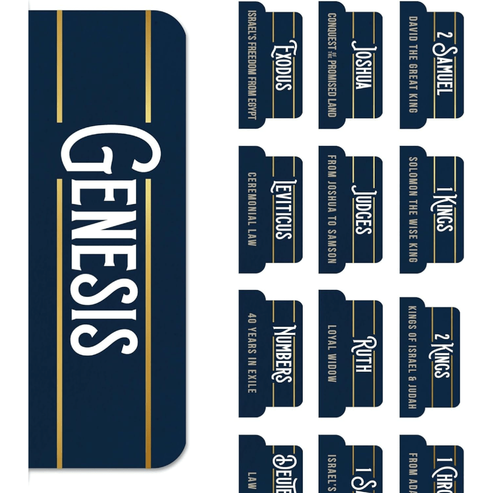
These tabs are very attractive based on the dark color with the white fonts and gold accents. They are all quite elegant
These images were ranked in order of legibility and it seems like a good product for bible readers.
i like the color, the font, and the all around lock. It's easy to see the chapters in this image which gives it an advantage over the other products.
I would like option A because of the yellowish lines on the upper and lower sides of the names.
I like the tabs with the little gold lines at top and bottom..those look really nice on the dark blue background, and add a visual focus area
I prefer design A because it is simple and elegant.
I made my choices in the order of what looks like the largest print, down to the smallest.
I prefer the font in A and the bottom text is also helpful.
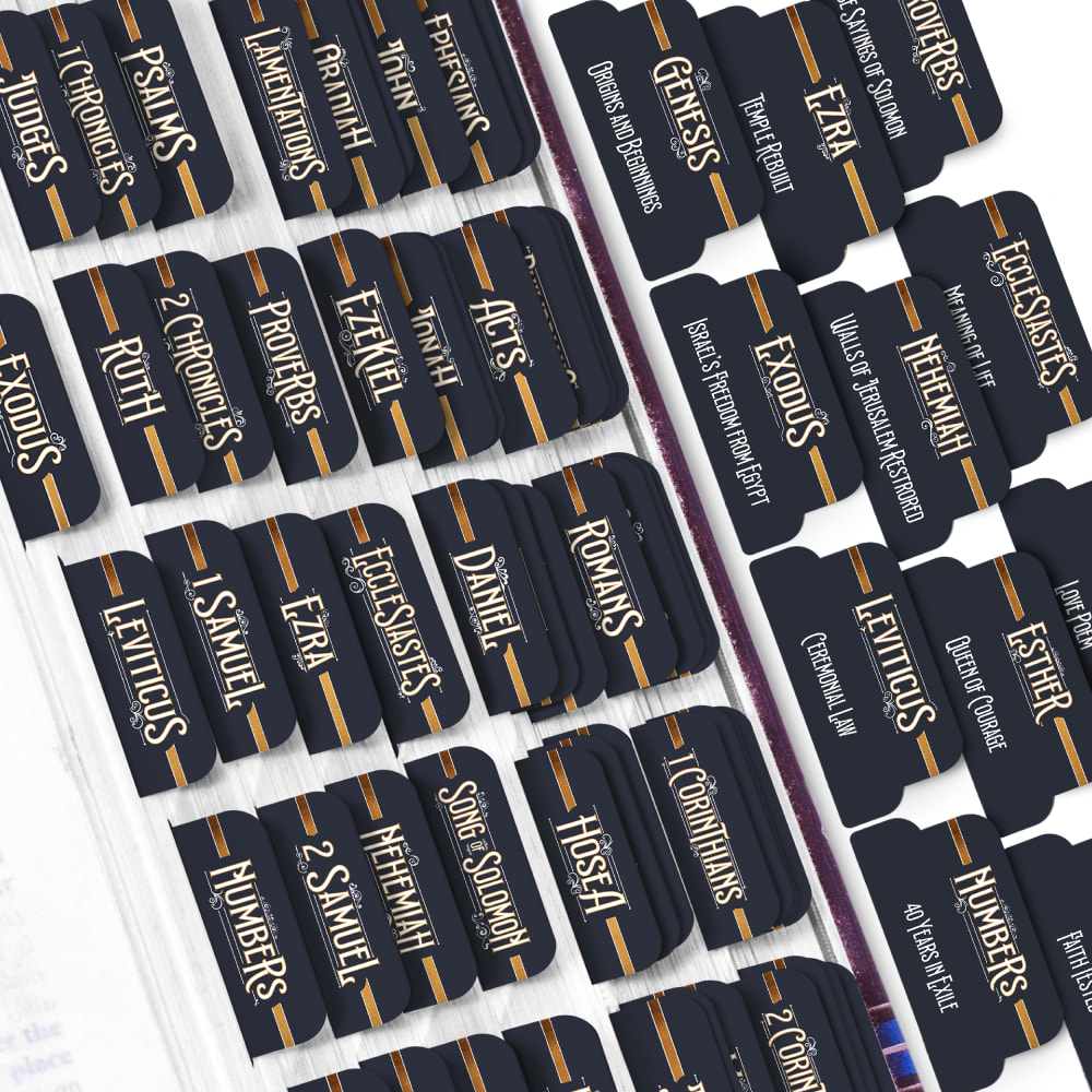
Slight preference for A over B. Option C looks like a college football logo, though.
Options A and C are pleasing to the eye and I find the colors to beautiful.
I'd go with Option A over the others. In my opinion, Option A's tabs look the most appealing to me.
I think A is the best because it's a nice font and easy to read. I think B looks nice but it's kind of hard to read. I think C is unappealing for the titles and doesn't fit the style for what I'd want.
5 Responses to Option B
The gold lines in B and A make the tabs look more luxurious and high quality.
Option B has the most elegant lettering with swirl details surrounding it. Option A uses very nice lettering, but it's a bit bland compared to Option B. Option C uses bold lettering, but it's not really elegant.
I like the central gold band and script in B the best, it looks fancy. I picked A second, it has a little style. I didn't like C much, it looked like a sports logo to me.
I think the very dark blue/blackish option is my favorite because my bible is black so it would match best.
I like the darker gold color for the lines used on option B because they make the labels stand out more compared to the other two options shown.
13 Responses to Option C
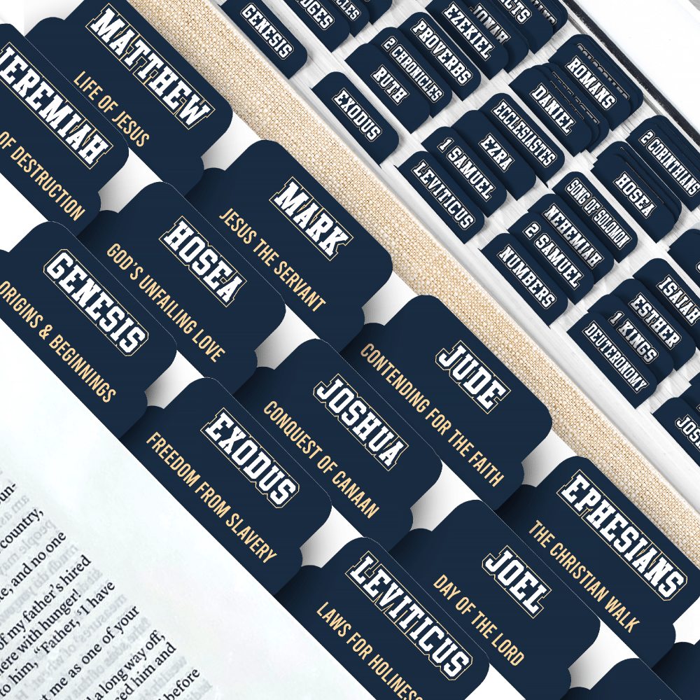
I simply picked these by ease of readability. The fancier the font, the harder it is to read for older people.
I chose option C. I haven't used any of these in years. I really like the ones in C as they are very easy to read and would make verses easier to find.
I would go with choice C because the focus is on the words and not on the font.
I think Option C is the most compelling and nice to look at. It's presented the best.
C is straightforward and does a good job by being simple, which I appreciate.
I enjoy the legibility of the text paired with the excellent use of the color positions in both option C and A. Enjoy B seems a bit too noisy to have any preference here due to the squished font and overlapping colors.
The names of the books look very clear in Option C. It's easy to tell which tab is for which book
I prefer C because I can see how the tabs will look when placed in my Bible. I would buy them.
C and A looks a little better than B and more fitting for the bible.
Option c has bolder writing easier to see and read also like gold lettering under each word.
I thought C and B had the best look to me and would stand out the most, so I went with those as my top 2.
I like this view of these tabs more, as they show how they actually look in use
I feel like these Bible Tabs would be a nice little gift for my Mother-In-Law. As far as the colors, Option C was the more visually appealing to me, based on the dark blue.
Explore who answered your poll
Analyze your results with demographic reports.

