Poll results
Save to favorites
Add this poll to your saved list for easy reference.
If you were in the process of buying a high-protein, plant-based meal replacement powder, which packaging design would you prefer and why?
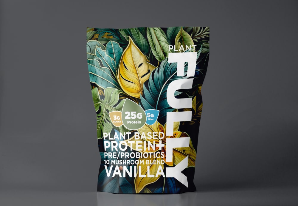
Option C won this Ranked poll with a final tally of 17 votes after 1 round of vote counting.
In a Ranked poll, respondents rank every option in order of preference. For example, when you test 6 options, each respondent orders their choices from first to sixth place.
PickFu requires a majority to win a Ranked poll. A majority winner differs from a plurality winner. A majority winner earns over 50% of the votes, whereas a plurality winner earns the most votes, regardless of winning percentage.
If an option does not earn a majority of votes, PickFu eliminates the option with the lowest number of votes. The votes from the eliminated option are reassigned based on each respondent’s next choice. This process continues in rounds until a majority winner emerges.
Scores reflect the percentage of total votes an option receives during the vote counting and indicate the relative preference of the respondents. If there is no majority winner, look to the scores to see how the options fared relative to one another.
| Option | Round 1 |
|---|---|
| C | 56.67% 17 votes |
| A | 33.33% 10 votes |
| B | 10% 3 votes |
Age range
Amazon Prime member
Gender identity
Nutritional supplement use
Options
Personal income range
Recently purchased categories
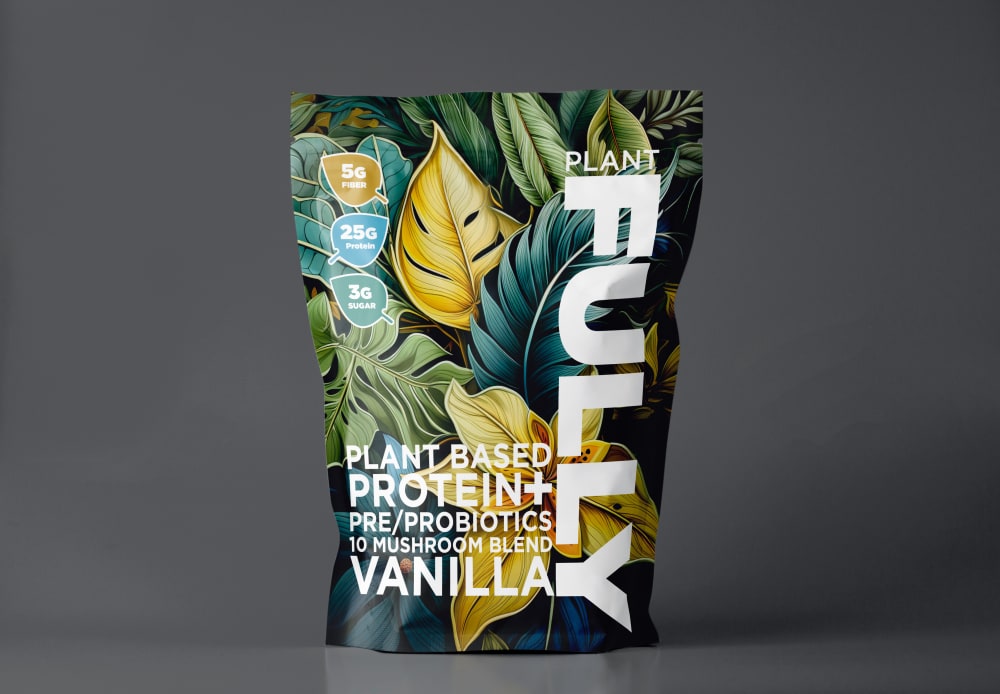
10 Responses to Option A
This label seems easier to read and less cluttered.
I think by having the stats of the bag in the upper left like in option A it makes for a better spaced front package, in the other designs the upper left corner just feels empty and bare.
I would opt for option A. I love how the product is packaged. I find the design to be visually appealing and aesthetically pleasing. I love how brightly colored the image is.
I like the placement of the smaller symbols with the information the best. They are the easiest to see and read when they are at the top and the side. They do not get lose in the middle. it has a very organized feeling.
I like seeing the supplement facts on their own in the top left corner. It makes it easier to read and makes the aesthetic looks better
I love A and C a lot as this is bigger and easier for me to read about the benefit of this product and also the numbers / nutrition for it. I love A the most as this one is the easiest to read and the one that gets my attention first.
I like option A the best because the three leaf shaped graphic bullet points running vertically up the left hand upper side of the package makes the leaf graphics on the package really stand out.
This is a better design because it actually separates a lot of the design elements and makes them more spread out on the product and it makes it feel less cluttered
The infographics are better a little further away and now cluttered with the other text.
The top left with the nutritional values is the best way to read it. The eye sees and read left to right so this is perfect positioning.
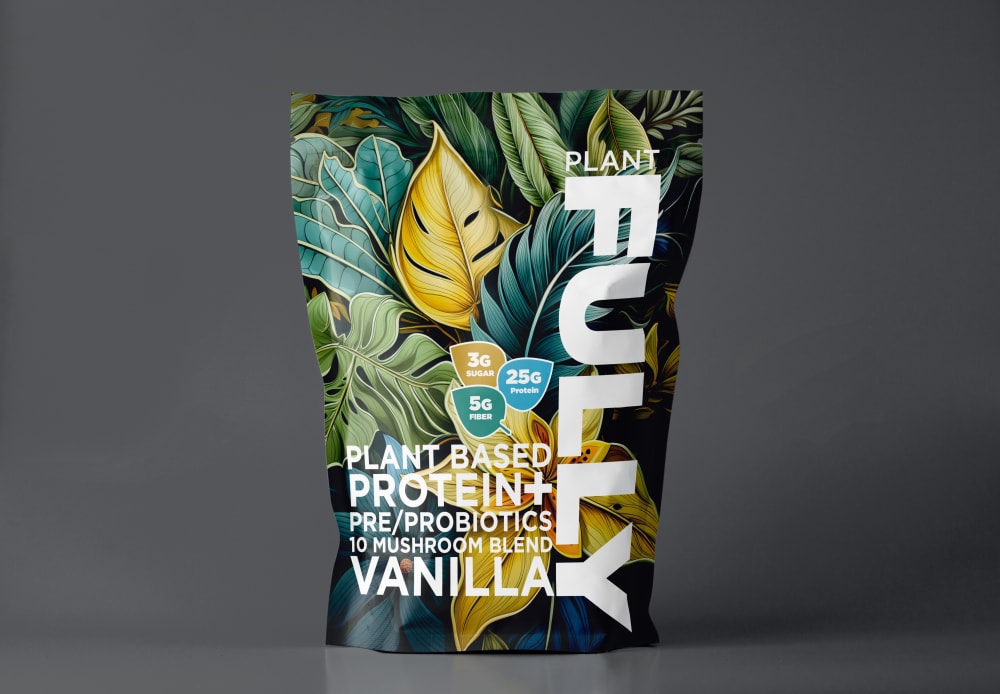
3 Responses to Option B
The bold design on the package makes the protein/sugar/fiber claims difficult to see, but I think it's most visible on B and C.
For me I love this color scheme as it fits the product very well.
I prefer option B, because I like how the nutritional information is shown near the center of the package in a more vertical fashion, which I think matches well with the name "FULLY" which also is shown flowing vertically too.
17 Responses to Option C
I prefer C the most because its three badges are the largest and most prominently placed, making them the most immediately obvious to see. B and A bury the three badges too much.
I like the arrangement of the information better on C and B, and I like that C has Protein on a larger leaf than the others because it is the most important to me.
The more centrally places labels make me see more of what is included in the packaging.
The callouts showing the nutrition facts/information were much easier to see in C.
I prefer the presentation of the nutrient information in Option C.
I prefer C most. The large size of indications about protein, sugar, and fiber contents is clear and helpful information.
C is more detailed and therefore more insightful. The ingredients icons arranged on the top left are clearer and more visible which makes them easier to read hence more convenient.
I didn't even see the labels in the corner. They're more visible right by the text. The issues is that the packaging is SO busy and colorful that it's hard to read or notice ANY text or symbols since they blend in.
I like option C the best, because the key nutrition information is very visible and prominent. It makes it easy to see and read. Option B is ok, but seems a bit squished into a corner. I don't like where it is located in option A. It isn't as prominent.
The 3G sugar, 25G protein and 5G fiber would attract me to option C.
Packaging design for C looks very quality in terms of the vibrant color design and floral patterns on it. The labels are also well arranged and written in large font and nice typography which makes them more visible.
i like the way the information is layed out on the packaging
Option B is too crowded on the right bottom side. Option C is more well-balanced as the descriptions and information are all in a horizontal manner.
I like the nutritional call outs right in the middle of the screen like on choice c
The little icons on the packaging is quite nice and the font is nice to read
It's nice having the nutrient text near the title text.
The arrangement of the three little boxes is more clear in C, and it's easier to read. B is a bit easier to read than A, and A is the hardest to read so I chose it last.
Explore who answered your poll
Analyze your results with demographic reports.

