Poll results
Save to favorites
Add this poll to your saved list for easy reference.
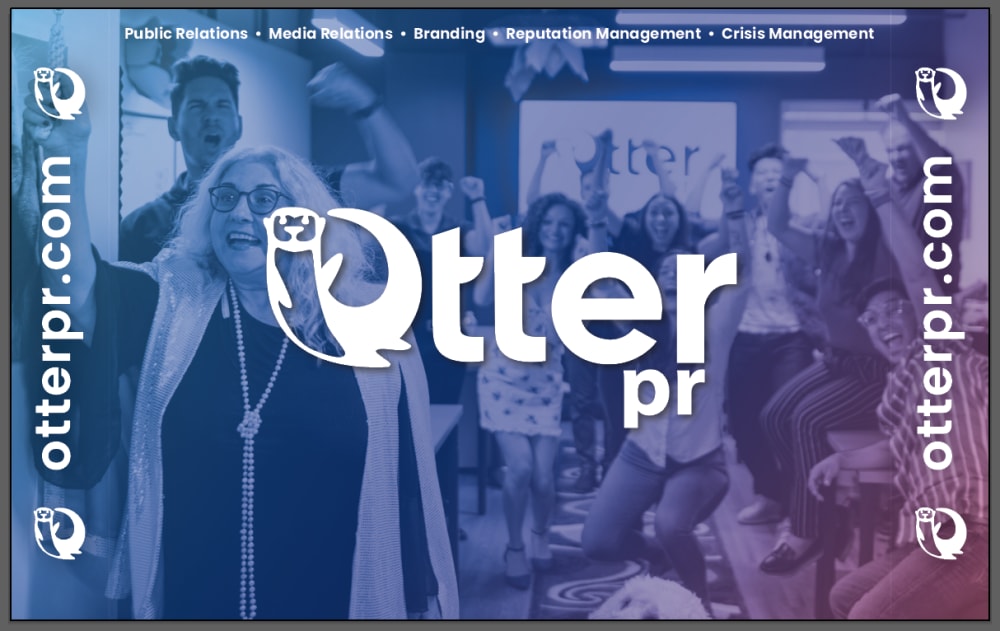
What background do you prefer for a B2B business conference? We will have a small table in front of it for people to learn more about our service. We are a PR firm that focuses on small and medium-sized businesses. (the sides will be folded in)
36 Responses to Option A
I prefer seeing the logo up close and a larger image will show the details to the consumer better
I like this one because it feels more personal. And gives a sense of togetherness.
A looks better with the photo
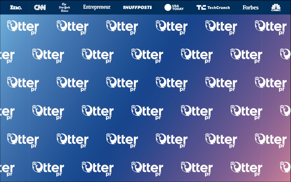
Option B is way too busy in terms of design. Someone could also have a hard time making out the words due to reducibility issues. Plus, option A is best since it is clear and includes the components and web address.
I think this is easier on the eyes and doesn't feel like it has too much going on. It's a great background and I love the colors. It feels like a fun and enjoyable space
I like A, but I think it has too much text on it, but I like the fact it has an image on it vs just the name a lot
I thought B was too cluttered since the logo was unnecessarily splashed everywhere on the background.
I feel like option b is too busy and confusing for what the name is really, its great for a background, but option a is better suited for the purpose
A looks way more interesting and it grabs my attention . B just seems way to generic and does not stand out at all.
i would prefer the one in option A because it looks more professional to me
I like seeing the cheering, happy faces. I think it would put me in a good mood every time I'd see it.
I don't like so much repeating patterns. I don't like the border url on A, but like the big log in the middle as you can see the otter better.
Option A because the background give a better idea of what the business is promoting
It’s a more active background that fits the setting very much.
I think which one is better depends on if your audience will immediately recognize what "pr" means. I like A because there is more depth to it, there is motion, you can see people all together, but the image doesn't seem to have much to do with pr. Unless it's a picture of your team? It's still better because of the categories of work listed across the top, that make it clear what your company actually does. I would recommend adjusting the photo so that the logo isn't hiding anyone's face, and if it is a stock photo, ensuring that there is a diverse group of people.
I prefer the option A advertisement because the background image shows happy people while the option B image just shows the same image repeated multiple times.
I like this one because you can see the company name in big letters and the people behind it that may be responsible for the company collaborating together.
This looks more professional and well done
i chose option a because with using bold lettering for otter pr it grabs your attention immediately
I voted based on how appealing the images were to me compared to the others and which ones I would click on in the real world.
I prefer the background of the B2B business conference of option A more than option B. It looks less cluttered than option B's background.
Seems more appealing as it stands out as something i would use
This promotes your business name front and direct - I think this is more appealing to show at a show.
I like this one beacuse it shoes the company as a team having a great time
I like this, it seems more appealing and inviting
I picked A as my top choice as the picture of people cheering tells me that it's a very proud team.
I think the repeated image in B is too distracting and I like the single worded image with a picture in A a lot better.
this logo or background looks more inviting than the other one. the other is too plain and looks like one of those fake websites on facebook. it would get more people to look at it if it was more personal in a warming welcome way.
B is way too busy and distracting for my taste.
I choose option A for the background for a B2B business conference because the large fonts draws attention right away and the background will keep attention trying to figure out what is going on in the background.
I like seeing the faces and the people engaging and being successful
B is too busy and very distracting to me.
The background picture represents a company.
I picked a because the other one seemed to cluttered and busy.
B is gross and almost makes me dizzy. A is easier to look at.
I like this background a lot better because for me it conveys a more professional look
14 Responses to Option B
I prefer choice B. This background is less distracting in my opinion while A is sort of distracting with everything going on.
A is a bit too busy. B is also busy, but less so and more appropriate for a backdrop.
Just having the logo is less distracting as a background as having a photo, it just looks better and more professional
I choose B, to many people shown in A
It is much more simpler and isn't filled with full of detail.
Be looks more professinal and eye appeasing
I prefer the background on option B because i find it to not be dull as the other one.
B was interesting and I liked the deep blue color a lot as well.
I prefer Option B because it looks more professional and Option A looks tacky and off-putting.
I like B more as the repetition in the name's logo could make people remember it better. I also just prefer it overall.
This reminds me quite a bit of the style of PR backgrounds they use for the NFL and sports. I like it, because the pattern helps really hit home what the logo is supposed to look like, and the name, over and over, which really implants it!
For a conference I think this one will work better than the other one. The other one looks too cluttered and busy.
I think the background of option B looks the most professional, that would be my pick. I think the people in option A look tacky and out of place.
I think option B stand out more and would draw people in better than the other one. They are both good choices though.
Explore who answered your poll
Analyze your results with demographic reports.
Demographics
Sorry, AI highlights are currently only available for polls created after February 28th.
We're working hard to bring AI to more polls, please check back soon.

