Poll results
Save to favorites
Add this poll to your saved list for easy reference.
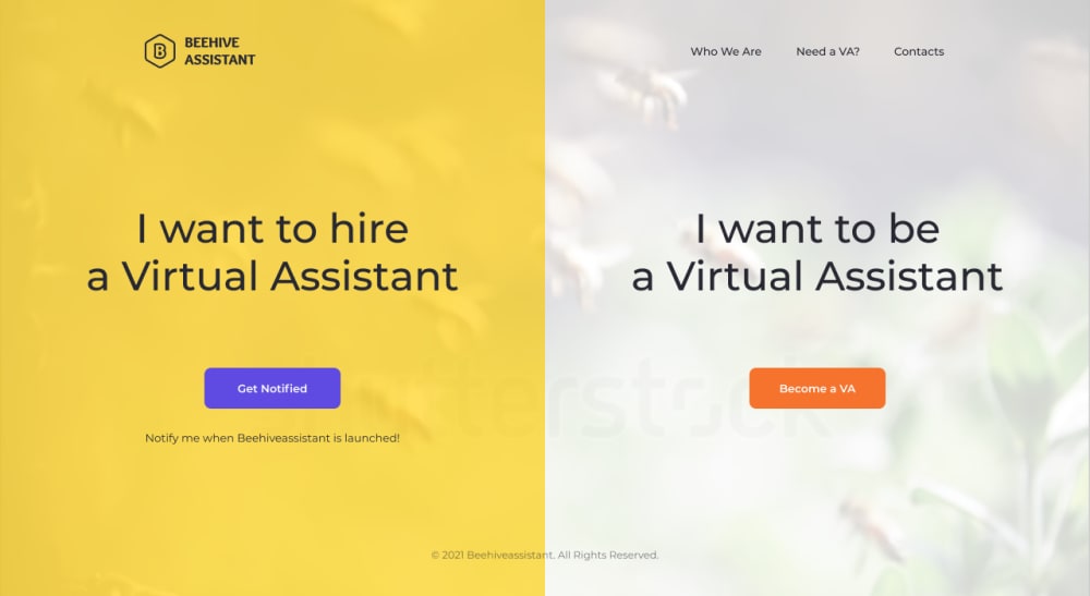
Which web page do you like better if you were either hiring a virtual assistant or interested in becoming one?
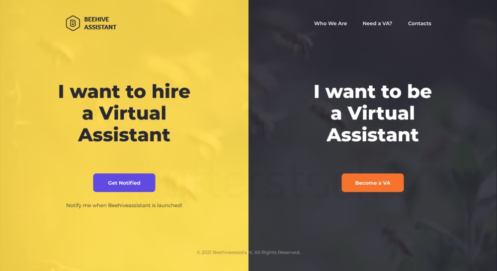
Option C won this Ranked poll with a final tally of 27 votes after 1 round of vote counting.
In a Ranked poll, respondents rank every option in order of preference. For example, when you test 6 options, each respondent orders their choices from first to sixth place.
PickFu requires a majority to win a Ranked poll. A majority winner differs from a plurality winner. A majority winner earns over 50% of the votes, whereas a plurality winner earns the most votes, regardless of winning percentage.
If an option does not earn a majority of votes, PickFu eliminates the option with the lowest number of votes. The votes from the eliminated option are reassigned based on each respondent’s next choice. This process continues in rounds until a majority winner emerges.
Scores reflect the percentage of total votes an option receives during the vote counting and indicate the relative preference of the respondents. If there is no majority winner, look to the scores to see how the options fared relative to one another.
| Option | Round 1 |
|---|---|
| C | 54% 27 votes |
| A | 18% 9 votes |
| D | 18% 9 votes |
| B | 10% 5 votes |
9 Responses to Option A
the yellow goes nice with the grey / white , i feel it looks more professional
I would go with option "A". This option looks appealing and effective.
The yellow and white are more attractive and eye-catching. The thinner font of A is quite nice. B is also pretty good. D and C both have yellow and black, which reminds one of bumblebees. I don't think it works well. I'm not sure about the purple "Get Notified" in any of them but the orange is good.
the smaller and thinner word fonts look better
I like the lighter version of the B a virtual assistant better, but it doesn't need to be bold like in B.
I like the choices with the transparent backgrounds. The ones with the black backgrounds don't look as great.
The top choice of mine has the right contrast and design balance that makes it the most readable and effective
Option A is the page that I am most drawn to. I think that the colors are just right for the subject. The neutral colors make this listing more appealing and the wording is appropriate. Option A is the one that gets my attention and whether I want to hire a virtual assistant or become one, this is the option that I would pay the most attention to
I like the more transparent pic in background on the right side
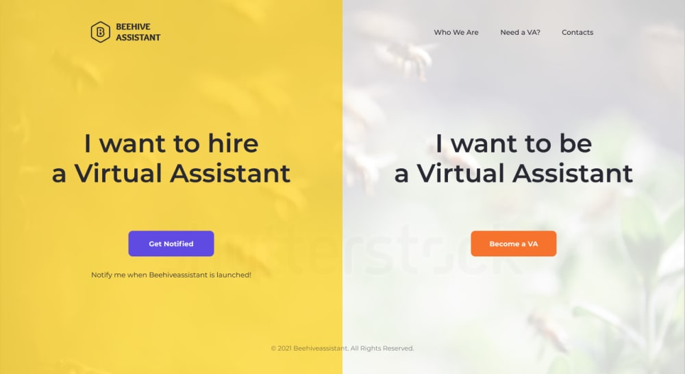
5 Responses to Option B
The templates are ranked based on the color schemes first and the boldness of the letters second.
white is easier to read and makes it clearer
The yellow and black look too much like a bumble bee. The bold makes this stand out more, which is more catchy to me
I like the white and bold writing in B the most. I like the white in A. I like the bold writing in C. D is my least favorite.
I feel that the white background looks more inviting.
27 Responses to Option C
B and A seem to thin to me. I think the big bold of C really makes it stand out.
I like the bolder font, it really stands out well on the yellow.
I like the black background the most, it feels natural.
The bolder text looks better and stands out more
The black looks better than the white to me
I like the contrasting yellow and black for the design. Because of the contrast I am able to read it better and I know one is for each category.
I prefer Options C and D because they are the colors of Pittsburgh and the Pittsburgh sports teams.
I think the text looks bolder in options C and D against the black background
Option C is clear bold and the text can be easily read and understood. The color choice is a big plus because it shows clearly the two categories on the web page, this minimizes the chances for making a wrong choice or mistake.
I ranked the options by how they appear in boldness. Option C is easy to read and the black text pops right off the screen. Option A looks a little squiggly and harder to make out. (I don't have great vision) The rest of the design does not matter as much to me as immediate legibility.
The color scheme is great and the font is simple and easy to read for anyone.
I like option C because it looks very confident and bold. Option D is also a nice backup. Option A and B feel inferior to me.
I like Options C & D best. I think they stand out more. Option C does the best job getting my attention with the bold font and contrasting colors.
i like the white bold text that jumps off the black background to my eyes. i immediately see that. the bold text is always better
I like the black background in C and D but I like the bolder text more in C so that's why it's first. I like the bolder text in B more than A
Larger and bold font, with the black background is more appealing.
I like the black and yellow options preferably the bolder font. Same with the white. The font should be bold. It's easier to read.
I like the font on Option C best and with the background it stands out well, like the old 80s ads.
I picked C for the lay out of the words in three lines, the background colors yellow and black and the bold print in black and white that was used. Next, I picked D for the background colors yellow and black and the layout of the words in two lines with the bold print in black and white. Next, I picked B because of the bold print words in two lines with the use of the yellow and white backgrounds. Next, I picked A because of the slightly smaller non-bold print in two rows.
Option C is the best by a long shot, the rest are hard for my Grandma to read and it needs to grasps the users attention.
I really like the black and yellow combination and I thought that the yellow used in C was more vibrant.
Option c is more eye catching and memorable
I like the color scheme in C and D better. I feel like it is more impactful and clear. I also think it's more aesthetic to have fewer words per line, even if it means breaking up the phrase "Virtual Assistant."
I chose the options based on how likely they were to catch my attention and whether or not I would give them a second thought.
C is my first choice because I like the coloring and bold font. D is second due to the color being more pleasing to me than the font choice, with B and A following that one due to my font preference.
Option C because the colors and the way the wording is, makes it the easiest to read. Stands out more
The more bolder the letters in a webpage where it does not take too much attention away from the other links then the better. In a situation where you want to hire someone or work for someone, my choice is the best for this type of business.
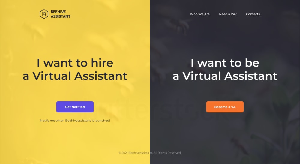
9 Responses to Option D
I like that choice D has a very intensifing message that has a strong broad display.
D is my top choice because it has the best design to it. The spacing is good, the text is very legible, and the colors really stand out.
I think the black and yellow designs would be best. The colors help to see the difference in where to sign up.
I chose in order of appearance and how appealing it is.
i would like this web page better because I feel like the text is more concise and the colors are good too
I ranked the font color and size of the message for the website that I liked the most. I found the font design of option D and the background to be the most appealing. I then liked the design of the website of option B followed by option A and then finally option C.
I think the darker color on the right panel contrasts way better
i like the black background its easier to read
Should I be interested in a virtual assistant, I would be drawn to the darker background rather than the lighter versions, which are less visible overall.
Explore who answered your poll
Analyze your results with demographic reports.
Demographics
Sorry, AI highlights are currently only available for polls created after February 28th.
We're working hard to bring AI to more polls, please check back soon.

