Poll results
Save to favorites
Add this poll to your saved list for easy reference.
Which site design do you find to be the most visually appealing in terms of layout and the branding style?
Option D won this Ranked poll with a final tally of 28 votes after 1 round of vote counting.
In a Ranked poll, respondents rank every option in order of preference. For example, when you test 6 options, each respondent orders their choices from first to sixth place.
PickFu requires a majority to win a Ranked poll. A majority winner differs from a plurality winner. A majority winner earns over 50% of the votes, whereas a plurality winner earns the most votes, regardless of winning percentage.
If an option does not earn a majority of votes, PickFu eliminates the option with the lowest number of votes. The votes from the eliminated option are reassigned based on each respondent’s next choice. This process continues in rounds until a majority winner emerges.
Scores reflect the percentage of total votes an option receives during the vote counting and indicate the relative preference of the respondents. If there is no majority winner, look to the scores to see how the options fared relative to one another.
| Option | Round 1 |
|---|---|
| D | 56% 28 votes |
| C | 26% 13 votes |
| B | 8% 4 votes |
| A | 6% 3 votes |
| E | 4% 2 votes |
Age range
Education level
Gender identity
Options
Personal income range
Racial or ethnic identity
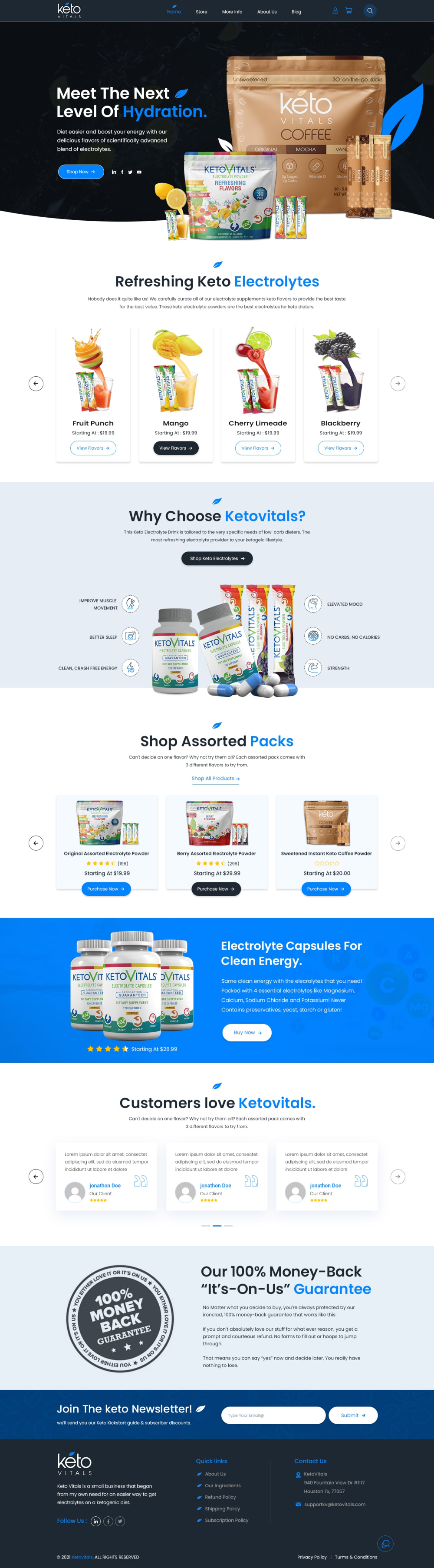
3 Responses to Option A
I like the people in the first 1 because they look familiar to me.
A's design I feel looks the best because it flows well while still looking very diverse to change it up.
I choose A it has a video to break down what the product is about also electrolites to keep me healthy it's a win all the way to me so this is why I choose A over B E C D
4 Responses to Option B
I like that there are videos in a few of them, I like the brighter colors of the others ones without videos
I like B and C beacuse it looks more put togther and the colors macth
I like the bright white background on Option B and the pretty pastel colors on Option D. Option A has too much gray.
They are all great layouts. The color and pictures all look nice and give you something to look at
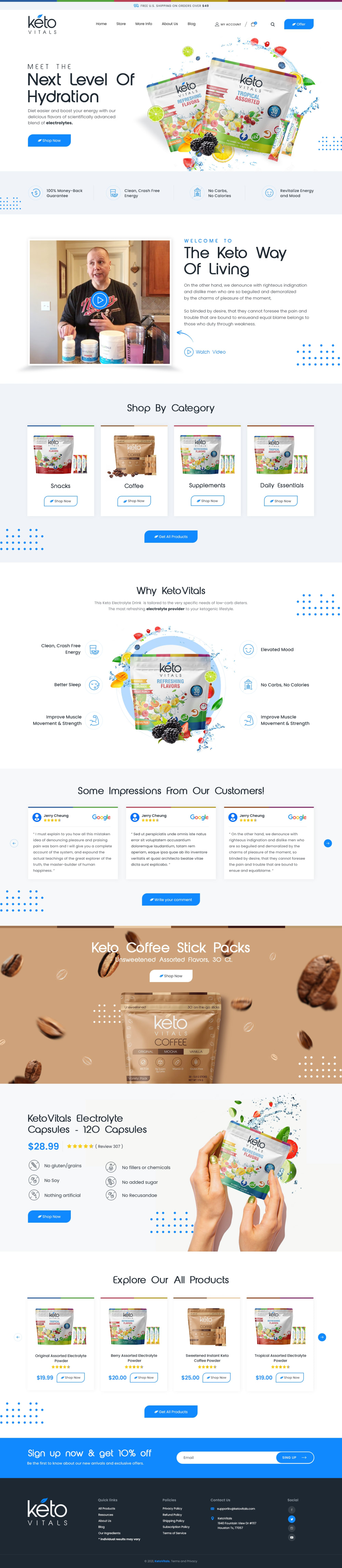
13 Responses to Option C
I think my top pick looks the most modern and professional overall, it drew my attention to it first.
I chose C as #1 because the header colors looked fantastic and I really like them.
I like the versions with some more color in them, and especially the darker ones. I think most people prefer darker pages these days, and most things run in dark mode as it is.
Looks much more modern and sleek to me. More professional.
Less is more. The more thats shoved on a page the more confusing it gets.
I think that choice C is the best looking image of the 5 choices to choose from
So they all have their unique designs, but I ranked them in order that I would be most happiest to be on the site and continue browsing it. The ones at the bottom may turn me off enough for me to leave.
they are all too bright
I like C because of the black background at the top, C and D because of the drink selection in the page. A is last because it looks the most medicinal.
I like the wavy background graphics that are used with C showing the product lines enlarged for the landing page in C
Option C has a nice banner and simple selections once you scroll down. Option E seems the most barebones and is the least stylish.
I liked Option C. The variation between the dark and light panels brings a lot of interest to the site. I feel like it would keep my attention as I scrolled.
A is too long and D wastes too much space using a woman's pictures. C is short and has a good set of colors so it's the best one
28 Responses to Option D
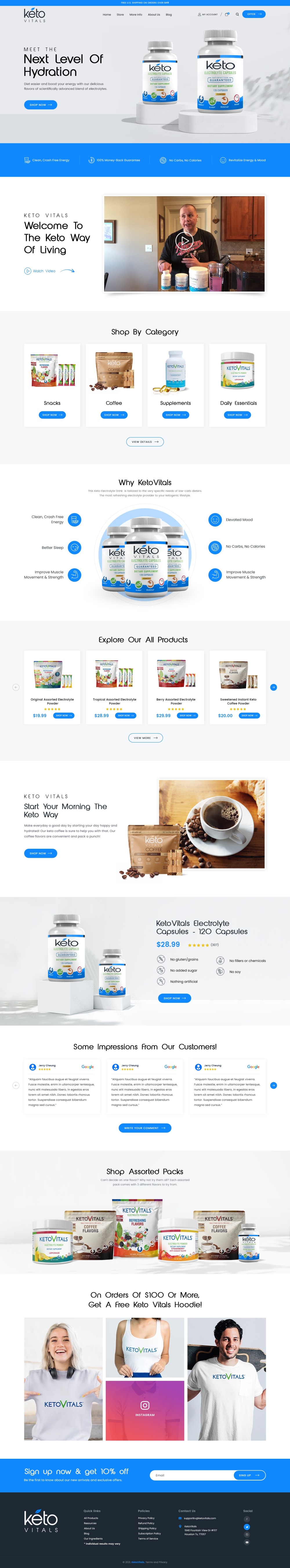
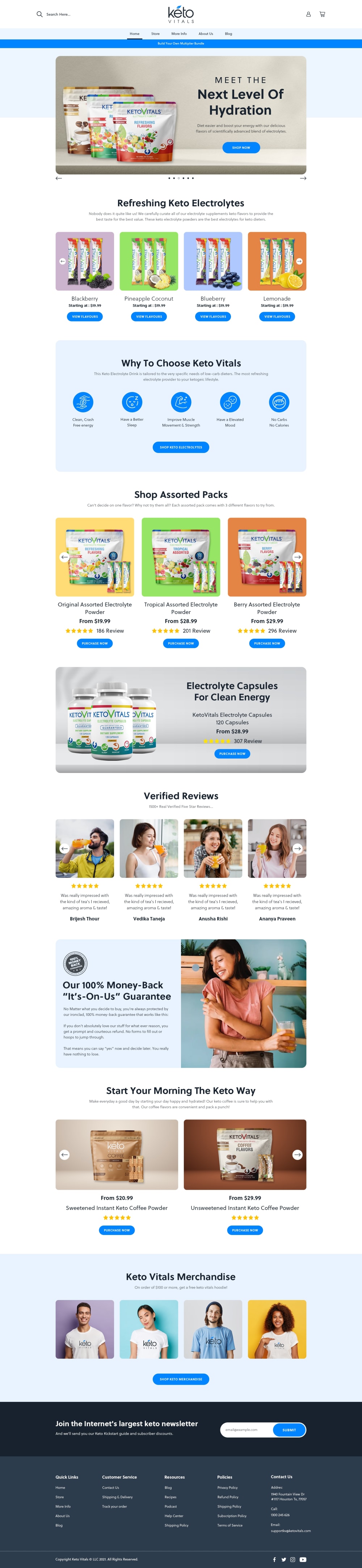
I really like D, the info all flows really well with the colors and designs, I think it looks the best. A is very boring and bland and it isn't that interesting to look at. I like having a little bit more images to go on
I like D the best because all the fruit pictures appealed to me.
The color scheme and very large images really make this layout stand out for me.
D and C uses color which helps the website stand out. A uses color but not as much. E and B are basically white websites which is boring.
i like option D the most for having a more appealing design
I love the style and color palette of option D. Its very attractive. Both options D and B have great hero images. Option A has a nice clean layout but it isn't very dynamic in terms of design. Options C and E feel basic compared to the others.
I voted based on how appealing the images were to me compared to the others and which ones I would click on in the real world.
I would say option D is most enticing. The model is pretty, the colors are vibrant, and the site itself just looks very high quality and professional. Also like the sizing of the images and products on the page.
The colorful backgrounds are fun and really draw my attention to the products. I'm also more likely to read about the different aspects.
I like the site design of option D the best. The layout is clear and attractive. The color scheme of the design is also appealing.
I definitely like choice D the most. The color scheme is great because it shows a wide variety of warm and bright colors that brighten up the image and it makes me want to learn more about the product. I really like the pictures of the female on the cover as well which gives the product some personality to it.
I prefer option D because the different colors used in each section are attractive and eye catching.
I found the my first option to be more colorful and having a better layout. I also preferred the images used. All other's were ranked similarly especially with color scheme and photo choices.
I like D because the person in that layout seems nice and trustworthy.
I like Option D. The bright pastel colors are really eye catching and make you think of light, sweet, fruity flavors. I like how the site repeats this color pattern to nicely break up sections of the page. It's very eye catching.
I think the way that people scroll, nowadays, being able to engage them right off the bat is the most important thing- and to then make them -want- to scroll with purpose. so I think D and A capture this the best; they give you a lot of content to focus on, and to really carry the viewer down the page.
The girl in the photos very photogenic and I think sells your products
I really like the design of option D the best. All of the colors used really make this one stand out to me. Your photos are also really eye catching in this option as well.
The choice of photos looks better and more eye-catching in the higher ranked picks. Better choice of webpage colors as well.
I love the feature of the young lady in two spots along with everything else you get from the site. They way they feature her fits well with everything.
I think option D is probably my favorite. It's informative. I get the information that I need, without it being overkill. It's bright and colorful. Overall, I really like option D.
I chose D as my first choice because I like the way that it is set up. I like the graphics, the images, the texts, the icons, and the colors. I chose C as my second choice because I like the the colors, the way it is laid out, the graphics, and the wording. I chose E as my third choice because I like the the colors, the set up, the images, and the descriptions. I chose B as my forth choice because I like the colors, the video option, the overall look. I chose A as my final choice because I like the simple uniformed look, the images, and the text.
I chose the ones that were the most colorful while also keeping the layout simple. I liked the look of the fruit coming out of the drinks as it made the product look refreshing.
Its better with the items bigger and less on it, too much clutter and stuff makes it difficult to see and read it.
I like option D the best because the image the people stands out more in the ad.
I like the colors and layout of option D the best. It seems the most sleek and modern while also being user friendly and cleanly set up, not too busy. Very visually appealing.
I prefer the option D site design because I like the pastel colors and the happy person in the image. I chose option B second because I like the description of the Keto Coffee Stick Packs. I chose option E third because I like the blue background colors a lot. I chose option A fourth because I like the gray and blue color scheme much more than the black, blue and gray color scheme seen in the option C website design.
They are all good designs. Option D is my favorite though. The first thing I see when looking at option D is the 100% money back guarantee and the free hoodie that I can get if I spend $100. I feel like that would really encourage people to shop. Option D also seems to be less cluttered with small things. I like options C and E as well, though not as much. I do not care for the video preview in options A and B, which that is more a personal preference.
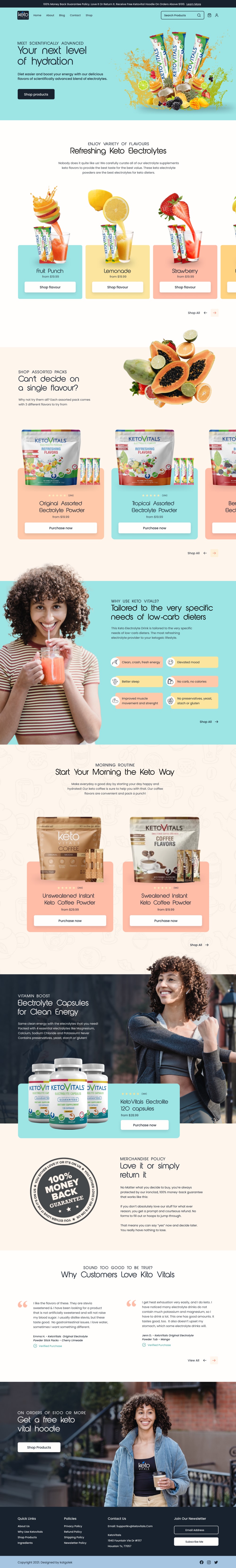
2 Responses to Option E
E C and D all look good and clean to me, with E having the nicest blue tones. I saw the video on B and A and immediately thought of it autoplaying and never visiting the site again.
E and D are the easiest to read and least cluttered.
Explore who answered your poll
Analyze your results with demographic reports.
Demographics
Sorry, AI highlights are currently only available for polls created after February 28th.
We're working hard to bring AI to more polls, please check back soon.

