Poll results
Save to favorites
Add this poll to your saved list for easy reference.
Which of these two comment fields do you prefer? Why?
Age range
Education level
Gender identity
Options
Personal income range
Racial or ethnic identity
29 Responses to Option A
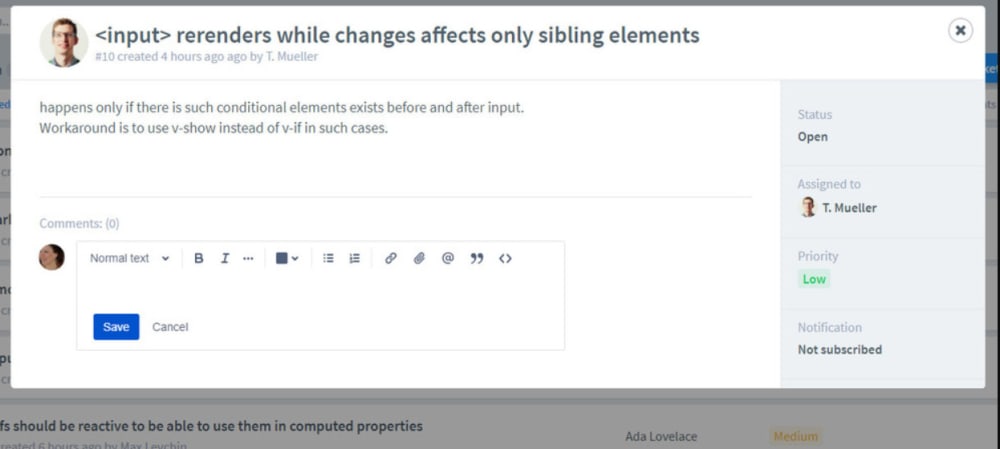
I prefer Option A since it gives me the options to change different things about the font and add attachments.
I like the ease of choosing the font, size, colour etc of the text.
I chose A because I love the opportunity to bold or italicize if need be.
The tool bar is important to assist the commenter bring out their ideas.
I prefer having controls to format the text as needed. It let's me express myself beyond just words - I can emphasize my thoughts.
Between the two comment fields, I would pick choice A because I feel A gives the writers/commentators different ways to customize their thoughts.
the typing template options gives it a different feel
I prefer having the different text format options because text format and attachments can be very useful in explaining issues.
this one allows you to edit
A is better because it gives the option to make changes to the font. It also looks like email.
I prefer this comment field because of the advanced features available for text.
This one is more visually appealing to my eye
I like the ability to change and format text in my comment. This can allow for organization, stressing certain words, and other ways to communicate your response more clearly.
Gives more options and ways to express one's self
A has a cancel button in the comment box
I prefer the ability to edit and cancel. That's why A is better.
Definitely A. It’s so much more flexible in terms of the tools at my disposal and the possible test that I could produce, I want to be able to embolden, italicize, and colorize. It doesn’t look like thats possible in B
I like that there are formatting options available in the option that I picked.
I chose A, because I would like to have the option to format text or add more elements or attachments to the comment.
Feels like there's more options. Looks nice and easy to back out if needed.
I like A because I like to be able to fully edit my messages and A provides me with all the tools to do so.
I dont always use the functionality in this option but it's nice to have the choice
Choice A has a more appealing look to me. More importantly, it has easy access to all of the features you can use to format your response. This makes life so much easier.
I prefer option A because there is more options to change the comment box with the fonts, bold, italics, etc.
Option "A": The comment field with text tools immediately visible is both familiar and intuitive for even casual users of online forms. (It must be a limitation that prevents cursor focus in conjuction with text tools but that scenario would be optimal.)
I prefer having the ability to change don't style. This feature may be useful as I write my comment.
I chose A because I prefer to have the added buttons to change/amend the text. I don't always use these features, but having them available is very nice.
A provides better custom options.
A offers flexibility.
21 Responses to Option B
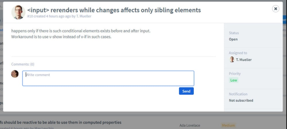
I prefer option B because the blue square comment field just looks visually more appealing to my eyes.
I find that less is more when it comes to comments. Many comments are not helpful and so it is best to reduce options to just a single format for easy transcription into back-end reporting. Especially for the expressive millennial addicted to untranslatable emoticons.
It's way less complicated and much easier to look at. A is way too complex and has too many options.
B is simpler and easier to see the typing field
I like choice B, it seems easier and more basic to leave a quick reply.
the outline box indicates to me its for comments clearly
Honestly I like a very simple chat box or comment section I very rarely use the formation options you know as far as bold and size and things like that and you'll get what you want
I like the simple version, just type your comment and that's it, don't need all the fancy options
I like this one, because it is extremely easy to see where I need to type my comment in. I have to search around a bit on the other choice to see where it should go, and I hate that.
I prefer the design of Option B because it is more similar to what I am used to while option A has a different design that I am not comfortable with.
most easy to understand
I prefer B since it has a box and one can see where to write the comment. Option A does not have a readily noticeable box and you have to figure out where to start writing.
More simple, and the huge amount of time the other text editting buttons are not needed at all.
I like the big blue box in B. Just like in this study to write this response, I know right where to go with no confusion.
Choice b is less cluttered and easier to see
I think that editing comments is not necessary. It looks fine without the extra buttons. People won't often use it in my opinion so it seems to just take up room.
Personally I feel that comments section you shouldn't be able to change the font or text size to the original size of the content that is written which is why I chose option B. While option A is nice to change color, font, sizes, etc, I just don't think it gives a flow to the website page
Something simple and easily to type, no need for all the dropdowns and widgets.
I chose B because it just look less complicated! If I K going to respond to something like this and their punctuation is off and everything, then I do not want to mess with all the stuff in option A. I just want to shoot a fast response and be done
it's cleaner and more modern
I don't think it's necessary to have all of the editing tools at the top of the comment box. The only thing I would add to Option B is the Cancel button.
Explore who answered your poll
Analyze your results with demographic reports.
Demographics
Sorry, AI highlights are currently only available for polls created after February 28th.
We're working hard to bring AI to more polls, please check back soon.

