Poll results
Save to favorites
Add this poll to your saved list for easy reference.
Which Color style design do you prefer for crypto market research tool and why ?
Option C won this Ranked poll with a final tally of 51 votes after 4 rounds of votes counting.
In a Ranked poll, respondents rank every option in order of preference. For example, when you test 6 options, each respondent orders their choices from first to sixth place.
PickFu requires a majority to win a Ranked poll. A majority winner differs from a plurality winner. A majority winner earns over 50% of the votes, whereas a plurality winner earns the most votes, regardless of winning percentage.
If an option does not earn a majority of votes, PickFu eliminates the option with the lowest number of votes. The votes from the eliminated option are reassigned based on each respondent’s next choice. This process continues in rounds until a majority winner emerges.
Scores reflect the percentage of total votes an option receives during the vote counting and indicate the relative preference of the respondents. If there is no majority winner, look to the scores to see how the options fared relative to one another.
| Option | Round 1 | Round 2 | Round 3 | Round 4 |
|---|---|---|---|---|
| C | 34% 34 votes | 36% 36 votes +2 | 40% 40 votes +4 | 51% 51 votes +11 |
| E | 26% 26 votes | 31% 31 votes +5 | 40% 40 votes +9 | 49% 49 votes +9 |
| A | 13% 13 votes | 17% 17 votes +4 | 20% 20 votes +3 | Eliminated 20 votes reassigned |
| B | 15% 15 votes | 16% 16 votes +1 | Eliminated 16 votes reassigned | |
| D | 12% 12 votes | Eliminated 12 votes reassigned |
Age range
Cryptocurrency investments
Education level
Gender identity
Options
Personal income range
Racial or ethnic identity
13 Responses to Option A
I would say that I prefer Choice A's layout. Since the majority of the site's layout is black, having those highlights in a brighter, contrasting color makes things both a lot clearer at a glance and just plain nicer looking. When it comes to anything with money, I want things to be very easy to identify visually. Not only to prevent mistakes, it also just looks more professional.
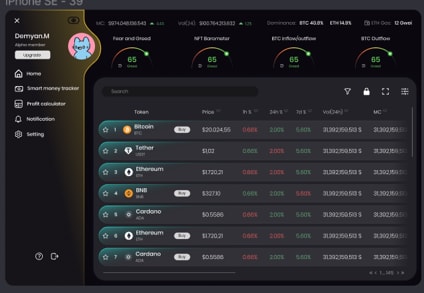
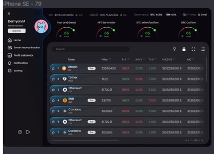
A and D is the best choice because of the yellow and orange accent colors which fit the bitcoin logo and style for the trading market.
Choice A I thought stood out the most, with the color scheme, and the layout. As each choice progressed in rank, the visual stood out to me less. Choice D was quite bold, as well as Choice B. Choice D didn't have much color contrast, but had borders. Choice E was quite bland.
I like the color of A and B. I really like the look and how it pops.
A is my favorite as the color pops against the black background.
I prefer option A because I think that the Yellow side bar and dark green highlights for each row compliment each other well and give the page a more colorful and approachable appearance, I think that the other color schemes (d and c) are good too but I like the how the colors in option A interact with each other and make the parts they are highlighting stick out. Maybe an option could be placed in the settings for people to select and customize their own favorite colors?
I liked option A the best because I felt like the colors "popped" more and they matched pretty well together, too.
My top choices are A and B.
Option A to me is the most noticeable change in the color scheme for the page and stands out the most compared to the other options.
I like having that soft yellow in the color it helps to make the image a bit stronger. The balance of the picture was good.
I prefer the slightly brighter teal and yellow highlights of option A, as they make the page seem more interesting with the brighter colors but dont take away from the main content of the page.
I like this one the most as I think its bold and brighter due to the gold tint it has on the border of the first column.
Option A, the brown color on the sidebar sets it apart from the rest of the options. Option C is similar, but the gray is not as much of a contrast. Option D is also similar that it sets apart the left sidebar, but it's not as noticeable. The other 2 options don't really set off the sidebars to set them apart from the rest of the page.
15 Responses to Option B
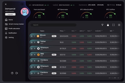
I prefer option B color style design looks natural. I find it easy on the eyes.
I prefer option B because I think that it is the most interesting, visually appealing, and premium-looking color style design out of the five options. I also think that it is the color scheme that would make me most want to interface with this crypto market research tool.
I love option B the most because it has the best crypto vibe to this shade and it is the most futuristic looking one.
It may be very traditional, but to see information that refers to valuations, i.e. money, I prefer screens as clear as possible and this one does not divert my attention, for me it is very valid.
Option B is really easy on my eyes, especially in a darker room, making it easier to process the information shown compared to the other options.
The first one looks both modern and subtle and seems to fit the theme. The last one is just plain ugly (the green)
I prefer option B and E the most, the darker blue and purple designs makes me feel calmer and I really enjoy the vibe of darker themes on most softwares. I know most people who spend time on online software prefer dark modes so option B would be my favorite.
I think the black/gray ones are easiest to look at, although I do also like the gold.
the difference is too subtle for it to be relevant. pick any. although i prefer darker blue
A kind of looks like a vomit color, I don't like that orange at all. I think the best ones are just going to be a dark blue, crypto always seems to have a dark color
I like the colors in my top answer better.
I picked B first because the color is unique and most appealing. I picked E next because it's a pleasant color. I put A and D on the bottom because they're just unappealing even though they stand out.
I am more of a fan of the subtle blue tones than the green ones.
I like the color of my first choice the best. It has an attractive and rich look to it.
I like the blue black color combination. I'm not too fond of the green one.
34 Responses to Option C
The green looks good but it is also the color of money so that's really cool
i prefer option c because using the green colored background makes the graph easier to read
I really like the first two. I prefer the green idea I think it means money and has that feeling.
I like the green color in C, the teal is fine and blue is boring. the yellow color is fine and doesn't bother me on the side
I liked option C the most because I felt the color made it the easiest to read. I then thought E was the next clearest followed by A, D and B.
I prefer C to other options because its color pattern is more creative and visually attractive and appealing than other options
Option C is my favorite color scheme because the green and dark mode scheme is easy on the eyes.
Green stood out as the most relevant, as crypto is money, and money is green. After that, the brighter blue colors were better.
All of the designs are similar, but I would prefer a more muted side panel instead of a bright outline.
I would choose choices C, B and A which have a good design and the color combination of the page look more attractive and more selling as compared to choices E and D which have a lesser attractive color combinations for me.
I like the darker green in option C. Don't like the teal in option A, but the extra shade on the left panel is nice.
Option C has a really cool slight shade of yellow that makes the screen pop, so that is the one that I would choose as my favorite.
I prefer the green coloring the best. It's unique and memorable. It caught my eye right away.
The options that show the tokens in green are more appealing than blue. Keeping the sidebar color a neutral outline also makes the UI more appealing.
I would choose option C because color green is bright compared to other and in the list on page it looks prominent and good can have a better search result with this color
C is the best color. B and E are nice too being blue and kind of blends in subtly. D and A stand out more.
I like option C. For me “green” is the color of money. Also it works the best in the layout than the other choices.
I actually like Option C the most out of the five choices. The grey on black looks the most appealing in my opinion, although the other color look decent. I just Think Option D's color scheme looks the best.
The other colors are overused. Green has a unique personality that makes it stand out from the others
I just find C's sharp green coloring to be more professional looking.
When thinking of currency of any kind the color green stands out. Choice C highlights the information more effectively with these colors and look.
Ranked based on the color schemes that caught my attention upon first glance.
I chose option C as my favorite because I like the green hue on he color. It made it stand out against the dark background more than the other options.
I prefer C with the greenish tint on each column and the header, very attractive. A is also attractive, with the orange hue running along the left hand border between the menu and rows. No real preference between E, B, and D
Green makes me think of money which would be my objective with crypto.
C stands out the best for me. They are all a little difficult to read with the black background.
I like the shade of green used. It stands out and I find it visually appealing.
The choices all loo pretty similar to me. I guess option C had a better color scheme, but they all look fine.
based on the color scheme being easier to read and sperate at a quick glance
I ranked the color style for the crypto market research that I liked the most. I really like the design of option C's green color the most followed by option B's design then option A then option D and then finally option E.
I like option C the best. I really like the buttons green color. very easy on viewing
I honestly don't see a difference with anyone except C. I'm not sure what differences there are, but it's not obvious. I like the color green in C, and the rest all look fine, it's like a discord style and I like it.
I would generally prefer having a bit more green on the layout (as in Option C), as that makes me feel a bit more positive and bullish overall. I have the same feeling about having a yellowish/gold overlay on the task window on the left side, as in Option A. All of these layouts look pretty good though and any combination of colors shown would work just fine.
Option C has a nice green tone with slight lighting around the edges of the interface that helps me delineate between functional areas. The green also, at least to an extent, helps me focus on money.
12 Responses to Option D
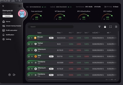
Ranked by most pleasing to look at and which ones popped out the most without being to intrusive
These colors are the most eye pleasing in terms of how they appear in the interfaces
I think D and E are definitely the best as the dark blue complements the black the best. The teal color in A and B is just okay, but the green in C is bad as it makes it look like some task succeeded or something.
I think the trim colors of D stand out really nicely against the darker background.
D. Honestly I think they are all real junk and hard to see. Why would someone want a dark theme in something as important as day trading? I chose D first barbecue it has the most contrast in the brighter colors. C. This choice has better contrast in bright colors than the rest. A. I chose this the third option as the blue-green is a little washed out, but still better than the last two choices. E. It looks like inside a cave with candles as light - poor. B. This choice is also washed out like being in a case with hot coals as the only light. I would hope this trading site has options of themes because this is just horrible. I cannot comment any more than that.
The user interface is simple and easy to navigate
My choices were based on my preferred color schemes. I like the blue schemes more than the green ones.
i prefer the color style in option D the most because it is the easiest to read and pleasant to look at
I choose option D because I think the bluer end of the spectrum looks best, D being mid-cool blue.
I Like option D as the darker blue colors are much easier to look at and are pretty soothing.
I like this option most because the yellow is light but it gives a nice amount of contrast to the rest of the interface.
I like the gold color on the side to make a contrast in the color. However, green color is no good in the investment world.
26 Responses to Option E
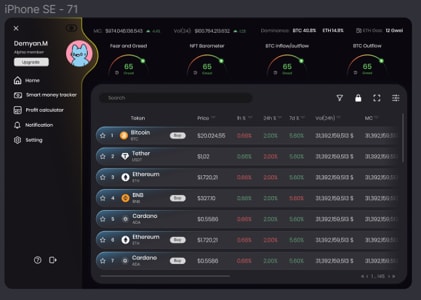
I based them on gut instinct for images because thee is no solid image with red/green as a natural response indicator. They are all god, though.
E I feel has the best overall design as it does not try to do too much, and it meshes well all around.
colors stand out to me as more useful and appealing as well as it catches my attention the most with the vivid graphics and colors
I prefer this color scheme because the panel on the left is a similar color to the main colors used for the crypto portions in the center. Really has a balanced look. Nothing stands out or is too distracting.
There are some distinctive differences in terms of color scheme of the UI in the five designs. The first difference is whether the column of user icon and navigational links on the left side uses some background colors. The designs in D and A use bright yellow but I do not think they are good designs. Users would focus on the price changes when using the tools. Those bright yellow colors appear to be distractions. Thus, designs in D and A are not my top picks. The designs in E, B, and C are similar. The difference is the color option of each row in the price table. For conventions, green is used when price is up and red is used when price is down. It may not be good ideas to use either green or red for each row since users may be confused. Thus, using some other colors for each row in the price table is preferred. Based on this criteria, the designs in E and B are my top picks.
Option E because it was the most clear and easiest to read
I just prefer the color mixture and the look the colors give the pages accordingly.
Initially, I was unable to spot the difference. I had to enlarge the pictures to see the frame color and then once I adjusted the angle of my monitor the difference was clear even on the thumbnails. I do not have a strong preference as they are so similar, but I guess I prefer the outline look more so than the color fading. I then have a slight preference of the blue and grey hues over the orangeish color.
I like choice E because of the blue tint that is visible in the image. The blue tint looks really cool and it jumps out. Choice B, D, and A are similar but are not the same blue. I did not like choice C, green doesn't look good.
I like the dark blue tinged ones the best; it's most pleasing to the eyes. The green background on the panels makes it confusing.
I would rank them in this order. Choice E would be my top choice because I like the blue color design best. I think there is something soothing about it and since the crypto market is so volatile I will take something I consider soothing any day.
I like the dark blue for the bars based on my own personal color preference
I prefer the dark blue color theme. It looks futuristic and elegant. The overall style is very intuitive and easy to understand.
I like option E the best because I like the blue colors that are on the line to the left of the screen and at the beginning of each line shaded in the background.
I think the teal and the blue look amazing together so E is my favorite.
I chose this option because it easily stands out compared to the rest . The design is unique .
I like a slightly darker blue because it's easy enough to read, but doesn't look too hokey.
I ranked E the highest because I like that the colors are subtle and it fits the tool much better for its intended use.
They were all similar and I wouldn't mind using any of them. I prefer the dark background that they all had, that is better than it being a white background. I preferred "E" a bit more than the others because the color shading behind the profile image was close to the colors behind the crypto names. The other rankings were just my personal thoughts about how the colors looked. I didn't have any strong feelings for or against any of them, they all looked good.
This is based on what I thought looked the best, and what was easier to read.
I prefer A and E because they seem to make the text more readable with the given colors. The others are fine, but E and A are easier to read for me
E, like the blue highlight, it is very appealing and fits the overall design well.A, the yellow color stands out and really makes the area noticeable.B, I find the color is a little less appealing and makes me less interested.D, I dislike how the yellow color doesn't stand out as well, it is less noticeable.C, I dislike the gray color it is much much appealing to me.
I think in this case the strong black and blue looks the best. At least it doesn't have a tinge of yellow like the one next to it. The all are pretty similar and I wouldn't mind any of the first three. But I think option E looks the best. I think there should be more color in all of these.
I think the blue and blue is best for crypto
I prefer the calming shades of blue
I prefer blues against a dark gray and black palette as it looks more modern. So E was my favorite, then D. B and A were teal and acceptable but C's green felt too old fashioned.
Explore who answered your poll
Analyze your results with demographic reports.
Demographics
Sorry, AI highlights are currently only available for polls created after February 28th.
We're working hard to bring AI to more polls, please check back soon.

