Poll results
Save to favorites
Add this poll to your saved list for easy reference.
Please rate this landing page and explain you rating
Rating stars
Age range
Education level
Gender identity
Personal income range
Racial or ethnic identity
50 Responses
It is not useful to me in any way.
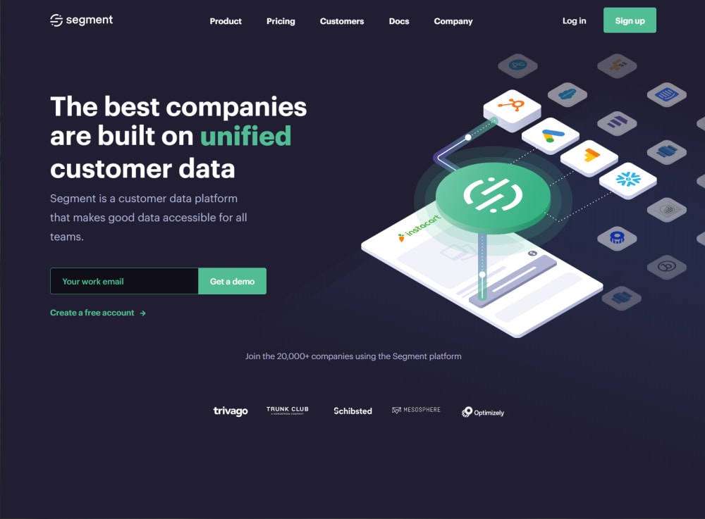
looks really cool like Linux
it is defininitly eye catching. look cool to me.
love the layout its simple and informative and has all the needed links
The layout is simple to understand. The graphics are clean and easy to view. There should be a little more detail to this page for me.
The design is slick and visually appealing. The reason why I can't rate it higher is that it really doesn't tell me enough about what it does. I need more information on the EXACT services offered to want to dig any deeper, and it's not there.
The color template is both visually pleasing and meaningful; the colors are used to indicate and emphasize meaning. It also echoes other webpages by having logins and sponsors in familiar places. The sponsors at the bottom are hard to read, which is why it only got four stars.
The page is very clean and well organized. I also like its futuristic look.
I like it but maybe ad some people to the page
The site seems to be modern and they have a new approach to whatever they are appealing to
it looks clearly mapped out and easy to use
I like that the graphics are simple yet engaging. I recognize other companies logos so that lends credibility along with the list of their customers in the footer. The language is clear and states what they do. I also like that they request my work email so I know this is a business solution.
It looks pretty slick and high tech. I would definitely investigate.
Not a fan of the purprle
It is clean, visually appealing, and the messaging and call to action are clear.
This looks incredibly sleek and stylish and good and nice
I think this landing page is super clean and concise and gets the message across very plainly!
Landing page is really bland. Nothing much jumps out. Not really sure what the "product" is.
The graphics look nice and professionally made. The site looks easy to navigate.
I like it a lot. It is easy to understand and the page looks high quality in my opinion.
I don't like how it asks for my work email. I would hate to put that in so it would be spammed. Not something I would do
Whats the company name? this almost looks like a page you land on when you made a mistake somewhere
It's very trendy and modern. The illustration is a creative way to depict data usage. The page is also organized well and easy to navigate.
It looks professional and a bit modern and.futuristic. Very trustworthy.
Overall, I like it. The landing page is detailed, but not overwhelming. It is easy to navigate all the different areas of the site and find what you need. I like that everything is spaced out and not too cluttered.
This is an excellent ad - well designed and informative. I would add one more sentence to explain how this is beneficial to customers in specific terms or explain what problem it solves.
The landing page is very clear and easy to navigate. The only reason that I gave it 4 stars and not 5 is because the graphic draws attention away from the fillable material because it seems too busy for me. I was stuck trying to figure out the graphic rather than fill out or read the material.
I'm impressed I think this looks really slick. I'm actually really curious about what it does and what's it like to work for this company,etc.
The page looks attractive and appealing, it just doesn’t do the good of a job at explaining what service the company provides.
I like the use of the graphics on the right with the floating icons. The navigation and footer bars are nice to have. It seems like Segment is a reliable company and they have some good customers already. I like it and think a free demo would be great to see.
I like the simplicity of the landing page. It's not overwhelming and I get a good impression of the company.
It looks nice and modern and kind of futuristic.
The color is dark, but it is professional, simple, and easy to understand.
the color scheme makes it easy to read
I like the dark colors a lot. It's very sharp
The dark background looks great and everything feels fairly intuitive
This looks really clean and professional. I like the dark background and the image is great. I love the way they used a visual of app icons and showed how you'd use this on a mobile phone
It looks user friendly. I like the tabs at the top. The number of companies using the platform is encouraging. Overall, it looks to be a quality product that I would be interested in using.
I like the concept o the landing page, but because the background is so dark, the light purple text is challenging to read. Either the text needs to be white, or the background needs to be lighter.
Quick and easy to visualize and breakdown if needed
I like how it talks about customer data being their main reason for success
This is visually interesting and has a lot of good information.
Its visually appealing and provides good information about the product.
I feel this landing page is well executed and thought out and looks professional enough for me to want to invest my time on the page.
Great graphics and the location the images are fine for finding them easily
This looks great, I like the use of colors and contrasts.
looks like it easy to use,easy to navigate. like the colors used. text size is ok.
This looks informative and has a good blend of color to it.
The page is too dark for me. I tend not to look at everything when the page is dark like this because things blend into the background. I would prefer this same page, but with a white background so I can better see all of the words and icons.
I like this landing page and rate it high because the design is comprehensive and aesthetically nice.
Explore who answered your poll
Analyze your results with demographic reports.
Demographics
Sorry, AI highlights are currently only available for polls created after February 28th.
We're working hard to bring AI to more polls, please check back soon.

