Poll results
Save to favorites
Add this poll to your saved list for easy reference.
Please rate the design (not the content) of this landing page.
Rating stars
Age range
Education level
Gender identity
Personal income range
Racial or ethnic identity
50 Responses
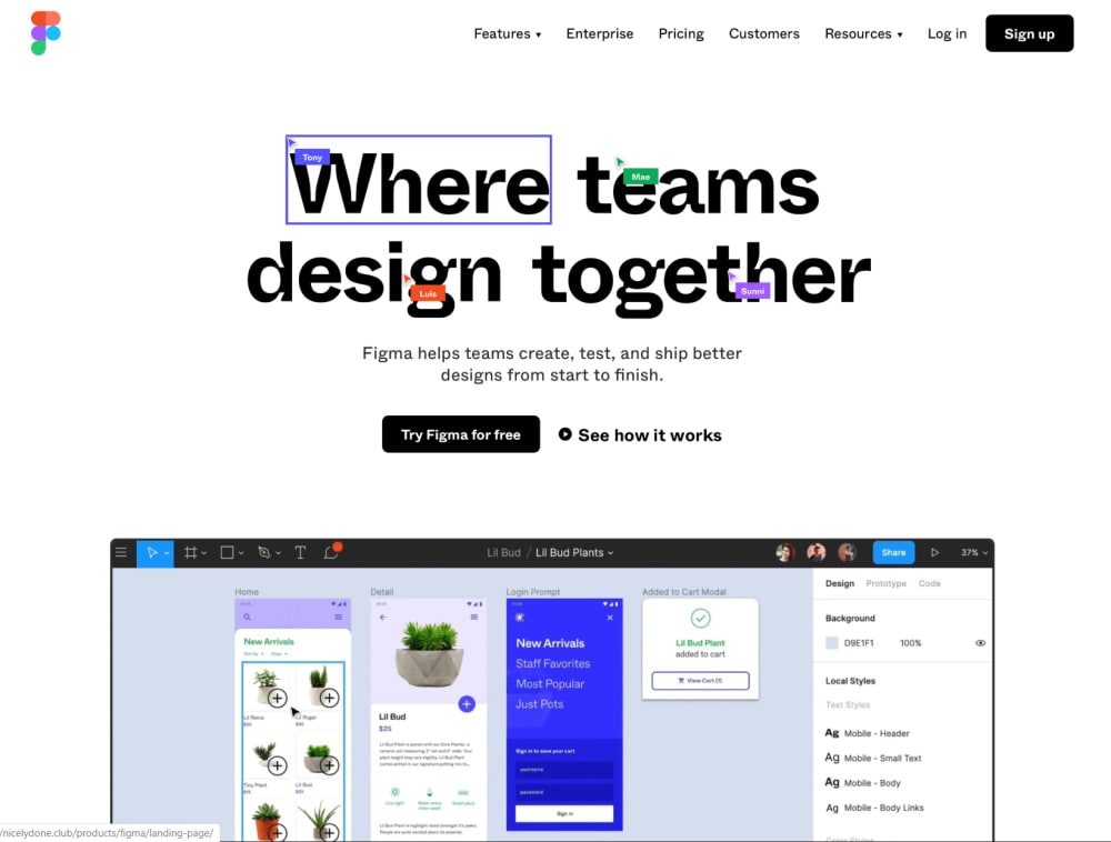
It gives a good idea of the sort of group strategy of the app
I like how they are making changes on the page
This is fairly crisp and sharp but the eye does struggle a little to find a landing spot
I don't care for the design of this landing page and gave it one star because it has a lot of confusing content that I don't find relevant.
It's kind of messy looking to me.
This landing page is great. I like the way that it looks and is laid out. The page makes you want to know more and look at the plants.
I think the design is a bit cluttered as there seems to be a lot going on at first glace.
The first image looks a bit cluttered. I get the point they are trying to convey, but it looks very messy
The designs is nice however the logo could have the names off to the side of the bounding boxes and not covering the title text. Otherwise the design is clean and straightforward.
Lots of clutter and distractions. Just give it to me straight without extras.
The use of names over the header text is a cute idea but actually makes it harder to read. And though each rectangle toward the bottom is quite crowded, the very clear delineation of sections suggests different categories, though putting all this info on multiple pages may better serve there purpose.
The design is great. I love the options presented. The website is simple to navigate and bright and colorful.
bit harder to understand but cute,interesting
It looks like a good landing page but it feels a bit too busy. I'm not sure where I am suppose to look after the "Where teams design together" portion. I like it and do think Figma is worth a try.
I like the layout and most people, myself included like bright colors.
It catches my eye and is easy to read, but I don't think the page does a good job of using the space.
It's detailed but looks a bit complicated. Maybe some navigation tools on the left hand side would help orient the user?
I love this. The layout is so awesome. I love all the colors and the design. There are so many options and each of the pictures show that.
This design is hard to locate because of how small it is.
I did not like the design very much. Frankly speaking it looks a bit messy. I did not find it overall organized.
It's kind of confusing and I really dislike the names over the name of the company.
that looks like the best one so far with nice colours
A typical landing page, but though it's part of the content I really like the top main page. It easily demonstrates to those with experience one of the aspects of the program. I won't mention the right hand side navigation in the second part of the main page since that's content as well.
I like the inclusion of this statement.
I like the idea of drop down menus on the top, very easy to use.
The small navigation on the top of the page is easy to overlook.
It seems to be a clean, functional design that is able to clearly explain what the product is and, through the captured screenshot, to explain the functionality of the product and how it works. My only complaint (and reason for subtracting a star) is that I felt that the box around "Where" and the user cursors on the "Where teams design together" text was entirely too "noisy" and distracting. I felt it did not significantly add value to the landing page, and was unnecessary, as I was able to understand the product without them.
i think the page is attractive and easy to navigate. I can't pinpoint any particular improvements
visually it is cool but a little BUSY and very colorful. I'm not sure I love the overall design
The design of this website looks very inviting. I can tell that it is a quality service and will benefit me if I wanted to design a website.
This is absolutely perfect design, eye catching one, gives stunning look
sleek, great usability and design
The design of this page seems to have too much things and it looks extremely cluttered compared to how simple the other pages were and as a result I am not a big fan.
This design is memorable but just a bit too busy
The arrangement of the images feels a little busy, like there are too many choices and clickable areas overall. It takes a little while to figure out where I want to go. I prefer a more simplistic look.
This is a nice, colorful design. I really do not like the names of the team members in the little colored boxes near the title of this page. It feels like they shouldn't be there and look cluttered.
very hard to understand.
It is unexpected and well developed. It will get frequent attention. I am curious about.
I like it. It is clean and simple.
There is a lot going on in this page. I'm not sure why there are text bubble with names in them all over the title. It seems just a little too busy.
Shows a lot of different options.
It is different, engaging, and fun to look at. The colors are good.
it looks very cluttered and not thoughtful
This needs to be cleaned up for better readability.
The design is a little plain and does nothing to actually make you interested in their product
I like the user icons on top of the text phrase. It really gives you the idea of the collaborative nature of the product. I don't like the font of the text though. The cutout on some of the letters are distracting and it is unclear if it is a design element related tot he product or not. Finally, I like having the screenshot at the bottom to get a better look into what the product does. Only real criticism is the font.
The icons in the middle of the larger words that say peoples' names are very messy and extremely off putting.
I feel like it has too many colors.
While I find the font interesting and the concept inventive, the overall feeling is the page is too busy, perhaps confusing with the individual designer names, and lacks some cohesiveness as a design. I do like the design app window at the bottom making me want to review further.
I love the idea, but the tiny little boxes with peoples names are very distracting
Explore who answered your poll
Analyze your results with demographic reports.
Demographics
Sorry, AI highlights are currently only available for polls created after February 28th.
We're working hard to bring AI to more polls, please check back soon.

