Poll results
Save to favorites
Add this poll to your saved list for easy reference.
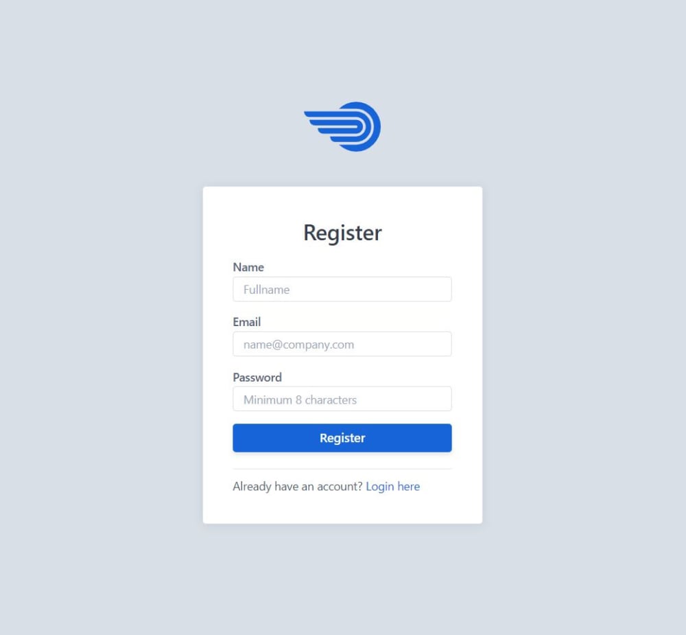
Assume your are signing up for a software bug tracking solution. Which of the two register forms do you prefer?

Age range
Education level
Gender identity
Options
Personal income range
Racial or ethnic identity
34 Responses to Option A
Short forms are inviting, long forms are too much work.
i feel like my name wouldnt matter
They the same
I don't see the need for a name. I could easily be something fake anyway.
I feel more comfortable not giving them my name in A. If I chose B I would more than likely give a fake alias anyways.
I chose Option A as my top choice because if I had to choose between providing my name and not, I would much rather not have to provide my name.
Full name in choice B seems too intrusive for a registration page.
I just prefer to put email and name because its slightly faster. I can usually add my name in later if its relevant. They normally dont actually know youre name anyway and it just gets added to emails and messages automatically. Its fine if its just left out.
i think the less info the better, so leaving the name out is better, go with A
A does not ask for my name which I feel better not giving.
I choose A because it does not ask for my name on the log in page.
I don't like any site that requires inputtt8ng your jame
email and password is standard, full name is a little much, you can always add this at another point
most easy to understand
I prefer the most simple option with the least amount of information.
Prefer the more simple two field sign up page. But some people would prefer to use a separate name rather than their email as an identifier.
name is not required on most sign ups, just email and password is enough
I'd rather not have to enter in my name.
I chose "A" because it's simpler and doesn't ask for my full name. Also there are less steps to fill out.
you just need a username and a password no need for a real name
I would prefer option A because I don't have to put my name on it.
I prefer the more compact one, not sure why I just think it has a more professional feel to it.
This form leaves off the name, less information out there. I would choose this one.
I don't really see any reason why one would have to input his/her name. The email and password alone should work just fine.
avoids the extra field, don't have to put my name in till later if i choose to and just provides a quick signup
Considering the service, B makes me suspicious. Don't do that at jump.
If I don't have to give my name I don't want to. I'd rather choose "A" since I would not have to give my name out.
You shouldn't need my name to register.
I like A without the name. This is more comfortable to sign up on.
If I was in the market to look for a software bug tracking solution, I would pick option A. However, it is to note that both registration forms look well enough to use and they are very similiar.
Option A asks for less information.
I would rather not give my name if I didn't have to, so just the email and password would be better.
Option A doesn't ask for my full name, which leads me to trust it more than Option B because I'm not sure why a bug tracking software would need that information.
It is less information that I have to give.
16 Responses to Option B
I would prefer to enter my name because my name might not be part of my email address.
I prefer B because I always appreciate forms that have more information per page to eliminate the amount of pressing "next" I have to do. It is more efficient that way.
this one looks more trustworthy
I suppose my name is important in the form.
Prefer B, I think ones name should be given while signing up for the product
I'm choosing option B because it is asking for a full name. My thinking is, when you get emails from the company, it will be addressing you by name, making it more personal.
I see no issue in giving my name for this purpose
Would like to prefer option B because its easy to register not see much difference on both the form
I like B is larger and easier to see.
The larger more bold logo is centered and attractive. It automatically attracts my attention to the register prompt.
I would prefer to enter my name when I register. It feels more official.
I prefer option B. It is a larger window, easier to read. You don't feel like they are hiding anything by their small font.
this one is easier to see
The bigger box makes me feel like I have more room to type. It makes me feel less claustrophobic.
because name is also must while creating an account
Option B , i feel that this is more professional and formal than option A,
Explore who answered your poll
Analyze your results with demographic reports.
Demographics
Sorry, AI highlights are currently only available for polls created after February 28th.
We're working hard to bring AI to more polls, please check back soon.

