Poll results
Save to favorites
Add this poll to your saved list for easy reference.
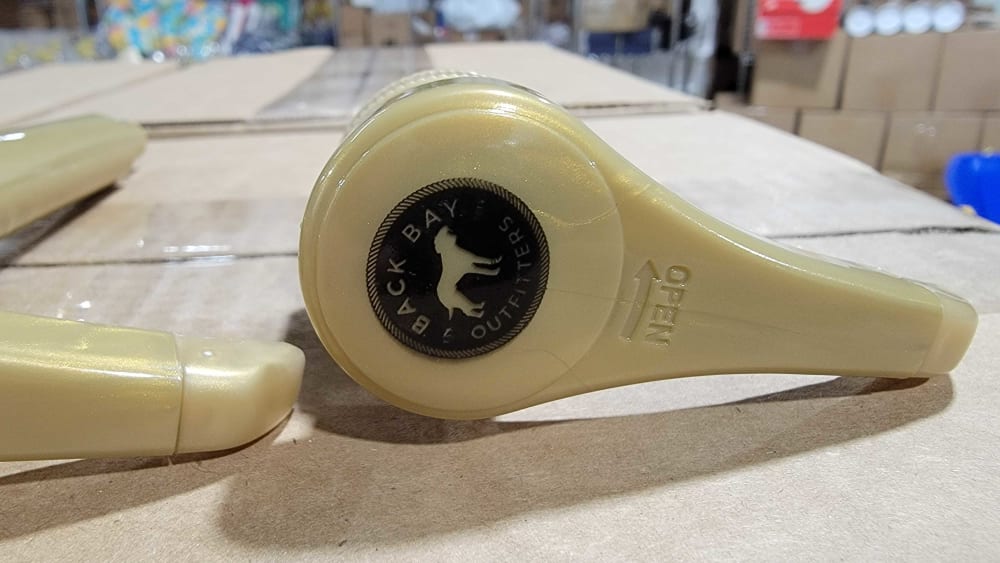
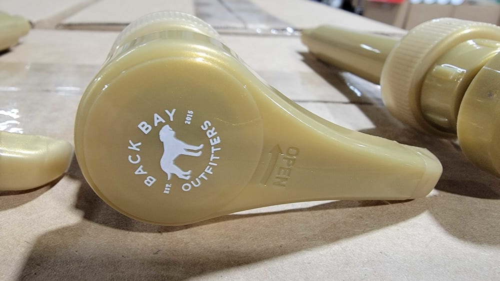
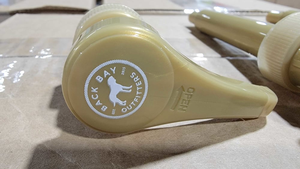
Which logo style/color do you prefer for the top of a pump?


Option C won this Ranked poll with a final tally of 30 votes after 2 rounds of votes counting.
In a Ranked poll, respondents rank every option in order of preference. For example, when you test 6 options, each respondent orders their choices from first to sixth place.
PickFu requires a majority to win a Ranked poll. A majority winner differs from a plurality winner. A majority winner earns over 50% of the votes, whereas a plurality winner earns the most votes, regardless of winning percentage.
If an option does not earn a majority of votes, PickFu eliminates the option with the lowest number of votes. The votes from the eliminated option are reassigned based on each respondent’s next choice. This process continues in rounds until a majority winner emerges.
Scores reflect the percentage of total votes an option receives during the vote counting and indicate the relative preference of the respondents. If there is no majority winner, look to the scores to see how the options fared relative to one another.
| Option | Round 1 | Round 2 |
|---|---|---|
| C | 40% 20 votes | 60% 30 votes +10 |
| B | 34% 17 votes | 40% 20 votes +3 |
| A | 26% 13 votes | Eliminated 13 votes reassigned |
13 Responses to Option A
I don't like logos on products, so A first because the black doesn't stand out as much. B over C because I don't like the additional circle around it.
A has a more distinctive look that makes the product look higher quality to me. It looks stronger and more durable.
I prefer option A because I think that it has the most interesting and visually appealing logo design out of the three options.
A and C stand out more than B which almost blends in to the product.
The black logo looks bold and stands out on the cream colored product.
A looks strong and simple. B looks simplistic which is good. C is a bit big and not that attractive.
I chose panel A. I think the black label looks better for the logo as it stands out very well.
The logo stands out and looks more professional when it's black on the tan color of the dryer.
I like the black logo of Option A because it looks better aesthetically, Other like Option C is okay and Option B looks the worst.
I chose the order in which I like the colors the most based on how well it matched the pump.
The black on stands out a lot better
I prefer the option A logo because I like the black circular logo the most. I chose option C second because this logo has a circular border like the option A logo. I chose option B last because circular logo has no border and it is a white color.
I liked the more outline circle look of option A and C. Option A, I preferred the black color a bit more. Option B, I thought the no outline around the logo, didn't look as nice which is why I ranked it last.
17 Responses to Option B
An open logo in which there is no borders around it shows the company is open minded and not rigid to new ideas.
The options in white are much easier to see and read, even from a distance. Also, the option without the circle around it allows the logo itself to be larger and more readable.
i would choose option b because the logo stands out the most without the circle around the outside
B is simple yet elegant and looks great, C i think the circle is just a little too much, looks better without it. A does not look nearly as good
I like the white lettering and the image of the dog. Plus I like this one without the white circle.
B and/or C - I can actually see the white logos better. A is too hard to see.
I would prefer B the most. I think the white better complement with the color of the pump, and I also think the design gives me an impression that the product is natural, free of harmful chemicals, and modern.
Choice b looks nicer and doesn’t feel cramped together, choice A is to dark and difficult to see the logo.
I can see the white one better and I prefer without the circle - it blends better with the product rather than looking like it was affixed like a sticker to the prodcut.
The logo is easier to see. It stands out more.
I think B is the best because it is simple and the colors are appealing. It's not a logo that sticks out, but it looks organized.
I liked that B’s logo was a little more subtle and appreciated that C featured lighter colors than A.
I prefer Option B over the others, because there is less paint involved. The paint used on plastics such as this usually comes off before the useful life of the product has expired. The black paint is already coming off of Option A, and the small text used in the date is hard to see.
The white versions are much easier to read, the black looks muddled.
I think the logo is very easy to read and doesn't stand out too much. It looks like the print quality is good with nice and clean lines.
I like b the best. Doesn’t need a border to look good.
I like how bold this logo looks and how easily readable it is.
20 Responses to Option C
I like C the most as I like the circle around it to really separate it and make it feel whole but I think using the negative space as a background is nice. A feels unfinished and B is really unreadable.
The circle provides a clear distinction of where the logo ends and begins. I also like the white logo. It stands out very clearly and looks clean and neat. It pops off the neutral color of the pump.
i don't like the combination with the dark color so A is last. I like the white circle so C is the best one
A's logo is very difficult to read the actual name of the brand. I really like the additional circle around C's logo.
Choice #1 is clean, clear, and bold. Whereas #3 is dark and harder to see. Choice #2 is okay, bright white font easier to read, it's just not as bold as #1.
Choices C and B are the two logo styles and colors that I like the most because the white color that they both have looks a lot better and stands out more. It is easier to notice them and to especially read the text. Choice C was ahead for me because I like the white circle that it has around it. It looks nice and makes the whole thing stand out more to me compared to Choice B without it. Choice A is last because the black color makes it hard to see the logo and especially make out what the wording on it is.
The white has a much better contrast here. I would go with that as the best choice with the circle. That gives it shape and definition. Think that logo looks the best in option C. A great look for the product brand.
cleanest design, i like this one
I like C because it's easy to see and I think the circle frames it nicely.
C is my favorite because I think the white contrasts nicely against the beige color of the pump. A is my second because the logo looks sleek and professional, but it doesn't stand out as much as C does. B is last because without the ring, the logo looks unfinished.
The white one with the circle around looks best/most contrast-effect; the other white without is still good, and the black one overall just seems like it fades in/is less clear as to what it is.
I prefer the circular design and lighter color of C. The color goes better with the product color.
I like option C better - rank 1. It has the best colors-fonts combination and a circle around the picture is great. Option B got rank 2 because it has no the circle.Option A is so dark and not good visible. So, rank 3.
I like the way it looks best with the white and circle combination.
C - Caught my attention to the logoB - Same, caught my attention to the logo but it's not so good like the option CA - First reaction is that it was dirty and then I understood the logo
The circle around the logo like seen in C makes it stand out among others
I chose by logos that look the most detailed and most professionally made.
I think the white logos are much more eye catching and I prefer the circle around the logo just because it looks a little more complete.
I like the lighter logos, with option C being the clear winner with the solid circle surrounding. It looks a little more professional than option B. Last was the black of option A
The white font and the circle surrounding the logo both make it much more visible.
Explore who answered your poll
Analyze your results with demographic reports.
Demographics
Sorry, AI highlights are currently only available for polls created after February 28th.
We're working hard to bring AI to more polls, please check back soon.

