Poll results
Save to favorites
Add this poll to your saved list for easy reference.
Which Logo do you prefer for high-value organic superfood supplements that power up overall health and longevity.

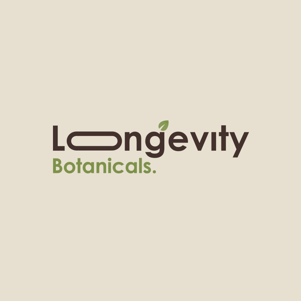
Option A won this Ranked poll with a final tally of 51 votes after 1 round of vote counting.
In a Ranked poll, respondents rank every option in order of preference. For example, when you test 6 options, each respondent orders their choices from first to sixth place.
PickFu requires a majority to win a Ranked poll. A majority winner differs from a plurality winner. A majority winner earns over 50% of the votes, whereas a plurality winner earns the most votes, regardless of winning percentage.
If an option does not earn a majority of votes, PickFu eliminates the option with the lowest number of votes. The votes from the eliminated option are reassigned based on each respondent’s next choice. This process continues in rounds until a majority winner emerges.
Scores reflect the percentage of total votes an option receives during the vote counting and indicate the relative preference of the respondents. If there is no majority winner, look to the scores to see how the options fared relative to one another.
| Option | Round 1 |
|---|---|
| A | 51% 51 votes |
| C | 29% 29 votes |
| D | 11% 11 votes |
| B | 9% 9 votes |
Age range
Amazon Prime member
Education level
Gender identity
Nutritional supplement use
Options
Personal income range
Racial or ethnic identity
Walmart.com shopper
51 Responses to Option A
the design of the log just screams high class
I love the flower design above the name on the logo, it's simple and elegant.
I really like the logo design of A. It looks very calming and appealing. B's long O is very cheezy and silly. Don't use that one.
I like option A the best because the bold lettering stands out the most and grabs my attention.
A is my top choice because the logo is the most simple, balanced, and easy to read given the font and spacing while maintaining the spirit of the product. Option C is my next choice because the thin font is more balanced than the similar design in D, and the leaf in the B is better than in D. Option B is my last choice as it looks juvenile, generic, and forced. I find the idea of making a letter long because of the root "long" in longevity to be the thinking of a simpleton.
Option A and C, for me, are pretty even. I like both of their logos and the contrast of the black and green text. Option D isn't bad, although generic. Option B is really bad, turning the o into an, obviously, pill shape is a bad idea. It throws off the whole design.
A is the best logo and the design and best looking logo compared to the others the last is not appealing.
I selected the logos that I liked best for high value organic superfood supplements.
I love the logo and design of this one. I love the simplicity of it. I love the abstract design. Very cool and cute.
I chose option A first because I like the symmetry of the green leaf symbol, and I like the bold black and green font used for the name and subtitle. I chose option C second because I like the more artistic style of the letter B with the leaf for a botanical product compared to option D. I chose option B last because I did not like how the letter o was stretched to indicate longevity; I found the option B font style to be childish and not appropriate for a high-value organic super-food supplement product.
A gives a nice "natural" vibe. C gives me a similar situation. D to a much lesser extent. B is kind of funny, but feels less professional.
I like the four leave clover looking design
A has an intricate geometric design. C and D are very natural and earthy looking. B has a weird shape, too long for my taste.
I ranked them by the most aesthetically pleasing.
Option A is the winner for me because the logo is very classy looking and the font being used matches the logo perfectly, so overall option A looks much better to me.
I like the logo the mos ton my #1 choice
I like option A because it is balanced, professional, appropriate and free of gimmicks (cf. option B). The illustration reminds me a seed germinating, which itself is a symbol of life and growth.
The logo of option A instantly gives me a high quality feeling, it looks like it is one of those brands you will know and remember for the rest of your life, like the Apple logo. I could associate seeing this brand as being the best on the market and I feel the logo gives that vibe. The font spacing is also great for botanicals just to match the length of the term longevity on top. Option C was a very strong runner up, I think it earned second place for having a less unique logo. Option D is the same with an addition of the font for botanicals doesn't come off clean or nice to me. B is the last choice, for me it's a hit or miss and it missed with me. I'm not sure I can analyze it in a perspective that would put it in first place either.
I ranked the logo design of the longevity botanicals that I liked the most. I found the logo design of option A to be the most appealing followed by the design of option C then option D and then finally option B.
I think this choice looks the most professional and upscale. I think it looks like a brand your physician would want you to purchase. I also think the name, Longevity, needs to be more dominant over the "botanicals" part.
I love choice A because it vaguely resembles Celtic knotwork; the design is very appealing, it feels like an infinity symbol of sorts. Choice C is a close second, it looks clean and professional and the leaf in the "B" is very nice. Choice D is just OK; the leaf is too abstract in the typography of the "B". The elongated O in choice B looks ridiculous. Just no.
I like my first choice because it kind of reminds me of the infinity symbol, but in nature form, like it keeps going and replenishing itself.
I liked A because the logo was the most professional looking of the four logos, and looked like one I would trust.
Options A and C are my favorites. They're unassuming and original. Option B is my least favorite... it looks cheesy and gimmicky.
Option B just looks odd, where Option D is a little too simple. Option A looks the best thanks to the bold font highlighting the main idea of the brand, longevity, and the easy to remember brand logo right above the font.
I chose the logo in panel A. I like the green in the logo which to me represents nature and life. I think it is elegant and I would remember it when shopping.
A looks very high quality and good. I like the font used and the image
I like how this one is simple, but beautiful. It is very cute and stylish.
Option A is pleasant to look at and is quite professional looking. Option B looks ridiculous and I would never pick that one.
I prefer A because it's nice and bold and it's easily readable as well as professional looking compared to the others.
option B is a 100% no-go for me. A was by far my favorite of those shown
Though the stretched O in option B is funny. I feel that option A is my best choice because of the creative and beautiful design chosen.
I think Options A and C definitely look the most high quality and well made. They look confident and trustworthy.
I liked that this one has a logo other than their name or initials, the c and d choice are ok but feel it could be more creative with a logo and I HATE that B has the elongated O...looks cheesy
I really do not like the overly extended O letter in option B. I prefer the name spelled out without the initials but rather the very elegant design in A. Between D and C, I preferred the two letters separated rather than overlapping.
A has a really neat graphic on it but B has the silly elongated O which makes it look super unprofessional
I really like the design of the first one I picked. I also like the font of it.
I like option A the best because I think that it is the most eye-catching and visually appealing out of the four options. The only one that I do not really like is option B.
I like option A the most because this logo has nature's feel to it because of flower symbol displayed and it is green, main point is conveyed well and proportioned.
I like the logo in option A the most. Just stands out more then the others. I chose D next and then C.
I like A because it has a logo with an image. D and C are close seconds. B looks bad because the o is stretched and looks goofy
I think the logo design in A feels very continuous and flowing, which connects very well with the brand name.
A has a great design and the quality of it is more fun and the look of it is much sharper as well.
A is my favorite choice since I like the leaf pattern and the text the best out of the four. It seems more classy and that it might benefit me more, since more care has been taken with the item. C is second since once again I like the leaf as part of the logo, I like it less since it just has it's initials as the logo and it's not as classy. D I like and dislike for the same reasons as C but D ranks lower since the leaf in the B seems like it won't be seen by everyone as a leaf and not just a distorted B. B is last since I understand why the o is elongated but it looks corny and like they find the product a joke, and I could not trust the supplement because of that.
I like both the logo and the front style of my first choice that I made here. It looks the best
A is almost like an infinity symbol in the logo. C is cool looking, D is pretty, B looks too comical.
I like the leaves in A. Just seems fitting for the type of company. Not a fan of B.
I really like the font and design of the first two options. I don't really care for the designs of the other two options. The LB seems too large in option D and I don't care for the elongated O in option B.
i like the graphic it goes well with the colors and font it has a Indian feel to it
the last one is just odd and i'm not a fan of #3 either. #1 is by far my favorite because it shows a simbol that symbolizes natural and it hink has that connotation to it too.
Options A and C are my top choices. I prefer Option A slightly because it looks more high-value and luxurious. The symmetric diamond shape reminds me of a very nice spa or a plastic surgeon's office. I really like how the leaf was incorporated into the logo in Option C. I have a minor issue with the way the letters in LONGEVITY are distributed. The E is strange.Option D is okay, but it's a bit too simple for a high-value branded logo. Also, the spacing and font choices for Longevity and Botanicals seem unbalanced. Option B is my least favorite. The O is too oblong and makes my uncomfortable. It makes me think of a suppository.
9 Responses to Option B
B has a strong and resonating format with a higher degree of artistic style.
Option B is cool, unusual, grabs your attention. Stretching out the "O" in LONGEVITY indicates that the company's products can stretch out your life!
I like the way the O is in Option B, it really stands out, so I selected Option B first. Option D has a sleek design, so it's my second choice. I ranked the others by how much they stood out to me.
The logo with the long O is the clear and most effective of all the options.
Option B is very creative and well designed and it definitely fits the name quite well. Options C,A and D are also nice and definitely wouldn't be bad runner ups.
The long O really adds some personality to it. It makes it both playful and memorable
B catches the eye the most. A could be used as an icon to replace the name eventually. The other 2 remind me of pregnant women.
Option B because it was creative and eye catching
I like option B the best because I like how the o is extended horizontally and ties in with the "long" in longevity. I also like the leaf that is showing above the g.
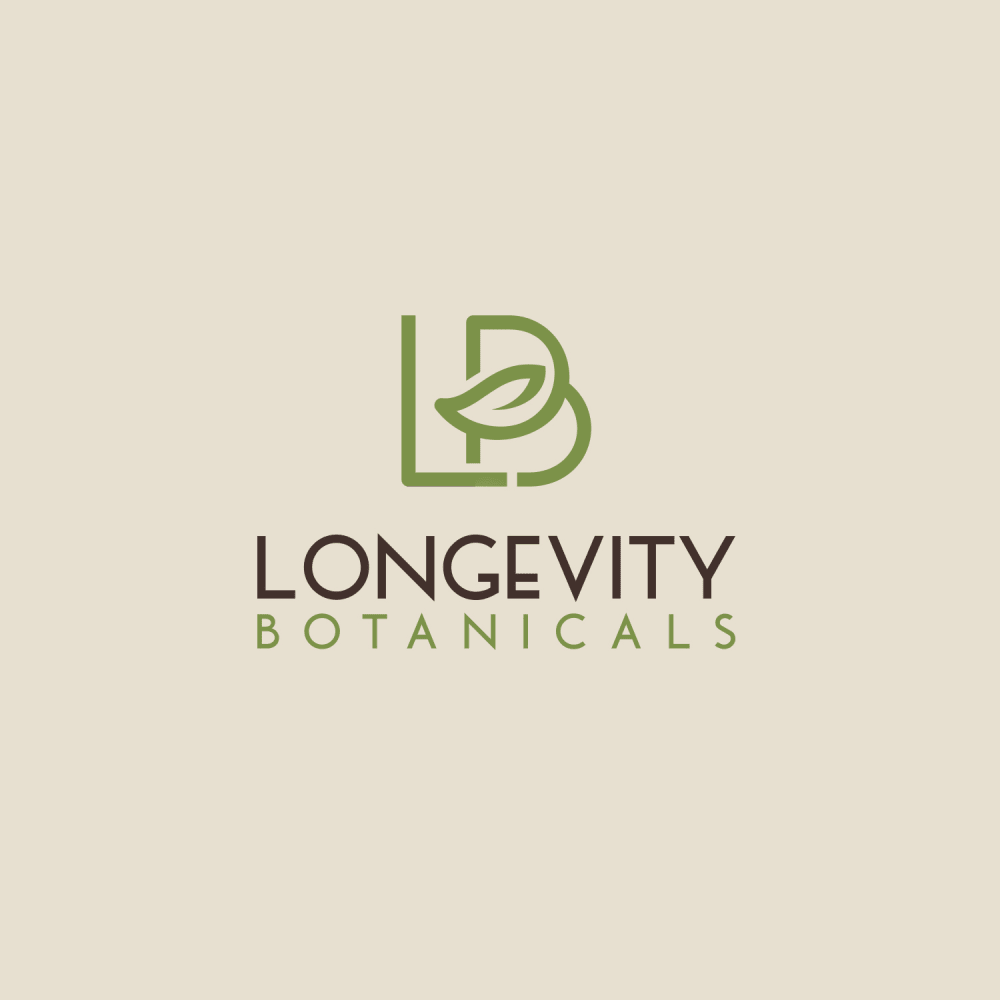
29 Responses to Option C
I feel C looks the most attractive overall
The logo and color differences. The first choice has a better color scheme.
I like the options that look more modern more and think that they would really stand out to consumers.
based on what caught my interest the most
for high-value organic superfood supplements that power up overall health and longevity i would prefer option C logo because it feels like it represents the product the company trying to sell
I like the simplicity and cleanness of the option C logo. Option A, I like as well. But it doesn't stand out, I feel like I've seen a lot of similar looking logos. Option D, the B on LB looks a bit awkward and slightly pregnant to me. Option B is a bit too on the nose.
This one says superpowered to me and it also lets me know that it is top quality
I strongly prefer C. I think it's delicate looking, unique and pretty-- I think it fits the company the best. I like A too. B is cool in concept, but if it's botanicals the elongated shape looks like a pill, which makes me think of pharmacy medicines, so I don't like it as much.
i like this logo because it conveys the idea that it powers up overall health and longevity and the green is good too
I like the logo in C&D the best. I like the C is more dainty than D. I like the logo in A as well but not as much as the first 2. I don't like the logo in B
I went from the most professional looking to the least. B looks absolutely stupid, if I may be honest. I see what they were going for, but that makes it even worse.
Option C is clean and get the point across. I like the nod to botanicals that's featured with the leaf in the B.
C has the most creative and aesthetically pleasing design. A has a great logo. I dislike the font of The L in option D. Option B, while I understand why the "o" is elongated, it looks ugly.
Option C is the best because it is the most professional. Option B is by far the worst because that long "o" looks very unprofessional.
I really like the look of the leaf being incorporated into the B. The leaf makes me think organic.
Option C looks very professional, there is a balance between the letters and words of the logo, the initials at the top of the logo are beautifully intertwined and the addition of the leaf as part pf the letter B is very nice. Option D looks nice but less delicate, there is no balance between the size of the letters. Option A is beautiful and elegant, but doesn't show the initials of the name of the company. The idea behind option B is wonderful, but it looks less formal, more playful.
I think that this logo stood out to me because it’s very intricate. There is a lot of connectivity.
I picked the one that looked the most professional and high quality. The one that had the most elegant and beautiful design.
My rankings are based on the which logo I feel would be best for a superfood supplement product / company. My top choice, my favorite is Option C. I love this logo!
I like the prominent letter design of C and D over the other choices. They seem more professional and sophisticated. I dislike B because it seems less formal and less professional as a result.
I like the ones with the plant icon incorporated into the design. I also like the ones that focus on the word Longevity, but do not have the oval shaped "o" in the middle.
Using a pill for the letter O looks so strange. It's too long to work. I like the font a lot in C. It's more creative, and using green for botanicals is a nice touch.
B is weird to read with the super long o. C however shows a very cohesive and smooth design. Longevity of life and botanicals are linked
I like the simplicity of the top 2.
I prefer the options with the LB logo with the leaf element in them the best. With option c being my favorite because i like the font style and the leaf is a nice readable element that would make the logo recognizable
I liked logos C and D the most because they are minimalistic and they just stood out from the rest of the options. I liked the combination of colors, the place of the font, style of the fond. C and D are of the same quality but I liked C lightly more. A is interesting but the logo looks familiar and so it lead me think its not as creative as the other ones. B on the other hand is confusing and I didnt like it as much as the other options.
I like simple and elegant designs for these types of products. I ranked the designs in order of how attractive they are visually and how I would feel clicking on each
C, A, and D were all pretty close to me, but I definitely didn't like the long, sideways O in B.
B is awful. The weird O is long but the longevity pun is just kind of annoying. C and A are the only two I would actually use. D is okay but not great.
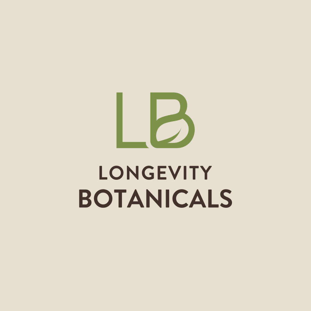
11 Responses to Option D
I really like the design of D the best. The B isnt obstructed by the leaf and its still easy to read and understand the logo concept.
i like how this design is the best mix of centered, clean, and neat while also showing the green leaf to make it feel natural
D looks simple and neat. A and C are more intricate but also nice. B is too plain
D is very creative, doesnt try too hard.
The design of the logo of option D looks very professional.
I voted based on how appealing the images were to me compared to the others and which ones I would click on in the real world.
I like the creative use of negative space, and the simplicity makes it seem higher end.
I like and prefer the simple logo designs.
I like the initials logo it seems cohesive and premium and I like how the words are dark and the logo is green. It's a calming design
I like the LB logo it looks sleek and really professional overall choices B and A do not look professional in my opinion
I really like both D and C, though I give the slight edge to D. I appreciate the simplicity of it. I think these are both bold, but not overwhelmingly so. A looks a bit cliché and I feel like I've seen it a thousand times before -- it bores me. B is just awful -- it's silly and much to on the nose.
Explore who answered your poll
Analyze your results with demographic reports.
Demographics
Sorry, AI highlights are currently only available for polls created after February 28th.
We're working hard to bring AI to more polls, please check back soon.

