Poll results
Save to favorites
Add this poll to your saved list for easy reference.
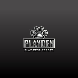
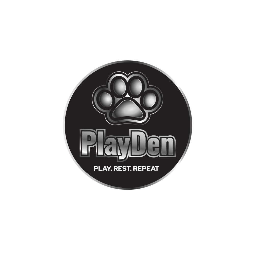
Which logo do you prefer for a company that does <pets play pens and crates> ?
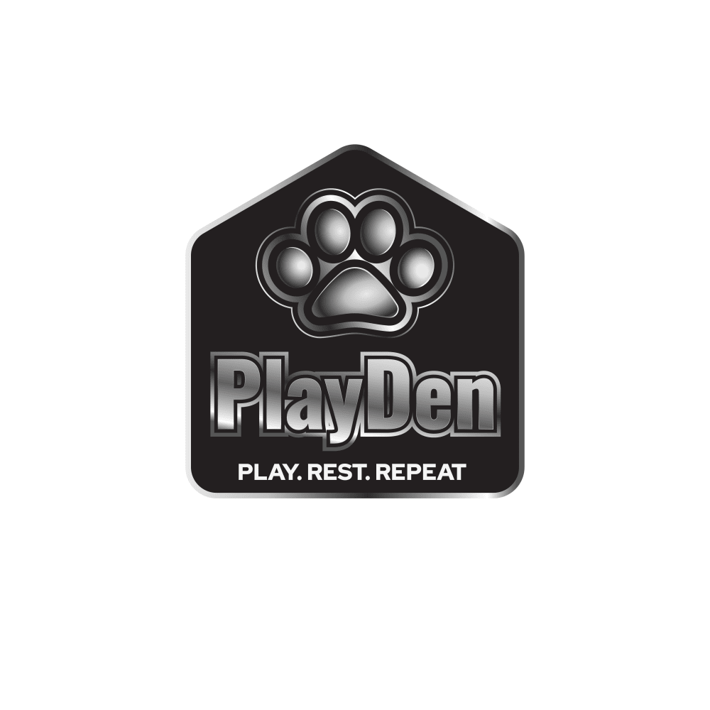
Option B won this Ranked poll with a final tally of 19 votes after 1 round of vote counting.
In a Ranked poll, respondents rank every option in order of preference. For example, when you test 6 options, each respondent orders their choices from first to sixth place.
PickFu requires a majority to win a Ranked poll. A majority winner differs from a plurality winner. A majority winner earns over 50% of the votes, whereas a plurality winner earns the most votes, regardless of winning percentage.
If an option does not earn a majority of votes, PickFu eliminates the option with the lowest number of votes. The votes from the eliminated option are reassigned based on each respondent’s next choice. This process continues in rounds until a majority winner emerges.
Scores reflect the percentage of total votes an option receives during the vote counting and indicate the relative preference of the respondents. If there is no majority winner, look to the scores to see how the options fared relative to one another.
| Option | Round 1 |
|---|---|
| B | 63.33% 19 votes |
| C | 20% 6 votes |
| A | 16.67% 5 votes |
Age range
Amazon Prime member
Crowdfunding participant
Cryptocurrency investments
Gender identity
Hobbies and interests
Online shopping marketplaces
Options
Pet owner
5 Responses to Option A
The dark background behind the logo looks the nicest and most professional.
I like option A because the size represents a play pen and would make you notice the logo.
I picked option A because of the fuller square dark black background.
I like no shaping in the background. The all black background is my preferred look for this logo. I think everything flows much better in this one. I would not like to see the others because it does not seem to fit well with the shape behind the logo.
I like the box around the name of this one a lot. I think it makes the name stick out. It makes it seem like the law is sitting on top of the box too which I like
19 Responses to Option B
The logo looks like a dog house. Makes perfect sense to me!
I like the logo in option B because it is the shape of a home, which is kind of in line with pet playpens and crates.
The shape of the logo looks like a doghouse which goes well with the company products.
B has a very fitting overall design as it looks like a dog house, and meshes well with the name of the business.
I like B the most for it's unique shape. I think it looks best, but C was a close 2nd. A is good too, but I liked the uniqueness and shapes of the other two more.
I voted for B as 1st because because I prefer the shape of the logo over the others. C came in 2nd because I do not like how A has a large background.
Because it looks kind of like a playpen/crate with the housing design.
Option B is clever in that the emblem is like a den, the name is play den, and the image with the words works well together
the house shape in B looks cozy and pet friendly, best. then the circle C. A with the big square feels very depressing and cold.
I like the logo design shaped like a house the best, it seems suited for the product. I would follow that with Option C.
I prefer a shape instead of the all black background. Option B - the Pentagon shape - seems the most welcoming to me.
I find it witty that this logo is in the shape of a house.
The logo that i prefer for this type of company and their products is the one shown in option B, mainly because this logo have a more appealing shape which resembles a house or a play pen, making it more enticing to the public and much more interesting, making the public highly interested in the products that this brand could offer.
easier to read and the different shapes show different styles of playpens
I like the "house" look of this logo; it makes me feel like they know pets are part of the family.
I like B because it’s in a little dog house which looks really cute and makes me know what the product is right away.
I like the dog house shape as it matches the brand well.
I like the smaller options and I think the shape of a house in my first choice is cute.
I prefer the logo in option B because it stands out and is attention grabbing. Its design and shape also feels like it makes sense and fits with the company description.
6 Responses to Option C
First, I would like to say I think this is a wonderfully cute idea! That being said, I suppose any of these company logos would work just fine, with a slight nod to Option C for it being the more traditional looking of the three.
I prefer option C. I like the round logo. It has the least amount of dead space in it.
I like the round logo the best, so Option C is my first choice. Options B and A are similar and would be viable alternatives, but I prefer Option C.
The shapes look like dog tags, so they fit nicely with the theme.
The text below the brand name is just bright enough. It's too bright in B and too obscured in A.
The round outer layer of the logo in option C is what I like most.
Explore who answered your poll
Analyze your results with demographic reports.

